如何定制Material-ui的选择?
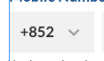
这是预期的结果:
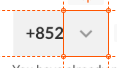
这是我到目前为止的工作方式:
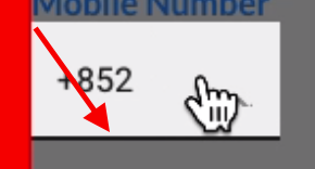
我不能做的是将SVG图标放在右侧;接下来是文本,这是检查结果:
此外,当光标与元素重叠时,下面有一条精确的黑线。
这是我的代码:
<MuiThemeProvider theme={createMuiTheme({
    overrides: {
        MuiSelect: {
            'root': {                         display: 'flex',
                    alignItems: 'center'
            }
        },
        MuiInput: {
            '&:hover': {
                    borderBottom: '0px',
                    borderColor: 'transparent'
            },
            underline: {
                '&:after': {
                    borderBottom: '0px',
                    borderColor: 'transparent'
                },
                '&:hover': {
                    borderBottom: '0px',
                    borderColor: 'transparent'
                }
            }
        }
    }
})}>
<Select
    IconComponent={newIcon}
    color={'#f1f1f1'}
    autoWidth={false}
    inputStyle={{
        borderBottom: '0px',
        color: '#2d2d2d',
        fontFamily: 'Lato',
        fontWeight: 'bold',
        fontSize: '16px',
        lineHeight: '19px',
    }}
    style={{
        borderBottom: 'none',
        backgroundColor: '#f1f1f1',
        padding: '12px',
        width: '93px'
    }}
    value={0}
>
    <MenuItem value={0} style={{
        color: '#2d2d2d',
        fontFamily: 'Lato',
        fontWeight: 'bold',
        fontSize: '16px',
        lineHeight: '19px',
    }}>+852</MenuItem>
    <MenuItem value={1} style={{
        color: '#2d2d2d',
        fontFamily: 'Lato',
        fontWeight: 'bold',
        fontSize: '16px',
        lineHeight: '19px'
    }}>+86</MenuItem>
</Select>
</MuiThemeProvider>
这是我的图标:
   const newIcon = (props) => {
        return (
        <SvgIcon>
            <svg xmlns="http://www.w3.org/2000/svg" width="45" height="45" viewBox="0 0 45 45">
                <path fill="none" fill-rule="evenodd" stroke="#979797" stroke-width="2" d="M17 20l5.467 5.467L27.934 20"/>
            </svg>
        </SvgIcon>
        )
    };
请问您如何正确定位图标,以及如何摆脱底线?谢谢。
2 个答案:
答案 0 :(得分:2)
您还可以使用
IconComponent={() => <ExpandMoreIcon />}
选择元素属性,以获取要查找的“材料库”图标
答案 1 :(得分:1)
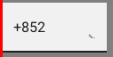
Select组件的本机图标在<svg>元素上使用以下样式:
{ position: 'absolute', right: 0, top: 0, pointerEvents : 'none'}
您只需要将以上样式属性应用于MuiSelect.root覆盖即可获得预期的结果。
您在鼠标悬停时观察到的突出显示来自Input组件,该组件是Select组件的根元素。可以使用属性disableUnderline禁用此行为。
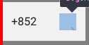
工作示例:
const iconStyle = { position: 'absolute', right: 0, top: 0, pointerEvents : 'none'};

const newIcon = (props) => {
      return (
        <svg xmlns="http://www.w3.org/2000/svg" style={iconStyle} width="32" height="32" viewBox="0 0 45 45">
          <path fill="none" fill-rule="evenodd" stroke="#979797" stroke-width="2" d="M17 20l5.467 5.467L27.934 20"/>
        </svg>
      )
  };

ReactDOM.render(
  <Select
      IconComponent={newIcon}
      disableUnderline
      color={'#f1f1f1'}
      autoWidth={false}
      inputStyle={{
      borderBottom: '0px',
      color: '#2d2d2d',
      fontFamily: 'Lato',
      fontWeight: 'bold',
      fontSize: '16px',
      lineHeight: '19px',
      }}
      style={{
      borderBottom: 'none',
      backgroundColor: '#f1f1f1',
      padding: '12px',
      width: '93px'
      }}
      value={0}
  >
      <MenuItem value={0} style={{
      color: '#2d2d2d',
      fontFamily: 'Lato',
      fontWeight: 'bold',
      fontSize: '16px',
      lineHeight: '19px',
      }}>+852</MenuItem>
      <MenuItem value={1} style={{
      color: '#2d2d2d',
      fontFamily: 'Lato',
      fontWeight: 'bold',
      fontSize: '16px',
      lineHeight: '19px'
      }}>+86</MenuItem>
  </Select>
  , document.getElementById('root'));
请参见StackBlitz上的演示。
相关问题
最新问题
- 我写了这段代码,但我无法理解我的错误
- 我无法从一个代码实例的列表中删除 None 值,但我可以在另一个实例中。为什么它适用于一个细分市场而不适用于另一个细分市场?
- 是否有可能使 loadstring 不可能等于打印?卢阿
- java中的random.expovariate()
- Appscript 通过会议在 Google 日历中发送电子邮件和创建活动
- 为什么我的 Onclick 箭头功能在 React 中不起作用?
- 在此代码中是否有使用“this”的替代方法?
- 在 SQL Server 和 PostgreSQL 上查询,我如何从第一个表获得第二个表的可视化
- 每千个数字得到
- 更新了城市边界 KML 文件的来源?