自定义列表框滚动条样式问题
我有以下用于WPF ListBox控件的xaml。我已经定制了它以满足我的UI要求。但是,滚动条拇指不会到达顶部和滚动条的底部。如果我点击垂直滚动条轨道上的其他位置,拇指也不会滚动。请帮我解决问题。任何帮助表示赞赏。
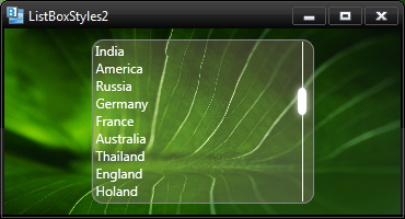
这是我自定义的ListBox控件的快照:
<Window
xmlns="http://schemas.microsoft.com/winfx/2006/xaml/presentation"
xmlns:x="http://schemas.microsoft.com/winfx/2006/xaml"
xmlns:Microsoft_Windows_Themes="clr-namespace:Microsoft.Windows.Themes;assembly=PresentationFramework.Aero"
x:Class="MovieMessageBox.ListBoxStyles2"
x:Name="Window"
Title="ListBoxStyles2"
Width="370" Height="200">

<Window.Resources>

    <SolidColorBrush x:Key="ListBorder" Color="#828790"/>
    <Style x:Key="ListBoxStyle1" TargetType="{x:Type ListBox}">
        <Setter Property="Background" Value="{DynamicResource {x:Static SystemColors.WindowBrushKey}}"/>
        <Setter Property="BorderBrush" Value="{StaticResource ListBorder}"/>
        <Setter Property="BorderThickness" Value="1"/>
        <Setter Property="Foreground" Value="{DynamicResource {x:Static SystemColors.ControlTextBrushKey}}"/>
        <Setter Property="ScrollViewer.HorizontalScrollBarVisibility" Value="Auto"/>
        <Setter Property="ScrollViewer.VerticalScrollBarVisibility" Value="Auto"/>
        <Setter Property="ScrollViewer.CanContentScroll" Value="true"/>
        <Setter Property="ScrollViewer.PanningMode" Value="Both"/>
        <Setter Property="Stylus.IsFlicksEnabled" Value="False"/>
        <Setter Property="VerticalContentAlignment" Value="Center"/>
        <Setter Property="Template">
            <Setter.Value>
                <ControlTemplate TargetType="{x:Type ListBox}">
                    <Grid>
                        <Rectangle Fill="Pink" RadiusX="10" RadiusY="10" Opacity="0.195" />
                        <Border CornerRadius="10" x:Name="Bd" BorderBrush="{TemplateBinding BorderBrush}" BorderThickness="{TemplateBinding BorderThickness}" Padding="1" SnapsToDevicePixels="true">
                            <ScrollViewer Focusable="false" Padding="{TemplateBinding Padding}" Template="{DynamicResource ScrollViewerControlTemplate1}">
                                <ItemsPresenter SnapsToDevicePixels="{TemplateBinding SnapsToDevicePixels}"/>
                            </ScrollViewer>
                        </Border>
                    </Grid>
                    <ControlTemplate.Triggers>
                        <Trigger Property="IsEnabled" Value="false">
                            <Setter Property="Background" TargetName="Bd" Value="{DynamicResource {x:Static SystemColors.ControlBrushKey}}"/>
                        </Trigger>
                        <Trigger Property="IsGrouping" Value="true">
                            <Setter Property="ScrollViewer.CanContentScroll" Value="false"/>
                        </Trigger>
                    </ControlTemplate.Triggers>
                </ControlTemplate>
            </Setter.Value>
        </Setter>
    </Style>
    <ControlTemplate x:Key="ScrollViewerControlTemplate1" TargetType="{x:Type ScrollViewer}">
        <Grid x:Name="Grid" Background="{TemplateBinding Background}">
            <Grid.ColumnDefinitions>
                <ColumnDefinition Width="*"/>
                <ColumnDefinition Width="Auto"/>
            </Grid.ColumnDefinitions>

            <ScrollContentPresenter x:Name="PART_ScrollContentPresenter" CanContentScroll="{TemplateBinding CanContentScroll}" CanHorizontallyScroll="False" CanVerticallyScroll="False" ContentTemplate="{TemplateBinding ContentTemplate}" Content="{TemplateBinding Content}" Grid.Column="0" Margin="{TemplateBinding Padding}" />
            <ScrollBar x:Name="PART_VerticalScrollBar" AutomationProperties.AutomationId="VerticalScrollBar" Cursor="Arrow" Grid.Column="1" Maximum="{TemplateBinding ScrollableHeight}" Minimum="0" Visibility="{TemplateBinding ComputedVerticalScrollBarVisibility}" Value="{Binding VerticalOffset, Mode=OneWay, RelativeSource={RelativeSource TemplatedParent}}" ViewportSize="{TemplateBinding ViewportHeight}" Style="{DynamicResource ScrollBarStyle1}"/>
        </Grid>
    </ControlTemplate>
    <LinearGradientBrush x:Key="VerticalScrollBarBackground" EndPoint="1,0" StartPoint="0,0">
        <GradientStop Color="#E1E1E1" Offset="0"/>
        <GradientStop Color="#EDEDED" Offset="0.20"/>
        <GradientStop Color="#EDEDED" Offset="0.80"/>
        <GradientStop Color="#E3E3E3" Offset="1"/>
    </LinearGradientBrush>
    <SolidColorBrush x:Key="ScrollBarDisabledBackground" Color="#F4F4F4"/>

    <Style x:Key="ScrollBarButton" TargetType="{x:Type RepeatButton}">
        <Setter Property="OverridesDefaultStyle" Value="true"/>
        <Setter Property="Focusable" Value="false"/>
        <Setter Property="IsTabStop" Value="false"/>
        <Setter Property="Template">
            <Setter.Value>
                <ControlTemplate TargetType="{x:Type RepeatButton}">
                    <Microsoft_Windows_Themes:ScrollChrome x:Name="Chrome" RenderMouseOver="{TemplateBinding IsMouseOver}" RenderPressed="{TemplateBinding IsPressed}" SnapsToDevicePixels="true" Microsoft_Windows_Themes:ScrollChrome.ScrollGlyph="{TemplateBinding Microsoft_Windows_Themes:ScrollChrome.ScrollGlyph}"/>
                </ControlTemplate>
            </Setter.Value>
        </Setter>
    </Style>
    <Style x:Key="VerticalScrollBarPageButton" TargetType="{x:Type RepeatButton}">
        <Setter Property="OverridesDefaultStyle" Value="true"/>
        <Setter Property="Background" Value="Transparent"/>
        <Setter Property="Focusable" Value="false"/>
        <Setter Property="IsTabStop" Value="false"/>
        <Setter Property="Template">
            <Setter.Value>
                <ControlTemplate TargetType="{x:Type RepeatButton}">
                    <Rectangle Fill="{TemplateBinding Background}" Height="{TemplateBinding Height}" Width="{TemplateBinding Width}"/>
                </ControlTemplate>
            </Setter.Value>
        </Setter>
    </Style>
    <Style x:Key="ScrollBarThumb" TargetType="{x:Type Thumb}">
        <Setter Property="OverridesDefaultStyle" Value="true"/>
        <Setter Property="IsTabStop" Value="false"/>
        <Setter Property="Template">
            <Setter.Value>
                <ControlTemplate TargetType="{x:Type Thumb}">
                    <Rectangle Height="25" Width="8" Fill="White" RadiusX="5" RadiusY="5">
                        <Rectangle.Effect>
                            <DropShadowEffect ShadowDepth="0" BlurRadius="10" Color="White" />
                        </Rectangle.Effect>
                    </Rectangle>
                </ControlTemplate>
            </Setter.Value>
        </Setter>
    </Style>
    <LinearGradientBrush x:Key="HorizontalScrollBarBackground" EndPoint="0,1" StartPoint="0,0">
        <GradientStop Color="#E1E1E1" Offset="0"/>
        <GradientStop Color="#EDEDED" Offset="0.20"/>
        <GradientStop Color="#EDEDED" Offset="0.80"/>
        <GradientStop Color="#E3E3E3" Offset="1"/>
    </LinearGradientBrush>
    <Style x:Key="HorizontalScrollBarPageButton" TargetType="{x:Type RepeatButton}">
        <Setter Property="OverridesDefaultStyle" Value="true"/>
        <Setter Property="Background" Value="Transparent"/>
        <Setter Property="Focusable" Value="false"/>
        <Setter Property="IsTabStop" Value="false"/>
        <Setter Property="Template">
            <Setter.Value>
                <ControlTemplate TargetType="{x:Type RepeatButton}">
                    <Rectangle Fill="{TemplateBinding Background}" Height="{TemplateBinding Height}" Width="{TemplateBinding Width}"/>
                </ControlTemplate>
            </Setter.Value>
        </Setter>
    </Style>
    <Style x:Key="ScrollBarStyle1" TargetType="{x:Type ScrollBar}">
        <Setter Property="Background" Value="Transparent"/>
        <Setter Property="Stylus.IsPressAndHoldEnabled" Value="false"/>
        <Setter Property="Stylus.IsFlicksEnabled" Value="false"/>
        <Setter Property="Foreground" Value="{DynamicResource {x:Static SystemColors.ControlTextBrushKey}}"/>
        <Setter Property="Width" Value="{DynamicResource {x:Static SystemParameters.VerticalScrollBarWidthKey}}"/>
        <Setter Property="MinWidth" Value="{DynamicResource {x:Static SystemParameters.VerticalScrollBarWidthKey}}"/>

        <Setter Property="Template">
            <Setter.Value>
                <ControlTemplate TargetType="{x:Type ScrollBar}">
                    <Grid x:Name="Bg" Background="{TemplateBinding Background}" SnapsToDevicePixels="true">
                        <Border Width="1" Background="#FFFFFF" HorizontalAlignment="Center"/>
                        <Track x:Name="PART_Track" IsDirectionReversed="true" IsEnabled="{TemplateBinding IsMouseOver}">

                            <Track.Thumb>
                                <Thumb Style="{StaticResource ScrollBarThumb}" Microsoft_Windows_Themes:ScrollChrome.ScrollGlyph="VerticalGripper"/>
                            </Track.Thumb>
                        </Track>
                    </Grid>
                    <ControlTemplate.Triggers>
                        <Trigger Property="IsEnabled" Value="false">
                            <Setter Property="Background" TargetName="Bg" Value="{StaticResource ScrollBarDisabledBackground}"/>
                        </Trigger>
                    </ControlTemplate.Triggers>
                </ControlTemplate>
            </Setter.Value>
        </Setter>
        <Style.Triggers>
            <Trigger Property="Orientation" Value="Horizontal">
                <Setter Property="Width" Value="Auto"/>
                <Setter Property="MinWidth" Value="0"/>
                <Setter Property="Height" Value="{DynamicResource {x:Static SystemParameters.HorizontalScrollBarHeightKey}}"/>
                <Setter Property="MinHeight" Value="{DynamicResource {x:Static SystemParameters.HorizontalScrollBarHeightKey}}"/>
                <Setter Property="Background" Value="{StaticResource HorizontalScrollBarBackground}"/>
                <Setter Property="Template">
                    <Setter.Value>
                        <ControlTemplate TargetType="{x:Type ScrollBar}">
                            <Grid x:Name="Bg" Background="{TemplateBinding Background}" SnapsToDevicePixels="true">
                                <Grid.ColumnDefinitions>
                                    <ColumnDefinition MaxWidth="{DynamicResource {x:Static SystemParameters.HorizontalScrollBarButtonWidthKey}}"/>
                                    <ColumnDefinition Width="0.00001*"/>
                                    <ColumnDefinition MaxWidth="{DynamicResource {x:Static SystemParameters.HorizontalScrollBarButtonWidthKey}}"/>
                                </Grid.ColumnDefinitions>
                                <RepeatButton Command="{x:Static ScrollBar.LineLeftCommand}" IsEnabled="{TemplateBinding IsMouseOver}" Style="{StaticResource ScrollBarButton}" Microsoft_Windows_Themes:ScrollChrome.ScrollGlyph="LeftArrow"/>
                                <Track x:Name="PART_Track" Grid.Column="1" IsEnabled="{TemplateBinding IsMouseOver}">
                                    <Track.DecreaseRepeatButton>
                                        <RepeatButton Command="{x:Static ScrollBar.PageLeftCommand}" Style="{StaticResource HorizontalScrollBarPageButton}"/>
                                    </Track.DecreaseRepeatButton>
                                    <Track.IncreaseRepeatButton>
                                        <RepeatButton Command="{x:Static ScrollBar.PageRightCommand}" Style="{StaticResource HorizontalScrollBarPageButton}"/>
                                    </Track.IncreaseRepeatButton>
                                    <Track.Thumb>
                                        <Thumb Style="{StaticResource ScrollBarThumb}" Microsoft_Windows_Themes:ScrollChrome.ScrollGlyph="HorizontalGripper"/>
                                    </Track.Thumb>
                                </Track>
                                <RepeatButton Grid.Column="2" Command="{x:Static ScrollBar.LineRightCommand}" IsEnabled="{TemplateBinding IsMouseOver}" Style="{StaticResource ScrollBarButton}" Microsoft_Windows_Themes:ScrollChrome.ScrollGlyph="RightArrow"/>
                            </Grid>
                            <ControlTemplate.Triggers>
                                <Trigger Property="IsEnabled" Value="false">
                                    <Setter Property="Background" TargetName="Bg" Value="{StaticResource ScrollBarDisabledBackground}"/>
                                </Trigger>
                            </ControlTemplate.Triggers>
                        </ControlTemplate>
                    </Setter.Value>
                </Setter>
            </Trigger>
        </Style.Triggers>
    </Style>
    <Style TargetType="{x:Type ListBoxItem}">
        <Setter Property="Foreground" Value="White" />
        <Setter Property="Background" Value="Transparent"/>
        <Setter Property="HorizontalContentAlignment" Value="{Binding HorizontalContentAlignment, RelativeSource={RelativeSource AncestorType={x:Type ItemsControl}}}"/>
        <Setter Property="VerticalContentAlignment" Value="{Binding VerticalContentAlignment, RelativeSource={RelativeSource AncestorType={x:Type ItemsControl}}}"/>
        <Setter Property="Padding" Value="2,0,0,0"/>
        <Setter Property="Template">
            <Setter.Value>
                <ControlTemplate TargetType="{x:Type ListBoxItem}">
                    <Border x:Name="Bd" BorderBrush="{TemplateBinding BorderBrush}" BorderThickness="{TemplateBinding BorderThickness}" Background="{TemplateBinding Background}" Padding="{TemplateBinding Padding}" SnapsToDevicePixels="true">
                        <ContentPresenter HorizontalAlignment="{TemplateBinding HorizontalContentAlignment}" SnapsToDevicePixels="{TemplateBinding SnapsToDevicePixels}" VerticalAlignment="{TemplateBinding VerticalContentAlignment}"/>
                    </Border>
                    <ControlTemplate.Triggers>
                        <Trigger Property="IsSelected" Value="true">
                            <Setter Property="Background" TargetName="Bd" Value="{DynamicResource {x:Static SystemColors.HighlightBrushKey}}"/>
                            <Setter Property="Foreground" Value="{DynamicResource {x:Static SystemColors.HighlightTextBrushKey}}"/>
                        </Trigger>
                        <MultiTrigger>
                            <MultiTrigger.Conditions>
                                <Condition Property="IsSelected" Value="true"/>
                                <Condition Property="Selector.IsSelectionActive" Value="false"/>
                            </MultiTrigger.Conditions>
                            <Setter Property="Background" TargetName="Bd" Value="{DynamicResource {x:Static SystemColors.ControlBrushKey}}"/>
                            <Setter Property="Foreground" Value="{DynamicResource {x:Static SystemColors.ControlTextBrushKey}}"/>
                        </MultiTrigger>
                        <Trigger Property="IsEnabled" Value="false">
                            <Setter Property="Foreground" Value="{DynamicResource {x:Static SystemColors.GrayTextBrushKey}}"/>
                        </Trigger>
                    </ControlTemplate.Triggers>
                </ControlTemplate>
            </Setter.Value>
        </Setter>
    </Style>

</Window.Resources>
<Window.Background>
    <ImageBrush ImageSource="@aleaf-1920.jpg"/>
</Window.Background>

<Grid x:Name="LayoutRoot">
    <ListBox HorizontalAlignment="Center" Height="150" Width="203" Style="{DynamicResource ListBoxStyle1}">
        <ListBoxItem Content="India"/>
        <ListBoxItem Content="America"/>
        <ListBoxItem Content="Russia"/>
        <ListBoxItem Content="Germany"/>
        <ListBoxItem Content="France"/>
        <ListBoxItem Content="Australia"/>
        <ListBoxItem Content="Thailand"/>
        <ListBoxItem Content="England"/>
        <ListBoxItem Content="Holand"/>
        <ListBoxItem Content="Poland"/>
        <ListBoxItem Content="Lesotho"/>
        <ListBoxItem Content="Tanzania"/>
    </ListBox>
</Grid>
</Window>
3 个答案:
答案 0 :(得分:7)
您看到的行为是因为滚动条拇指是成比例的。比较下图中的两个拇指。

拇指实际上使用了滚动条高度的75%,因为列表框显示了12个项目中的9个。但是您已将自定义拇指的高度设置为25.删除&#34; height = 25&#34;属性,它会表现得很好。
答案 1 :(得分:1)
关键是设置ViewportSize =&#34; NaN&#34;在滚动条的Track组件上。
答案 2 :(得分:0)
尝试将高度设置为NaN。不确定我是否记得正确。
相关问题
最新问题
- 我写了这段代码,但我无法理解我的错误
- 我无法从一个代码实例的列表中删除 None 值,但我可以在另一个实例中。为什么它适用于一个细分市场而不适用于另一个细分市场?
- 是否有可能使 loadstring 不可能等于打印?卢阿
- java中的random.expovariate()
- Appscript 通过会议在 Google 日历中发送电子邮件和创建活动
- 为什么我的 Onclick 箭头功能在 React 中不起作用?
- 在此代码中是否有使用“this”的替代方法?
- 在 SQL Server 和 PostgreSQL 上查询,我如何从第一个表获得第二个表的可视化
- 每千个数字得到
- 更新了城市边界 KML 文件的来源?