圆角周围的盒子阴影?
我正在使用Twitter的Bootstrap库快速拼凑原型。
以下是我在HTML中的布局:
<div class="navbar-messages container">
<div class="alert alert-info fade in">
<button class="close" data-dismiss="alert">×</button>
<strong>Awesomeness!</strong> You're pretty cool.
</div>
<div class="alert alert-error fade in">
<button class="close" data-dismiss="alert">×</button>
<strong>Awesomeness!</strong> You're pretty cool.
</div>
</div>
这是我的LESS的样子:
div.navbar div.navbar-messages {
    .drop-shadow(1px 1px 10px 1px rgba(0, 0, 0, 0.2));

    div.alert {
        -webkit-border-radius: 0px;
        -moz-border-radius: 0px;
        border-radius: 0px;

        margin-bottom: 0px;

        &:last-child {
            -webkit-border-bottom-right-radius: 4px;
            -webkit-border-bottom-left-radius: 4px;
            -moz-border-radius-bottomright: 4px;
            -moz-border-radius-bottomleft: 4px;
            border-bottom-right-radius: 4px;
            border-bottom-left-radius: 4px;
        }
    }
}

.drop-shadow(@params) {
    -moz-box-shadow: @params;
    -webkit-box-shadow: @params;
    box-shadow: @params;
}
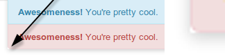
奇怪的是,阴影没有围绕子元素的弯角弯曲:
如何让它在拐角处正确弯曲?
3 个答案:
答案 0 :(得分:24)
您的div.navbar div.navbar-messages元素缺少圆角,因此阴影显示为方形。如其名称所述,box-shadow在元素的框周围绘制阴影,而不是元素的内容,因此如果盒子本身没有圆角,那么阴影也不会。
您也可以尝试将相同的border-radius样式应用于div.navbar div.navbar-messages,因此它的阴影会围绕角落弯曲:
div.navbar div.navbar-messages {
    .drop-shadow(1px 1px 10px 1px rgba(0, 0, 0, 0.2));
    .rounded-bottom-corners(4px);

    div.alert {
        -webkit-border-radius: 0px;
        -moz-border-radius: 0px;
        border-radius: 0px;

        margin-bottom: 0px;

        &:last-child {
            .rounded-bottom-corners(4px);
        }
    }
}

.drop-shadow(@params) {
    -moz-box-shadow: @params;
    -webkit-box-shadow: @params;
    box-shadow: @params;
}

.rounded-bottom-corners(@params) {
    -webkit-border-bottom-right-radius: @params;
    -webkit-border-bottom-left-radius: @params;
    -moz-border-radius-bottomright: @params;
    -moz-border-radius-bottomleft: @params;
    border-bottom-right-radius: @params;
    border-bottom-left-radius: @params;
}
答案 1 :(得分:1)
我有这个:
blockquote {
    border: none;
    font-style: italic;
    font-size: 20px;
    line-height: 40px;
    font-weight: 300;
    padding: 0;
    margin: 30px 0;
    text-shadow: 0 1px 1px #666666;
    background: rgba(255,255, 255, 0.4);
    box-shadow: 0px 0.5px 1px #888888;
    padding-left: 10px;
    -webkit-border-radius: 6px;
    -moz-border-radius: 6px;
    border-radius: 6px;
}
所以:
-webkit-border-radius: 6px;
        -moz-border-radius: 6px;
        border-radius: 6px;
这对我很有用!非常感谢。
答案 2 :(得分:0)
是的...只是在有阴影的div上放置一个border-radius。确保border-radius值与div中对象的值匹配,它们将正确匹配。
相关问题
最新问题
- 我写了这段代码,但我无法理解我的错误
- 我无法从一个代码实例的列表中删除 None 值,但我可以在另一个实例中。为什么它适用于一个细分市场而不适用于另一个细分市场?
- 是否有可能使 loadstring 不可能等于打印?卢阿
- java中的random.expovariate()
- Appscript 通过会议在 Google 日历中发送电子邮件和创建活动
- 为什么我的 Onclick 箭头功能在 React 中不起作用?
- 在此代码中是否有使用“this”的替代方法?
- 在 SQL Server 和 PostgreSQL 上查询,我如何从第一个表获得第二个表的可视化
- 每千个数字得到
- 更新了城市边界 KML 文件的来源?