宽度为100%的HTML表格,在tbody中有垂直滚动
如何设置<table> 100%宽度并仅在<tbody>垂直滚动内放置某个高度?
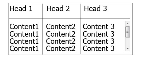
table {
    width: 100%;
    display:block;
}
thead {
    display: inline-block;
    width: 100%;
    height: 20px;
}
tbody {
    height: 200px;
    display: inline-block;
    width: 100%;
    overflow: auto;
}
<table>
  <thead>
    <tr>
    	<th>Head 1</th>
    	<th>Head 2</th>
    	<th>Head 3</th>
    	<th>Head 4</th>
    	<th>Head 5</th>
    </tr>
  </thead>
  <tbody>
    <tr>
    	<td>Content 1</td>
    	<td>Content 2</td>
    	<td>Content 3</td>
    	<td>Content 4</td>
    	<td>Content 5</td>
    </tr>
  </tbody>
</table>
我想避免添加一些额外的div,我想要的只是这样的简单表,当我尝试更改显示时,table-layout,position以及CSS表中的更多内容不能正常工作100%宽度仅在px中具有固定宽度。
13 个答案:
答案 0 :(得分:605)
为了使<tbody>元素可滚动,我们需要更改它在页面上的显示方式,即使用display: block;将其显示为块级元素。
由于我们更改了display的{{1}}属性,因此我们应该更改tbody元素的属性,以防止破坏表格布局。
所以我们有:
thead默认情况下,网络浏览器会将thead, tbody { display: block; }
tbody {
height: 100px; /* Just for the demo */
overflow-y: auto; /* Trigger vertical scroll */
overflow-x: hidden; /* Hide the horizontal scroll */
}
和thead元素显示为行组(tbody和table-header-group)。
更改后,内部table-row-group元素不会填充其容器的整个空间。
为了解决这个问题,我们必须计算tr列的宽度,并通过JavaScript将相应的值应用于tbody列。
自动宽度列
以下是上述逻辑的jQuery版本:
thead这是输出(在Windows 7 Chrome 32上):

<强> WORKING DEMO
全宽表,相对宽度列
正如原始海报所需,我们可以将// Change the selector if needed
var $table = $('table'),
$bodyCells = $table.find('tbody tr:first').children(),
colWidth;
// Get the tbody columns width array
colWidth = $bodyCells.map(function() {
return $(this).width();
}).get();
// Set the width of thead columns
$table.find('thead tr').children().each(function(i, v) {
$(v).width(colWidth[i]);
});
扩展到其容器table的100%,然后使用亲戚(百分比){{1} }对于表的每一列。
width由于表格具有(某种)流体布局,因此我们应该在容器调整大小时调整width列的宽度。
因此,我们应该在调整窗口大小后设置列的宽度:
table {
    width: 100%; /* Optional */
}

tbody td, thead th {
    width: 20%;  /* Optional */
}
输出结果为:

<强> WORKING DEMO
浏览器支持和替代方案
我已经通过主要的Web浏览器(包括IE10 +)的新版本在Windows 7上测试了上述两种方法,并且它有效。
但是,doesn't work properly on IE9及以下。
这是因为table layout中的,所有元素都应遵循相同的结构属性。
对thead和// Adjust the width of thead cells when *window* resizes
$(window).resize(function() {
/* Same as before */
}).resize(); // Trigger the resize handler once the script runs
元素使用display: block;,我们打破了表格结构。
通过JavaScript重新设计布局
一种方法是重新设计(整个)表格布局。使用JavaScript动态创建新布局并动态处理和/或调整单元格的宽度/高度。
例如,看一下以下示例:
- jQuery .floatThead() 插件(浮动/锁定/粘贴表格标题插件)
- jQuery Scrollable Table 插件。 (source code在github上)
- jQuery .FixedHeaderTable() 插件(github上的source code)
- DataTables vertical scrolling 示例。
嵌套表
此方法使用两个包含div的嵌套表。第一个<thead>只有一个单元格有<tbody>,第二个表格放在table元素内。
检查 CSS Play 中的Vertical scrolling tables。
这适用于大多数网络浏览器。我们也可以通过JavaScript动态地完成上述逻辑。
滚动
时固定标题的表格由于向div添加垂直滚动条的目的是在每行的顶部显示表格标题,我们可以定位 {{ 1}}元素将div保留在屏幕顶部。
Working Demo 执行此方法的 Julien 。 它有一个很有前途的Web浏览器支持。
由here pure CSS实施 Willem Van Bockstal 。
纯CSS解决方案
这是旧答案。当然,我添加了一个新方法并改进了CSS声明。
具有固定宽度的表
在这种情况下,<tbody>应该有一个固定的thead (包括列的宽度和垂直滚动条的宽度之和)。
每个列应具有特定的宽度,fixed元素的最后一列需要更大的宽度< / em>等于其他人的宽度 +垂直滚动条的宽度。
因此,CSS将是:
table这是输出:

<强> WORKING DEMO
100%宽度的表
在此方法中,width的宽度为thead,对于每个table {
width: 716px; /* 140px * 5 column + 16px scrollbar width */
border-spacing: 0;
}
tbody, thead tr { display: block; }
tbody {
height: 100px;
overflow-y: auto;
overflow-x: hidden;
}
tbody td, thead th {
width: 140px;
}
thead th:last-child {
width: 156px; /* 140px + 16px scrollbar width */
}
和table,100%属性的值应小于th。
另外,我们需要将td的宽度缩小为垂直滚动条的 width 的值。
为了做到这一点,我们需要使用CSS3 calc()函数,如下所示:
width以下是 Online Demo 。
注意:如果每列的内容打破了这一行,这种方法将失败,即每个单元格的内容应该足够短
在下文中,我回答了这个问题时创建了两个简单的纯CSS解决方案示例。
以下是 jsFiddle Demo v2 。
旧版本: jsFiddle Demo v1
答案 1 :(得分:78)
在以下解决方案中,表占用父容器的100%,不需要绝对大小。它是纯CSS,使用flex布局。
以下是它的外观:
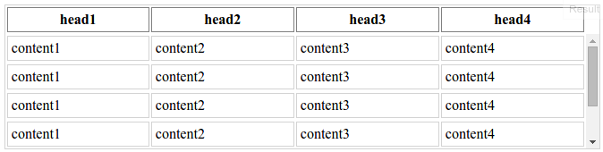
可能的缺点:
- 垂直滚动条始终可见,无论是否需要;
- 表格布局是固定的 - 列不会根据内容宽度调整大小(您仍然可以设置您想要的任何列宽度);
- 有一个绝对大小 - 滚动条的宽度,对于我能够检查的浏览器大约是0.9em。
HTML(缩写):
<div class="table-container">
    <table>
        <thead>
            <tr>
                <th>head1</th>
                <th>head2</th>
                <th>head3</th>
                <th>head4</th>
            </tr>
        </thead>
        <tbody>
            <tr>
                <td>content1</td>
                <td>content2</td>
                <td>content3</td>
                <td>content4</td>
            </tr>
            <tr>
                <td>content1</td>
                <td>content2</td>
                <td>content3</td>
                <td>content4</td>
            </tr>
            ...
        </tbody>
    </table>
</div>
CSS,为清晰起见省略了一些装饰:
.table-container {
    height: 10em;
}
table {
    display: flex;
    flex-flow: column;
    height: 100%;
    width: 100%;
}
table thead {
    /* head takes the height it requires,
    and it's not scaled when table is resized */
    flex: 0 0 auto;
    width: calc(100% - 0.9em);
}
table tbody {
    /* body takes all the remaining available space */
    flex: 1 1 auto;
    display: block;
    overflow-y: scroll;
}
table tbody tr {
    width: 100%;
}
table thead, table tbody tr {
    display: table;
    table-layout: fixed;
}
LESS中的相同代码,因此您可以将其混合使用:
.table-scrollable() {
  @scrollbar-width: 0.9em;
  display: flex;
  flex-flow: column;

  thead,
  tbody tr {
    display: table;
    table-layout: fixed;
  }

  thead {
    flex: 0 0 auto;
    width: ~"calc(100% - @{scrollbar-width})";
  }

  tbody {
    display: block;
    flex: 1 1 auto;
    overflow-y: scroll;

    tr {
      width: 100%;
    }
  }
}
答案 2 :(得分:18)
我正在display:block和thead使用tbody。
因此,thead列的宽度与tbody列的宽度不同。
table {
    margin:0 auto;
    border-collapse:collapse;
}
thead {
    background:#CCCCCC;
    display:block
}
tbody {
    height:10em;overflow-y:scroll;
    display:block
}
要解决此问题,我使用小jQuery代码,但只能在JavaScript内完成。
var colNumber=3 //number of table columns

for (var i=0; i<colNumber; i++) {
  var thWidth=$("#myTable").find("th:eq("+i+")").width();
  var tdWidth=$("#myTable").find("td:eq("+i+")").width();
  if (thWidth<tdWidth)
      $("#myTable").find("th:eq("+i+")").width(tdWidth);
  else
      $("#myTable").find("td:eq("+i+")").width(thWidth);
}
这是我的工作演示: http://jsfiddle.net/gavroche/N7LEF/
在IE 8中不起作用
var colNumber=3 //number of table columns


for (var i=0; i<colNumber; i++)
  {
      var thWidth=$("#myTable").find("th:eq("+i+")").width();
      var tdWidth=$("#myTable").find("td:eq("+i+")").width();
      if (thWidth<tdWidth)
          $("#myTable").find("th:eq("+i+")").width(tdWidth);
      else
          $("#myTable").find("td:eq("+i+")").width(thWidth);
  }
table {margin:0 auto; border-collapse:separate;}
thead {background:#CCCCCC;display:block}
tbody {height:10em;overflow-y:scroll;display:block}<script src="https://ajax.googleapis.com/ajax/libs/jquery/1.11.1/jquery.min.js"></script>
<table id="myTable" border="1">
<thead>
<tr>
<th>A really Very Long Header Text</th>
<th>Normal Header</th>
<th>Short</th>
</tr>
</thead>
<tbody>
<tr>
<td>
Text shorter than header
</td>
<td>
Text is longer than header
</td>
<td>
Exact
</td>
</tr>
<tr>
<td>
Text shorter than header
</td>
<td>
Text is longer than header
</td>
<td>
Exact
</td>
</tr>
<tr>
<td>
Text shorter than header
</td>
<td>
Text is longer than header
</td>
<td>
Exact
</td>
</tr>
<tr>
<td>
Text shorter than header
</td>
<td>
Text is longer than header
</td>
<td>
Exact
</td>
</tr>
<tr>
<td>
Text shorter than header
</td>
<td>
Text is longer than header
</td>
<td>
Exact
</td>
</tr>
<tr>
<td>
Text shorter than header
</td>
<td>
Text is longer than header
</td>
<td>
Exact
</td>
</tr>
<tr>
<td>
Text shorter than header
</td>
<td>
Text is longer than header
</td>
<td>
Exact
</td>
</tr>
<tr>
<td>
Text shorter than header
</td>
<td>
Text is longer than header
</td>
<td>
Exact
</td>
</tr>
<tr>
<td>
Text shorter than header
</td>
<td>
Text is longer than header
</td>
<td>
Exact
</td>
</tr>
<tr>
<td>
Text shorter than header
</td>
<td>
Text is longer than header
</td>
<td>
Exact
</td>
</tr>
<tr>
<td>
Text shorter than header
</td>
<td>
Text is longer than header
</td>
<td>
Exact
</td>
</tr>
</tbody>
</table>
答案 3 :(得分:16)
在现代浏览器中,您只需使用css:
即可th {
position: sticky;
top: 0;
z-index: 2;
}
答案 4 :(得分:12)
一个接一个地创建两个表,将第二个表放在固定高度的div中,并将overflow属性设置为auto。同时将第二个表中的所有td保留在第二个表中。
<div>
    <table>
        <thead>
            <tr>
                <th>Head 1</th>
                <th>Head 2</th>
                <th>Head 3</th>
                <th>Head 4</th>
                <th>Head 5</th>
            </tr>
        </thead>
    </table>
</div>

<div style="max-height:500px;overflow:auto;">
    <table>
        <thead>
            <tr>
                <th></th>
                <th></th>
                <th></th>
                <th></th>
                <th></th>
            </tr>
        </thead>
        <tbody>
        <tr>
            <td>Content 1</td>
            <td>Content 2</td>
            <td>Content 3</td>
            <td>Content 4</td>
            <td>Content 5</td>
        </tr>
        </tbody>
    </table>
</div>
答案 5 :(得分:6)
按照以下说明,我最终使用纯CSS获得了它:
http://tjvantoll.com/2012/11/10/creating-cross-browser-scrollable-tbody/
第一步是将<tbody>设置为display:block,以便可以应用溢出和高度。从那里<thead>中的行需要设置为position:relative和display:block,以便它们位于现在可滚动的<tbody>之上。
tbody, thead { display: block; overflow-y: auto; }
因为<thead>相对定位,每个表格单元格需要显式宽度
td:nth-child(1), th:nth-child(1) { width: 100px; }
td:nth-child(2), th:nth-child(2) { width: 100px; }
td:nth-child(3), th:nth-child(3) { width: 100px; }
但不幸的是,这还不够。当存在滚动条时,浏览器会为其分配空间,因此,<tbody>最终可用空间少于<thead>。注意这会造成轻微的错位......
我能想到的唯一解决方法是在除最后一列之外的所有列上设置最小宽度。
td:nth-child(1), th:nth-child(1) { min-width: 100px; }
td:nth-child(2), th:nth-child(2) { min-width: 100px; }
td:nth-child(3), th:nth-child(3) { width: 100px; }
下面的整个codepen示例:
CSS:
.fixed_headers {
  width: 750px;
  table-layout: fixed;
  border-collapse: collapse;
}
.fixed_headers th {
  text-decoration: underline;
}
.fixed_headers th,
.fixed_headers td {
  padding: 5px;
  text-align: left;
}
.fixed_headers td:nth-child(1),
.fixed_headers th:nth-child(1) {
  min-width: 200px;
}
.fixed_headers td:nth-child(2),
.fixed_headers th:nth-child(2) {
  min-width: 200px;
}
.fixed_headers td:nth-child(3),
.fixed_headers th:nth-child(3) {
  width: 350px;
}
.fixed_headers thead {
  background-color: #333333;
  color: #fdfdfd;
}
.fixed_headers thead tr {
  display: block;
  position: relative;
}
.fixed_headers tbody {
  display: block;
  overflow: auto;
  width: 100%;
  height: 300px;
}
.fixed_headers tbody tr:nth-child(even) {
  background-color: #dddddd;
}
.old_ie_wrapper {
  height: 300px;
  width: 750px;
  overflow-x: hidden;
  overflow-y: auto;
}
.old_ie_wrapper tbody {
  height: auto;
}
HTML:
<!-- IE < 10 does not like giving a tbody a height.  The workaround here applies the scrolling to a wrapped <div>. -->
<!--[if lte IE 9]>
<div class="old_ie_wrapper">
<!--<![endif]-->

<table class="fixed_headers">
  <thead>
    <tr>
      <th>Name</th>
      <th>Color</th>
      <th>Description</th>
    </tr>
  </thead>
  <tbody>
    <tr>
      <td>Apple</td>
      <td>Red</td>
      <td>These are red.</td>
    </tr>
    <tr>
      <td>Pear</td>
      <td>Green</td>
      <td>These are green.</td>
    </tr>
    <tr>
      <td>Grape</td>
      <td>Purple / Green</td>
      <td>These are purple and green.</td>
    </tr>
    <tr>
      <td>Orange</td>
      <td>Orange</td>
      <td>These are orange.</td>
    </tr>
    <tr>
      <td>Banana</td>
      <td>Yellow</td>
      <td>These are yellow.</td>
    </tr>
    <tr>
      <td>Kiwi</td>
      <td>Green</td>
      <td>These are green.</td>
    </tr>
    <tr>
      <td>Plum</td>
      <td>Purple</td>
      <td>These are Purple</td>
    </tr>
    <tr>
      <td>Watermelon</td>
      <td>Red</td>
      <td>These are red.</td>
    </tr>
    <tr>
      <td>Tomato</td>
      <td>Red</td>
      <td>These are red.</td>
    </tr>
    <tr>
      <td>Cherry</td>
      <td>Red</td>
      <td>These are red.</td>
    </tr>
    <tr>
      <td>Cantelope</td>
      <td>Orange</td>
      <td>These are orange inside.</td>
    </tr>
    <tr>
      <td>Honeydew</td>
      <td>Green</td>
      <td>These are green inside.</td>
    </tr>
    <tr>
      <td>Papaya</td>
      <td>Green</td>
      <td>These are green.</td>
    </tr>
    <tr>
      <td>Raspberry</td>
      <td>Red</td>
      <td>These are red.</td>
    </tr>
    <tr>
      <td>Blueberry</td>
      <td>Blue</td>
      <td>These are blue.</td>
    </tr>
    <tr>
      <td>Mango</td>
      <td>Orange</td>
      <td>These are orange.</td>
    </tr>
    <tr>
      <td>Passion Fruit</td>
      <td>Green</td>
      <td>These are green.</td>
    </tr>
  </tbody>
</table>

<!--[if lte IE 9]>
</div>
<!--<![endif]-->
编辑:表格宽度100%的替代解决方案(实际上是固定宽度,并没有回答问题):
HTML:
<table>
  <thead>
    <tr>
      <th>Name</th>
      <th>Color</th>
      <th>Description</th>
    </tr>
  </thead>
  <tbody>
    <tr>
      <td>Apple</td>
      <td>Red</td>
      <td>These are red.</td>
    </tr>
    <tr>
      <td>Pear</td>
      <td>Green</td>
      <td>These are green.</td>
    </tr>
    <tr>
      <td>Grape</td>
      <td>Purple / Green</td>
      <td>These are purple and green.</td>
    </tr>
    <tr>
      <td>Orange</td>
      <td>Orange</td>
      <td>These are orange.</td>
    </tr>
    <tr>
      <td>Banana</td>
      <td>Yellow</td>
      <td>These are yellow.</td>
    </tr>
    <tr>
      <td>Kiwi</td>
      <td>Green</td>
      <td>These are green.</td>
    </tr>
  </tbody>
</table>
CSS:
table {
  width: 100%;
  text-align: left;
  min-width: 610px;
}
tr {
  height: 30px;
  padding-top: 10px
}
tbody {
  height: 150px;
  overflow-y: auto;
  overflow-x: hidden;
}
th,td,tr,thead,tbody { display: block; }
td,th { float: left; }
td:nth-child(1),
th:nth-child(1) {
  width: 20%;
}
td:nth-child(2),
th:nth-child(2) {
  width: 20%;
  float: left;
}
td:nth-child(3),
th:nth-child(3) {
  width: 59%;
  float: left;
}
/* some colors */
thead {
  background-color: #333333;
  color: #fdfdfd;
}
table tbody tr:nth-child(even) {
  background-color: #dddddd;
}
答案 6 :(得分:2)
使用'block'tbody
强制列正确显示列的Css解决方法此解决方案仍需要{jone
计算和设置th宽度
table.scroll tbody,
table.scroll thead { display: block; }

table.scroll tbody {
    overflow-y: auto;
    overflow-x: hidden;
    max-height: 300px;
}

table.scroll tr {
    display: flex;
}

table.scroll tr > td {
    flex-grow: 1;
    flex-basis: 0;
}
和Jquery / Javascript
var $table = $('#the_table_element'),
    $bodyCells = $table.find('tbody tr:first').children(),
    colWidth;

$table.addClass('scroll');

// Adjust the width of thead cells when window resizes
$(window).resize(function () {

    // Get the tbody columns width array
    colWidth = $bodyCells.map(function () {
        return $(this).width();
    }).get();

    // Set the width of thead columns
    $table.find('thead tr').children().each(function (i, v) {
        $(v).width(colWidth[i]);
    });

}).resize(); // Trigger resize handler
答案 7 :(得分:2)
尝试以下方法,非常简单易于实施
以下是jsfiddle链接
http://jsfiddle.net/v2t2k8ke/2/
HTML:
<table border='1' id='tbl_cnt'>
<thead><tr></tr></thead><tbody></tbody>
CSS:
 #tbl_cnt{
 border-collapse: collapse; width: 100%;word-break:break-all;
 }
 #tbl_cnt thead, #tbl_cnt tbody{
 display: block;
 }
 #tbl_cnt thead tr{
 background-color: #8C8787; text-align: center;width:100%;display:block;
 }
 #tbl_cnt tbody {
 height: 100px;overflow-y: auto;overflow-x: hidden;
 }
Jquery的:
 var data = [
    {
    "status":"moving","vehno":"tr544","loc":"bng","dri":"ttt"
    }, {
    "status":"stop","vehno":"tr54","loc":"che", "dri":"ttt"
    },{    "status":"idle","vehno":"yy5499999999999994","loc":"bng","dri":"ttt"
    },{
    "status":"moving","vehno":"tr544","loc":"bng", "dri":"ttt"
    }, {
    "status":"stop","vehno":"tr54","loc":"che","dri":"ttt"
    },{
    "status":"idle","vehno":"yy544","loc":"bng","dri":"ttt"
    }
    ];
   var sth = '';
   $.each(data[0], function (key, value) {
     sth += '<td>' + key + '</td>';
   });
   var stb = '';
   $.each(data, function (key, value) {
       stb += '<tr>';
       $.each(value, function (key, value) {
       stb += '<td>' + value + '</td>';
       });
       stb += '</tr>';
    });
      $('#tbl_cnt thead tr').append(sth);
      $('#tbl_cnt tbody').append(stb);
      setTimeout(function () {
      var col_cnt=0
      $.each(data[0], function (key, value) {col_cnt++;});
      $('#tbl_cnt thead tr').css('width', ($("#tbl_cnt tbody") [0].scrollWidth)+ 'px');
      $('#tbl_cnt thead tr td,#tbl_cnt tbody tr td').css('width',  ($('#tbl_cnt thead tr ').width()/Number(col_cnt)) + 'px');}, 100)
答案 8 :(得分:2)
仅CSS
用于 Chrome,Firefox,Edge (以及其他常绿浏览器)
只需from fastai.vision import *
您的Dim a As String
Dim b As String
Dim split = TextBox1.Text.Split(":")
If (split.Count = 2) Then
a = split(0).ToString
b = split(1).ToString
End If
TextBox2.Text = a
TextBox3.Text = b
元素:
position: sticky; top: 0;th
PS:如果TH元素需要边界,/* Fix table head */
.tableFixHead { overflow-y: auto; height: 100px; }
.tableFixHead th { position: sticky; top: 0; }
/* Just common table stuff. */
table { border-collapse: collapse; width: 100%; }
th, td { padding: 8px 16px; }
th { background:#eee; }会有所帮助(因为默认边框在滚动时无法正确绘制)。
对于上述仅使用少量JS来适应 IE11 的变体,请参见以下答案https://stackoverflow.com/a/47923622/383904
答案 9 :(得分:1)
在 tbody &amp;之后添加固定宽度 td,th thead 显示块工作正常,我们也可以使用slimscroll插件使滚动条漂亮。
library(tidyverse)
res <- df %>%
        mutate(ind = 1) %>%
        complete(., date, jobcategory, fill = list(ind = 0)) %>%
        group_by(date, jobcategory) %>%
        summarise(Count= sum(ind)) %>%
        arrange(jobcategory, date)
res %>%
    filter(jobcategory == "SP")
# A tibble: 4 x 3
# Groups:   date [4]
#        date jobcategory Count
#       <date>       <chr> <dbl>
#1 2016-01-01          SP     2
#2 2016-01-02          SP     2
#3 2016-01-03          SP     3
#4 2016-01-04          SP     0
答案 10 :(得分:1)
这是对我有用的代码,它可以在带有可滚动tbody的桌子上创建一个粘性thead:
table ,tr td{
    border:1px solid red
}
tbody {
    display:block;
    height:50px;
    overflow:auto;
}
thead, tbody tr {
    display:table;
    width:100%;
    table-layout:fixed;/* even columns width , fix width of table too*/
}
thead {
    width: calc( 100% - 1em )/* scrollbar is average 1em/16px width, remove it from thead width */
}
table {
    width:400px;
}
答案 11 :(得分:0)
要使用“溢出:滚动”,必须在广告和正文上设置“ display:block”。这就弄乱了它们之间的列宽。但是,您可以使用Javascript复制thead行,并将其作为隐藏行粘贴到tbody中,以保持确切的col宽度。
$('.myTable thead > tr').clone().appendTo('.myTable tbody').addClass('hidden-to-set-col-widths');
http://jsfiddle.net/Julesezaar/mup0c5hk/
<table class="myTable">
    <thead>
        <tr>
            <td>Problem</td>
            <td>Solution</td>
            <td>blah</td>
            <td>derp</td>
        </tr>
    </thead>
    <tbody></tbody>
</table>
<p>
  Some text to here
</p>
css:
table {
  background-color: #aaa;
  width: 100%;
}

thead,
tbody {
  display: block; // Necessary to use overflow: scroll
}

tbody {
  background-color: #ddd;
  height: 150px;
  overflow-y: scroll;
}

tbody tr.hidden-to-set-col-widths,
tbody tr.hidden-to-set-col-widths td {
  visibility: hidden;
  height: 0;
  line-height: 0;
  padding-top: 0;
  padding-bottom: 0;
}

td {
  padding: 3px 10px;
}
答案 12 :(得分:0)
尝试此jsfiddle。这是使用jQuery并由Hashem Qolami的答案完成的。首先,创建一个常规表,然后使其可滚动。
const makeScrollableTable = function (tableSelector, tbodyHeight) {
  let $table = $(tableSelector);
  let $bodyCells = $table.find('tbody tr:first').children();
  let $headCells = $table.find('thead tr:first').children();
  let headColWidth = 0;
  let bodyColWidth = 0;

  headColWidth = $headCells.map(function () {
    return $(this).outerWidth();
  }).get();
  bodyColWidth = $bodyCells.map(function () {
    return $(this).outerWidth();
  }).get();

  $table.find('thead tr').children().each(function (i, v) {
    $(v).css("width", headColWidth[i]+"px");
    $(v).css("min-width", headColWidth[i]+"px");
    $(v).css("max-width", headColWidth[i]+"px");
  });
  $table.find('tbody tr').children().each(function (i, v) {
    $(v).css("width", bodyColWidth[i]+"px");
    $(v).css("min-width", bodyColWidth[i]+"px");
    $(v).css("max-width", bodyColWidth[i]+"px");
  });

  $table.find('thead').css("display", "block");
  $table.find('tbody').css("display", "block");

  $table.find('tbody').css("height", tbodyHeight+"px");
  $table.find('tbody').css("overflow-y", "auto");
  $table.find('tbody').css("overflow-x", "hidden");

};
- 我写了这段代码,但我无法理解我的错误
- 我无法从一个代码实例的列表中删除 None 值,但我可以在另一个实例中。为什么它适用于一个细分市场而不适用于另一个细分市场?
- 是否有可能使 loadstring 不可能等于打印?卢阿
- java中的random.expovariate()
- Appscript 通过会议在 Google 日历中发送电子邮件和创建活动
- 为什么我的 Onclick 箭头功能在 React 中不起作用?
- 在此代码中是否有使用“this”的替代方法?
- 在 SQL Server 和 PostgreSQL 上查询,我如何从第一个表获得第二个表的可视化
- 每千个数字得到
- 更新了城市边界 KML 文件的来源?