如何根据设备屏幕大小设置div大小?
我正在开发一个可在iOS设备上使用的网络应用程序,包括iPhone4和iPhone5。我使用5开发了应用程序,并且所有东西都适合并且完美地工作,但是试图让它适合4的较小高度似乎不起作用。以下是我要完成的事情:
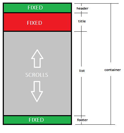
我在顶部有一个标题div,一个包含图像和日期的标题div,然后是一个列表div,后跟一个页脚div。所有都包含在一个名为div的div中。我希望页眉,标题和页脚div保持固定,并且列表div用于滚动在加载时动态输入的内容。页脚应保留在屏幕底部,列表应从其下方向外滚动(如果有意义的话)。
我在开发它时为所有div设置了固定的高度,它可以在我的iPhone5上运行,但当我尝试将列表div高度设置为((window.screen.height) - header - title - footer)整个文档滚动,而不仅仅是列表div。这是我通过大量试验和错误创建的:
#container {
    min-width: 1280px;
    position: relative;
}

#header {
    height: 140px;
    width: 100%;
}

#title {
    height: 330px;
    width: 100%;
    position: relative;
}

#list {
    height: 1592px;
    width: 100%;
    overflow: auto;
    -webkit-overflow-scrolling: touch;
}

#footer {
    height: 140px;
    width: 100%;
}
1 个答案:
答案 0 :(得分:4)
您可以使用固定定位,而不是使用顶部和底部指定#list的高度以使其适合。
#container {
    min-width: 1280px;
    position: relative;
}

#header {
    height: 140px;
    width: 100%;
    posiotion:fixed;
    top:0px; /* Top left corner of the screen */
    left:0px;
}

#title {
    height: 330px;
    width: 100%;
    position: relative;
    posiotion:fixed;
    top:140px; /* 140px below the top left corner of the screen */
    left:0px;
}

#list {
    /*height: 1592px; remove this - the height will be determined by top and bottom */
    width: 100%;
    overflow: auto;
    -webkit-overflow-scrolling: touch;
    posiotion:fixed;
    top:470px; /* start 470px below top left corner */
    bottom:140px; /* This is the trick - specify bottom instead of height */
    left:0px;

}

#footer {
    height: 140px;
    width: 100%;
    posiotion:fixed;
    top:auto;
    bottom:0px; /* Stick to bottom */
    left:0px;
}
注意:从我的代码中我理解#title不应该滚动。如果您想要滚动它,请将其放在#list内并更新位置。
相关问题
最新问题
- 我写了这段代码,但我无法理解我的错误
- 我无法从一个代码实例的列表中删除 None 值,但我可以在另一个实例中。为什么它适用于一个细分市场而不适用于另一个细分市场?
- 是否有可能使 loadstring 不可能等于打印?卢阿
- java中的random.expovariate()
- Appscript 通过会议在 Google 日历中发送电子邮件和创建活动
- 为什么我的 Onclick 箭头功能在 React 中不起作用?
- 在此代码中是否有使用“this”的替代方法?
- 在 SQL Server 和 PostgreSQL 上查询,我如何从第一个表获得第二个表的可视化
- 每千个数字得到
- 更新了城市边界 KML 文件的来源?