зВєеЗїеЫЊж†ЗжЙУеЉАHTML5жЧ•жЬЯйАЙжЛ©еЩ®
жИСжЬЙдЄАдЄ™HTML5жЧ•жЬЯйАЙжЛ©еЩ®гАВ
еНХеЗїжЧ•жЬЯйАЙжЛ©еЩ®жЦЗжЬђж°ЖжЧґжЙУеЉАгАВ
TodoпЉЪ
- жИСењЕй°їе∞ЖдЇЛдїґжЫіжФєдЄЇеЫЊж†ЗпЉМдљЖжИСдЄНз°ЃеЃЪе¶ВдљХеЃЮзО∞ж≠§еКЯиГљгАВ
ељУжИСзВєеЗїжЧ•еОЖеЫЊж†ЗжЧґпЉМжИСењЕй°їжЙУеЉАжЧ•жЬЯйАЙжЛ©еЩ®гАВ
дї•дЄЛжШѓжИСзЪДdatepickerзЪДHTMLдї£з†БпЉЪ
<img src="date.png" alt="Date Picker" id="datepickericon" />
<input name="calendarselect{ContactID}" class="timeselect" type="date" id="calendar">
<script>
document.getElementById("datepickericon").onclick = function(e){
console.log('inside click');
    document.getElementById("calendar").style.visibility="visible";
    // document.getElementById("calendar").focus();
    // You could write code to toggle this
}

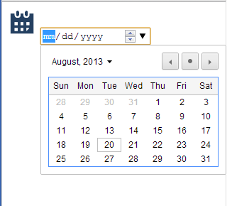
зВєеЗїеЫЊж†ЗпЉМжИСењЕй°їеЊЧеИ∞е¶ВдЄЛеЫЊжЙАз§ЇзЪДжЙУеЉАжЧ•еОЖиІЖеЫЊ
7 дЄ™з≠Фж°И:
з≠Фж°И 0 :(еЊЧеИЖпЉЪ9)
еЄ¶жЬЙ<input>зЪДHTML5 type='date'дїЕйАВзФ®дЇОfew browsersгАВж≠§е§ЦпЉМдљЬдЄЇз®ЛеЇПеСШпЉМжВ®жЧ†ж≥ХжОІеИґеЕґе§ЦиІВжИЦдїїдљХеЕґдїЦжЦєйЭҐпЉИдЊЛе¶ВжШЊз§ЇеТМйЪРиЧПеЃГпЉЙпЉИQuick FAQs on input type dateпЉЙ
еЫ†ж≠§пЉМе¶ВжЮЬжВ®ењЕй°їињЩж†ЈеБЪпЉМеИЩHTML5 <input type='date'>ж†ЗиЃ∞дЄНжШѓдЄАдЄ™йАЙй°єгАВжВ®ењЕй°їдљњзФ®JavaScriptжЮДеїЇзЪДеЖЕеЃєпЉМдЊЛе¶ВjQuery UIжИЦBootstrapжЧ•жЬЯйАЙжЛ©еЩ®гАВ
жЧІз≠Фж°И
жВ®ењЕй°їеЬ®зВєеЗїеЫЊж†ЗжЧґйЩДеК†жіїеК®гАВеБЗиЃЊжВ®зЪДHTMLзЬЛиµЈжЭ•еГПињЩж†ЈпЉЪ
<img src="date.png" alt="Date Picker" id="datepickericon" />
<input name="calendarselect{ContactID}" class="timeselect" type="date" id="calendar">
жВ®ењЕй°їж£АжЯ•еЫЊж†ЗдЄКзЪДonclickдЇЛдїґеєґжШЊз§ЇжИЦйЪРиЧПжЧ•еОЖгАВ
document.getElementById("datepickericon").onclick = function(e){
    document.getElementById("calendar").focus();
    // You could write code to toggle this
}
з≠Фж°И 1 :(еЊЧеИЖпЉЪ7)
е¶ВжЮЬжВ®дЄНдїЛжДПеЬ®жЧ•жЬЯиЊУеЕ•е≠ЧжЃµдЄ≠еМЕеРЂжЧ•еОЖеЫЊж†ЗпЉМйВ£дєИиЈ®жµПиІИеЩ®зЪДжЫњдї£жЦєж≥ХжШѓе∞ЖжЧ•еОЖеЫЊж†ЗжФЊеЬ®дЄЙиІТ嚥жЧ•еОЖйАЙжЛ©еЩ®жМЗз§ЇеЩ®зЪДй°ґйГ®пЉМзДґеРОе∞ЖжЧ•еОЖеЫЊж†ЗиЃЊзљЃдЄЇ{{1ињЩе∞ЖеѓЉиЗіжЙАжЬЙзВєеЗїдЇЛдїґдЉ†йАТеИ∞дЄЛйЭҐзЪДдЄЙиІТ嚥жЧ•еОЖйАЙжЛ©еЩ®жМЗз§ЇеЩ®гАВжИСдЄНеЃМеЕ®з°ЃеЃЪжЧ•еОЖйАЙжЛ©еЩ®жМЗз§ЇеЩ®еЬ®дЄНеРМжµПиІИеЩ®дЄ≠зЪДдљНзљЃжШѓеР¶дЄАиЗідљЖеЃГеЇФиѓ•йЭЮеЄЄзЫЄдЉЉгАВиѓЈеПВйШЕдЄЛйЭҐзЪДз§ЇдЊЛгАВ
pointer-events: none.sd-container {
position: relative;
float: left;
}
.sd {
border: 1px solid #1cbaa5;
padding: 5px 10px;
height: 30px;
width: 150px;
}
.open-button {
position: absolute;
top: 10px;
right: 3px;
width: 25px;
height: 25px;
background: #fff;
pointer-events: none;
}
.open-button button {
border: none;
background: transparent;
}
ж≠§е§ЦпЉМињШеПѓдї•жЫіжФєжЧ•жЬЯиЊУеЕ•е≠ЧжЃµпЉИдљЖдЄНжШѓжЧ•еОЖжЧ•жЬЯйАЙжЛ©еЩ®пЉЙзЪДжЯРдЇЫе§ЦиІВпЉМеЫ†дЄЇеЃГзЪДж†ЈеЉПз±їдЉЉдЇОжЦЗжЬђиЊУеЕ•е≠ЧжЃµгАВж≠§е§ЦпЉМеЃГдїђињШжЬЙиЃЄе§ЪWebKit CSSе±ЮжАІпЉМињЩдЇЫе±ЮжАІеЬ®ж≠§е§ДињЫи°МдЇЖиІ£йЗКAre there any style options for the HTML5 Date picker?
з≠Фж°И 2 :(еЊЧеИЖпЉЪ3)
жИСеЫЮз≠ФињЩдЄ™йЧЃйҐШпЉМеЄМжЬЫжЬЙжЦ∞дЇЇиГљеПСзО∞еЃГжЬЙзФ®пЉЪ жИСзЪДHTMLжШѓињЩж†ЈзЪДпЉЪ
In [5]: df= pd.ExcelFile('PTE_Kinetics_04-30-2015.xlsx')

In [7]: sh = df.parse('Forced Wash')

In [8]: sh.head()
Out[8]:
   Time  Absorbance
0     0      0.1254
1     5      0.1278
2    10      0.1280
3    15      0.1286
4    20      0.1303

In [9]: sh.set_index('Time').head()
Out[9]:
      Absorbance
Time
0         0.1254
5         0.1278
10        0.1280
15        0.1286
20        0.1303
жИСеЈ≤зїПеЬ®Chromeж®°жЛЯеЩ®дї•еПКAndroidиЃЊе§ЗдЄКеѓєеЃГињЫи°МдЇЖжµЛиѓХпЉМеЃГзЪДеЈ•дљЬеОЯзРЖйЭЮеЄЄе•љгАВдљЖйЬАи¶БеЬ®iOSиЃЊе§ЗдЄКињЫи°МжµЛиѓХгАВ
з≠Фж°И 3 :(еЊЧеИЖпЉЪ2)
жВ®еПѓдї•е∞ЖжЧ•жЬЯеЕГзі†з≤ШиііеИ∞еЫЊж†ЗдЄКпЉМеєґиЊУеЕ•opactiyпЉЪ0; еєґзїЩеЗЇе≠ЧдљУе∞ЇеѓЄдЄОеЫЊж†ЗзЪДе§Іе∞ПдЄАж†Је§ІпЉМзДґеРОе∞±дЉЪеПСеЗЇйФЩиѓѓ
з≠Фж°И 4 :(еЊЧеИЖпЉЪ2)
е¶ВжЮЬзФ®жИЈзВєеЗїдЇЖеѓєеЇФlabelж†ЗиЃ∞пЉМеИЩе§Іе§ЪжХ∞пЉИе¶ВжЮЬдЄНжШѓеЕ®йГ®пЉЙжµПиІИеЩ®йГљдЉЪеЕ≥ж≥®и°®еНХжОІдїґгАВеЫ†ж≠§пЉМдЄАдЄ™еПѓиГљзЪДиІ£еЖ≥жЦєж°ИжШѓе∞ЖеЫЊж†ЗжФЊеЕ•labelж†ЗиЃ∞пЉМе¶ВдЄЛжЙАз§ЇпЉЪ
<label for="dateinput">Birthday:</label>
<input type="date" id="dateinput">
<label for="dateinput">
    <img src="data:image/png;base64,iVBORw0KGgoAAAANSUhEUgAAABgAAAAYCAYAAADgdz34AAAA80lEQVRIie2SzQqCQBDHe5/w1kXt1qUFo6NP1Melp8geIvxgyzbJoIJ6gQ1SA6V6AJ1OG0SsaQkWOPCHPfxmf8wwtVoZZcyXKx0TJwe/0TFZZxaYtgOm7UDhvD8aDD0VxazBV5qZwnhPbcfeqNfnCk4qSiiSHg0USW8/p0h84k8qSvgTKE04tBpgTjSwNA0OrcZbAePN8fjBpwookmAhC0BkAY5IzDDBK58qKCJcARbrUES4gvB6gyJSvoCd3Sfv3xBUK6pW9LngHEZfrycII77A3e1vwReSIIzA3e4vXIFuka4xW57ZyHljYBJMsd3hCv6y7o9Nby8uLYYvAAAAAElFTkSuQmCC" style="vertical-align: middle;" alt="Calendar" title="Set focus on birthday field">
</label>
дљЖжЬЙеЗ†зВєйЬАи¶Бж≥®жДПпЉЪ
-
labelж†Зз≠ЊињШзФ®дЇОе∞Жи°®еНХжОІдїґзЪДжППињ∞ињЮжО•еИ∞и°®еНХжОІдїґжЬђиЇЂпЉМеЫ†ж≠§иЊЕеК©жКАжЬѓпЉИдЊЛе¶Ве±ПеєХйШЕиѓїеЩ®пЉЙеПѓдї•дЄОзФ®жИЈињЫи°МйАЪдњ°пЉМдїОиАМ嚥жИРдїЦдїђйАЙжЛ©зЪДжОІдїґгАВеЫ†ж≠§пЉМеПѓиГљдЄНйЉУеК±жї•зФ®labelж†ЗиЃ∞жЭ•жШЊз§ЇеЫЊж†ЗгАВеЫ†ж≠§пЉМдљњзФ®дЄ§дЄ™labelж†ЗиЃ∞пЉМињЩдЄ§дЄ™ж†ЗиЃ∞йГљйУЊжО•еИ∞еРМдЄАдЄ™и°®еНХжОІдїґпЉМдЄАдЄ™жППињ∞еЃГпЉМеП¶дЄАдЄ™ж†ЗиЃ∞зФ®дЇОжЧ•еОЖеЫЊж†ЗгАВ - ж≠§иІ£еЖ≥жЦєж°Ие∞ЖжЧ•жЬЯе≠ЧжЃµйЗНзВєжФЊеЬ®зФ®жИЈеНХеЗїеЕґдЄ≠зЪДдљНзљЃгАВзЙєеИЂжШѓChrome on DesktopпЉИзЫЃеЙНзЙИжЬђдЄЇ66пЉЙдїНзДґи¶Бж±ВзФ®жИЈзВєеЗїдЄАдЄ™е∞ПеРСдЄЛзЃ≠е§іжЭ•е±ХеЉАжЧ•еОЖгАВиЩљзДґ пЉМAndroidдЄКзЪДFirefoxпЉМEdgeеТМChromeдЉЉдєОињРи°МиЙѓе•љ
з≠Фж°И 5 :(еЊЧеИЖпЉЪ0)
<input type="date">

input[type="date"], input[type="month"]{
    position: relative;
}

/* create a new arrow, because we are going to mess up the native one
see "List of symbols" below if you want another, you could also try to add a font-awesome icon.. */
input[type="date"]:after,input[type="month"]:after {
    font-family: "Font Awesome 5 Free";
    font-weight: 900;
    content: "\f073";
    color: #555;
    padding: 0 5px;
}

/* change color of symbol on hover */
input[type="date"]:hover:after,input[type="month"]:hover:after {
    color: #bf1400;
}

/* make the native arrow invisible and stretch it over the whole field so you can click anywhere in the input field to trigger the native datepicker*/
input[type="date"]::-webkit-calendar-picker-indicator,input[type="month"]::-webkit-calendar-picker-indicator  {
    position: absolute;
    top: 0;
    left: 0;
    right: 0;
    bottom: 0;
    width: auto;
    height: auto;
    color: transparent;
    background: transparent;
}

/* adjust increase/decrease button */
input[type="date"]::-webkit-inner-spin-button,input[type="month"]::-webkit-inner-spin-button {
    z-index: 1;
}

 /* adjust clear button */
 input[type="date"]::-webkit-clear-button, input[type="month"]::-webkit-clear-button {
     z-index: 1;
 }
з≠Фж°И 6 :(еЊЧеИЖпЉЪ0)
жВ®еПѓдї•жЯ•зЬЛжЧ•жЬЯйАЙжЛ©еЩ®зЪД codepen йУЊжО•гАВ
https://codepen.io/ragi_jay/pen/NWdbJMG
HTML
<div class="tek-date-container tek-flow-modal-date-picker">
<input class="tek-input tek-date-input-box" type="date"  placeholder="Date" name="startDate" id="tek_start_date" value="" />

<span class="tek-btn-date">

  <div class="tek-cal-icon">
  <button type="button">

    <img src="data:image/svg+xml,%3csvg version='1.1' id='Layer_1' xmlns='http://www.w3.org/2000/svg' xmlns:xlink='http://www.w3.org/1999/xlink' x='0px' y='0px' viewBox='0 0 19.3 22' style='enable-background:new 0 0 19.3 22%3b' xml:space='preserve'%3e %3cstyle type='text/css'%3e .st0%7bfill:%235961FF%3b%7d %3c/style%3e %3cg id='Layer_2_1_'%3e %3cg id='Layer_1-2'%3e %3cpath class='st0' d='M17.2%2c2.8h-2.1V0.5c0-0.3-0.2-0.5-0.4-0.5c0%2c0%2c0%2c0-0.1%2c0h-0.3c-0.3%2c0-0.5%2c0.2-0.5%2c0.4c0%2c0%2c0%2c0%2c0%2c0.1v2.2H5.5 V0.5C5.5%2c0.2%2c5.3%2c0%2c5.1%2c0C5%2c0%2c5%2c0%2c5%2c0H4.6C4.3%2c0%2c4.1%2c0.2%2c4.1%2c0.5v2.2h-2C1%2c2.7%2c0%2c3.7%2c0%2c4.8v15.1C0%2c21%2c0.9%2c22%2c2%2c22c0%2c0%2c0.1%2c0%2c0.1%2c0 h15.1c1.2%2c0%2c2.1-0.9%2c2.1-2.1V4.8C19.3%2c3.7%2c18.3%2c2.8%2c17.2%2c2.8z M2.1%2c4.1h15.1c0.4%2c0%2c0.7%2c0.3%2c0.7%2c0.7c0%2c0%2c0%2c0%2c0%2c0v2.1H1.4V4.8 C1.4%2c4.4%2c1.7%2c4.1%2c2.1%2c4.1C2.1%2c4.1%2c2.1%2c4.1%2c2.1%2c4.1z M17.2%2c20.6H2.1c-0.4%2c0-0.7-0.3-0.7-0.7c0%2c0%2c0%2c0%2c0%2c0V8.3h16.5V20 C17.9%2c20.4%2c17.6%2c20.6%2c17.2%2c20.6z M6.4%2c13.8H4.6c-0.3%2c0-0.5-0.2-0.5-0.4c0%2c0%2c0%2c0%2c0-0.1v-1.7c0-0.3%2c0.2-0.5%2c0.4-0.5c0%2c0%2c0%2c0%2c0.1%2c0 h1.7c0.3%2c0%2c0.5%2c0.2%2c0.5%2c0.4c0%2c0%2c0%2c0%2c0%2c0.1v1.7C6.9%2c13.5%2c6.6%2c13.8%2c6.4%2c13.8z M10.5%2c13.8H8.8c-0.3%2c0-0.5-0.2-0.5-0.4c0%2c0%2c0%2c0%2c0-0.1 v-1.7c0-0.3%2c0.2-0.5%2c0.4-0.5c0%2c0%2c0%2c0%2c0.1%2c0h1.7c0.3%2c0%2c0.5%2c0.2%2c0.5%2c0.4c0%2c0%2c0%2c0%2c0%2c0.1v1.7C11%2c13.6%2c10.8%2c13.8%2c10.5%2c13.8z M14.6%2c13.8 h-1.7c-0.3%2c0-0.5-0.2-0.5-0.4c0%2c0%2c0%2c0%2c0-0.1v-1.7c0-0.3%2c0.2-0.5%2c0.4-0.5c0%2c0%2c0%2c0%2c0.1%2c0h1.7c0.3%2c0%2c0.5%2c0.2%2c0.5%2c0.4c0%2c0%2c0%2c0%2c0%2c0.1 v1.7C15.1%2c13.6%2c14.9%2c13.8%2c14.6%2c13.8z M10.5%2c17.9H8.8c-0.3%2c0-0.5-0.2-0.5-0.4c0%2c0%2c0%2c0%2c0-0.1v-1.7c0-0.3%2c0.2-0.5%2c0.4-0.5 c0%2c0%2c0%2c0%2c0.1%2c0h1.7c0.3%2c0%2c0.5%2c0.2%2c0.5%2c0.4c0%2c0%2c0%2c0%2c0%2c0.1v1.7C11%2c17.7%2c10.8%2c17.9%2c10.5%2c17.9z M6.4%2c17.9H4.6c-0.3%2c0-0.5-0.2-0.5-0.4 c0%2c0%2c0%2c0%2c0-0.1v-1.7c0-0.3%2c0.2-0.5%2c0.4-0.5c0%2c0%2c0%2c0%2c0.1%2c0h1.7c0.3%2c0%2c0.5%2c0.2%2c0.5%2c0.4c0%2c0%2c0%2c0%2c0%2c0.1v1.7 C6.9%2c17.6%2c6.6%2c17.9%2c6.4%2c17.9z M14.6%2c17.9h-1.7c-0.3%2c0-0.5-0.2-0.5-0.4c0%2c0%2c0%2c0%2c0-0.1v-1.7c0-0.3%2c0.2-0.5%2c0.4-0.5c0%2c0%2c0%2c0%2c0.1%2c0 h1.7c0.3%2c0%2c0.5%2c0.2%2c0.5%2c0.4c0%2c0%2c0%2c0%2c0%2c0.1v1.7C15.1%2c17.7%2c14.9%2c17.9%2c14.6%2c17.9z'/%3e %3c/g%3e %3c/g%3e %3c/svg%3e" alt="calendar" class="tek-calendar-img" id="tekStartDateClick">
   </button></div>
</span>
CSS
.tek-date-container {
  position: relative;
  float: left;
 }

.tek-input {
   border: 1px solid #cacaca;
   padding: 3px 10px;
  height: 30px;
  width:  280px;

 }

.tek-btn-date{
 position: absolute;
top: 10px;
right: 8px;
width: 25px;
height: 25px;
background: #fff;
pointer-events: none;
}

.tek-btn-date button {
 border: none;
 background: transparent;
}

.tek-cal-icon{
   display: flex;
  justify-content: center;
  align-items: center;
  width: 40px;
  height: 100%;
  border: none;
 background: transparent;

}
.tek-calendar-img {
   width: 20px;
 }
.tek-date-input-box {
   font-family: "Roboto",sans-serif !important;
  border-radius: 5px;
  font-size: 14px;
  border: none !important;
  padding: 5px;
  outline: none;
  font-size: 14px;
  background: none;
  box-shadow: none;
}

.tek-flow-modal-date-picker {
   display: flex;
  justify-content: space-between;
  align-items: center;
  border: 1px solid #cacaca;
  border-radius: 3px;
 }
- зВєеЗїеЫЊж†ЗжЙУеЉАHTML5жЧ•жЬЯйАЙжЛ©еЩ®
- зВєеЗїжЧ•жЬЯйАЙжЛ©еЩ®еЫЊж†ЗзЪДдЇЛдїґ
- еНХеЗїеЫЊеГПжЧґжЙУеЉАжЧ•жЬЯйАЙжЛ©еЩ®
- зВєеЗїжМЙйТЃжЙУеЉАжЧ•жЬЯйАЙжЛ©еЩ®
- е¶ВдљХеЬ®жМЙйТЃзВєеЗїжЧґжЙУеЉАжЧ•жЬЯйАЙжЛ©еЩ®пЉЯ
- иЈ®еЇ¶зВєеЗїжЙУеЉАжЧ•жЬЯйАЙжЛ©еЩ®
- зВєеЗїжЙУеЉАbootstrapиІТеЇ¶иМГеЫіжЧ•жЬЯйАЙжЛ©еЩ®
- еЬ®иЊУеЕ•ж°ЖдЄ≠жЙУеЉАHTML5жЧ•жЬЯйАЙжЛ©еЩ®пЉМзВєеЗї
- jQueryжЧ•жЬЯйАЙжЛ©еЩ®еЬ®зВєеЗїжЧґжЬ™жЙУеЉА
- жИСжАОж†ЈжЙНиГљзВєеЗїеЫЊж†ЗеєґеПНеЇФжЧ•жЬЯйАЙжЛ©еЩ®е∞ЖжЙУеЉА
- жИСеЖЩдЇЖињЩжЃµдї£з†БпЉМдљЖжИСжЧ†ж≥ХзРЖиІ£жИСзЪДйФЩиѓѓ
- жИСжЧ†ж≥ХдїОдЄАдЄ™дї£з†БеЃЮдЊЛзЪДеИЧи°®дЄ≠еИ†йЩ§ None еАЉпЉМдљЖжИСеПѓдї•еЬ®еП¶дЄАдЄ™еЃЮдЊЛдЄ≠гАВдЄЇдїАдєИеЃГйАВзФ®дЇОдЄАдЄ™зїЖеИЖеЄВеЬЇиАМдЄНйАВзФ®дЇОеП¶дЄАдЄ™зїЖеИЖеЄВеЬЇпЉЯ
- жШѓеР¶жЬЙеПѓиГљдљњ loadstring дЄНеПѓиГљз≠ЙдЇОжЙУеН∞пЉЯеНҐйШњ
- javaдЄ≠зЪДrandom.expovariate()
- Appscript йАЪињЗдЉЪиЃЃеЬ® Google жЧ•еОЖдЄ≠еПСйАБзФµе≠РйВЃдїґеТМеИЫеїЇжіїеК®
- дЄЇдїАдєИжИСзЪД Onclick зЃ≠е§іеКЯиГљеЬ® React дЄ≠дЄНиµЈдљЬзФ®пЉЯ
- еЬ®ж≠§дї£з†БдЄ≠жШѓеР¶жЬЙдљњзФ®вАЬthisвАЭзЪДжЫњдї£жЦєж≥ХпЉЯ
- еЬ® SQL Server еТМ PostgreSQL дЄКжߕ胥пЉМжИСе¶ВдљХдїОзђђдЄАдЄ™и°®иОЈеЊЧзђђдЇМдЄ™и°®зЪДеПѓиІЖеМЦ
- жѓПеНГдЄ™жХ∞е≠ЧеЊЧеИ∞
- жЫіжЦ∞дЇЖеЯОеЄВиЊєзХМ KML жЦЗдїґзЪДжЭ•жЇРпЉЯ