底部填充方法不适用于Equal Height Div
我想让两个div等高 - 左和右div。
我参考了以下帖子并找到了一种底部填充方法。
- How do I achieve equal height divs (positioned side by side) with HTML / CSS ?
- CSS: How to make left float div to adjust height dynamically?
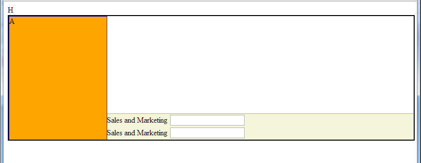
我试图在我的页面中应用这个概念;但它无法正常工作。在右边的div上面有不需要的空间。我们怎样才能纠正它?
CODE
   <!DOCTYPE html>

<style type="text/css">
    .myContent {
        width: 100%;
        border: 2px solid violet;
        min-width: 1210px;
    }

    .myHeader {
        width: 100%;
        /*width: 1200px;*/
        clear: both;
        background-color: #DFE8EF;
        border: 1px solid red;
    }

    .leftPart {
        border: 1px solid red;
        width: 200px;
        height: 200px;
        float: left;
        background-color: silver;
    }

    .rightPart {
        border: 1px solid orange;
        background-color: beige;
        float: left;
        min-width: 1000px;
        /*
        margin-bottom: -1000px;
        padding-bottom: 1000px;
        margin-right: -5000px;
        padding-right: 5000px;
    */
    }
</style>

<html>
<head>
    <title>UpdateAccrualByItem</title>


    <link href="Content/MasterLayoutStyle.css" rel="stylesheet" type="text/css" />

</head>
<body>

    <div id="body">
        <div class="myContent">

            <div class="myHeader">
                <img src="/Images/logo_header.jpg" />
            </div>

            <div class="leftPart">
                Menu
            </div>
            <div class="rightPart">

                <h2>UpdateAccrualByItem</h2>
            </div>

        </div>
    </div>

</body>
</html>
1 个答案:
答案 0 :(得分:1)
你很亲密,但只是有一些小错误。
您不需要右列的宽度,只需要默认的width:auto。我使用相同的负边距和填充技巧使右列的高度达到左边高度的大小,同时也为右列提供了占据剩余空间的错觉。你也应该漂浮正确的容器并带走边缘。您可以删除左列的clear:both,因为它未使用
.leftPart {
    border: 1px solid blue;
    width: 200px;
    height:200px;
    float:left;
    background-color: orange;
}
.rightPart {
    border: 1px solid orange;
    background-color: beige;
    float:left;
    margin-bottom: -1000px;
    padding-bottom: 1000px;
    margin-right: -5000px;
    padding-right: 5000px;
}
修改
您还可以添加某种类型的@media查询,以便调整窗口以使其更加流畅。 Here is an example。它是基于示例中的文本长度进行半硬编码的,但在最终产品上,它可能是您最后添加的内容
相关问题
最新问题
- 我写了这段代码,但我无法理解我的错误
- 我无法从一个代码实例的列表中删除 None 值,但我可以在另一个实例中。为什么它适用于一个细分市场而不适用于另一个细分市场?
- 是否有可能使 loadstring 不可能等于打印?卢阿
- java中的random.expovariate()
- Appscript 通过会议在 Google 日历中发送电子邮件和创建活动
- 为什么我的 Onclick 箭头功能在 React 中不起作用?
- 在此代码中是否有使用“this”的替代方法?
- 在 SQL Server 和 PostgreSQL 上查询,我如何从第一个表获得第二个表的可视化
- 每千个数字得到
- 更新了城市边界 KML 文件的来源?