R中不规则间隔风数据的流线型?
我有一些电台的风数据。数据包括csv文件中每个站的站点纬度,经度,风速和风向。该数据不是规则间隔的数据。我需要在R语言中为这些数据绘制流线。
我通过互联网搜索了rasterVis STREAMPLOT()的几个包TeachingDemos My.Symbols,但是我没有成功。
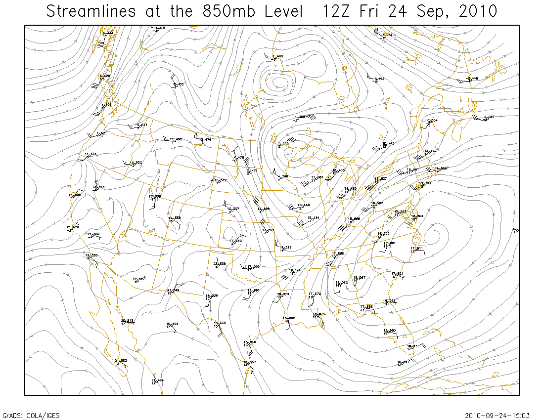
这是我正在谈论的一个示例情节。 http://wx.gmu.edu/dev/clim301/850stream.png
此外,还有来自csv文件的一些示例数据,我试图绘制流线型。
longitude,latitude,windspeed,winddirection
84.01,20,1.843478261,126.6521739
77.13,28.48,3.752380952,138.952381
77.2,28.68,2.413333333,140.2666667
78.16,31.32,1.994444444,185.0555556
77.112,31.531,2.492,149.96
77,28.11,7.6,103
77.09,31.5,1.752631579,214.8947368
76.57,31.43,1.28,193.6
77.02,32.34,3.881818182,264.4545455
77.15,28.7,2.444,146.12
77.35,30.55,3.663157895,131.3684211
75.5,29.52,4.175,169.75
72.43,24.17,2.095,279.3
76.19,25.1,1.816666667,170
76.517,30.975,1.284210526,125.6315789
76.13,28.8,4.995,126.7
75.04,29.54,4.09,151.85
72.3,24.32,0,359
72.13,23.86,1.961111111,284.7777778
74.95,30.19,3.032,137.32
73.16,22.36,1.37,251.8
75.84,30.78,3.604347826,125.8695652
73.52,21.86,1.816666667,228.9166667
70.44,21.5,2.076,274.08
69.75,21.36,3.81875,230
78.05,30.32,0.85625,138.5625
有人可以帮助我绘制不规则风数据的流线型吗?
2 个答案:
答案 0 :(得分:4)
和你一样,我希望将与streamlnes相同类型的数据可视化,但我找不到能够解决这个问题的函数......所以我编写了自己的原始函数:
streamlines <- function(x, y, u, v, step.dist=NULL,
                        max.dist=NULL, col.ramp=c("white","black"),
                        fade.col=NULL, length=0.05, ...) {

  ## Function for adding smoothed vector lines to a plot.
  ## Interpolation powered by akima package

  ## step.distance - distance between interpolated locations (user coords)
  ## max.dist - maximum length of interpolated line (user coords)
  ## col.ramp - colours to be passed to colorRampPalette
  ## fade.col - NULL or colour to add fade effect to interpolated line
  ## ... - further arguments to pass to arrows

  ## build smoothed lines using interp function
  maxiter <- max.dist/step.dist
  l <- replicate(5, matrix(NA, length(x), maxiter), simplify=FALSE)
  names(l) <- c("x","y","u","v","col")
  l$x[,1] <- x
  l$y[,1] <- y
  l$u[,1] <- u
  l$v[,1] <- v
  for(i in seq(maxiter)[-1]) {
    l$x[,i] <- l$x[,i-1]+(l$u[,i-1]*step.dist)
    l$y[,i] <- l$y[,i-1]+(l$v[,i-1]*step.dist)
    r <- which(l$x[,i]==l$x[,i-1] & l$y[,i]==l$y[,i-1])
    l$x[r,i] <- NA
    l$y[r,i] <- NA
    for(j in seq(length(x))) {
      if(!is.na(l$x[j,i])) {
        l$u[j,i] <- c(interp(x, y, u, xo=l$x[j,i], yo=l$y[j,i])$z)
        l$v[j,i] <- c(interp(x, y, v, xo=l$x[j,i], yo=l$y[j,i])$z)
      }
    }
  }

  ## make colour a function of speed and fade line
  spd <- sqrt(l$u^2 + l$v^2) # speed
  spd <- apply(spd, 1, mean, na.rm=TRUE) # mean speed for each line
  spd.int <- seq(min(spd, na.rm=TRUE), max(spd, na.rm=TRUE), length.out=maxiter)
  cr <- colorRampPalette(col.ramp)
  cols <- as.numeric(cut(spd, spd.int))
  ncols <- max(cols, na.rm=TRUE)
  cols <- cr(ncols)[cols]
  if(is.null(fade.col)) {
    l$col <- replicate(maxiter, cols)
  } else {
    nfade <- apply(!is.na(l$x), 1, sum)
    for(j in seq(length(x))) {
      l$col[j,seq(nfade[j])] <- colorRampPalette(c(fade.col, cols[j]))(nfade[j])
    }
  }

  ## draw arrows
  for(j in seq(length(x))) {
    arrows(l$x[j,], l$y[j,], c(l$x[j,-1], NA), c(l$y[j,-1], NA),
           col=l$col[j,], length=0, ...)
    i <- which.max(which(!is.na(l$x[j,]))) # draw arrow at end of line
    if(i>1) {
      arrows(l$x[j,i-1], l$y[j,i-1], l$x[j,i], l$y[j,i],
             col=l$col[j,i-1], length=length, ...)
    }
  }

}
该函数由akima包中的interp函数提供支持,并且通过一些摆弄,它可以产生一些不错的视觉效果:
&#13;
&#13;
&#13;
&#13;
dat <- "longitude,latitude,windspeed,winddirection
84.01,20,1.843478261,126.6521739
77.13,28.48,3.752380952,138.952381
77.2,28.68,2.413333333,140.2666667
78.16,31.32,1.994444444,185.0555556
77.112,31.531,2.492,149.96
77,28.11,7.6,103
77.09,31.5,1.752631579,214.8947368
76.57,31.43,1.28,193.6
77.02,32.34,3.881818182,264.4545455
77.15,28.7,2.444,146.12
77.35,30.55,3.663157895,131.3684211
75.5,29.52,4.175,169.75
72.43,24.17,2.095,279.3
76.19,25.1,1.816666667,170
76.517,30.975,1.284210526,125.6315789
76.13,28.8,4.995,126.7
75.04,29.54,4.09,151.85
72.3,24.32,0,359
72.13,23.86,1.961111111,284.7777778
74.95,30.19,3.032,137.32
73.16,22.36,1.37,251.8
75.84,30.78,3.604347826,125.8695652
73.52,21.86,1.816666667,228.9166667
70.44,21.5,2.076,274.08
69.75,21.36,3.81875,230
78.05,30.32,0.85625,138.5625"

tf <- tempfile()
writeLines(dat, tf)
dat <- read.csv(tf)

library(rgdal) # for projecting locations to utm coords
library(akima) # for interpolation

## add utm coords
xy <- as.data.frame(project(cbind(dat$longitude, dat$latitude), "+proj=utm +zone=43 +datum=NAD83"))
names(xy) <- c("easting","northing")
dat <- cbind(dat, xy)

## add u and v coords
dat$u <- -dat$windspeed*sin(dat$winddirection*pi/180)
dat$v <- -dat$windspeed*cos(dat$winddirection*pi/180)


#par(bg="black", fg="white", col.lab="white", col.axis="white")
plot(northing~easting, data=dat, type="n", xlab="Easting (m)", ylab="Northing (m)")
streamlines(dat$easting, dat$northing, dat$u, dat$v,
            step.dist=1000, max.dist=50000, col.ramp=c("blue","green","yellow","red"),
            fade.col="white", length=0, lwd=5)

答案 1 :(得分:3)
我认为这不足以满足您的要求:
 require(plotrix)
 require(maps)
 map("world",xlim=c(69,85),ylim= c(20,35))
 with(dat,
     vectorField(windspeed, winddirection, longitude, latitude , vecspec="deg") )
稍微盯着输出后,我认为我可能在使用该功能或使用功能本身时遇到问题。箭头的方向似乎是错误的。同样地,我认为TeachingDemos矢量字段做得不好,但这是我得到的:
require(TeachingDemos)
 map("world",xlim=c(69,85),ylim= c(20,35))
 with(dat, my.symbols(x=longitude, y=latitude,
       symb= ms.arrows, length=windspeed/10, angle=2*pi*winddirection/360))
这个情节似乎在方向上有足够的变化,但箭头的大小似乎变化不大。无论如何,这些图都没有表明这些数据可用于构建流线。就相邻位置的wid方向而言,数据太稀疏且内部矛盾。

相关问题
最新问题
- 我写了这段代码,但我无法理解我的错误
- 我无法从一个代码实例的列表中删除 None 值,但我可以在另一个实例中。为什么它适用于一个细分市场而不适用于另一个细分市场?
- 是否有可能使 loadstring 不可能等于打印?卢阿
- java中的random.expovariate()
- Appscript 通过会议在 Google 日历中发送电子邮件和创建活动
- 为什么我的 Onclick 箭头功能在 React 中不起作用?
- 在此代码中是否有使用“this”的替代方法?
- 在 SQL Server 和 PostgreSQL 上查询,我如何从第一个表获得第二个表的可视化
- 每千个数字得到
- 更新了城市边界 KML 文件的来源?