CSS3иҝҮжёЎдёҚйҖӮз”ЁдәҺdisplayеұһжҖ§
жҜҸеҪ“жҲ‘жӮ¬еҒңе…¶зҲ¶е…ғзҙ ж—¶пјҢжҲ‘дёҖзӣҙеңЁе°қиҜ•дҪҝз”ЁcssжқҘжҳҫзӨәйҡҗи—Ҹзҡ„Divж·Ўе…Ҙж·ЎеҮәгҖӮ
еҲ°зӣ®еүҚдёәжӯўпјҢжҲ‘жүҖиҰҒеҒҡзҡ„е°ұжҳҜи®©йҡҗи—Ҹзҡ„divжҳҫзӨәеҮәжқҘпјҢдҪҶжҳҜжІЎжңүд»»дҪ•зј“е’ҢиҝҮжёЎгҖӮ
д»ҘдёӢжҳҜжҲ‘еңЁJSfiddleдёҠзҡ„д»Јз Ғhttp://jsfiddle.net/9dsGP/
иҝҷжҳҜжҲ‘зҡ„д»Јз Ғпјҡ
HTMLпјҡ
<div id="header">
<div id="button">This is a Button
    <div class="content">
    This is the Hidden Div
    </div>
</div>
</div>
CSSпјҡ
#header #button {width:200px; background:#eee}

#header #button:hover > .content {display:block; opacity:1;}

#header #button .content:hover { display:block;}

#header #button .content {

-webkit-transition: all .3s ease .15s;
-moz-transition: all .3s ease .15s;
-o-transition: all .3s ease .15s;
-ms-transition: all .3s ease .15s;
transition: all .3s ease .15s;

    opacity:0;
    clear: both;
    display: none;

    top: -1px;
    left:-160px;
    padding: 8px;
    min-height: 150px;
    border-top: 1px solid #EEEEEE;
    border-left: 1px solid #EEEEEE;
    border-right: 1px solid #EEEEEE;
    border-bottom: 1px solid #EEEEEE;
    -webkit-border-radius: 0px 7px 7px 7px;
    -moz-border-radius: 0px 7px 7px 7px;
    -khtml-border-radius: 0px 7px 7px 7px;
    border-radius: 0px 7px 7px 7px;
    -webkit-box-shadow: 0px 2px 2px #DDDDDD;
    -moz-box-shadow: 0px 2px 2px #DDDDDD;
    box-shadow: 0px 2px 2px #DDDDDD;
    background: #FFF;
}
е…ідәҺжҲ‘еҒҡй”ҷдәҶд»Җд№Ҳзҡ„д»»дҪ•зәҝзҙўпјҹеҪ“жҲ‘е°Ҷйј ж ҮжӮ¬еҒңеңЁжҢүй’®дёҠж—¶пјҢеҸӘжҳҜиҜ•еӣҫдёәйҡҗи—ҸеҶ…е®№иҺ·еҫ—е№іж»‘ж•ҲжһңгҖӮжҸҗеүҚи°ўи°ўпјҒ
7 дёӘзӯ”жЎҲ:
зӯ”жЎҲ 0 :(еҫ—еҲҶпјҡ88)
В В
display:none;д»ҺйЎөйқўдёӯеҲ йҷӨдёҖдёӘеқ—пјҢе°ұеҘҪеғҸе®ғд»ҺжңӘеҮәзҺ°иҝҮдёҖж ·гҖӮ В В ж— жі•йғЁеҲҶжҳҫзӨәеқ—;е®ғиҰҒд№ҲеӯҳеңЁпјҢиҰҒд№ҲдёҚеӯҳеңЁгҖӮ В Вvisibilityд№ҹжҳҜеҰӮжӯӨ;дҪ дёҚиғҪжҢҮжңӣдёҖдёӘеқ—жҳҜдёҖеҚҠ В ВhiddenпјҢж №жҚ®е®ҡд№үпјҢvisibleпјҒе№ёиҝҗзҡ„жҳҜпјҢдҪ еҸҜд»Ҙ В В иҜ·ж”№з”Ёж·ЎеҢ–ж•ҲжһңopacityВ В - reference
дҪңдёәжӣҝд»ЈCSSи§ЈеҶіж–№жЎҲпјҢжӮЁеҸҜд»ҘдҪҝз”ЁopacityпјҢheightе’ҢpaddingеұһжҖ§жқҘе®һзҺ°зҗҶжғіж•Ҳжһңпјҡ
#header #button:hover > .content {
    opacity:1;
    height: 150px;
    padding: 8px;
}

#header #button .content {
    opacity:0;
    height: 0;
    padding: 0 8px;
    overflow: hidden;
    transition: all .3s ease .15s;
}
пјҲз”ұдәҺз®ҖжҙҒпјҢзңҒз•ҘдәҶдҫӣеә”е•ҶеүҚзјҖгҖӮпјү
иҝҷжҳҜ working demo гҖӮ SOдёҠд№ҹжҳҜa similar topicгҖӮ
#header #button {
  width:200px;
  background:#ddd;
  transition: border-radius .3s ease .15s;
}

#header #button:hover, #header #button > .content {
    border-radius: 0px 0px 7px 7px;
}

#header #button:hover > .content {
  opacity: 1;
  height: 150px;
  padding: 8px;
}

#header #button > .content {
  opacity:0;
  clear: both;
  height: 0;
  padding: 0 8px;
  overflow: hidden;

  -webkit-transition: all .3s ease .15s;
  -moz-transition: all .3s ease .15s;
  -o-transition: all .3s ease .15s;
  -ms-transition: all .3s ease .15s;
  transition: all .3s ease .15s;

  border: 1px solid #ddd;

  -webkit-box-shadow: 0px 2px 2px #ddd;
  -moz-box-shadow: 0px 2px 2px #ddd;
  box-shadow: 0px 2px 2px #ddd;
  background: #FFF;
}

#button > span { display: inline-block; padding: .5em 1em }
<div id="header">
<div id="button"> <span>This is a Button</span>
<div class="content">
This is the Hidden Div
</div>
</div>
</div>
зӯ”жЎҲ 1 :(еҫ—еҲҶпјҡ13)
жӮЁж— жі•дҪҝз”Ёheight: 0е’Ңheight: autoжқҘиҪ¬жҚўиә«й«ҳгҖӮ autoе§Ӣз»ҲжҳҜзӣёеҜ№зҡ„пјҢдёҚиғҪиҝҮжёЎеҲ°гҖӮдҪҶжҳҜпјҢжӮЁеҸҜд»ҘдҪҝз”Ёmax-height: 0并е°Ҷе…¶иҪ¬жҚўдёәmax-height: 9999pxгҖӮ
жҠұжӯүпјҢжҲ‘ж— жі•иҜ„и®әпјҢжҲ‘зҡ„д»ЈиЎЁдёҚеӨҹй«ҳ......
зӯ”жЎҲ 2 :(еҫ—еҲҶпјҡ2)
жҲ‘еңЁж‘Ҷеј„ж—¶жүҫеҲ°дәҶи§ЈеҶіж–№жЎҲгҖӮ
зӣҙжҺҘжғізңӢз»“жһңзҡ„дәәпјҡ
зӮ№еҮ»пјҡ https://jsfiddle.net/dt52jazg/
жӮ¬еҒңпјҡ https://jsfiddle.net/7gkufLsh/1/
д»ҘдёӢжҳҜд»Јз Ғпјҡ
<ејә> HTML
<ul class="list">
  <li>Hey</li>
  <li>This</li>
  <li>is</li>
  <li>just</li>
  <li>a</li>
  <li>test</li>
</ul>

<button class="click-me">
  Click me
</button>
<ејә> CSS
.list li {
  min-height: 0;
  max-height: 0;
  opacity: 0;
  -webkit-transition: all .3s ease-in-out;
  transition: all .3s ease-in-out;
}

.active li {
  min-height: 20px;
  opacity: 1;
}
<ејә> JS
(function() {
  $('.click-me').on('click', function() {
    $('.list').toggleClass('active');
  });
})();
иҜ·и®©жҲ‘зҹҘйҒ“иҝҷдёӘи§ЈеҶіж–№жЎҲжҳҜеҗҰжңүд»»дҪ•й—®йўҳ'еӣ дёәжҲ‘и§үеҫ—иҝҷдёӘи§ЈеҶіж–№жЎҲдёҚдјҡйҷҗеҲ¶жңҖеӨ§й«ҳеәҰгҖӮ
зӯ”жЎҲ 3 :(еҫ—еҲҶпјҡ0)
иҝӣиЎҢдәҶдёҖдәӣжӣҙж”№пјҢдҪҶжҲ‘и®ӨдёәжҲ‘дҪҝз”ЁvisibilityиҺ·еҫ—дәҶжӮЁжғіиҰҒзҡ„ж•ҲжһңгҖӮ http://jsfiddle.net/9dsGP/49/
жҲ‘д№ҹеҒҡдәҶиҝҷдәӣж”№еҸҳпјҡ
position: absolute; /* so it doesn't expand the button background */
top: calc(1em + 8px); /* so it's under the "button" */
left:8px; /* so it's shifted by padding-left */
width: 182px; /* so it fits nicely under the button, width - padding-left - padding-right - border-left-width - border-right-width, 200 - 8 - 8 - 1 - 1 = 182 */
жҲ–иҖ…пјҢжӮЁеҸҜд»Ҙе°Ҷ.contentдҪңдёә.buttonзҡ„е…„ејҹпјҢдҪҶжҲ‘жІЎжңүдёәжӯӨеҒҡеҮәзӨәдҫӢгҖӮ
зӯ”жЎҲ 4 :(еҫ—еҲҶпјҡ0)
жҲ‘йҒҮеҲ°дәҶdisplay:none
жҲ‘жңүеҮ дёӘеёҰжңүиҝҮжёЎж•Ҳжһңзҡ„ж°ҙе№іжқЎпјҢдҪҶжҲ‘жғіеҸӘжҳҫзӨәиҜҘе®№еҷЁзҡ„дёҖйғЁеҲҶ并жҠҳеҸ е…¶дҪҷйғЁеҲҶпјҢеҗҢж—¶дҝқжҢҒж•ҲжһңгҖӮжҲ‘еӨҚеҲ¶дәҶдёҖдёӘе°ҸеһӢжј”зӨәhere
жҳҫиҖҢжҳ“и§Ғзҡ„жҳҜе°Ҷиҝҷдәӣйҡҗи—Ҹзҡ„еҠЁз”»жқЎеҢ…иЈ№еңЁdivдёӯпјҢ然еҗҺеҲҮжҚўиҜҘе…ғзҙ зҡ„й«ҳеәҰе’ҢдёҚйҖҸжҳҺеәҰ
.hide{
  opacity: 0;
  height: 0;
}
.bars-wrapper.expanded > .hide{
 opacity: 1;
 height: auto;
}
еҠЁз”»ж•ҲжһңеҫҲеҘҪпјҢдҪҶй—®йўҳжҳҜиҝҷдәӣйҡҗи—Ҹзҡ„ж Ҹзӣ®д»ҚеңЁжҲ‘йЎөйқўдёҠж¶ҲиҖ—з©әй—ҙ并йҮҚеҸ е…¶д»–е…ғзҙ
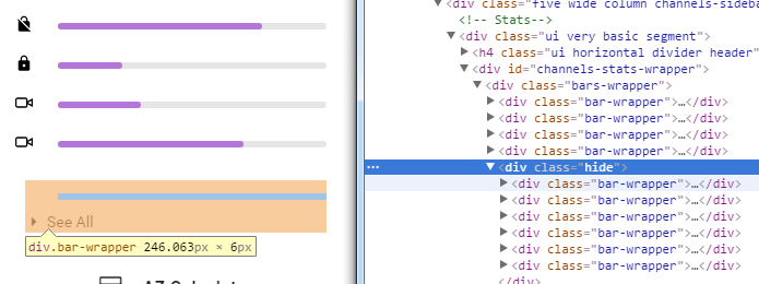
еӣ жӯӨпјҢе°Ҷdisplay:noneж·»еҠ еҲ°йҡҗи—Ҹзҡ„еҢ…иЈ…еҷЁ.hideеҸҜд»Ҙи§ЈеҶіиҫ№и·қй—®йўҳпјҢдҪҶдёҚиғҪи§ЈеҶіиҪ¬жҚўй—®йўҳпјҢеӣ дёәdisplay:noneжҲ–height:0;opacity:0йғҪдёҚйҖӮз”ЁдәҺеӯҗе…ғзҙ гҖӮ
жүҖд»ҘжҲ‘жңҖеҗҺзҡ„и§ЈеҶіж–№жі•жҳҜз»ҷйӮЈдәӣйҡҗи—Ҹзҡ„жқЎеҪўеӣҫдёҖдёӘиҙҹйқўе’Ңз»қеҜ№зҡ„дҪҚзҪ®пјҢ并且е®ғйҖӮз”ЁдәҺCSSиҝҮжёЎгҖӮ
зӯ”жЎҲ 5 :(еҫ—еҲҶпјҡ0)
жңҖеӨ§й«ҳеәҰ
.PrimaryNav-container {
...
max-height: 0;
overflow: hidden;
transition: max-height 0.3s ease;
...
}

.PrimaryNav.PrimaryNav--isOpen .PrimaryNav-container {
max-height: 300px;
}
зӯ”жЎҲ 6 :(еҫ—еҲҶпјҡ-1)
еҪ“жӮЁйңҖиҰҒеҲҮжҚўе…ғзҙ ж—¶пјҢжӮЁдёҚйңҖиҰҒдёәmarginеұһжҖ§и®ҫзҪ®еҠЁз”»гҖӮдҪ еҸҜд»ҘиҜ•иҜ•margin-top: -999999emгҖӮеҸӘжҳҜдёҚиҰҒиҝҮжёЎжүҖжңүгҖӮ
- иҝҮжёЎдёҚйҖӮз”ЁдәҺе…ғзҙ
- cssиҝҮжёЎдёҚйҖӮз”ЁдәҺsafari
- CSS3иҝҮжёЎдёҚйҖӮз”ЁдәҺdisplayеұһжҖ§
- CSSиҝҮжёЎдёҚйҖӮз”ЁдәҺheightеұһжҖ§
- иҝҮжёЎеұһжҖ§дёҚйҖӮз”Ё
- дёәд»Җд№ҲиҝҷдёӘиҝҮжёЎеұһжҖ§дёҚйҖӮз”ЁдәҺcssпјҹ
- CSS3иҝҮжёЎеұһжҖ§дёҚйҖӮз”ЁдәҺзәҝжҖ§жёҗеҸҳиғҢжҷҜ
- иҝҮжёЎдёҚйҖӮз”ЁдәҺеӨҡдёӘеұһжҖ§
- CSSиҝҮжёЎдёҚйҖӮз”ЁдәҺд»»дҪ•еұһжҖ§
- CSS иҝҮжёЎеұһжҖ§дёҚйҖӮз”ЁдәҺ Transform
- жҲ‘еҶҷдәҶиҝҷж®өд»Јз ҒпјҢдҪҶжҲ‘ж— жі•зҗҶи§ЈжҲ‘зҡ„й”ҷиҜҜ
- жҲ‘ж— жі•д»ҺдёҖдёӘд»Јз Ғе®һдҫӢзҡ„еҲ—иЎЁдёӯеҲ йҷӨ None еҖјпјҢдҪҶжҲ‘еҸҜд»ҘеңЁеҸҰдёҖдёӘе®һдҫӢдёӯгҖӮдёәд»Җд№Ҳе®ғйҖӮз”ЁдәҺдёҖдёӘз»ҶеҲҶеёӮеңәиҖҢдёҚйҖӮз”ЁдәҺеҸҰдёҖдёӘз»ҶеҲҶеёӮеңәпјҹ
- жҳҜеҗҰжңүеҸҜиғҪдҪҝ loadstring дёҚеҸҜиғҪзӯүдәҺжү“еҚ°пјҹеҚўйҳҝ
- javaдёӯзҡ„random.expovariate()
- Appscript йҖҡиҝҮдјҡи®®еңЁ Google ж—ҘеҺҶдёӯеҸ‘йҖҒз”өеӯҗйӮ®д»¶е’ҢеҲӣе»әжҙ»еҠЁ
- дёәд»Җд№ҲжҲ‘зҡ„ Onclick з®ӯеӨҙеҠҹиғҪеңЁ React дёӯдёҚиө·дҪңз”Ёпјҹ
- еңЁжӯӨд»Јз ҒдёӯжҳҜеҗҰжңүдҪҝз”ЁвҖңthisвҖқзҡ„жӣҝд»Јж–№жі•пјҹ
- еңЁ SQL Server е’Ң PostgreSQL дёҠжҹҘиҜўпјҢжҲ‘еҰӮдҪ•д»Һ第дёҖдёӘиЎЁиҺ·еҫ—第дәҢдёӘиЎЁзҡ„еҸҜи§ҶеҢ–
- жҜҸеҚғдёӘж•°еӯ—еҫ—еҲ°
- жӣҙж–°дәҶеҹҺеёӮиҫ№з•Ң KML ж–Ү件зҡ„жқҘжәҗпјҹ