底部边框小于宽度的标题
我需要创建一个下划线效果,其下边框小于h2标题的宽度。通常我不会上传图片,但我认为这可能有助于进一步解释这个问题:
7 个答案:
答案 0 :(得分:15)
你可以使用伪元素。 (example)
.pseudo_border {
    position:relative;
    display:inline-block;
}
.pseudo_border:after {
    content:'';
    position:absolute;
    left:0; right:0;
    top:100%;
    margin:10px auto;
    width:50%;
    height:6px;
    background:#00f;
}
只需相对于父元素绝对定位一个伪元素。从100%定位top,并使用left:0; right:0和margin auto的组合进行水平居中。相应地修改元素的高度/宽度,并更改间距的margin-top。
答案 1 :(得分:4)
其他方法:
具有负展布半径的框阴影:
body{text-align:center;}
h2{
  font-size:40px;
  color:#409FB3;
  display:inline-block;
  height:50px;
  box-shadow: 0 25px 0 -23px #5CC7A8;
}
<h2>Some title</h2>
注意:您需要确保- spread-radius x2 < height否则盒子阴影的高度为0并且消失。
答案 2 :(得分:4)
您也可以使用linear-gradient执行此操作。在这种方法中,使用渐变创建一个小背景图像,使其对第一个和最后一个25%是透明的,而其余50%具有颜色(从而使它看起来像是实际h2的50%文本)。然后将此背景定位在元素的底部,使其看起来像底部边框。可以通过修改背景大小来改变边框的大小。
即使h2内的文字数量发生变化,效果也会很好。然而,主要的缺点是与伪元素或盒子阴影方法相比,浏览器对渐变的支持相对较差。
注意:在答案中使用脚本仅用于避免浏览器前缀:)
h2{
  display: inline-block;
  text-align: center;
  padding: 10px 10px 15px; /* bottom padding should be higher to make up for pseudo border height */
  background: linear-gradient(90deg, transparent 25%, lightseagreen 25%, lightseagreen 75%, transparent 75%);
  background-size: 100% 5px;
  background-position: 0% 100%;
  background-repeat: no-repeat;
}

.semitransparent{
  background: linear-gradient(90deg, transparent 25%, lightseagreen 25%, lightseagreen 75%, transparent 75%), linear-gradient(90deg, transparent 0%, rgba(50,50,50,0.25) 0%);
  background-size: 100% 5px, 100% 100%;
  background-position: 0% 100%, 0% -5px;
  background-repeat: no-repeat;
}

.colored{
  background: linear-gradient(90deg, transparent 25%, lightseagreen 25%, lightseagreen 75%, transparent 75%), linear-gradient(90deg, transparent 0%, aliceblue 0%);
  background-size: 100% 5px, 100% 100%;
  background-position: 0% 100%, 0% -5px;
  background-repeat: no-repeat;
}

/* Just for demo */

body{
  background-image: radial-gradient(circle, #3F9CBA 0%, #153346 100%);
  font-family: Calibri, Tahoma;
  text-align: center;
}
<script src="https://cdnjs.cloudflare.com/ajax/libs/prefixfree/1.0.7/prefixfree.min.js"></script>
<h2>Some Text</h2><br/>
<h2 class='semitransparent'>Some Lengthy Text</h2><br/>
<h2 class='colored'>Some more examples yay!!</h2>
答案 3 :(得分:2)
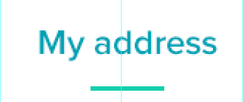
您可以使用一种“假”边框,只需在其周围包裹div并在标题后面创建一个边框div
<强> HTML
<div id="border-wrapper">
    <h2>My address</h2>
    <div id="border"></div>
</div>
<强> CSS
#border-wrapper{
    position:relative;
    display:inline-block;
}
#border{
    position: relative;
    width: 50%;
    height: 2px;
    background-color: blue;
    margin: 0 auto;
}
答案 4 :(得分:0)
h2 ::after {
   background: #f1991b none repeat scroll 0 0;
   content: "";
   display: block;
   height: 2px;
   margin-top: 15px;
   width: 50px;
}
答案 5 :(得分:0)
<style>
.main{
    text-align:center;
}
.title{
    font-weight: 300;
    display: inline-block;
    padding-bottom: 15px;
    position: relative;
}
.title::after {
    content: "";
    position: absolute;
    width: 50%;
    height: 1px;
    bottom: 0;
    left: 0;
    border-bottom: 3px solid #ff5533;
    right: 0;
    margin: 0 auto;
}
</style>
 <div class="main">
    <h1 class="title">
        Your Title
    </h1>
</div>
答案 6 :(得分:0)
我过去看到的几乎所有针对此效果的解决方案都依赖于定位 - 但使用display: flex我们可以很容易地实现它。以下是标题的示例,但它可以用于任何元素。请记住flex-direction: column的性质会叠加任何子元素。
<强> HTML
<h3 class="heading">Hey presto! We have an underline.</h3>
<强> CSS
.heading {
  display: flex;
  flex-direction: column;
  align-items: center;
  text-align: center;
}
.heading:after {
  content: '';
  border-bottom: 1px solid #ccc;
  padding-top: 10px;
  width: 50px;
}
请注意,您可能需要为flex添加供应商前缀,具体取决于浏览器支持(当然主要是IE的早期版本)https://caniuse.com/#search=flex
- 我写了这段代码,但我无法理解我的错误
- 我无法从一个代码实例的列表中删除 None 值,但我可以在另一个实例中。为什么它适用于一个细分市场而不适用于另一个细分市场?
- 是否有可能使 loadstring 不可能等于打印?卢阿
- java中的random.expovariate()
- Appscript 通过会议在 Google 日历中发送电子邮件和创建活动
- 为什么我的 Onclick 箭头功能在 React 中不起作用?
- 在此代码中是否有使用“this”的替代方法?
- 在 SQL Server 和 PostgreSQL 上查询,我如何从第一个表获得第二个表的可视化
- 每千个数字得到
- 更新了城市边界 KML 文件的来源?