Bootstrapдҫ§иҫ№ж ҸдёҺиғҢжҷҜйўңиүІ
жҲ‘жңүдёҖдёӘдҪҝз”Ёbootstrapзҡ„з®ҖеҚ•еёғеұҖпјҢе®ғз»ҷдәҶжҲ‘2еҲ— - дёҖдёӘLEFTе’ҢдёҖдёӘRIGHTгҖӮдҪҝз”ЁBootstrapзҡ„12еҲ—зҪ‘ж јж јејҸ - е·Ұдҫ§еә”дёә8е®ҪпјҢеҸідҫ§еҲ—дёә4е®ҪпјҢеҰӮдёӢжүҖзӨәгҖӮ
<div class="row">
    <div class="col-md-8">Left Content</div>
    <div class="col-md-4">Right Content</div>
</div>
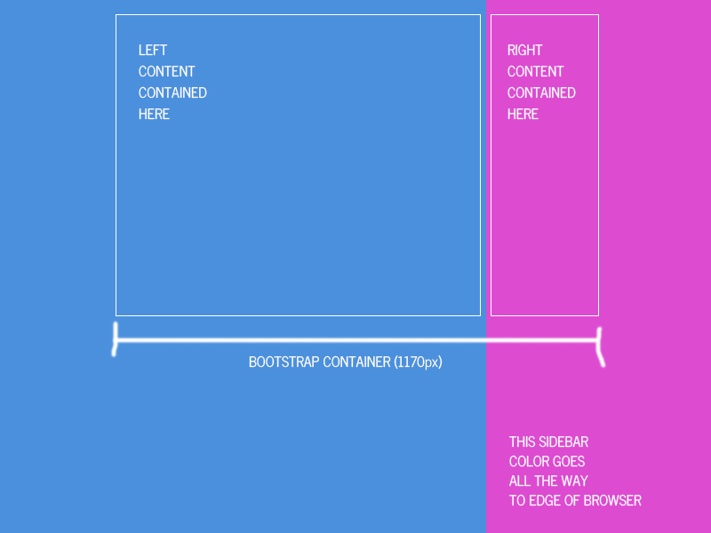
й—®йўҳпјҹеҰӮдҪ•еңЁиЎҢдёӯж·»еҠ CONTAINERд»ҘдҪҝдәӢзү©еұ…дёӯдҪҶжҳҜдёәеҸіеҲ—жҸҗдҫӣдёҖзӣҙ延伸еҲ°жөҸи§ҲеҷЁиҫ№зјҳзҡ„иғҢжҷҜйўңиүІгҖӮеӣ жӯӨпјҢеҰӮжһңе·ҰиғҢжҷҜйўңиүІдёәи“қиүІдё”еҸіиғҢжҷҜдёәзІүзәўиүІпјҢеҲҷйўңиүІдјҡд»Ҙе…Ёе®ҪеәҰиҝҗиЎҢпјҢеҗҢж—¶йҖҡиҝҮе®№еҷЁдҝқжҢҒе…¶дёӯзҡ„еҶ…е®№гҖӮ
8 дёӘзӯ”жЎҲ:
зӯ”жЎҲ 0 :(еҫ—еҲҶпјҡ3)
иҪ»жқҫгҖӮ
е·ҘдҪңи§ЈеҶіж–№жЎҲпјҡhttps://jsfiddle.net/qbe2k1he/
/** Custom CSS **/
body {
	background-color: #4E8FD8;
	overflow-x: hidden;
}

.content, .sidebar {
	border: 1px solid white;
	color: white;
	padding: 20px;
	text-transform: uppercase;
	min-height: 500px;
}

.content {
	min-height: 2000px;
}

.sidebar::before {
	content: '';
	position: fixed;
	top: 0;
	width: 100vw;
	height: 100vh;
	background: #DB4ECB;
	z-index: -1;
	margin-left: -35px;
}

@media screen and (max-width: 991px) {
	.sidebar::before {
		display: none;
	}
}

/** Bootstrap Grid **/
@-ms-viewport {
  width: device-width;
}
.visible-xs,
.visible-sm,
.visible-md,
.visible-lg {
  display: none !important;
}
.visible-xs-block,
.visible-xs-inline,
.visible-xs-inline-block,
.visible-sm-block,
.visible-sm-inline,
.visible-sm-inline-block,
.visible-md-block,
.visible-md-inline,
.visible-md-inline-block,
.visible-lg-block,
.visible-lg-inline,
.visible-lg-inline-block {
  display: none !important;
}
@media (max-width: 767px) {
  .visible-xs {
    display: block !important;
  }
  table.visible-xs {
    display: table;
  }
  tr.visible-xs {
    display: table-row !important;
  }
  th.visible-xs,
  td.visible-xs {
    display: table-cell !important;
  }
}
@media (max-width: 767px) {
  .visible-xs-block {
    display: block !important;
  }
}
@media (max-width: 767px) {
  .visible-xs-inline {
    display: inline !important;
  }
}
@media (max-width: 767px) {
  .visible-xs-inline-block {
    display: inline-block !important;
  }
}
@media (min-width: 768px) and (max-width: 991px) {
  .visible-sm {
    display: block !important;
  }
  table.visible-sm {
    display: table;
  }
  tr.visible-sm {
    display: table-row !important;
  }
  th.visible-sm,
  td.visible-sm {
    display: table-cell !important;
  }
}
@media (min-width: 768px) and (max-width: 991px) {
  .visible-sm-block {
    display: block !important;
  }
}
@media (min-width: 768px) and (max-width: 991px) {
  .visible-sm-inline {
    display: inline !important;
  }
}
@media (min-width: 768px) and (max-width: 991px) {
  .visible-sm-inline-block {
    display: inline-block !important;
  }
}
@media (min-width: 992px) and (max-width: 1199px) {
  .visible-md {
    display: block !important;
  }
  table.visible-md {
    display: table;
  }
  tr.visible-md {
    display: table-row !important;
  }
  th.visible-md,
  td.visible-md {
    display: table-cell !important;
  }
}
@media (min-width: 992px) and (max-width: 1199px) {
  .visible-md-block {
    display: block !important;
  }
}
@media (min-width: 992px) and (max-width: 1199px) {
  .visible-md-inline {
    display: inline !important;
  }
}
@media (min-width: 992px) and (max-width: 1199px) {
  .visible-md-inline-block {
    display: inline-block !important;
  }
}
@media (min-width: 1200px) {
  .visible-lg {
    display: block !important;
  }
  table.visible-lg {
    display: table;
  }
  tr.visible-lg {
    display: table-row !important;
  }
  th.visible-lg,
  td.visible-lg {
    display: table-cell !important;
  }
}
@media (min-width: 1200px) {
  .visible-lg-block {
    display: block !important;
  }
}
@media (min-width: 1200px) {
  .visible-lg-inline {
    display: inline !important;
  }
}
@media (min-width: 1200px) {
  .visible-lg-inline-block {
    display: inline-block !important;
  }
}
@media (max-width: 767px) {
  .hidden-xs {
    display: none !important;
  }
}
@media (min-width: 768px) and (max-width: 991px) {
  .hidden-sm {
    display: none !important;
  }
}
@media (min-width: 992px) and (max-width: 1199px) {
  .hidden-md {
    display: none !important;
  }
}
@media (min-width: 1200px) {
  .hidden-lg {
    display: none !important;
  }
}
.visible-print {
  display: none !important;
}
@media print {
  .visible-print {
    display: block !important;
  }
  table.visible-print {
    display: table;
  }
  tr.visible-print {
    display: table-row !important;
  }
  th.visible-print,
  td.visible-print {
    display: table-cell !important;
  }
}
.visible-print-block {
  display: none !important;
}
@media print {
  .visible-print-block {
    display: block !important;
  }
}
.visible-print-inline {
  display: none !important;
}
@media print {
  .visible-print-inline {
    display: inline !important;
  }
}
.visible-print-inline-block {
  display: none !important;
}
@media print {
  .visible-print-inline-block {
    display: inline-block !important;
  }
}
@media print {
  .hidden-print {
    display: none !important;
  }
}
.container {
  margin-right: auto;
  margin-left: auto;
  padding-left: 15px;
  padding-right: 15px;
}
@media (min-width: 768px) {
  .container {
    width: 750px;
  }
}
@media (min-width: 992px) {
  .container {
    width: 970px;
  }
}
@media (min-width: 1200px) {
  .container {
    width: 1170px;
  }
}
.container-fluid {
  margin-right: auto;
  margin-left: auto;
  padding-left: 15px;
  padding-right: 15px;
}
.row {
  margin-left: -15px;
  margin-right: -15px;
}
.col, .col-xs-1, .col-sm-1, .col-md-1, .col-lg-1, .col-xs-2, .col-sm-2, .col-md-2, .col-lg-2, .col-xs-3, .col-sm-3, .col-md-3, .col-lg-3, .col-xs-4, .col-sm-4, .col-md-4, .col-lg-4, .col-xs-5, .col-sm-5, .col-md-5, .col-lg-5, .col-xs-6, .col-sm-6, .col-md-6, .col-lg-6, .col-xs-7, .col-sm-7, .col-md-7, .col-lg-7, .col-xs-8, .col-sm-8, .col-md-8, .col-lg-8, .col-xs-9, .col-sm-9, .col-md-9, .col-lg-9, .col-xs-10, .col-sm-10, .col-md-10, .col-lg-10, .col-xs-11, .col-sm-11, .col-md-11, .col-lg-11, .col-xs-12, .col-sm-12, .col-md-12, .col-lg-12 {
  position: relative;
  min-height: 1px;
  padding-left: 15px;
  padding-right: 15px;
}
.col, .col-xs-1, .col-xs-2, .col-xs-3, .col-xs-4, .col-xs-5, .col-xs-6, .col-xs-7, .col-xs-8, .col-xs-9, .col-xs-10, .col-xs-11, .col-xs-12 {
  float: left;
}
.col-xs-12 {
  width: 100%;
}
.col-xs-11 {
  width: 91.66666667%;
}
.col-xs-10 {
  width: 83.33333333%;
}
.col-xs-9 {
  width: 75%;
}
.col-xs-8 {
  width: 66.66666667%;
}
.col-xs-7 {
  width: 58.33333333%;
}
.col-xs-6 {
  width: 50%;
}
.col-xs-5 {
  width: 41.66666667%;
}
.col-xs-4 {
  width: 33.33333333%;
}
.col-xs-3 {
  width: 25%;
}
.col-xs-2 {
  width: 16.66666667%;
}
.col-xs-1 {
  width: 8.33333333%;
}
.col-xs-pull-12 {
  right: 100%;
}
.col-xs-pull-11 {
  right: 91.66666667%;
}
.col-xs-pull-10 {
  right: 83.33333333%;
}
.col-xs-pull-9 {
  right: 75%;
}
.col-xs-pull-8 {
  right: 66.66666667%;
}
.col-xs-pull-7 {
  right: 58.33333333%;
}
.col-xs-pull-6 {
  right: 50%;
}
.col-xs-pull-5 {
  right: 41.66666667%;
}
.col-xs-pull-4 {
  right: 33.33333333%;
}
.col-xs-pull-3 {
  right: 25%;
}
.col-xs-pull-2 {
  right: 16.66666667%;
}
.col-xs-pull-1 {
  right: 8.33333333%;
}
.col-xs-pull-0 {
  right: auto;
}
.col-xs-push-12 {
  left: 100%;
}
.col-xs-push-11 {
  left: 91.66666667%;
}
.col-xs-push-10 {
  left: 83.33333333%;
}
.col-xs-push-9 {
  left: 75%;
}
.col-xs-push-8 {
  left: 66.66666667%;
}
.col-xs-push-7 {
  left: 58.33333333%;
}
.col-xs-push-6 {
  left: 50%;
}
.col-xs-push-5 {
  left: 41.66666667%;
}
.col-xs-push-4 {
  left: 33.33333333%;
}
.col-xs-push-3 {
  left: 25%;
}
.col-xs-push-2 {
  left: 16.66666667%;
}
.col-xs-push-1 {
  left: 8.33333333%;
}
.col-xs-push-0 {
  left: auto;
}
.col-xs-offset-12 {
  margin-left: 100%;
}
.col-xs-offset-11 {
  margin-left: 91.66666667%;
}
.col-xs-offset-10 {
  margin-left: 83.33333333%;
}
.col-xs-offset-9 {
  margin-left: 75%;
}
.col-xs-offset-8 {
  margin-left: 66.66666667%;
}
.col-xs-offset-7 {
  margin-left: 58.33333333%;
}
.col-xs-offset-6 {
  margin-left: 50%;
}
.col-xs-offset-5 {
  margin-left: 41.66666667%;
}
.col-xs-offset-4 {
  margin-left: 33.33333333%;
}
.col-xs-offset-3 {
  margin-left: 25%;
}
.col-xs-offset-2 {
  margin-left: 16.66666667%;
}
.col-xs-offset-1 {
  margin-left: 8.33333333%;
}
.col-xs-offset-0 {
  margin-left: 0%;
}
@media (min-width: 768px) {
  .col, .col-sm-1, .col-sm-2, .col-sm-3, .col-sm-4, .col-sm-5, .col-sm-6, .col-sm-7, .col-sm-8, .col-sm-9, .col-sm-10, .col-sm-11, .col-sm-12 {
    float: left;
  }
  .col-sm-12 {
    width: 100%;
  }
  .col-sm-11 {
    width: 91.66666667%;
  }
  .col-sm-10 {
    width: 83.33333333%;
  }
  .col-sm-9 {
    width: 75%;
  }
  .col-sm-8 {
    width: 66.66666667%;
  }
  .col-sm-7 {
    width: 58.33333333%;
  }
  .col-sm-6 {
    width: 50%;
  }
  .col-sm-5 {
    width: 41.66666667%;
  }
  .col-sm-4 {
    width: 33.33333333%;
  }
  .col-sm-3 {
    width: 25%;
  }
  .col-sm-2 {
    width: 16.66666667%;
  }
  .col-sm-1 {
    width: 8.33333333%;
  }
  .col-sm-pull-12 {
    right: 100%;
  }
  .col-sm-pull-11 {
    right: 91.66666667%;
  }
  .col-sm-pull-10 {
    right: 83.33333333%;
  }
  .col-sm-pull-9 {
    right: 75%;
  }
  .col-sm-pull-8 {
    right: 66.66666667%;
  }
  .col-sm-pull-7 {
    right: 58.33333333%;
  }
  .col-sm-pull-6 {
    right: 50%;
  }
  .col-sm-pull-5 {
    right: 41.66666667%;
  }
  .col-sm-pull-4 {
    right: 33.33333333%;
  }
  .col-sm-pull-3 {
    right: 25%;
  }
  .col-sm-pull-2 {
    right: 16.66666667%;
  }
  .col-sm-pull-1 {
    right: 8.33333333%;
  }
  .col-sm-pull-0 {
    right: auto;
  }
  .col-sm-push-12 {
    left: 100%;
  }
  .col-sm-push-11 {
    left: 91.66666667%;
  }
  .col-sm-push-10 {
    left: 83.33333333%;
  }
  .col-sm-push-9 {
    left: 75%;
  }
  .col-sm-push-8 {
    left: 66.66666667%;
  }
  .col-sm-push-7 {
    left: 58.33333333%;
  }
  .col-sm-push-6 {
    left: 50%;
  }
  .col-sm-push-5 {
    left: 41.66666667%;
  }
  .col-sm-push-4 {
    left: 33.33333333%;
  }
  .col-sm-push-3 {
    left: 25%;
  }
  .col-sm-push-2 {
    left: 16.66666667%;
  }
  .col-sm-push-1 {
    left: 8.33333333%;
  }
  .col-sm-push-0 {
    left: auto;
  }
  .col-sm-offset-12 {
    margin-left: 100%;
  }
  .col-sm-offset-11 {
    margin-left: 91.66666667%;
  }
  .col-sm-offset-10 {
    margin-left: 83.33333333%;
  }
  .col-sm-offset-9 {
    margin-left: 75%;
  }
  .col-sm-offset-8 {
    margin-left: 66.66666667%;
  }
  .col-sm-offset-7 {
    margin-left: 58.33333333%;
  }
  .col-sm-offset-6 {
    margin-left: 50%;
  }
  .col-sm-offset-5 {
    margin-left: 41.66666667%;
  }
  .col-sm-offset-4 {
    margin-left: 33.33333333%;
  }
  .col-sm-offset-3 {
    margin-left: 25%;
  }
  .col-sm-offset-2 {
    margin-left: 16.66666667%;
  }
  .col-sm-offset-1 {
    margin-left: 8.33333333%;
  }
  .col-sm-offset-0 {
    margin-left: 0%;
  }
}
@media (min-width: 992px) {
  .col, .col-md-1, .col-md-2, .col-md-3, .col-md-4, .col-md-5, .col-md-6, .col-md-7, .col-md-8, .col-md-9, .col-md-10, .col-md-11, .col-md-12 {
    float: left;
  }
  .col-md-12 {
    width: 100%;
  }
  .col-md-11 {
    width: 91.66666667%;
  }
  .col-md-10 {
    width: 83.33333333%;
  }
  .col-md-9 {
    width: 75%;
  }
  .col-md-8 {
    width: 66.66666667%;
  }
  .col-md-7 {
    width: 58.33333333%;
  }
  .col-md-6 {
    width: 50%;
  }
  .col-md-5 {
    width: 41.66666667%;
  }
  .col-md-4 {
    width: 33.33333333%;
  }
  .col-md-3 {
    width: 25%;
  }
  .col-md-2 {
    width: 16.66666667%;
  }
  .col-md-1 {
    width: 8.33333333%;
  }
  .col-md-pull-12 {
    right: 100%;
  }
  .col-md-pull-11 {
    right: 91.66666667%;
  }
  .col-md-pull-10 {
    right: 83.33333333%;
  }
  .col-md-pull-9 {
    right: 75%;
  }
  .col-md-pull-8 {
    right: 66.66666667%;
  }
  .col-md-pull-7 {
    right: 58.33333333%;
  }
  .col-md-pull-6 {
    right: 50%;
  }
  .col-md-pull-5 {
    right: 41.66666667%;
  }
  .col-md-pull-4 {
    right: 33.33333333%;
  }
  .col-md-pull-3 {
    right: 25%;
  }
  .col-md-pull-2 {
    right: 16.66666667%;
  }
  .col-md-pull-1 {
    right: 8.33333333%;
  }
  .col-md-pull-0 {
    right: auto;
  }
  .col-md-push-12 {
    left: 100%;
  }
  .col-md-push-11 {
    left: 91.66666667%;
  }
  .col-md-push-10 {
    left: 83.33333333%;
  }
  .col-md-push-9 {
    left: 75%;
  }
  .col-md-push-8 {
    left: 66.66666667%;
  }
  .col-md-push-7 {
    left: 58.33333333%;
  }
  .col-md-push-6 {
    left: 50%;
  }
  .col-md-push-5 {
    left: 41.66666667%;
  }
  .col-md-push-4 {
    left: 33.33333333%;
  }
  .col-md-push-3 {
    left: 25%;
  }
  .col-md-push-2 {
    left: 16.66666667%;
  }
  .col-md-push-1 {
    left: 8.33333333%;
  }
  .col-md-push-0 {
    left: auto;
  }
  .col-md-offset-12 {
    margin-left: 100%;
  }
  .col-md-offset-11 {
    margin-left: 91.66666667%;
  }
  .col-md-offset-10 {
    margin-left: 83.33333333%;
  }
  .col-md-offset-9 {
    margin-left: 75%;
  }
  .col-md-offset-8 {
    margin-left: 66.66666667%;
  }
  .col-md-offset-7 {
    margin-left: 58.33333333%;
  }
  .col-md-offset-6 {
    margin-left: 50%;
  }
  .col-md-offset-5 {
    margin-left: 41.66666667%;
  }
  .col-md-offset-4 {
    margin-left: 33.33333333%;
  }
  .col-md-offset-3 {
    margin-left: 25%;
  }
  .col-md-offset-2 {
    margin-left: 16.66666667%;
  }
  .col-md-offset-1 {
    margin-left: 8.33333333%;
  }
  .col-md-offset-0 {
    margin-left: 0%;
  }
}
@media (min-width: 1200px) {
  .col, .col-lg-1, .col-lg-2, .col-lg-3, .col-lg-4, .col-lg-5, .col-lg-6, .col-lg-7, .col-lg-8, .col-lg-9, .col-lg-10, .col-lg-11, .col-lg-12 {
    float: left;
  }
  .col-lg-12 {
    width: 100%;
  }
  .col-lg-11 {
    width: 91.66666667%;
  }
  .col-lg-10 {
    width: 83.33333333%;
  }
  .col-lg-9 {
    width: 75%;
  }
  .col-lg-8 {
    width: 66.66666667%;
  }
  .col-lg-7 {
    width: 58.33333333%;
  }
  .col-lg-6 {
    width: 50%;
  }
  .col-lg-5 {
    width: 41.66666667%;
  }
  .col-lg-4 {
    width: 33.33333333%;
  }
  .col-lg-3 {
    width: 25%;
  }
  .col-lg-2 {
    width: 16.66666667%;
  }
  .col-lg-1 {
    width: 8.33333333%;
  }
  .col-lg-pull-12 {
    right: 100%;
  }
  .col-lg-pull-11 {
    right: 91.66666667%;
  }
  .col-lg-pull-10 {
    right: 83.33333333%;
  }
  .col-lg-pull-9 {
    right: 75%;
  }
  .col-lg-pull-8 {
    right: 66.66666667%;
  }
  .col-lg-pull-7 {
    right: 58.33333333%;
  }
  .col-lg-pull-6 {
    right: 50%;
  }
  .col-lg-pull-5 {
    right: 41.66666667%;
  }
  .col-lg-pull-4 {
    right: 33.33333333%;
  }
  .col-lg-pull-3 {
    right: 25%;
  }
  .col-lg-pull-2 {
    right: 16.66666667%;
  }
  .col-lg-pull-1 {
    right: 8.33333333%;
  }
  .col-lg-pull-0 {
    right: auto;
  }
  .col-lg-push-12 {
    left: 100%;
  }
  .col-lg-push-11 {
    left: 91.66666667%;
  }
  .col-lg-push-10 {
    left: 83.33333333%;
  }
  .col-lg-push-9 {
    left: 75%;
  }
  .col-lg-push-8 {
    left: 66.66666667%;
  }
  .col-lg-push-7 {
    left: 58.33333333%;
  }
  .col-lg-push-6 {
    left: 50%;
  }
  .col-lg-push-5 {
    left: 41.66666667%;
  }
  .col-lg-push-4 {
    left: 33.33333333%;
  }
  .col-lg-push-3 {
    left: 25%;
  }
  .col-lg-push-2 {
    left: 16.66666667%;
  }
  .col-lg-push-1 {
    left: 8.33333333%;
  }
  .col-lg-push-0 {
    left: auto;
  }
  .col-lg-offset-12 {
    margin-left: 100%;
  }
  .col-lg-offset-11 {
    margin-left: 91.66666667%;
  }
  .col-lg-offset-10 {
    margin-left: 83.33333333%;
  }
  .col-lg-offset-9 {
    margin-left: 75%;
  }
  .col-lg-offset-8 {
    margin-left: 66.66666667%;
  }
  .col-lg-offset-7 {
    margin-left: 58.33333333%;
  }
  .col-lg-offset-6 {
    margin-left: 50%;
  }
  .col-lg-offset-5 {
    margin-left: 41.66666667%;
  }
  .col-lg-offset-4 {
    margin-left: 33.33333333%;
  }
  .col-lg-offset-3 {
    margin-left: 25%;
  }
  .col-lg-offset-2 {
    margin-left: 16.66666667%;
  }
  .col-lg-offset-1 {
    margin-left: 8.33333333%;
  }
  .col-lg-offset-0 {
    margin-left: 0%;
  }
}
.clearfix,
.clearfix:before,
.clearfix:after,
.container:before,
.container:after,
.container-fluid:before,
.container-fluid:after,
.row:before,
.row:after {
  content: " ";
  display: table;
}
.clearfix:after,
.container:after,
.container-fluid:after,
.row:after {
  clear: both;
}
.center-block {
  display: block;
  margin-left: auto;
  margin-right: auto;
}
.pull-right {
  float: right !important;
}
.pull-left {
  float: left !important;
}
*,
*:before,
*:after {
  -webkit-box-sizing: border-box;
  -moz-box-sizing: border-box;
  box-sizing: border-box;
}
<div id="wrapper">
<div class="container">
<div class="col-md-9">
<div class="content">
<p>left content</p>
</div>
</div>
<div class="col-md-3">
<div class="sidebar">
<p>right content</p>
</div>
</div>
</div>
</div>
зӯ”жЎҲ 1 :(еҫ—еҲҶпјҡ2)
дҪ еҸҜд»Ҙе°қиҜ•иҝҷдёӘпјҢе®ғйҖӮз”ЁдәҺжҲ‘пјҢдҪ еҝ…йЎ»ж·»еҠ дёҖдёӘйўқеӨ–зҡ„CSSзұ»гҖӮ
<div class="container col-md-12 nopadding">
     <div class="row">
        <div class="col-md-8" style="background-color:blue;">Left Content</div>
        <div class="col-md-4" style="background-color:pink;">Right Content</div>
     </div>
</div>
е’ҢCSSеҰӮдёӢ
.nopadding {
  padding: 0 !important;
  margin: 0 !important;
}
зӯ”жЎҲ 2 :(еҫ—еҲҶпјҡ1)
жҲ‘еҫҲжғҠ讶жҲ‘еҸ‘зҺ°еҸӘжңүиҝҷж ·зҡ„дёҖдәӣй—®йўҳгҖӮжҲ‘жңүзұ»дјјзҡ„иҰҒжұӮпјҢжҲ‘и®ҫжі•дҪҝз”Ёз»қеҜ№е®ҡдҪҚе…ғзҙ е’Ң vw еҚ•дҪҚзҡ„з»„еҗҲжқҘи§ЈеҶіе®ғгҖӮ
еҹәжң¬дёҠпјҢеҢ…иЈ…е…ғзҙ е…·жңүе·Ұдҫ§зҡ„иғҢжҷҜйўңиүІпјҢдҪҝе…¶зңӢиө·жқҘеғҸ延伸еҲ°еұҸ幕зҡ„иҫ№жЎҶпјҢ并且具жңүзӣёеҗҢи§ҶеҸЈе®ҪеәҰзҡ„з»қеҜ№е®ҡдҪҚdivдҪңдёәеҸідҫ§зҡ„иғҢжҷҜ延伸гҖӮ / p>
жӮЁеҸҜд»ҘеңЁthis codepen
дёӯзңӢеҲ°е®ғжӯЈеёёе·ҘдҪңж Үи®°е°ұеғҸиҝҷж ·
<div class="wrapper"> <!-- to style bg without with messing with container margins -->
  <div class="container">
    <div class="row">
      <div class="col-md-8 left"></div>
      <div class="col-md-4 right">
        <div class="bg"><!-- additional element that will act as background --></div>
      </div>
    </div>
  </div>
</div>
е’Ңcssпјҡ
/* Wrapper has the bg color of left side */
.wrapper,
.left {
  background-color: blue;
}

/* Right container */
.right {
  background-color: pink;
  position: relative; /* Let it have absolute positioned children  */
  z-index: 0;
}

.right .bg {
  background-color: pink;

  /* Following will make our bg element the same size as its parent
   and will put it behind it making it look like a background */
  position: absolute;
  left: 0;
  top: 0;
  height: 100%;
  z-index: -1;

  width: 100%; // fallback for old browsers, bg will be same size as its parent
  width: 100vw; // Have the bg the same width as the screen, making the bg hang outside the screen

}
жіЁж„ҸпјҢеӣ дёәbgе°ҶеңЁе®№еҷЁеӨ–йғЁжҢӮиө·пјҢжӮЁйңҖиҰҒwrapper divжҲ–е…¶зҲ¶зә§д№ӢдёҖжүҚиғҪе°Ҷoverflow-xеұһжҖ§и®ҫдёәhidden пјҢеҗҰеҲҷдјҡеҮәзҺ°ж°ҙе№іж»ҡеҠЁжқЎгҖӮ
еҰӮжһңеҸіеҲ—дёӯжңүдёҖдәӣзү№е®ҡе…ғзҙ пјҢжӮЁз”ҡиҮіеҸҜд»ҘдҪҝз”Ё:beforeзӯүcssдјӘе…ғзҙ жқҘйҒҝе…ҚеЈ°жҳҺbgе…ғзҙ гҖӮ
жӯӨеӨ–пјҢжӮЁйңҖиҰҒи®ҫзҪ®йҖӮеҪ“зҡ„еұҸ幕ж–ӯзӮ№пјҢд»Ҙдҫҝдёәиҫғе°Ҹзҡ„еұҸ幕е°әеҜёи®ҫзҪ®ж ·ејҸгҖӮ
зӯ”жЎҲ 3 :(еҫ—еҲҶпјҡ0)
<div class="_100">
    <div class="container col-md-8 nopadding" style="background-color:blue;">

        <div class="col-md-8 right nopadding" style="background-color:blue;border:white 1px solid;margin:5px">Left Content</div>

    </div>
    <div class="container col-md-4 nopadding" style="background-color:pink;">
        <div class="col-md-6 nopadding" style="background-color:pink;border:white 1px solid;margin:5px">Right Content</div>
    </div>

</div>
зҡ„CSSпјҡ
.nopadding{padding: 0 !important;margin: 0 !important;}
._100 {width:100%;}
.right{float:right;}
зӯ”жЎҲ 4 :(еҫ—еҲҶпјҡ0)
дҪ еҸҜд»Ҙе°қиҜ•иҝҷдёӘпјҢдҪ еҸҜд»ҘйҡҸж„Ҹж”№еҸҳпјҢдёҚйңҖиҰҒйўқеӨ–зҡ„CSSгҖӮ
<div class="container col-md-12">
  <div class="row col-md-6 col-md-offset-3">
      <div class="col-md-8" style="background-color:blue;">Left Content</div>
      <div class="col-md-4" style="background-color:pink;">Right Content</div>
  </div>
</div>
DemoжӯӨеӨ„
зӯ”жЎҲ 5 :(еҫ—еҲҶпјҡ0)
дҪ еҝ…йЎ»еҜ№дҪ зҡ„е®ҪеәҰжңүжүҖдәҶи§ЈпјҢиҝҷдјҡеңЁж–ӯзӮ№еӨ„еҸҳеҫ—жҢ‘еү”пјҢдҪҶиҝҷе°ҶдҪңдёәдёҖдёӘиө·зӮ№пјҡ
DEMOпјҡhttp://www.bootply.com/F9PCGnQr6Y
<div class="container bg-grey">Example Container</div>
<div class="col-md-8 bg-info" style="height:100px">
  <div class="row">
    <div class="left-container bg-warning pull-right" style="height:50px">
      <div class="col-xs-12">Left Content - is wider than in-container col-md-8, because it's 8/12ths of full-width</div>
    </div>
  </div>
</div>
<div class="col-md-4 bg-danger" style="height:100px">
  <div class="row">
    <div class="right-container bg-success" style="height:50px">
    <div class="col-xs-12">Right Content</div>
  </div>
</div>
</div>
жӮЁиӮҜе®ҡйңҖиҰҒеңЁж–ӯзӮ№еӨ„зј–еҶҷдёҖдәӣиҮӘе®ҡд№үиЎҢдёәпјҢ并且иҝҳеҸҜиғҪеёҢжңӣеҶ…йғЁе®№еҷЁдёәcol-7е’Ңcol-5пјҢеӣ дёәеҲқе§Ӣcol-8жңҖз»Ҳйқһеёёе®ҪпјҢдҪҶйӮЈдәӣиҮӘе®ҡд№үеҸ–еҶідәҺдҪ ......
зӯ”жЎҲ 6 :(еҫ—еҲҶпјҡ0)
жЈҖжҹҘжҲ‘зҡ„и§ЈеҶіж–№жЎҲгҖӮжҲ‘жғідҪ йңҖиҰҒиҝҷдёӘ - codepen дҪҶжҳҜдҪ йңҖиҰҒеҢ…жӢ¬bootstrap 4иҖҢдёҚжҳҜbootstrap 3
html, body, .wrapper{
  height:100%;
}

.wrapper{
  padding:10px;
}


.right {
  position: relative;
  z-index: 0;
  padding:0 !important;
}


.wrapper {
  background-color: #00a2ff;
  overflow-x: hidden;
}
.right:before {
  content:"";
  background-color: #f7469e;
  height: 100%;
  position: fixed;
  top: 0;
  width: 100%;
  width: 100vw;
  z-index: -1;
}

body {
  background-color: #999;
  color: #fff;
}

.left, .right {
  outline: 1px solid #fff;
}
<link href="https://cdnjs.cloudflare.com/ajax/libs/twitter-bootstrap/4.0.0/css/bootstrap.css" rel="stylesheet"/>
<div class="wrapper">
<div class="container">
<div class="row">
<div class="col-8 left">Lorem Ipsum is simply dummy text of the printing and typesetting industry. Lorem Ipsum has been the industry's standard dummy text ever since the 1500s, when an unknown printer took a galley of type and scrambled it to make a type specimen book.</div>
<div class="col-4 right">Right Content -THIS CONTENT MUST NOT BE FULL WIDTH. MUST ONLY BE WIDTH OF col-md-4. THE BACKGROUND COLOR must be full-width.</div>
</div>
</div>
</div>
зӯ”жЎҲ 7 :(еҫ—еҲҶпјҡ-1)
иҝҷжҳҜи§ЈеҶіж–№жЎҲгҖӮиҝҷдәӣеқ—жҳҜиҮӘйҖӮеә”зҡ„пјҢжӮЁеҸҜд»ҘдёәдёӨдёӘеқ—и®ҫзҪ®д»»дҪ•й«ҳеәҰпјҢй«ҳеәҰд№ҹдјҡж №жҚ®еҶ…е®№иҮӘеҠЁи®ҫзҪ®гҖӮ codepen
diff fileA fileB- жҲ‘еҶҷдәҶиҝҷж®өд»Јз ҒпјҢдҪҶжҲ‘ж— жі•зҗҶи§ЈжҲ‘зҡ„й”ҷиҜҜ
- жҲ‘ж— жі•д»ҺдёҖдёӘд»Јз Ғе®һдҫӢзҡ„еҲ—иЎЁдёӯеҲ йҷӨ None еҖјпјҢдҪҶжҲ‘еҸҜд»ҘеңЁеҸҰдёҖдёӘе®һдҫӢдёӯгҖӮдёәд»Җд№Ҳе®ғйҖӮз”ЁдәҺдёҖдёӘз»ҶеҲҶеёӮеңәиҖҢдёҚйҖӮз”ЁдәҺеҸҰдёҖдёӘз»ҶеҲҶеёӮеңәпјҹ
- жҳҜеҗҰжңүеҸҜиғҪдҪҝ loadstring дёҚеҸҜиғҪзӯүдәҺжү“еҚ°пјҹеҚўйҳҝ
- javaдёӯзҡ„random.expovariate()
- Appscript йҖҡиҝҮдјҡи®®еңЁ Google ж—ҘеҺҶдёӯеҸ‘йҖҒз”өеӯҗйӮ®д»¶е’ҢеҲӣе»әжҙ»еҠЁ
- дёәд»Җд№ҲжҲ‘зҡ„ Onclick з®ӯеӨҙеҠҹиғҪеңЁ React дёӯдёҚиө·дҪңз”Ёпјҹ
- еңЁжӯӨд»Јз ҒдёӯжҳҜеҗҰжңүдҪҝз”ЁвҖңthisвҖқзҡ„жӣҝд»Јж–№жі•пјҹ
- еңЁ SQL Server е’Ң PostgreSQL дёҠжҹҘиҜўпјҢжҲ‘еҰӮдҪ•д»Һ第дёҖдёӘиЎЁиҺ·еҫ—第дәҢдёӘиЎЁзҡ„еҸҜи§ҶеҢ–
- жҜҸеҚғдёӘж•°еӯ—еҫ—еҲ°
- жӣҙж–°дәҶеҹҺеёӮиҫ№з•Ң KML ж–Ү件зҡ„жқҘжәҗпјҹ