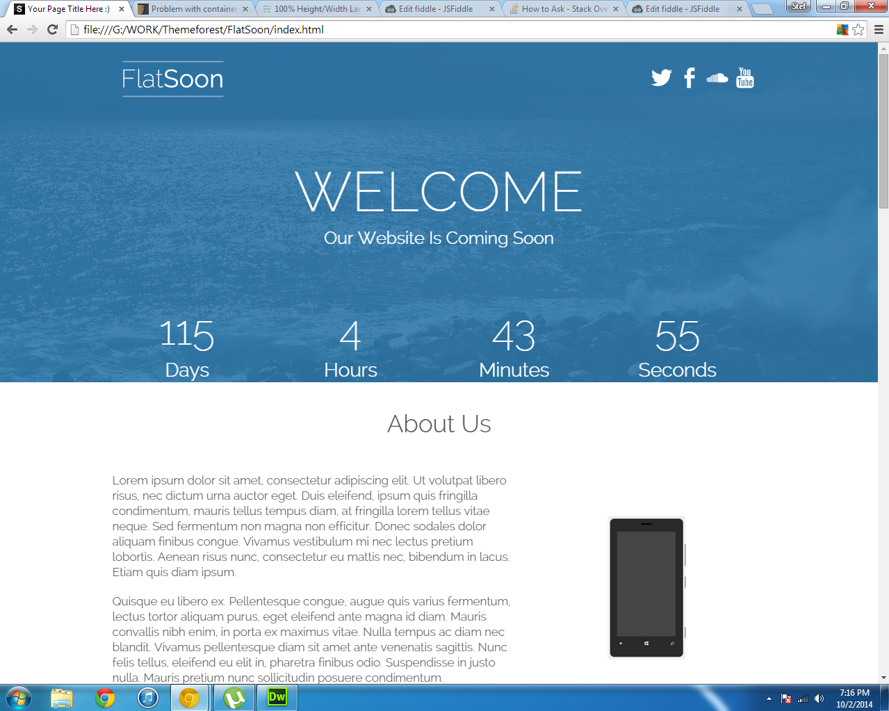
我试图获得像这样的全屏高度登陆页面 http://themeforest.net/item/de7igner-flat-ios7-inspired-coming-soon-template/full_screen_preview/5800714
但我有这个
这是我的代码
    <div class="wrapper">
        <div class="headerbg">
        <header>

            <div class="container">

                <div class="topheader wow fadeInDown">
                    <img src="images/logo.png">

                    <ul>
                        <li><a href="#"><img src="icons/twitter.png"></a></li>
                        <li><a href="#"><img src="icons/facebook.png"></a></li>
                        <li><a href="#"><img src="icons/soundcloud.png"></a></li>
                        <li><a href="#"><img src="icons/youtube.png"></a></li>
                    </ul>
                </div>

                <div class="wow fadeIn">
                    <h1>Welcome</h1>
                    <h2>Our Website Is Coming Soon</h2>
                </div>

                <div class="wow fadeInUp">
                    <div id="defaultCountdown"></div>
                </div>

            </div>

        </header>
        </div>
    </div>
和我的css:
/*-----------------------------------------------------------------------------------------------------------------
                                    Header
---------------------------------------------------------------------------------------------------------------- */

.wrapper {
    width: 100%;
    min-height: 100%;
}


.headerbg {
  background: url(../images/bg.jpg) no-repeat center center fixed;
  -webkit-background-size: cover;
  -moz-background-size: cover;
  -o-background-size: cover;
  background-size: cover;
  min-height:100%;
}

header .container {
    background:none;
}

.topheader {
    height:100px;
    margin:0;
}
.topheader img {
    float:left;
}

.topheader ul {
    float:right;
    padding-right: 20px;
    line-height:100px;
    color:#fff;
}

.topheader li {
    display:inline;
}
.topheader li img {
    width:40px;
    height:40px;
    padding-top:30px;


    -webkit-transition: all 0.4s;
    -moz-transition: all 0.4s;
    transition: all 0.4s;
}

.topheader li img:hover {
    opacity:0.5;
}


header h1 {
    font-size:80px;
    line-height:80px;
    color:#fff;
    text-align:center;
    font-family: 'Raleway', sans-serif;
    font-weight:100;
    padding-top:75px;
    text-transform:uppercase;
    padding-bottom:0;
}

header h2 {
    font-size:25px;
    line-height:25px;
    color:#fff;
    text-align:center;
    font-family: 'Raleway', sans-serif;
    font-weight:300;
    padding-top:0px;
    padding-bottom:50px;
}

@media only screen and (max-width: 767px) {

header {
    height:500px;
    width:100%;
}


header h1 {
    font-size:40px;
    line-height:40px;
    color:#fff;
    text-align:center;
    font-family: 'Raleway', sans-serif;
    font-weight:100;
    padding-top:40px;
    text-transform:uppercase;
    padding-bottom:0px;
}

header h2 {
    font-size:20px;
    line-height:20px;
    color:#fff;
    text-align:center;
    font-family: 'Raleway', sans-serif;
    font-weight:300;
    padding-right:10px;
    padding-left:10px;
    padding-top:0px;
}

.topheader li img {
    width:30px;
    height:30px;
    padding-top:30px;
}

.topheader {
    height:75px;
    margin:0;
}
.topheader img {
    width:150px;
    height:75px;
}


}
答案 0 :(得分:1)
您的包装 可能占据其所在容器的100%,但该容器(主体)不占用其容器的100%。
html, body { min-height: 100%; }
答案 1 :(得分:1)
我想,但也许我错了,更好用的是JavaScript来执行功能发现精确的窗口或设备高度,因为你可以使用其他元素直接在这个100%高度部分的末端没有差异,也可以在调整窗口之后。 (而且你可以在中间拥有标题和其他元素)
此代码例如:
HTML:
<div class="container">
    <h1>Welcome</h1>
    <h2>Our Website Is Coming Soon</h2>
</div>
<div class="other">
    <h2>About us</h2>
    <p>
        am sit amet quam ut metus mattis condimentum. Vestibulum nec ultrices ex. Pellentesque eros mi, accumsan sit amet auctor ac, fringilla sit amet tortor. Nam sit amet quam ut metus mattis condimentum. Vestibulum nec ultrices ex. Pellentesque eros mi, accumsan sit amet auctor ac, fringilla sit amet tortor. Aliquam rutrum eros mauris, sit amet tincidunt purus tristique ac. Nunc semper dui ipsum. Vestibulum fermentum nunc enim, non gravida nibh iaculis eu. Vivamus pretium neque mauris..
    </p>
</div>
CSS:
body{
    margin:0;
}
.container{
    background:#79F;
    color:#fff;
    text-align:center;
}
h1{
    margin:0 0 40px 0;
}
h2{
    margin:0;
}
JS(jQuery):
$(function(){
    $wheight = $(window).height();
    $('.container').height($wheight/2+60);
    $('.container').css('padding-top',$wheight/2-60+'px');

    $(window).resize(function(){
        $wheight = $(window).height();
        $('.container').height($wheight/2+60);
        $('.container').css('padding-top',$wheight/2-60+'px');
    });
});
答案 2 :(得分:0)
你必须给你的包装器一个绝对的位置。
.wrapper {
    position: absolute;
    width: 100%;
    height: 100%;
}