如何制作一个与其内部div相关的可拉伸div
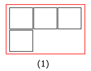
如何使父div(红色)可伸缩,以便其中的最小chidren数可以是1,最大数可以是3,之后第四个div自动垂直向下设置。


我对内部div的css是
.inner_div {
min-height: 238px;
border-bottom: 1px dashed #e7e7e7;
border-right: 1px dashed #e7e7e7;
border-top: 1px dashed #e7e7e7;
border-left: 1px dashed #e7e7e7;
padding-top: 10px;
padding-bottom: 10px;
float: left;
padding: 9px;
width: 200px;
background-color: white;
}
和父(外部div)的css是
.outer_div {
    padding: 0 20px;
margin-top: 55px!important;
margin-bottom: 33px!important;
background: white;
border-left: 1px dashed #e7e7e7;
overflow: hidden;
max-width: 611px;
min-width: 223px;
width: auto;
}
7 个答案:
答案 0 :(得分:3)
你可能应该为你的outer_div的最大宽度添加一些像素,否则3个inner_divs不适合:
max-width: 660px;
然后清除每三个inner_div:
.inner_div:nth-of-type(3n+1) {
    clear: left;
}
<小时/> 这是jsfiddle。
答案 1 :(得分:3)
让我们获取流体!
这里有很多答案!
以下示例适用于所有屏幕尺寸/宽度,最多3个方框。
@media用于在每个视口宽度处给出和取出边框,一列最多三列。它还为每个步骤重新调整外部div的大小,并根据需要更改背景颜色等。请参阅代码段中的注释,以获取有关正在进行的操作的基本说明。
此示例可以根据需要使用多个或多个框。全屏打开并调整大小以查看结果。
更新 - 我为内部提供了深绿色背景,外部为display: inline-block以调整其内容的大小。

* {
  box-sizing: border-box;
  /* incorporate padding into width (.outer_div padding is excluded) */
}
.outer_div {
  margin: 50px;
  display: inline-block;
  max-width: 640px;
  min-width: 240px;
  /* 200 * 3 across + 40 .outer_div padding = 640 */
  padding: 20px;
  /* transition? yes! on re-size! */
  transition: background 1s;
  transition: max-width 0.05s;
}
.inner_div {
  min-height: 238px;
  /* BORDER ALL THE THINGS!!!*/
  border: 1px dashed #000;
  float: left;
  padding: 9px;
  /* padding is accounted for in the width thanks to border-box */
  width: 200px;
  background: #0a8f08;
}
/* Clear the floats at the very end */

.outer_div:after {
  content: ' ';
  display: block;
  clear: left;
}
/* 3 boxes across */

/*@media sizes increase and decrease dependant on inner box width and outer_div padding */

@media screen and (min-width: 756px) {
  .outer_div {
    background: #a3e9a4;
  }
  /* Remove all bottom borders */
  .inner_div {
    border-bottom: none
  }
  /* Remove every middle border  */
  .inner_div:nth-child(3n+2) {
    border-right: none;
    border-left: none;
  }
  /* Last child gets a right border  */
  .inner_div:last-child {
    border-right: 1px dashed #000;
  }
  /* last three get a bottom border */
  .inner_div:nth-last-child(-n+3) {
    border-bottom: 1px dashed #000;
  }
}
/* 2 boxes across */

@media screen and (min-width: 573px) and (max-width: 755px) {
  .outer_div {
    max-width: 440px;
    background: #dcedc8;
  }
  /* Remove all bottom borders */
  .inner_div {
    border-bottom: none;
  }
  /* Remove every second border */
  .inner_div:nth-child(2n) {
    border-left: none;
  }
  /* last two get a bottom border */
  .inner_div:nth-last-child(-n+2) {
    border-bottom: 1px dashed #000;
  }
}
/* 1 box across */

@media screen and (max-width: 572px) {
  .outer_div {
    max-width: 240px;
    background: #f0f4c3;
  }
  /* Remove all bottom borders */
  .inner_div {
    border-bottom: none;
  }
  /* last one gets a border */
  .inner_div:last-child {
    border-bottom: 1px dashed #000;
  }
}
<div class="outer_div">
<div class="inner_div"></div>
<div class="inner_div"></div>
<div class="inner_div"></div>
<div class="inner_div"></div>
<div class="inner_div"></div>
<div class="inner_div"></div>
</div>
答案 2 :(得分:1)
只需使用此
更改外部div css即可 .outer_div {
padding: 0 20px;
margin-top: 55px!important;
margin-bottom: 33px!important;
background: white;
border-left: 1px dashed #e7e7e7;
overflow: hidden;
max-width: 100%;
min-width: 223px;
}
答案 3 :(得分:1)
您可以按比例尝试按照代码更改参数。
display:inline-block;可以做技巧
.outer_div{
  display:inline-block;
  max-width:300px;
  height:300px;
  background-color:red;
  overflow:auto;
}
.inner_div{
  width:100px;
  height:100px;
  background-color:black;
  float:left;
}
答案 4 :(得分:1)
使用:nth-child伪类。
要使父div可伸缩,请添加float: left或display: inline-block。
.outer_div {
    padding: 0 20px;
    margin-top: 55px!important;
    margin-bottom: 33px!important;
    background: white;
    border-left: 1px dashed #e7e7e7;
    overflow: hidden;
    width: auto;

    float: left;
    clear: both;
    margin: auto;
}
.inner_div {
    min-height: 238px;
    border: 1px dashed #e7e7e7;
    float: left;
    padding: 9px;
    width: 200px;
    background-color: white;
}
.inner_div:nth-child(3n+1) {
    clear: left;
}
您可以在jsfiddle中看到结果。
答案 5 :(得分:1)
在inner-div类中添加此行
display:inline-block;
和outer-div必须像这样
.outer_div {
    padding: 0 20px;
    margin-top: 55px!important;
    margin-bottom: 33px!important;
    background: white;
    border-left: 1px dashed #e7e7e7;
    overflow: hidden;
    max-width: 669px;
    min-width: 223px;
   }
您可以随时更改最大宽度以获得更多第四个块的可用空间或删除第三个块!
答案 6 :(得分:0)
- 我写了这段代码,但我无法理解我的错误
- 我无法从一个代码实例的列表中删除 None 值,但我可以在另一个实例中。为什么它适用于一个细分市场而不适用于另一个细分市场?
- 是否有可能使 loadstring 不可能等于打印?卢阿
- java中的random.expovariate()
- Appscript 通过会议在 Google 日历中发送电子邮件和创建活动
- 为什么我的 Onclick 箭头功能在 React 中不起作用?
- 在此代码中是否有使用“this”的替代方法?
- 在 SQL Server 和 PostgreSQL 上查询,我如何从第一个表获得第二个表的可视化
- 每千个数字得到
- 更新了城市边界 KML 文件的来源?