围绕div的样式边框
我有点卡在div框周围的样式边框上。
问题是我不能让边界不像:
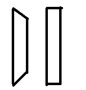
这是我的真实例子:
.num.num_1 {
  border-left-color: #0D2431;
}
.num {
  width: 60px;
  height: 60px;
  line-height: 50px;
  border-width: 5px;
  font-size: 40px;
}
.num {
  float: left;
  width: 40px;
  height: 40px;
  line-height: 36px;
  text-align: center;
  border: 2px solid #eee;
  font-size: 20px;
  color: #0D2431;
  background-color: #fff;
}
div {
  margin: 0;
  padding: 0;
  border: 0;
  font: inherit;
  font-size: 100%;
  vertical-align: baseline;
}
}
<div class="num num_1">1</div>
4 个答案:
答案 0 :(得分:1)
.num.cheat:before {
    content:"";
    position: absolute;
    left: -5px;
    right: -5px;
    top: -5px;
    bottom: -5px;

}
.num_1:before {
    border-left: 5px solid black;
}
.num_2:before {
    border-left: 5px solid black;
    border-top: 5px solid black;
}
.num_3:before {
    border-left: 5px solid black;
    border-top: 5px solid black;
    border-right: 5px solid black;
}
.num_4:before {
    border-left: 5px solid black;
    border-top: 5px solid black;
    border-right: 5px solid black;
    border-bottom: 5px solid black;
}
.num {
  width: 60px;
  height: 60px;
  line-height: 50px;
  border-width: 5px;
  font-size: 40px;
  position: relative;
  margin-right: 10px;
}
.num {
  float: left;
  width: 40px;
  height: 40px;
  line-height: 36px;
  text-align: center;
  border: 5px solid #eee;
  font-size: 20px;
  color: #0D2431;
  background-color: #fff;
}
div {
  margin: 0;
  padding: 0;
  border: 0;
  font: inherit;
  font-size: 100%;
  vertical-align: baseline;
}
}
<div class="num num_1 cheat">1</div>
<div class="num num_2 cheat">2</div>
<div class="num num_3 cheat">3</div>
<div class="num num_4 cheat">4</div>
我稍微修改了你的CSS。我使用:before伪元素解决了它。
答案 1 :(得分:1)
更好的是,你可以使用box-shadow来实现这一点,而无需任何额外的元素。
请参阅:http://jsfiddle.net/w3b1uh7g/2/
.num {
  border-left: 0px;
  box-shadow: -5px 0 0 0 #0D2431;
}
答案 2 :(得分:0)
你可以做一系列奇怪的嵌套div:
&#13;
&#13;
&#13;
&#13;
.border {
    background: green;
    padding: 10px 10px 10px 0;
    display: inline-block;
}
.border-left {
    padding-left: 10px;
    background: black;
    display: inline-block;
}
.inside-box {
    background: red;
    height: 100px;
    width: 100px;
}
<div class="border-left">
<div class="border">
<div class="inside-box">1</div>
</div>
</div>
答案 3 :(得分:0)
只需将这些添加到您的CSS中即可。 Pseudo Elements应该使它成为正方形而不在HTML中添加额外的div
.num.num_1:before {
content: "";
position: relative;
display: block;
top: -5px;
left: -5px;
height: 5px;
width: 5px;
background: black;
}

.num.num_1:after {
content: "";
position: relative;
display: block;
bottom: 0px;
left: -5px;
height: 5px;
width: 5px;
background: black;
}
相关问题
最新问题
- 我写了这段代码,但我无法理解我的错误
- 我无法从一个代码实例的列表中删除 None 值,但我可以在另一个实例中。为什么它适用于一个细分市场而不适用于另一个细分市场?
- 是否有可能使 loadstring 不可能等于打印?卢阿
- java中的random.expovariate()
- Appscript 通过会议在 Google 日历中发送电子邮件和创建活动
- 为什么我的 Onclick 箭头功能在 React 中不起作用?
- 在此代码中是否有使用“this”的替代方法?
- 在 SQL Server 和 PostgreSQL 上查询,我如何从第一个表获得第二个表的可视化
- 每千个数字得到
- 更新了城市边界 KML 文件的来源?