如何创建透明圆圈?
有没有办法在CSS中获得此效果?
我尝试使用此css,但它仅剪切第一层。
div{
    width:300px;
    height:300px;
    position:relative;
    overflow:hidden;
}
div:before{
    content:'';
    position:absolute;
    bottom:50%;
    width:100%;
    height:100%;
    border-radius:100%;
    box-shadow: 0px 300px 0px 300px #448CCB;
}
1 个答案:
答案 0 :(得分:8)
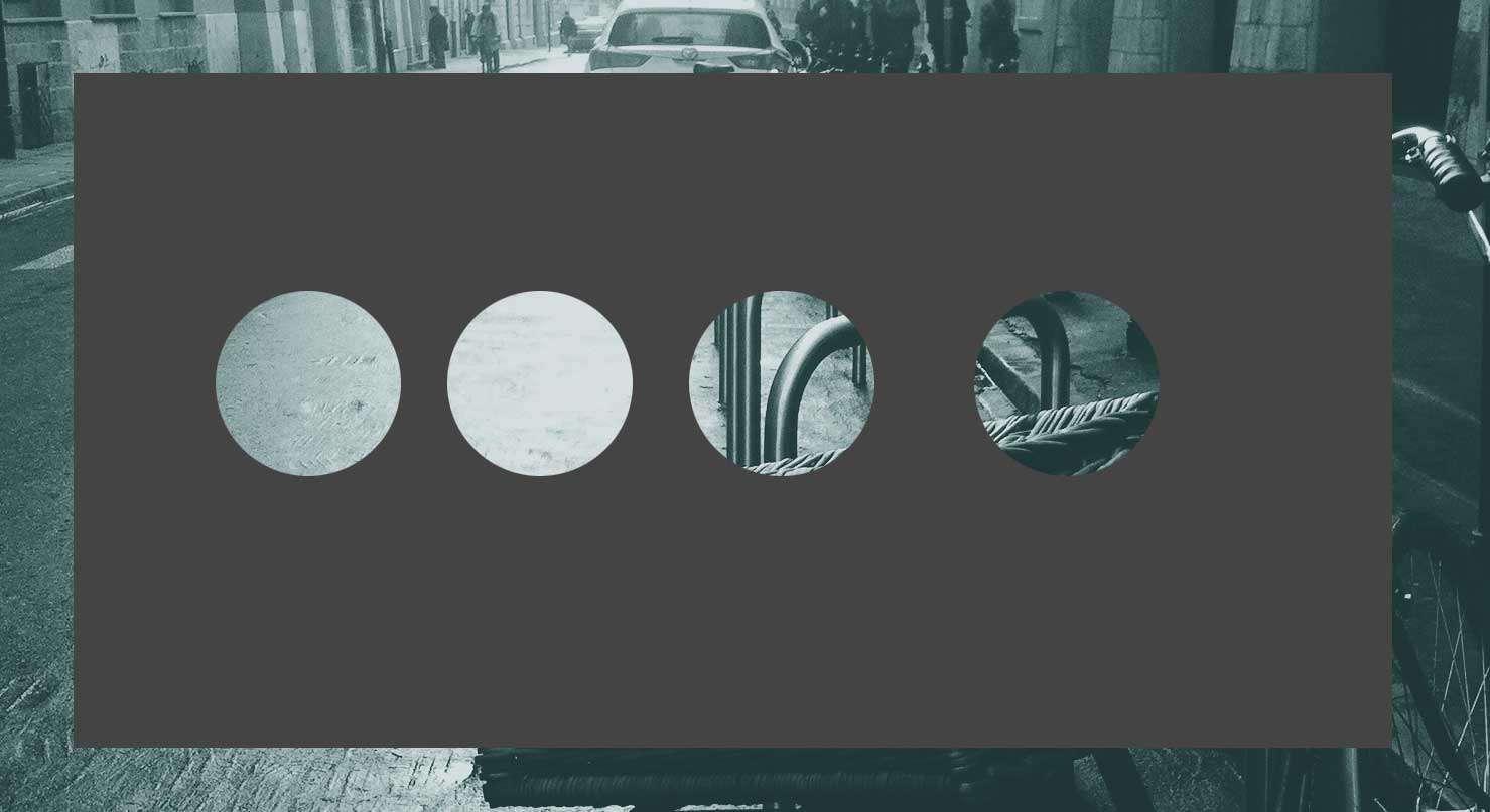
最简单的方法是使用透明 DIV,溢出隐藏(灰色) 比在里面简单地放一个带有阴影的圆圈,真的很大。
html, body{height:100%;}
body{
    background: url(http://web-vassets.ea.com/Assets/Richmedia/Image/Screenshots/FIFA-Street-London1web.jpg?cb=1330546446) 50% / cover;
}

.hasCircle{
    width:150px;
    height:300px;
    position:relative;
    overflow:hidden;
  float:left;
}
.hasCircle:after{
    content:" ";
    position:absolute;
    left:0; right:0;
    margin:100px auto;
    width:100px;
    height:100px;
    border-radius:50%;
    box-shadow: 0 0 0 1000px #444;
}
<div class="hasCircle"></div>
<div class="hasCircle"></div>
<div class="hasCircle"></div>
正如您在上面所看到的,我使用了:after伪元素,它可能会阻止.hasCircle中的某些文本可见(由于重叠的伪元素),但它只是为了得到一个想法,你可以使用像:
<div class="boxTransparentOverflow">
   <div class="theTransparentCircleWithGraySpread"></div>
   Some text
</div>
相关问题
最新问题
- 我写了这段代码,但我无法理解我的错误
- 我无法从一个代码实例的列表中删除 None 值,但我可以在另一个实例中。为什么它适用于一个细分市场而不适用于另一个细分市场?
- 是否有可能使 loadstring 不可能等于打印?卢阿
- java中的random.expovariate()
- Appscript 通过会议在 Google 日历中发送电子邮件和创建活动
- 为什么我的 Onclick 箭头功能在 React 中不起作用?
- 在此代码中是否有使用“this”的替代方法?
- 在 SQL Server 和 PostgreSQL 上查询,我如何从第一个表获得第二个表的可视化
- 每千个数字得到
- 更新了城市边界 KML 文件的来源?