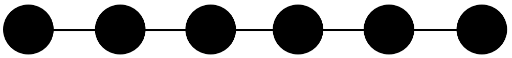
自定义形状进度条
我正努力为网站实施自定义进度条。这是它应该拥有的形状:
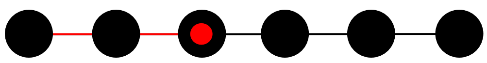
当用户选择一个圆圈时,我希望线条(只有线条,而不是圆圈)用不同的颜色填充,直到它到达那个圆圈,最后红色点应该出现在中间,如果用户点击第三个圆圈,则为最终结果:
我不知道什么是最好,更简单的方法。我已经在线尝试了一些纯CSS,jQuery和JavaScript解决方案,但没有人可以重新创建这种效果。我应该有两个图像并逐步覆盖它们,直到我只到达点击的点吗?我是否应该完全忘记图像并尝试使用CSS或SVG重新创建形状并更改某个部分的颜色?
我知道这里的问题通常都有代码,但我无法展示,因为我不知道采取什么方法,在线研究时间导致了无数的解决方案。适用于我的情况。
提前致谢。
3 个答案:
答案 0 :(得分:7)
混合使用CSS和一些小jQuery非常简单。


// Add click handler to the original dots
$("UL.progress LI").click(function(e) {
   // Deselect current selection
   $("UL.progress LI.selected").removeClass("selected");
   var  newDot = $(this);
   // Which dot are we selecting?
   var  newProgressWidth = newDot.index();
   // Animate the new width of the red line
   $("UL.progress LI.progressline").animate(
       {'width': (newProgressWidth * 90) + 'px'},
       400,
       function() {
          // When done, select the new dot
          newDot.addClass("selected");
       });

});

// Add the black and red bars as additional <li> elements
// without click handlers
$("<li>").addClass("blackbar").appendTo("UL.progress");
$("<li>").addClass("progressline").appendTo("UL.progress");

// Select the first dot
$("UL.progress LI").first().addClass("selected");
UL.progress {
list-style: none;
padding: 0;
position: relative;
}
/* the black dots */
UL.progress LI {
float: left;
width: 60px;
height: 60px;
background-color: black;
border-radius: 50%;
margin-left: 30px;
position: relative;
cursor: pointer;
}
/* first black dot has no gap to the left */
UL.progress LI:first-child {
margin-left: 0;
}
/* red dot when selected */
UL.progress LI.selected:after {
content: '';
display: block;
position: absolute;
top: 15px;
left: 15px;
width: 30px;
height: 30px;
background-color: red;
border-radius: 50%;
}
/* the black and red lines at the back*/
UL.progress LI.blackbar,
UL.progress LI.progressline {
z-index: -2;
content: '';
display: block;
position: absolute;
top: 28px;
left: 30px; /* 60 (diameter) / 2 */
width: 450px; /* 5*60 + 5*30 (dot diameter and gap) */
height: 4px;
background-color: black;
margin-left: 0;
border-radius: 0;
}
/* the black line */
UL.progress LI.blackbar {
z-index: -2;
background-color: black;
}
/* the red progress line */
UL.progress LI.progressline {
z-index: -1;
background-color: red;
width: 0;
}<script src="https://ajax.googleapis.com/ajax/libs/jquery/2.1.1/jquery.min.js"></script>
Example progress bar<br/>
<ul class="progress">
<li></li>
<li></li>
<li></li>
<li></li>
<li></li>
<li></li>
</ul>
答案 1 :(得分:1)
我会在黑色的正上方创建一条红线。然后使用jquery的animate来增加宽度,直到达到所需的圆。然后,一旦完成,做一些类似于制作红色圆圈的东西(如果你想要它展开,否则只需将它放在那里)
答案 2 :(得分:0)
简单的方法是在svg或png中制作黑线和点的bg然后将其用作背景repeat-x然后将红色部分也作为图像并将其放在bg的顶部,并使用新的html元素和也使用background repeat-x。然后你可以用css / js改变红色元素的宽度来填充进度条。
相关问题
最新问题
- 我写了这段代码,但我无法理解我的错误
- 我无法从一个代码实例的列表中删除 None 值,但我可以在另一个实例中。为什么它适用于一个细分市场而不适用于另一个细分市场?
- 是否有可能使 loadstring 不可能等于打印?卢阿
- java中的random.expovariate()
- Appscript 通过会议在 Google 日历中发送电子邮件和创建活动
- 为什么我的 Onclick 箭头功能在 React 中不起作用?
- 在此代码中是否有使用“this”的替代方法?
- 在 SQL Server 和 PostgreSQL 上查询,我如何从第一个表获得第二个表的可视化
- 每千个数字得到
- 更新了城市边界 KML 文件的来源?