жҜҸдёӘйЎ№зӣ®зҡ„е®ҪеәҰдёҺжңҖе®Ҫзҡ„е…ғзҙ зӣёеҗҢ
жҲ‘жғіеҲӣе»әиҝҷдёӘеёғеұҖпјҡ
еҪ“дёҖдёӘйЎ№зӣ®дёҚйҖӮеҗҲе®№еҷЁж—¶пјҢжҲ‘们еҸҜд»Ҙ移еҠЁеҲ°дёӢдёҖиЎҢпјҡ

еҪ“е®№еҷЁжҜ”иҫғе®Ҫзҡ„йЎ№зӣ®е°Ҹж—¶пјҢжҲ‘们еҸҜд»Ҙе°ҶеҶ…е®№еҢ…иЈ…еңЁеӨҡиЎҢ
дёӯ 
дҪҝз”ЁJavascriptйқһеёёз®ҖеҚ•пјҢиҝҷйҮҢжҳҜзӨәдҫӢhttps://jsfiddle.net/oucxsep4/гҖӮ
var choices = document.querySelectorAll('li');
var maxWidth = 0;
// read
for (i = 0; i < choices.length; ++i) {
    maxWidth = Math.max(maxWidth, choices[i].offsetWidth)
};

// write
for (i = 0; i < choices.length; ++i) {
    choices[i].style.width = maxWidth + "px";
};
ul{
margin: 0;
padding: 0;
list-style: none;
}
li{
background: red;
float: left;
margin: 5px;
}<ul>
<li>first choice</li>
<li>choice</li>
<li>This is the wider choice</li>
<li>other choice</li>
</ul>
жҳҜеҗҰеҸҜд»ҘдёҚдҪҝз”ЁJavascriptпјҢеҸӘдҪҝз”ЁCSSпјҹжҲ‘иҜ•иҝҮflexboxжІЎжңүжҲҗеҠҹгҖӮ
3 дёӘзӯ”жЎҲ:
зӯ”жЎҲ 0 :(еҫ—еҲҶпјҡ6)
еҸҜд»ҘдҪҝз”Ёз®ҖеҚ•зҡ„cssпјҡ
.list-container {
  display: inline-flex;
  flex-direction: row;
  justify-content: center;
}

.list {
  display: flex;
  flex-direction: column;
}

.list-item {
  text-transform: capitalize;
  background-color: rgb(200, 30, 40);
  font-size: 1.3em;
  text-align: left;
  padding: 10px;
  margin: 1px;
  display: flex;
  flex-direction: row;
  flex-wrap: wrap;
  justify-content: flex-start;
}
<!DOCTYPE html>
<div class="list-container">
<div class="list">
<div class="list-item">fresh figs</div>
<div class="list-item">pine nuts</div>
<div class="list-item">honey</div>
<div class="list-item">balsamic vinegar</div>
</div>
</div>
<div class="list-container">
<div class="list">
<div class="list-item">fresh figs</div>
<div class="list-item">pine nuts</div>
<div class="list-item">honey</div>
<div class="list-item">balsamic vinegar</div>
</div>
</div>
зӯ”жЎҲ 1 :(еҫ—еҲҶпјҡ3)
еҚ•зӢ¬зҡ„CSSж— жі•е°ҶжүҖжңүе…„ејҹе…ғзҙ е®ҪеәҰдёҺжңҖе®Ҫзҡ„е…ғзҙ е®ҪеәҰеҢ№й…ҚгҖӮдҪҶжҳҜпјҢйҖҡиҝҮдёәеҲ—иЎЁйЎ№жҸҗдҫӣ50пј…зҡ„е®ҪеәҰжқҘеҲӣе»әдёӨеҲ—з»“жһ„пјҲwidth: calc(50% - 10px /* subtracts margins */);пјүпјҢ然еҗҺдёәе®ғ们жҸҗдҫӣжңҖе°Ҹе®ҪеәҰпјҲmin-width:153px; inиҝҷдёӘдҫӢеӯҗпјүгҖӮ
еҰӮжһңжӮЁж— жі•еңЁCSSдёӯжүӢеҠЁи®ҫзҪ®жңҖе°Ҹе®ҪеәҰпјҢйӮЈд№ҲжӮЁеҸҜиғҪйңҖиҰҒдҪҝз”ЁдёҖдәӣjavascriptжқҘиЎҘе……CSSпјҢд»Ҙи®ҫзҪ®дёҺжӮЁзҡ„зӨәдҫӢзұ»дјјзҡ„е…„ејҹе…ғзҙ зҡ„жңҖе°Ҹе®ҪеәҰгҖӮ
ul{
margin: 0;
padding: 5px;
list-style: none;
width:50%;
background-color: #eee;
}
ul::after {
clear: both;
content: "";
display: block;
}
li {
background: red none repeat scroll 0 0;
display: block;
float: left;
margin: 5px;
min-width: 153px;
width: calc(50% - 10px);
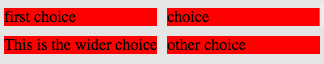
}<ul>
<li>first choice</li>
<li>choice</li>
<li>This is the wider choice</li>
<li>other choice</li>
</ul>
зӯ”жЎҲ 2 :(еҫ—еҲҶпјҡ0)
жҲ‘жңүдёҖдёӘдё‘йҷӢзҡ„и§ЈеҶіж–№жЎҲ
https://jsfiddle.net/y5x3znqo/2/
body {
  background: #ccc
}

ul {
  margin: 0;
  padding: 0;
  list-style: none;
}

li {
  background: red;
  float: left;
  margin: 5px;
}

.label {
  position: absolute;
}

.hide {
  visibility: hidden;
}
<ul>
<li>
<span class="label">first choice</span>
<span class="hide">This is the wider choice</span>
</li>
<li>
<span class="label">choice</span>
<span class="hide">This is the wider choice</span>
</li>
<li>
<span>This is the wider choice</span>
</li>
<li>
<span class="label">other choice</span>
<span class="hide">This is the wider choice</span>
</li>
</ul>
иҝҷдёӘжғіжі•жҳҜе°ҶжңҖе№ҝжіӣзҡ„йЎ№зӣ®ж”ҫеңЁжҜҸдёӘйҖүйЎ№дёӯпјҢе…·жңүеҸҜи§ҒжҖ§пјҡйҡҗи—ҸгҖӮиҝҷйңҖиҰҒйў„е…Ҳи®Ўз®—жңҖе®Ҫзҡ„йЎ№зӣ®пјҢдҫӢеҰӮеңЁеҗҺз«ҜгҖӮ
- е…·жңүзӣёеҗҢе®ҪеәҰзҡ„еӨҡдёӘе…ғзҙ зӯүдәҺжңҖе®Ҫе…ғзҙ
- зЎ®е®ҡListBoxдёӯжңҖе®Ҫе…ғзҙ зҡ„е®ҪеәҰ
- дҪҝжүҖжңү<li>дёҺжңҖе®Ҫзҡ„</li>зӣёеҗҢзҡ„е®ҪеәҰ
- е°Ҷulзҡ„е®ҪеәҰи®ҫзҪ®дёәжңҖе®Ҫзҡ„еӯҗе®ҪеәҰ
- жҜҸдёӘйЎ№зӣ®зҡ„е®ҪеәҰдёҺжңҖе®Ҫзҡ„е…ғзҙ зӣёеҗҢ
- дҪҝиЎЁдёӯзҡ„жүҖжңүеҚ•е…ғж је…·жңүзӯүдәҺжңҖе®ҪеҚ•е…ғж је®ҪеәҰзҡ„зӣёеҗҢе®ҪеәҰ
- жңҖе®Ҫе…ғзҙ зҡ„е®ҪеәҰи®ҫзҪ®иЎҢдёӯжүҖжңүе…„ејҹзҡ„е®ҪеәҰ
- дҪҝflexе…·жңүдёҺжңҖе®Ҫе…ғзҙ зӣёзӯүзҡ„е®ҪеәҰеҲ—
- дҪҝеј№жҖ§йЎ№зӣ®е…·жңүдёҺзҲ¶йЎ№зӣёеҗҢзҡ„е®ҪеәҰ
- еҰӮдҪ•дҪҝеј•еҜјеҜјиҲӘж ҸйЎ№зӣ®зҡ„е®ҪеәҰзӯүдәҺжңҖе®Ҫзҡ„дёӢжӢүйЎ№зӣ®зҡ„е®ҪеәҰпјҹ
- жҲ‘еҶҷдәҶиҝҷж®өд»Јз ҒпјҢдҪҶжҲ‘ж— жі•зҗҶи§ЈжҲ‘зҡ„й”ҷиҜҜ
- жҲ‘ж— жі•д»ҺдёҖдёӘд»Јз Ғе®һдҫӢзҡ„еҲ—иЎЁдёӯеҲ йҷӨ None еҖјпјҢдҪҶжҲ‘еҸҜд»ҘеңЁеҸҰдёҖдёӘе®һдҫӢдёӯгҖӮдёәд»Җд№Ҳе®ғйҖӮз”ЁдәҺдёҖдёӘз»ҶеҲҶеёӮеңәиҖҢдёҚйҖӮз”ЁдәҺеҸҰдёҖдёӘз»ҶеҲҶеёӮеңәпјҹ
- жҳҜеҗҰжңүеҸҜиғҪдҪҝ loadstring дёҚеҸҜиғҪзӯүдәҺжү“еҚ°пјҹеҚўйҳҝ
- javaдёӯзҡ„random.expovariate()
- Appscript йҖҡиҝҮдјҡи®®еңЁ Google ж—ҘеҺҶдёӯеҸ‘йҖҒз”өеӯҗйӮ®д»¶е’ҢеҲӣе»әжҙ»еҠЁ
- дёәд»Җд№ҲжҲ‘зҡ„ Onclick з®ӯеӨҙеҠҹиғҪеңЁ React дёӯдёҚиө·дҪңз”Ёпјҹ
- еңЁжӯӨд»Јз ҒдёӯжҳҜеҗҰжңүдҪҝз”ЁвҖңthisвҖқзҡ„жӣҝд»Јж–№жі•пјҹ
- еңЁ SQL Server е’Ң PostgreSQL дёҠжҹҘиҜўпјҢжҲ‘еҰӮдҪ•д»Һ第дёҖдёӘиЎЁиҺ·еҫ—第дәҢдёӘиЎЁзҡ„еҸҜи§ҶеҢ–
- жҜҸеҚғдёӘж•°еӯ—еҫ—еҲ°
- жӣҙж–°дәҶеҹҺеёӮиҫ№з•Ң KML ж–Ү件зҡ„жқҘжәҗпјҹ