如何仅为顶部和底部使用线性渐变边框?
使用下面的代码,我只能为其底部生成线性渐变border-image。如何修改代码以使其成为顶级代码?
div {
    /* gradient shining border */
    border-style: solid;
    border-width: 3px;
    -webkit-border-image: -webkit-linear-gradient(
        left,
        rgba(0,0,0,1) 1%,
        rgba(0,255,255,1) 50%,
        rgba(0,0,0,1) 100%
    ) 0 0 100% 0/0 0 3px 0 stretch;
    -moz-border-image: -moz-linear-gradient(
        left,
        rgba(0,0,0,1) 1%,
        rgba(0,255,255,1) 50%,
        rgba(0,0,0,1) 100%
    ) 0 0 100% 0/0 0 3px 0 stretch;
    -o-border-image: -o-linear-gradient(
        left,
        rgba(0,0,0,1) 1%,
        rgba(0,255,255,1) 50%,
        rgba(0,0,0,1) 100%
    ) 0 0 100% 0/0 0 3px 0 stretch;
    border-image: linear-gradient(
        to left,
        rgba(0,0,0,1) 1%,
        rgba(0,255,255,1) 50%,
        rgba(0,0,0,1) 100%
    ) 0 0 100% 0/0 0 3px 0 stretch;
}
当前输出:
1 个答案:
答案 0 :(得分:9)
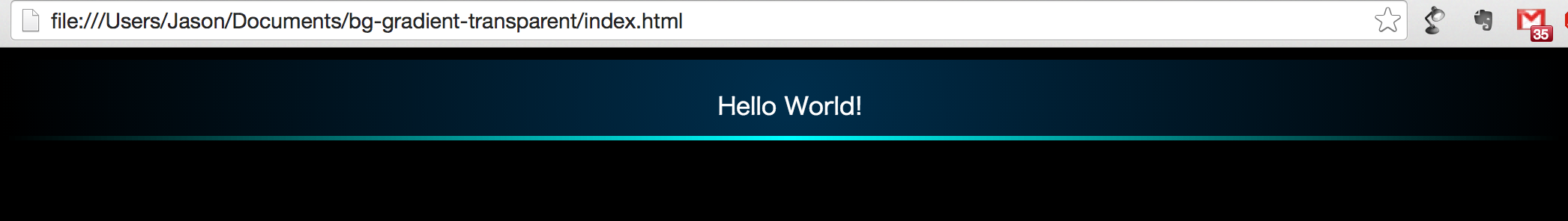
您正在使用简写border-image属性来设置渐变的大小,并根据提供的值,顶部,左侧和右侧边框无效。
将100%设置为顶部边框渐变的宽度,将3px设置为高度将导致渐变仅应用于顶部和底部。
border-image: linear-gradient(to left, rgba(0, 0, 0, 1) 1%, rgba(0, 255, 255, 1) 50%, rgba(0, 0, 0, 1) 100%)
              100% 0 100% 0/3px 0 3px 0 stretch;
在上面的代码行中,100% 0 100% 0/3px 0 3px 0表示每边的渐变边框的大小(读作[top] [right] [bottom] [left])。最初是0 0 100% 0/0 0 3px 0。
div {
  /* gradient shining border */
  border-style: solid;
  border-width: 3px;
  border-image: linear-gradient(to left, rgba(0, 0, 0, 1) 1%, rgba(0, 255, 255, 1) 50%, rgba(0, 0, 0, 1) 100%)
                100% 0 100% 0/3px 0 3px 0 stretch;

  /* other demo stuff */
  height: 50px;
  line-height: 50px;
  background-color: #222;
  color: white;
  text-align: center;
}
<div>Some content</div>
请注意,border-image property still has pretty low browser support如果您需要支持IE10及更低版本,则无效。而不是它,您可以使用下面代码段中的background-image来产生类似的效果。这也适用于IE10(但仍然无法在IE9中使用 - 因为它们根本不支持渐变)。
div {
  /* gradient shining border */
  background-image: linear-gradient(to left, rgba(0, 0, 0, 1) 1%, rgba(0, 255, 255, 1) 50%, rgba(0, 0, 0, 1) 100%),
                    linear-gradient(to left, rgba(0, 0, 0, 1) 1%, rgba(0, 255, 255, 1) 50%, rgba(0, 0, 0, 1) 100%);
  background-size: 100% 3px;
  background-position: 0% 0%, 0% 100%;
  background-repeat: no-repeat;

  /* other demo stuff */
  height: 50px;
  line-height: 50px;
  background-color: #222;
  color: white;
  text-align: center;
}
<div>Some content</div>
相关问题
最新问题
- 我写了这段代码,但我无法理解我的错误
- 我无法从一个代码实例的列表中删除 None 值,但我可以在另一个实例中。为什么它适用于一个细分市场而不适用于另一个细分市场?
- 是否有可能使 loadstring 不可能等于打印?卢阿
- java中的random.expovariate()
- Appscript 通过会议在 Google 日历中发送电子邮件和创建活动
- 为什么我的 Onclick 箭头功能在 React 中不起作用?
- 在此代码中是否有使用“this”的替代方法?
- 在 SQL Server 和 PostgreSQL 上查询,我如何从第一个表获得第二个表的可视化
- 每千个数字得到
- 更新了城市边界 KML 文件的来源?