虚线顶部和底部边框比文字
我想在下面的图像中实现边框顶部和底部我如何使用CSS技巧实现?

挑战是我不想要带有边框的整个宽度,它也应该响应。
移动版图片为http://i.imgur.com/XZTW28N.jpg,它也可以在桌面和移动浏览器中使用。
我尝试使用%宽度边框,但它无效。
我在下面写了代码,但对我来说并不是100%完美的答案。
HTML:
<h1>How it Works</h1
CSS:
h1:before, h1:after {
    content: "";
    height: 1px;
    background: linear-gradient(to right,  rgba(0,0,0,0) 0%,rgba(147,147,147,1) 50%,rgba(0,0,0,0) 100%);
    display: block;
    margin-bottom: 10px;
    margin-top: 10px;
}
3 个答案:
答案 0 :(得分:10)
我在CSS中做了一些更改:
h1{
    text-align: center;
    font-size: 70px;
}

h1:before, h1:after{
    position: relative;
    content: "";
    width: 30%;
    left: 35%;
    display: block;
    margin-bottom: 10px;
    margin-top: 10px;
    border-bottom: 5px dotted yellow;
}
修改
如果您想要固定的width,可以添加:
h1:before, h1:after{
    width: 150px;     /* You can change this value */
    left: 50%;
    transform: translateX(-50%);
}
答案 1 :(得分:4)
您也可以使用box-shadows来实现此目的,首先在顶部创建一个after伪元素,在底部创建一个before伪元素然后给出{{1}中的两个}}
&#13;
&#13;
&#13;
&#13;
box-shadowsbody{
background:#09858F;
}
div{
position:relative;
display:inline-block;
margin:100px;
}
h1{
text-align:center;
font-family: Calibri;
font-size:50px;
color:#fff;
margin:50px;
}
h1:after{
content:"";
position:absolute;
left:30%;
height:10px;
width:10px;
background:yellow;
top:20%;
border-radius:50%;
box-shadow:20px 0 0 0 yellow,40px 0 0 0 yellow,60px 0 0 0 yellow,80px 0 0 0 yellow,100px 0 0 0 yellow,120px 0 0 0 yellow,140px 0 0 0 yellow,160px 0 0 0 yellow;
}
h1:before{
content:"";
position:absolute;
left:30%;
height:10px;
width:10px;
background:yellow;
bottom:20%;
border-radius:50%;
box-shadow:20px 0 0 0 yellow,40px 0 0 0 yellow,60px 0 0 0 yellow,80px 0 0 0 yellow,100px 0 0 0 yellow,120px 0 0 0 yellow,140px 0 0 0 yellow,160px 0 0 0 yellow;
}
答案 2 :(得分:2)
这是使用radial-gradient背景图像在顶部和底部产生点的另一种方法。输出是响应和否。顶部和底部的点数由宽度决定(例如,width: 108px生成9个点,x轴为background-size为12px)。
这种方法优于其他方法的优点在于,这允许更好地控制点的大小和点之间的空间。与虚线边框方法相比,缺点是browser support for radial-gradient更低(IE10 +)。
&#13;
&#13;
&#13;
&#13;
h1 {
  position: relative;
  text-align: center;
  font-size: 48px;
  line-height: 1em;
  padding: 0.625em;
  font-family: Calibri;
  font-weight: 100;
}
h1:after {
  position: absolute;
  content: '';
  width: 108px;  /* multiples of background-size in X-axis */
  height: 100%;
  top: 0px;
  left: calc(50% - 50px);
  background: radial-gradient(circle at 50% 50%, rgb(250, 189, 38) 30%, transparent 50%), radial-gradient(circle at 50% 50%, rgb(250, 189, 38) 30%, transparent 50%);
  background-size: 12px 6px;
  background-repeat: repeat-x;
  background-position: 50% 0.125em, 50% 2em;
}
/* Just for demo */

body {
  background: rgb(9, 133, 143);
  color: white;
}
<!-- library included to support older browsers -->
<script src="https://cdnjs.cloudflare.com/ajax/libs/prefixfree/1.0.7/prefixfree.min.js"></script>
<h1>How it works</h1>
<h1>How it works with long text</h1>
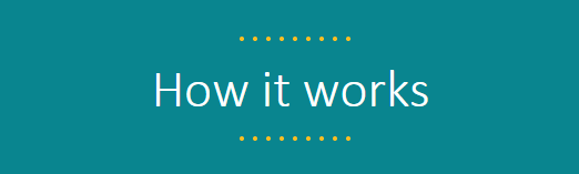
大点的屏幕截图:

要使点尺寸更小所需要做的就是减少径向渐变的颜色停止百分比。百分比越小,点越小。
&#13;
&#13;
&#13;
&#13;
h1 {
  position: relative;
  text-align: center;
  font-size: 48px;
  line-height: 1em;
  padding: 0.625em;
  font-family: Calibri;
  font-weight: 100;
}
h1:after {
  position: absolute;
  content: '';
  width: 108px;  /* multiples of background-size in X-axis */
  height: 100%;
  top: 0px;
  left: calc(50% - 50px);
  background: radial-gradient(circle at 50% 50%, rgb(250, 189, 38) 25%, transparent 35%), radial-gradient(circle at 50% 50%, rgb(250, 189, 38) 25%, transparent 35%);
  background-size: 12px 6px;
  background-repeat: repeat-x;
  background-position: 50% 0.125em, 50% 2em;
}

/* Just for demo */

body {
  background: rgb(9, 133, 143);
  color: white;
}
<!-- library included to support older browsers -->
<script src="https://cdnjs.cloudflare.com/ajax/libs/prefixfree/1.0.7/prefixfree.min.js"></script>
<h1>How it works</h1>
<h1>How it works with long text</h1>
点较小的屏幕截图:
相关问题
最新问题
- 我写了这段代码,但我无法理解我的错误
- 我无法从一个代码实例的列表中删除 None 值,但我可以在另一个实例中。为什么它适用于一个细分市场而不适用于另一个细分市场?
- 是否有可能使 loadstring 不可能等于打印?卢阿
- java中的random.expovariate()
- Appscript 通过会议在 Google 日历中发送电子邮件和创建活动
- 为什么我的 Onclick 箭头功能在 React 中不起作用?
- 在此代码中是否有使用“this”的替代方法?
- 在 SQL Server 和 PostgreSQL 上查询,我如何从第一个表获得第二个表的可视化
- 每千个数字得到
- 更新了城市边界 KML 文件的来源?