使圆形彩色柱的高度相同
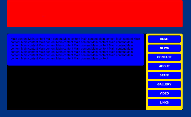
我遇到了一个长期存在的问题:获得两列高度不均匀的内容来填充其父容器,并且长度与内容相同,而且内容会有所不同。我知道这方面的一些黑客,比如在父对象上使用垂直平铺的背景图像来模拟列,但我也希望列上的圆角以及它们是不同的颜色。
父对象的高度由最高'子'列的高度决定,但是垂直较小的列的背景缩小到其内容的大小,使其背景比背景容器短。在这个例子中,我将通常不可见的背景对象着色为可见性,并希望左侧较大的蓝色列垂直填充该区域。在Blue列较高的情况下,我希望反转发生,黄色列填充黑色父对象。
我已将布局简化为最简单的形式,以演示问题,代码和图像如下。
CSS:
html {
    height: 100%;
    width: 100%;
}

body {
    margin: 0px;
    padding: 0px;
    background-color: rgb(0,50,130);
    position: relative;
}

* {
    font-family: Arial, Helvetica, sans-serif;
    font-size: 1em;
    text-align: left;
    margin: 0px;
    border: none;
    padding: 0px;
}

/*auto-centering outer container box*/
.outer {
    margin: 0px auto;
    width: 960px;
    text-align: center;
    position: relative;
}

.top {
    width: 960px;
    height: 150px;
    background-color: rgb(255,0,0);
    border-radius: 6px;
}

.mid {
    width: 960px;
    float: left;
    height: 100%;
    margin-top: 35px;
    background-color: rgb(0,0,0);
}

.midmain {
    width: 710px;
    height: 100%;
    background-color: rgb(0,0,255);
    float: left;
    border-radius: 10px;
    padding: 20px 20px 30px 20px;
    margin-right: 6px;
}

.midside {
    width: 180px;
    height: 100%;
    background-color: rgb(255,225,0);
    float:right;
    border-radius: 6px;
    padding: 10px 10px 10px 10px;
}

/*Text rules for midside*/
.nav {
width: 180px;
}

.nav a, nav a:link{
 display: block;
 width: 178px;
 height: 28px;
 background-color: blue;
 border: 1px solid rgb(0,20,100);
 padding: 10px 0px 0px 0px;
 margin-top: 0px;
 margin-bottom: 10px;
 border-radius: 6px;
 text-align: center;
 text-transform: uppercase;
 font-weight: bold;
 color: white;
 text-decoration: none;
}

.nav a:hover {
color: black;
background-color: white;
border: 1px solid rgb(128,0,0);
margin-top: -2px;
margin-bottom: 12px;
}

.bot {
    width: 960px;
    height: 100px;
    float: left;
    background-color: rgba(255,255,0,0.5);
    margin-top: 10px;
    margin-bottom: 20px;
    border-radius: 6px;
    box-shadow: 2px 2px 3px 3px rgba(0,20,60,0.3);
}
HTML:
<!DOCTYPE html>
<html xmlns="http://www.w3.org/1999/xhtml">
<head>
    <title>Columns</title>
    <link href="styles/col.css" rel="stylesheet" type="text/css" />
</head>
<body>
            <div class="outer">
                <div class="top">

                </div>
                <div class="mid">
                    <div class="midmain">
                        Main content Main content Main content Main content
                        Main content Main content Main content Main content Main content Main content Main content Main content Main content Main content Main content Main content Main content Main content Main content Main content
                        Main content Main content Main content Main content Main content Main content Main content Main content Main content Main content Main content Main content Main content Main content Main content Main content
                        Main content Main content Main content Main content Main content Main content Main content Main content Main content Main content Main content Main content
                    </div>
                    <div class="midside">
                        <div class="nav">
                            <a href="/home.aspx">Home</a>
                            <a href="/news.aspx">News</a>
                            <a href="/edu.aspx">Contact</a>
                            <a href="/board.aspx">About</a>
                            <a href="/staff.aspx">Staff</a>
                            <a href="/hist.aspx">Gallery</a>
                            <a href="/sport.aspx">Video</a>
                            <a href="/footy.aspx">Links</a>
                        </div>
                    </div>
                </div>
            </div>
    </body>
</html>
非常感谢任何建议或帮助!
谢谢, 千瓦
2 个答案:
答案 0 :(得分:1)
更改css中的以下定义:
.mid {
    width: 960px;
    float: left;
    margin-top: 35px;
    background-color: rgb(0,0,0);
    position:relative;
}

.midmain {
    position:absolute;
    width: 710px;
    min-height: calc(100% - 50px);
    background-color: rgb(0,0,255);
    border-radius: 10px;
    padding: 20px 20px 30px 20px;
    margin-right: 6px;
}

.midside {
    width: 180px;
    float:right;
    background-color: rgb(255,225,0);
    border-radius: 6px;
    padding: 10px 10px 10px 10px;
}
使用绝对定位时,子元素的高度是相对于其父元素定义的。
如果您不热衷于min-height: calc(100% - 50px);样式,则可以使用以下内容。它会产生同样的效果:
top:0;
bottom:0;
答案 1 :(得分:0)
我有时会遇到这种情况。基本上针对您希望找到最高(高度)的元素执行此操作,并将该css应用于其他元素。
请注意,您需要(并且应该始终)将box-sizing:border-box;应用于您的所有元素,(例如 - * { box-sizing:border-box;}
var heights = $(".mid > div").map(function ()
    {
        return $(this).outerHeight();
    }).get(),

    maxHeight = Math.max.apply(null, heights);
console.log(maxHeight);

$('.mid > div').css('height',maxHeight);
另请注意,您应该从(2)div元素中删除height(因为它将被覆盖。请记住,您可能“想”将此函数放入{{1如果您正在做响应(您也应该这样做),并且您有更改$(window).resize()等的媒体查询。
相关问题
最新问题
- 我写了这段代码,但我无法理解我的错误
- 我无法从一个代码实例的列表中删除 None 值,但我可以在另一个实例中。为什么它适用于一个细分市场而不适用于另一个细分市场?
- 是否有可能使 loadstring 不可能等于打印?卢阿
- java中的random.expovariate()
- Appscript 通过会议在 Google 日历中发送电子邮件和创建活动
- 为什么我的 Onclick 箭头功能在 React 中不起作用?
- 在此代码中是否有使用“this”的替代方法?
- 在 SQL Server 和 PostgreSQL 上查询,我如何从第一个表获得第二个表的可视化
- 每千个数字得到
- 更新了城市边界 KML 文件的来源?