将最后一个弹性项目放在容器的末尾
此问题涉及具有完整css3支持的浏览器,包括flexbox。
我有一个包含一些物品的弹性容器。他们都有理由进行flex-start,但我希望 last .end项被证明是flex-end的。有没有一种很好的方法可以在不修改HTML的情况下进行,而不需要求助于绝对定位?
.container {
  display: flex;
  flex-direction: column;
  outline: 1px solid green;
  min-height: 400px;
  width: 100px;
  justify-content: flex-start;
}
p {
  height: 50px;
  background-color: blue;
  margin: 5px;
}
<div class="container">
<p></p>
<p></p>
<p></p>
<p class="end"></p>
</div>
2 个答案:
答案 0 :(得分:106)
Flexible Box Layout Module - 8.1. Aligning with auto margins
弹性项目的自动边距效果与块流程中的自动边距非常相似:
在计算弹性基座和弹性长度时,自动边距被视为0。
在通过
justify-content和align-self进行对齐之前,任何正的可用空间都会分配到该维度中的自动边距。
因此,您可以使用margin-top: auto在其他元素和最后一个元素之间分配空间。这会将元素放在底部。
.end {
  margin-top: auto;
}
您还可以避免使用类并使用:last-of-type / last-child伪类。
p:last-of-type {
  margin-top: auto;
}
.container {
  display: flex;
  flex-direction: column;
  outline: 1px solid green;
  min-height: 400px;
  width: 100px;
  justify-content: flex-start;
}
p {
  height: 50px;
  background-color: blue;
  margin: 5px;
}
.end {
  margin-top: auto;
}
<div class="container">
<p></p>
<p></p>
<p></p>
<p class="end"></p>
</div>
答案 1 :(得分:41)
此flexbox原则也可以水平工作
在计算柔性基座和灵活长度时,自动边距 被视为0。在通过对齐内容和对齐之前 align-self,任何正的自由空间都分配给自动边距 那个维度。
为最后一项设置自动左边距将完成工作。
.last-item {
  margin-left: auto;
}
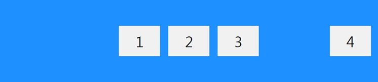
代码示例:
.container {
  display: flex;
  width: 400px;
  outline: 1px solid black;
}

p {
  height: 50px;
  width: 50px;
  margin: 5px;
  background-color: blue;
}

.last-item {
  margin-left: auto;
}
<div class="container">
<p></p>
<p></p>
<p></p>
<p class="last-item"></p>
</div>
这对于桌面页脚非常有用。
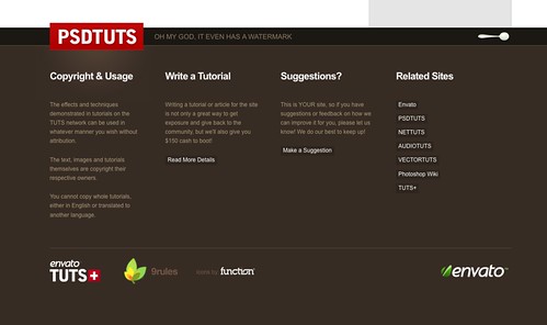
正如 Envato 在这里做了公司徽标。
相关问题
最新问题
- 我写了这段代码,但我无法理解我的错误
- 我无法从一个代码实例的列表中删除 None 值,但我可以在另一个实例中。为什么它适用于一个细分市场而不适用于另一个细分市场?
- 是否有可能使 loadstring 不可能等于打印?卢阿
- java中的random.expovariate()
- Appscript 通过会议在 Google 日历中发送电子邮件和创建活动
- 为什么我的 Onclick 箭头功能在 React 中不起作用?
- 在此代码中是否有使用“this”的替代方法?
- 在 SQL Server 和 PostgreSQL 上查询,我如何从第一个表获得第二个表的可视化
- 每千个数字得到
- 更新了城市边界 KML 文件的来源?