如何实现这种CSS布局?
我不太擅长用文字描述这个问题,所以我画了一张带有布局应该具有的属性的小图片。
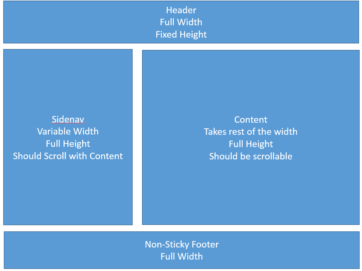
我尝试了几种可能性,但如果没有绝对定位和灵活盒,我无法实现这一点。我对css hacks也不太熟悉。
对于只有CSS和IE9 +(如果可能的IE8)兼容性的这种布局,有没有人有解决方案?
提前致谢
2 个答案:
答案 0 :(得分:1)
这很简单。
HTML
<header>
</header>

<section>

  <aside>
  </aside>

  <article>
  </article>

</section>

<footer>
</footer>
CSS
footer,
header {
  width: 100%;
}
section {
  width: 100%;
}
section:after {
  display: table;
  content: '';
  clear: both;
}
aside {
  width: 30%;
  float: left;
}
article {
  width: 60%;
  float: right;
}
答案 1 :(得分:1)
这是我的解决方案,祝你好运,欢迎来到前端世界。
HTML:
<body>
    <div class="wrapper">
        <div id="header"></div>
        <div id = "content">
            <div class="sidenav"></div>
            <div class="info"></div>
        </div>
        <div id="footer"></div>
    </div>
</body>
CSS:
body {
    width: 100%;
    height: 100%;
    margin: 0;
    padding: 0;
}

.wrapper {
    min-height:100%;
    position:relative;
}

#header {
    position: fixed;
    top: 0;
    z-index: 9999;
    padding-left: 0;
    padding-right: 0;
    width: 100%;
    height: 4em;
    background: navy;
}

#footer {
    width: 100%;
    height: 4em;
    position: absolute;
    bottom: 0;
    left: 0;
    background-color: pink;
}

#content {
    width: 100%;
    height: 2000px;
    display: inline-block;
    padding-top: 4em; /*same height header*/
    margin-top: 1em;
    margin-bottom: 1em;
    padding-bottom: 4em;
    /* or:
    padding: 4em 0 4em 0;
    margin: 1em 0 1em 0;
   */
}

.sidenav {
    float:left;
    width:500px;
    height: 100%;
    background-color: gray;
    margin-right: 1em;
}

.info {
    overflow:hidden;
    height: 100%;
    background-color: purple;
}
相关问题
最新问题
- 我写了这段代码,但我无法理解我的错误
- 我无法从一个代码实例的列表中删除 None 值,但我可以在另一个实例中。为什么它适用于一个细分市场而不适用于另一个细分市场?
- 是否有可能使 loadstring 不可能等于打印?卢阿
- java中的random.expovariate()
- Appscript 通过会议在 Google 日历中发送电子邮件和创建活动
- 为什么我的 Onclick 箭头功能在 React 中不起作用?
- 在此代码中是否有使用“this”的替代方法?
- 在 SQL Server 和 PostgreSQL 上查询,我如何从第一个表获得第二个表的可视化
- 每千个数字得到
- 更新了城市边界 KML 文件的来源?