iOS上的IFrame高度问题(移动版游记)
示例页面来源:
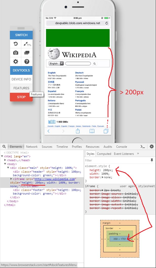
<!DOCTYPE html>
<html lang="en">
<head>
    <meta charset="UTF-8">
    <meta name="viewport" content="width=device-width, initial-scale=1, maximum-scale=1, user-scalable=no">
    <title>Page</title>
</head>
<body>
<div class="main" style="height: 100%;">
    <div class="header" style="height: 100px; background-color: green;"></div>

    <iframe src="http://www.wikipedia.com"
            style="height: 200px; width: 100%; border: none;"></iframe>

    <div class="footer" style="height: 100px; background-color: green;"></div>
</div>
</body>
</html>
问题是,在移动设备中忽略了IFrame内联样式的height 200px:
此外,我想通过vanilla JavaScript动态更改IFrame的高度,而这些JavaScript根本无法使用以下代码:
document.getElementsByTagName('iframe')[0].style.height = "100px"
height样式的值根据开发工具正确更改,但它被忽略,因为IFrame的实际渲染高度不会改变。
这似乎只是移动版Safari中的问题,并且在最新版本的桌面Safari,Firefox,Chrome,Androids WebView等上正常运行。
测试页:http://devpublic.blob.core.windows.net/scriptstest/index.html
Ps。:我在browserstack上使用各种设备对此进行了测试,并在那里拍摄了截图,因为我手头没有实际的iDevice。
3 个答案:
答案 0 :(得分:13)
看起来像这样:How to get an IFrame to be responsive in iOS Safari?
iFrames仅在iOS上存在问题,因此您必须调整iframe。
你可以把一个div包装在iframe上,在iframe上设置css,对我有用的是添加:put属性scrolling ='no'。
祝你好运。
答案 1 :(得分:9)
我遇到了同样的问题。在尝试了我能找到的所有解决方案之后,我终于找到了如何解决它。
这个问题是由iOS Safari引起的,它会自动消耗iframe的高度来适应里面的页面内容。
如果你把滚动=&#39; no&#39;属性为<iframe scrolling='no' src='content.html'>的iframe,此问题可以解决,但iframe无法显示页面的完整内容,超出框架的内容将被剪切。
所以我们需要放一个div包装iframe,然后处理它中的scroll事件。
<style>
.demo-iframe-holder {
  width: 500px;
  height: 500px;
  -webkit-overflow-scrolling: touch;
  overflow-y: scroll;
}

.demo-iframe-holder iframe {
  height: 100%;
  width: 100%;
}
</style>

<html>
<body>
    <div class="demo-iframe-holder">
        <iframe src="content.html" />
    </div>
</body>
</html>
参考:
https://davidwalsh.name/scroll-iframes-ios
How to get an IFrame to be responsive in iOS Safari?
希望它有所帮助。
答案 2 :(得分:-1)
问题:
我遇到了同样的问题。调整/样式化iframe的容器div并向iframe添加scrolling =“no”对我来说不起作用。像Freya描述的滚动溢出也不是一个选项,因为我的iframe的内容需要根据父容器来调整大小。以下是我的原始(不工作,溢出其容器)iframe代码的结构:
<style>
    .iframe-wrapper {
        position: relative;
        height: 500px;
        width:   100%;
    }

    .iframe {
        display: block;
        position: absolute;
        top:    0;
        bottom: 0;
        left:   0;
        right:  0;
        width:  100%;
        height: 100%;
    }
</style>

<div class="iframe-wrapper">
    <iframe frameborder="0" scrolling="no" class="iframe" src="content.html"></iframe>
</div>
解决方案:
这个超级简单的小CSS黑客做了诀窍:
<style>
    .iframe-wrapper {
        position: relative;
        height: 500px;
        width:   100%;
    }

    .iframe {
        display: block;
        position: absolute;
        top:    0;
        bottom: 0;
        left:   0;
        right:  0;
        width:  100px;
        min-width:  100%;
        height: 100px;
        min-height: 100%;
    }
</style>

<div class="iframe-wrapper">
    <iframe frameborder="0" scrolling="no" class="iframe" src="content.html"></iframe>
</div>
将iframe的高度/宽度设置为一些小的随机像素值。设置它的最小高度&amp;最小宽度到你真正想要的高度/宽度。这完全解决了我的问题。
- 我写了这段代码,但我无法理解我的错误
- 我无法从一个代码实例的列表中删除 None 值,但我可以在另一个实例中。为什么它适用于一个细分市场而不适用于另一个细分市场?
- 是否有可能使 loadstring 不可能等于打印?卢阿
- java中的random.expovariate()
- Appscript 通过会议在 Google 日历中发送电子邮件和创建活动
- 为什么我的 Onclick 箭头功能在 React 中不起作用?
- 在此代码中是否有使用“this”的替代方法?
- 在 SQL Server 和 PostgreSQL 上查询,我如何从第一个表获得第二个表的可视化
- 每千个数字得到
- 更新了城市边界 KML 文件的来源?