是否可以在圆圈周围放置物品?
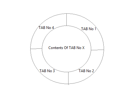
我正在尝试制作一个圆圈并在其周围放置3个等于它的部分。 我在网站上看到了下面的图片,但我想要三个等于而不是四个。
我希望他们(部分)就像一个按钮。如果有人点击它们,他们会引用另一页。
我尝试了很多但没有成功。我的目标是圈子周围的每个按钮都会引用另一个页面。是否可以使用HTML和CSS来实现?如果是,怎么样?
3 个答案:
答案 0 :(得分:3)
使用CSS:
创建此形状的一种纯CSS方法是使用CSS skew转换。由于您需要在零件上单击事件,因此最好使用单独的元素而不是使用伪元素。
.outer {
  position: relative;
  height: 200px;
  width: 200px;
  border-radius: 50%;
  border: 2px solid;
  overflow: hidden;
}
.inner {
  position: absolute;
  height: 50%;
  width: 50%;
  top: calc(25% - 2px);
  left: calc(25% - 2px);
  border-radius: 50%;
  background: yellowgreen;
  border: 2px solid;
}
.part {
  position: absolute;
  height: 100%;
  width: 100%;
}
.part:nth-child(2) {
  top: -50%;
  left: calc(-50% - 2px);
  transform: skewY(-30deg);
  transform-origin: right bottom;
  background: red;
  border: 2px solid;
}
.part:nth-child(3) {
  top: -50%;
  right: calc(-50% - 2px);
  transform: skewY(30deg);
  transform-origin: left bottom;
  background: green;
  border: 2px solid;
}
.part:nth-child(1) {
  top: 0%;
  left: 0%;
  width: 100%;
  background: yellow;
}
.part:hover {
  background: chocolate;
}
.part:nth-child(1) p{
  position: absolute;
  top: 85%;
  left: 50%;
  transform: translateX(-50%) translateY(-100%);
}
.part:nth-child(2) p{
  position: absolute;
  top: 50%;
  left: 55%;
  transform: skewY(30deg);
}
.part:nth-child(3) p{
  position: absolute;
  top: 50%;
  left: 30%;
  transform: skewY(-30deg);
}
<div class='outer'>
<div class='part'><p>Text</p></div>
<div class='part'><p>Text</p></div>
<div class='part'><p>Text</p></div>
<div class='inner'></div>
</div>
使用SVG:
我仍然建议使用SVG来创建这样的形状,因为它可以更好地控制圆形及其部分。应通过识别圆上的点来设置路径的坐标。 my answer here中描述了识别圆上点的逻辑。它使用三角法。
svg {
  height: 30vw;
  width: 30vw;
}
svg circle {
  fill: transparent;
  stroke: black;
}
path {
  stroke: black;
}
#part1 {
  fill: green;
}
#part2 {
  fill: yellow;
}
#part3 {
  fill: red;
}
#inner {
  fill: yellowgreen;
}
#part1:hover,
#part2:hover,
#part3:hover {
  fill: chocolate;
}
<svg viewBox='0 0 100 100'>
<defs>
<path d='M13.63,71 A42,42 0 0,1 50,8' id='path1' />
<path d='M50,8 A42,42 0 0,1 86.37,71' id='path2' />
<path d='M13.63,76 A42,42 0 0,0 86.37,76' id='path3' />
</defs>
<path d='M50,0 A50,50 0 0,0 7,75 L50,50z' id='part1' /> <!-- should use trignometry to calculate points - angle = 30deg -->
<path d='M50,0 A50,50 0 0,1 93,75 L50,50z' id='part2' /> <!-- should use trignometry to calculate points - angle = 300deg -->
<path d='M7,75 A50,50 0 0,0 93,75 L50,50z' id='part3' /> <!-- should use points calculated for previous two paths -->
<circle cx='50' cy='50' r='40' id='inner' />
<text font-family="Calibri" font-size="8" x="28">
<textPath xlink:href="#path1">
Tab 1 Text
</textPath>
</text>
<text font-family="Calibri" font-size="8" x="28">
<textPath xlink:href="#path2">
Tab 2 Text
</textPath>
</text>
<text font-family="Calibri" font-size="8" x="28">
<textPath xlink:href="#path3">
Tab 3 Text
</textPath>
</text>
</svg>
答案 1 :(得分:3)
好的,从列表中你可以使用绝对+变形: DEMO
ul,
li {
  margin: 0;
  padding: 0;
  list-style-type: none;
  display: block;
  box-sizing: border-box;
  overflow: hidden;
}

ul {
  margin: 1em auto;
  height: 300px;
  width: 300px;
  border: solid;
  border-radius: 50%;
  transform: rotate(45deg);
  background: #1D69A3;
}

li a {
  box-shadow: 0 0 5px;
  height: 100%;
  width: 100%;
  margin: -50%;
  position: absolute;
  background: tomato;
  top: 0;
  left: 0;
  transform-origin: bottom right;
  transform: rotate(0deg) skew(-15deg, -15deg);
}

li:nth-child(2) a {
  transform-origin: bottom left;
  transform: rotate(30deg) skew(15deg, 15deg);
  background: turquoise;
  top: 0;
  left: 100%;
}

li:nth-child(3) a {
  transform-origin: top right;
  top: auto;
  left: 0;
  bottom: 0;
  transform: rotate(-30deg) skew(15deg, 15deg);
  background: #7F9A12
}


/* hide center ? */

ul:before {
  content: '';
  position: absolute;
  top: 25%;
  left: 25%;
  right: 25%;
  bottom: 25%;
  background: purple;
  z-index: 1;
  border-radius: 50%;
  box-shadow: 0 0 5px, inset 15px 5px 15px 5px rgba(255, 255, 255, 0.2);
  border: solid 1px;
}
/* see some effects on hover */

a:hover {
  mix-blend-mode: multiply
}
ul:hover:before {
  mix-blend-mode:color
}
<ul>
<li><a href="#"><b>item 1</b></a></li><!-- <b> is here if you wish to add text and style in order to show it -->
<li><a href="#"><b>item 2</b></a></li>
<li><a href="#"><b>item 3</b></a></li>
</ul>
答案 2 :(得分:1)
你可以使用border-radius,
创建四个边框半径为50%的div和一个内部为100%边框半径的div,用于内容
<div class="container">
<div class="around top-left">
</div>
<div class="around top-right">
</div>
<div class="around bottom-left">
</div>
<div class="around bottom-right">
</div>
<div class="content">
</div>
</div>
CSS:
.container{
  position:relative;
  width:200px;
  height:200px;
}
.content{
  width:50%;
  height:50%;
  left:50px;
  top:50px;
  position:absolute;
  background-color:white;
  z-index:1;
  border-radius:50%;
}
.around{
  background-color:red;
  width:100px;
  height:100px;
  display:inline-block;
  position:absolute;
}
.top-left{border-top-left-radius:100%; top:0; left:0; background:blue;}
.top-right{border-top-right-radius:100%; top:0; right:0;background:green;}
.bottom-left{border-bottom-left-radius:100%; bottom:0; left:0;background:orange;}
.bottom-right{border-bottom-right-radius:100%; bottom:0; right:0;background:purple;}
相关问题
最新问题
- 我写了这段代码,但我无法理解我的错误
- 我无法从一个代码实例的列表中删除 None 值,但我可以在另一个实例中。为什么它适用于一个细分市场而不适用于另一个细分市场?
- 是否有可能使 loadstring 不可能等于打印?卢阿
- java中的random.expovariate()
- Appscript 通过会议在 Google 日历中发送电子邮件和创建活动
- 为什么我的 Onclick 箭头功能在 React 中不起作用?
- 在此代码中是否有使用“this”的替代方法?
- 在 SQL Server 和 PostgreSQL 上查询,我如何从第一个表获得第二个表的可视化
- 每千个数字得到
- 更新了城市边界 KML 文件的来源?