响应div横幅内容
响应包含图像和内容的DIV
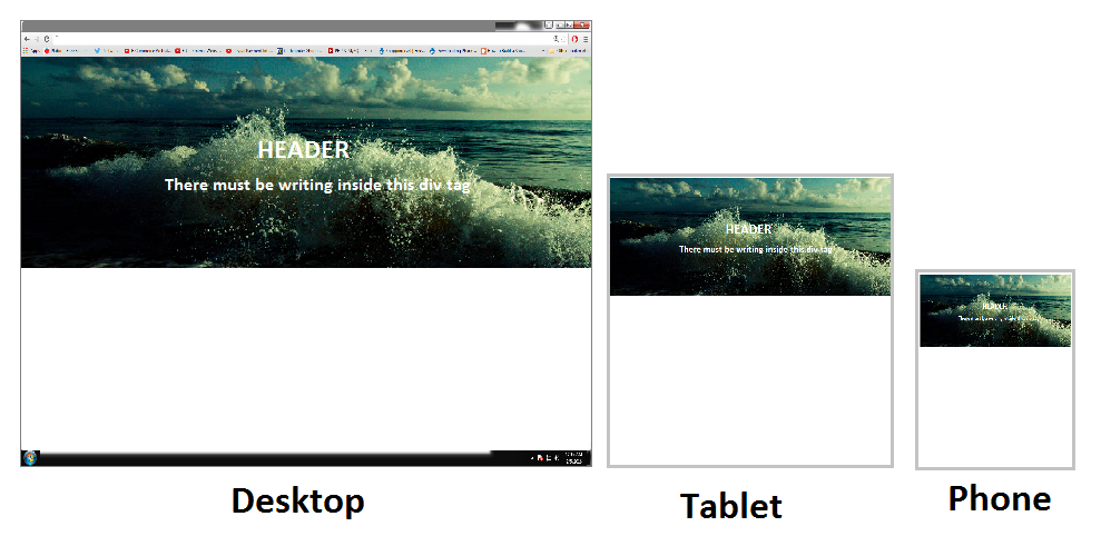
我正在尝试使用包含背景图像的div,其中包含内容(书写),如图所示。 div需要响应,图像必须保持100%并达到但不超过屏幕的框架,无论屏幕大小。
问题在于,当我缩小时,通过按ctrl并向下滚动鼠标,图像会丢失很多高度,而不是保持相同的高度。如何让它在放大和缩小时不会失去高度。
我已经尝试了一切,这是我最好的
enter code here


       <div id="container">
            <div class="content-inner">
                <h1>HELLO!!</h1>
                <hr>
                <p>I HAVE A QUESTION AND WAS WONERING IF YOU CAN HELP?</p>

            </div>
        </div>


<style>
html, body{
margin:0;
}
#container {
    position:relative;
    border:1px solid red;
    position: relative;
    width: 100%;
    min-height: auto;
    text-align: center;
    color: #fff;

    background: radial-gradient(circle, rgba(17, 5, 19, 0.94), rgba(20, 7, 35, 0.78), rgb(0, 0, 0)), url(backgrounddark.png) no-repeat;
    background-position: center;
    -webkit-background-size: cover;
    -moz-background-size: cover;
    background-size: cover;
    -o-background-size: cover;
            }

#container .content-inner {
    position: relative;
    width: 50%;
    padding: 100px 15px;
    text-align: center;
    margin:auto;
                        }

#container .content-inner .content-inner h1 {
    margin-top: 0;
    margin-bottom: 0;
    text-transform: uppercase;
    font-weight: 700;
}

#container .content-inner .content-inner hr {
    margin: 30px auto;
}

#container .content-inner .content-inner p {
    margin-bottom: 50px;
    font-size: 16px;
    font-weight: 300;
    color: rgba(255,255,255,.7);
}


</style>
谢谢
1 个答案:
答案 0 :(得分:1)
在您的代码中,您没有设置容器的高度,并且min-height设置为auto,这意味着它将扩展到div中包含的内容的大小。背景图片不被视为内容。
缩小时,与屏幕尺寸相比,字体大小和填充更小,这使得div更小(内容变小,div高度变小)。
如果您希望能够在不使图像变小的情况下缩小(即使文本有效),我建议设置div的高度。您可以使用vh单位将其设置为视口高度的百分比(有关浏览器支持,请参阅此处,它非常好,但我不知道您的方案:http://caniuse.com/#feat=viewport-units)。或者,您可以将#container上方的所有元素设置为高度或最小高度为100%,这样您就可以使用百分比作为#container的高度/最小高度值。
请注意,如果使用动态高度,文本将不会自动垂直居中,则需要额外的CSS(请参阅此Vertically align text in a div)。
相关问题
最新问题
- 我写了这段代码,但我无法理解我的错误
- 我无法从一个代码实例的列表中删除 None 值,但我可以在另一个实例中。为什么它适用于一个细分市场而不适用于另一个细分市场?
- 是否有可能使 loadstring 不可能等于打印?卢阿
- java中的random.expovariate()
- Appscript 通过会议在 Google 日历中发送电子邮件和创建活动
- 为什么我的 Onclick 箭头功能在 React 中不起作用?
- 在此代码中是否有使用“this”的替代方法?
- 在 SQL Server 和 PostgreSQL 上查询,我如何从第一个表获得第二个表的可视化
- 每千个数字得到
- 更新了城市边界 KML 文件的来源?