如何使用CSS实现这种视觉效果
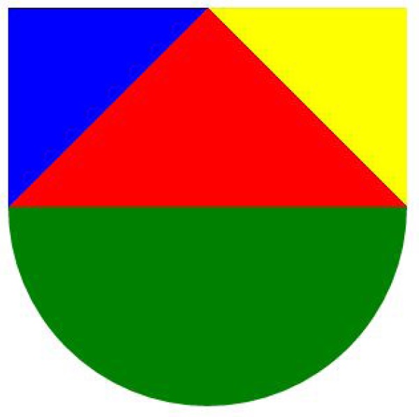
我需要仅使用css创建上述视觉效果,并且只需要一个高度和宽度为300px的div。我尝试过渐变但却得不到任何相同的东西。有人可以帮忙吗?
2 个答案:
答案 0 :(得分:1)
渐变是个好主意,你甚至可以添加内容,无论渐变的大小,只要你把它的大小设为正方形:
div {
  background-color: red;
  border-radius: 0 0 50% 50%;
  background-image:
       linear-gradient(-45deg, transparent 75%, blue 75%),
       linear-gradient(45deg, transparent 75%, yellow 75%),
       linear-gradient(to top, green 50%, transparent 50%);
  height: 300px;
  width: 300px;
  transition:0.5s;
}
div:hover {
  height: 150px;
  width: 150px;
}
/* fun */

div {
  display: flex;
  align-items: center;
  justify-content: center;
  text-align: center;
  font-size: 2.5em;
  color: white;
  text-shadow: 0 0 1px black, 0 0 1px black, 0 0 1px black, 0 0 1px black, 0 0 1px black, 0 0 1px black;
  box-shadow: 0 0 5px gray, inset 0 0 0 3px white,inset 0 0 5px black;
}
<div>Hover me</div>
答案 1 :(得分:0)
您可以尝试使用几个div,然后将其封装在一个div中。 在JSfiddle上查看我的代码。
.main {
  width: 300px;
  height: 300px;
}
.first {
  width: 300px;
  height: 150px;
}
.blue {
  width:150px;
  height: 150px;
  position: relative;
  float: left;
  background-color: blue;
}
.yellow {
  width:150px;
  height: 150px;
  position: relative;
  float: right;
  background-color: yellow;
}
.green {
  width: 300px;
  height: 150px;
  background-color: green;
  border-radius: 0 0 500px 500px;
}

.red {
  position: relative;
  height: 150px;
  top: -400px;
  border-left: 150px solid transparent;
  border-right: 150px solid transparent;
  border-bottom: 150px solid red;
}


<div class="main">
  <div class="first">
    <div class="blue">
    </div>
    <div class="yellow">
    </div>
  </div>
  <div class="green">
  </div>
  <div class="red">
  </div>
</div>
相关问题
最新问题
- 我写了这段代码,但我无法理解我的错误
- 我无法从一个代码实例的列表中删除 None 值,但我可以在另一个实例中。为什么它适用于一个细分市场而不适用于另一个细分市场?
- 是否有可能使 loadstring 不可能等于打印?卢阿
- java中的random.expovariate()
- Appscript 通过会议在 Google 日历中发送电子邮件和创建活动
- 为什么我的 Onclick 箭头功能在 React 中不起作用?
- 在此代码中是否有使用“this”的替代方法?
- 在 SQL Server 和 PostgreSQL 上查询,我如何从第一个表获得第二个表的可视化
- 每千个数字得到
- 更新了城市边界 KML 文件的来源?