如何自动调整底部固定页脚的高度
我希望达到上传图片中提到的预期效果。以下是两种观点的解释:
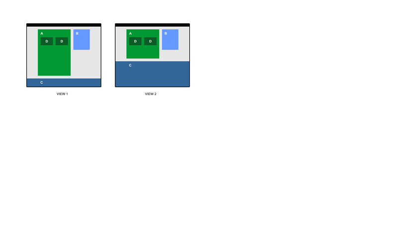
我总是希望区域A和区域C之间的边距为20px。如果屏幕尺寸发生变化,区域C应填满间隙(如图2所示),保持区域A和区域C之间的边距始终为20px。目前,每当屏幕尺寸改变区域A和区域C之间的间隙时增加或减少我不想要的,而应该由区域C填充。
的index.html
<!DOCTYPE html>
  <html lang="en-US">
  <head>
    <meta charset="UTF-8" />
    <title>Learn</title>
    <link href = "styles.css" rel = "stylesheet">
  </head>

  <body>
    <div style="text-align:center;">
      <div class="boxA">
        <h2>A</h2>
        <div class="boxD"><h2>D</h2></div>
        <div class="boxD"><h2>D</h2></div>
      </div>
      <div class="boxB">
        <h2>B</h2>
      </div>
      <div class="boxC">
        <h2>C</h2>
      </div>
    </div>
  </body>
</html>
styles.css的
html, body {
  margin:0;
  padding:0;
  width:100%;
  height:100%;
}
body, h2{
  margin: 0;
}

.boxA{
  width: 500px;
  height: 580px;
  background-color: #006400;
  margin-top: 20px;
  margin-right: 20px;
  display: inline-block;
  margin-bottom: 0px;
}

.boxB{
  width: 300px;
  height: 350px;
  background-color: blue;
  display: inline-block;
}

.boxC{
  width: 100%;
  background-color: yellow;
  margin-top: 20px;
  position:absolute;
  bottom: 0px;
}

.boxD{
  width:220px;
  display: inline-block;
  background-color: red;
  margin-left:20px;
  float:left;
}
注意:我想通过CSS实现这一目标。没有Javascript。
1 个答案:
答案 0 :(得分:1)
flexbox属性在这里派上用场。请在Mozilla Developer Network或CSS-Tricks了解详情。
CSS3 Flexible Box 或 flexbox ,是一种布局模式,提供 在页面上排列元素以使元素表现出来 可预见的是,页面布局必须适应不同的屏幕 尺寸和不同的显示设备。对于许多应用程序, 灵活的盒子模型提供了对块模型的改进 它不使用浮点数,也不使用弹性容器的边距 崩溃与其内容的边缘。
我复制了您提供的图像,并将内容与页脚的比例设置为4:1(或值的80%到20%)。请查看下面的代码,并确保查看全屏版本以查看其是否正常工作,或查看this JSFiddle。您可以根据需要更改值,但主要部分是:
.wrapper {
  display: flex;
  flex-direction: column;
  align-items: stretch;
  align-content: stretch;
  justify-content: flex-start;
}
它会在各种子元素中重复以满足需要。
body,
html {
  width: 100%;
  height: 100%;
  margin: 0;
  padding: 0;
}

.wrapper {
  height: 100%;
  width: 100%;
  display: flex;
  flex-direction: column;
  align-items: stretch;
  align-content: stretch;
  justify-content: flex-start;
}

.container {
  display: flex;
  flex-flow: row wrap;
  height: 80%;
  width: 100%;
  background: lightgray;
}

.green {
  display: flex;
  flex-flow: row wrap;
  margin: 20px;
  width: 60%;
  background: lightgreen;
}

.box {
  width: calc(50% - 50px);
  margin: 20px;
  background: darkgreen;
  box-sizing: border-box;
}

.blue {
  margin: 20px;
  width: 30%;
  max-height: 50%;
  background: blue;
}

.footer {
  height: 20%;
  background: lightblue;
}
<div class="wrapper">
<div class="container">
<div class="green">
a
<div class="box">d</div>
<div class="box">d</div>
</div>
<div class="blue">
b
</div>
</div>
<div class="footer">
c
</div>
</div>
相关问题
最新问题
- 我写了这段代码,但我无法理解我的错误
- 我无法从一个代码实例的列表中删除 None 值,但我可以在另一个实例中。为什么它适用于一个细分市场而不适用于另一个细分市场?
- 是否有可能使 loadstring 不可能等于打印?卢阿
- java中的random.expovariate()
- Appscript 通过会议在 Google 日历中发送电子邮件和创建活动
- 为什么我的 Onclick 箭头功能在 React 中不起作用?
- 在此代码中是否有使用“this”的替代方法?
- 在 SQL Server 和 PostgreSQL 上查询,我如何从第一个表获得第二个表的可视化
- 每千个数字得到
- 更新了城市边界 KML 文件的来源?