дҪҝз”ЁCSSйҖҗжёҗжӣҙж”№еӣҫеғҸпјҲж“ҰйҷӨиҝҮжёЎпјү
жҲ‘жңүдёҖдёӘеҘҮжҖӘзҡ„й—®йўҳгҖӮиҝҷеҫҲеҘҮжҖӘпјҢеӣ дёәжҲ‘еҫҲйҡҫи§ЈйҮҠжҲ‘зҡ„ж„ҸжҖқгҖӮжҲ‘ж„ҸиҜҶеҲ°пјҢжҲ‘еҸҜд»Ҙеҫ—еҲ°дёҖдәӣиҙҹйқўеҸҚйҰҲпјҢдҪҶжІЎжңүе…¶д»–ең°ж–№еҸҜд»Ҙй—®гҖӮ
жҲ‘жӯЈеңЁжҗңзҙўзҡ„жҳҜCSSдёӯзҡ„дёҖз§ҚжҠҖжңҜпјҲжҲ–иҖ…еҰӮжһңдёҚеҸҜиғҪпјҢйӮЈд№Ҳд№ҹжҳҜJavaScriptпјүпјҢд»ҘдҫҝеңЁжӮ¬еҒңж—¶йҖҗжёҗжӣҙж”№еӣҫеғҸгҖӮжҲ‘дёҚеёҢжңӣе®ғдёҖдёӢеӯҗж·ЎеҮәжҲ–ж”№еҸҳж•ҙдёӘеӣҫеғҸгҖӮжҲ‘жғіиҰҒзҡ„жҳҜжӢҘжңүдёҖдёӘеӣҫеғҸпјҢеҪ“жҲ‘з”Ёйј ж ҮжӮ¬еҒңе®ғж—¶пјҢеӣҫеғҸзҡ„жӮ¬еҒңйғЁеҲҶдјҡеҸ‘з”ҹеҸҳеҢ–пјҢжҲ‘и¶ҠжҳҜжӮ¬жө®еңЁжҲ‘зҡ„еӣҫеғҸдёҠпјҢжҲ‘е°ұи¶ҠиғҪзңӢеҲ°еҸҰдёҖдёӘеӣҫеғҸгҖӮжҲ‘еёҢжңӣиҝҷдёӘжҸҸиҝ°е·Із»Ҹи¶іеӨҹдәҶгҖӮеҜ№дёҚиө·пјҢжҲ‘дёҚзҹҘйҒ“иҝҷжҳҜжҖҺд№ҲеӣһдәӢгҖӮ
жҲ‘еҒҡдәҶзұ»дјјжҲ‘еңЁжғізҡ„дәӢжғ…пјҲhttps://jsbin.com/xurokogicu/edit?html,css,outputпјү дҪҶиҝҷжҳҜж»ҡеҠЁзҡ„пјҢжҲ‘еёҢжңӣеҪ“жҲ‘з”Ёйј ж ҮжӮ¬еҒңеӣҫеғҸж—¶дјҡеҸ‘з”ҹиҝҷз§Қжғ…еҶөгҖӮ
еёҢжңӣдҪ зҗҶи§ЈжҲ‘еңЁиҝҷйҮҢиҜҙзҡ„д»»дҪ•иҜқпјҢ
жҸҗеүҚиҮҙи°ўпјҒ
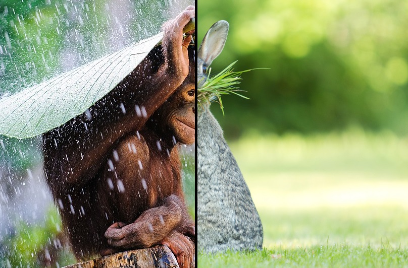
зј–иҫ‘пјҡ иҝҷжҳҜдёӨеј еӣҫзүҮпјҢд»ҘдҫҝжӣҙеҘҪең°зҗҶи§ЈжҲ‘зҡ„жғіжі•гҖӮй»‘зәҝиЎЁзӨәиҜҘиЎҢпјҲеһӮзӣҙпјүдёҠзҡ„жҹҗеӨ„жҳҜйј ж Үе…үж ҮгҖӮеҰӮжһңжҲ‘е°Ҷйј ж ҮжӮ¬еҒңеңЁе·Ұдҫ§пјҢеҲҷй»‘зәҝдјҡеҗ‘е·Ұ移еҠЁе№¶жҳҫзӨәе…¶д»–еӣҫеғҸзҡ„дёҖйғЁеҲҶгҖӮжүҖд»Ҙеҹәжң¬дёҠиө·еҲқе°ұжңүиҝҷеј зҢҙеӯҗз…§зүҮ然еҗҺпјҢж— и®әжҲ‘еңЁе“ӘйҮҢпјҢйғҪдјҡеҮәзҺ°й»‘зәҝпјҢеңЁеҸідҫ§жҳҫзӨәе…¶д»–еӣҫеғҸгҖӮ

EDIT2пјҡ дјҷ计们пјҢжҲ‘们жүҫеҲ°дәҶдёҖдёӘжҲ‘зҡ„ж„ҸжҖқзҡ„е®һдҫӢпјҡjpegmini.com дҪҶйҡҸзқҖдёҚеҗҢзҡ„еӣҫеғҸгҖӮ зҺ°еңЁжҲ‘иҰҒй—®зҡ„жҳҜжҲ‘иҜҘжҖҺд№ҲеҒҡпјҢжҲ–иҖ…жҖҺд№Ҳз§°е‘је®ғпјҢеӣ дёәжҲ‘зҡ„й—®йўҳжІЎжңүзӯ”жЎҲгҖӮ В жҲ‘д№ҹдјҡдёәе…¶д»–дәәжҗңзҙўж Үйўҳзҡ„еҗҚз§°гҖӮ
EDIT3пјҡ жҲ‘们已з»ҸжүҫеҲ°дәҶзӯ”жЎҲпјҢиҝҷжӯЈжҳҜжҲ‘дёҖзӣҙеңЁеҜ»жүҫзҡ„пјҡ
JS
var ctx = c.getContext("2d"),
img = new Image();         // image to show

img.onload = start;
img.src = "link to img";

function start() {
  c.onmousemove = function(e) {
    var r = c.getBoundingClientRect(),
        x = e.clientX - r.left;
    ctx.clearRect(0, 0, c.width, c.height);
    ctx.drawImage(img, 0, 0, x, c.height,  0, 0, x, c.height);
    ctx.fillRect(x, 0, 5, c.height);
  };

}
CSS
#c {
  background: url(link to other img);
  background-size: cover;
  }
HTML
<canvas id=c width=620 height=400></canvas>
2 дёӘзӯ”жЎҲ:
зӯ”жЎҲ 0 :(еҫ—еҲҶпјҡ5)
жҲ‘дјҡдҪҝз”Ёcanvas + CSSгҖӮиҝҷжҳҜеӣ дёәе®ғеҸҜд»Ҙи®©дҪ е®Ңе…ЁжҺ§еҲ¶йј ж Ү移еҠЁпјҢ并жҸҗдҫӣдёҖз§Қз®ҖеҚ•зҡ„ж–№жі•жқҘд»Ӣз»ҚжқЎеҪўе’ҢдёҚеҗҢзұ»еһӢзҡ„ж“ҰжӢӯе·ҫпјҲеҜ№и§’зәҝпјҢиҮӘе®ҡд№үзӯүпјүпјҢеҰӮжһңдҪ ж„ҝж„Ҹзҡ„иҜқгҖӮ
- е°ҶиғҢжҷҜеӣҫеғҸе®ҡд№үдёәcanvasе…ғзҙ зҡ„CSS
- еңЁйЎ¶йғЁеӣҫеғҸдёӯз»ҳеҲ¶еүӘиЈҒеҲ°йј ж ҮдҪҚзҪ®
е®һж–ҪдҫӢ
var ctx = c.getContext("2d"),
    img = new Image();         // image to show

img.onload = start;
img.src = "//i.imgur.com/mS4R13a.png";

function start() {
  c.onmousemove = function(e) {
    var r = this.getBoundingClientRect(),
        x = e.clientX - r.left;
    ctx.clearRect(0, 0, c.width, c.height);                     // clear canvas for new draw
    ctx.drawImage(img, 0, 0, x, c.height,  0, 0, x, c.height);  // clip and draw image to x
    ctx.fillRect(x, 0, 5, c.height);                            // draw a thin black bar
  };
}
#c {
background: url(//i.imgur.com/GQ6xVAT.png);
background-size: cover;
}<canvas id=c width=620 height=400></canvas>
зӯ”жЎҲ 1 :(еҫ—еҲҶпјҡ2)
еҲӣе»әjsBinжј”зӨәдёӯжҳҫзӨәзҡ„ж•ҲжһңпјҢеҚіпјҶпјғ34; slideпјҶпјғ34;еңЁж»ҡеҠЁдёҠпјҢжӮЁеҸҜд»Ҙе°қиҜ•иҝҷз§ҚзәҜCSSж–№жі•жқҘжү§иЎҢжӯӨж“ҚдҪңпјҡ
.container {
  position: relative;
  height:200px;
  width:400px;
  border:1px solid #CCC;
  display: flex;
  flex-direction: column;
  background: url(http://lorempixel.com/400/200/);
  overflow: hidden;
}

.container .step {
  border:1px dashed rgba(255,255,255,0.2);
  flex:1;
  position: relative;
  z-index:2;
}

.container .newimg {
  background: url(http://lorempixel.com/g/400/200/) fixed no-repeat 9px 9px;
  position: absolute;
  height:100%; width:100%;
  bottom:0; left:0;
  z-index:1;
  transition:bottom .3s;
}

.container .step:nth-of-type(1):hover ~ .newimg {
  bottom: 25%;
}
.container .step:nth-of-type(2):hover ~ .newimg {
  bottom: 50%;
}
.container .step:nth-of-type(3):hover ~ .newimg {
  bottom: 75%;
}
.container .step:nth-of-type(4):hover ~ .newimg {
  bottom: 100%;
}
<div class="container">
<div class="step"></div>
<div class="step"></div>
<div class="step"></div>
<div class="step"></div>
<div class="newimg"></div>
</div>
йҖ»иҫ‘/иҜҙжҳҺпјҡ
еҹәжң¬дёҠжҲ‘们жңүдёҖдёӘеёҰжңүеӣҫеғҸзҡ„е®№еҷЁпјҢйҮҢйқўжңүпјҶпјғ34;жӯҘйӘӨпјҶпјғ34;еҪ“е®ғжӮ¬еҒңж—¶пјҢдјҡж”№еҸҳеҸҰдёҖдёӘеҢ…еҗ«еҸҰдёҖдёӘеӣҫеғҸзҡ„еӯ©еӯҗгҖӮ第дәҢеј еӣҫзүҮе…·жңүfixedйҷ„件д»ҘеҲӣе»әи§Ҷе·®ж•ҲжһңгҖӮ
еҪ“然пјҢйҖҡиҝҮж·»еҠ жӣҙеӨҡжӯҘйӘӨеҸҜд»ҘжӣҙйЎәз•…пјҢдёәдәҶз®ҖеҢ–иҝҷдёҖзӮ№пјҢдҪ еҸҜд»ҘеҲӣе»әдёҖдёӘSASSеҫӘзҺҜжқҘи®Ўз®—жҜҸдёҖжӯҘпјҡ
$steps: 10;
@for $i from 1 through $steps {
  .container .step:nth-of-type(#{$i}):hover ~ .newimg {
    bottom: $i * 1/$steps * 100%;
  }
}
иҫ“еҮәз»“жһңеҰӮдёӢпјҡ
.container {
  position: relative;
  height: 200px;
  width: 400px;
  border: 1px solid #CCC;
  display: flex;
  flex-direction: column;
  background: url(http://lorempixel.com/g/400/200/);
  overflow: hidden;
}
.container .step {
  border: 1px dashed rgba(255, 255, 255, 0.2);
  flex: 1;
  position: relative;
  z-index: 2;
}
.container .newimg {
  background: url(http://lorempixel.com/400/200/) fixed no-repeat 9px 9px;
  position: absolute;
  height: 100%;
  width: 100%;
  bottom: 0%;
  left: 0;
  z-index: 1;
  transition: .3s;
}

.container .step:nth-of-type(1):hover ~ .newimg {
  bottom: 10%;
}

.container .step:nth-of-type(2):hover ~ .newimg {
  bottom: 20%;
}

.container .step:nth-of-type(3):hover ~ .newimg {
  bottom: 30%;
}

.container .step:nth-of-type(4):hover ~ .newimg {
  bottom: 40%;
}

.container .step:nth-of-type(5):hover ~ .newimg {
  bottom: 50%;
}

.container .step:nth-of-type(6):hover ~ .newimg {
  bottom: 60%;
}

.container .step:nth-of-type(7):hover ~ .newimg {
  bottom: 70%;
}

.container .step:nth-of-type(8):hover ~ .newimg {
  bottom: 80%;
}

.container .step:nth-of-type(9):hover ~ .newimg {
  bottom: 90%;
}

.container .step:nth-of-type(10):hover ~ .newimg {
  bottom: 100%;
}
<div class="container">
<!-- emmet code: .step*10 -->
<div class="step"></div>
<div class="step"></div>
<div class="step"></div>
<div class="step"></div>
<div class="step"></div>
<div class="step"></div>
<div class="step"></div>
<div class="step"></div>
<div class="step"></div>
<div class="step"></div>
<div class="newimg"></div>
</div>
jsFiddle with SCSS / SASSпјҡhttps://jsfiddle.net/azizn/q4Lye8he/
jsFiddleд»…йҖӮз”ЁдәҺ4дёӘжӯҘйӘӨпјҡhttps://jsfiddle.net/azizn/e92c6avj/
е”ҜдёҖзҡ„зјәзӮ№жҳҜеҝ…йЎ»дёәжҜҸдёӘжӯҘйӘӨеҲӣе»әйўқеӨ–зҡ„HTMLж Үи®°гҖӮ
- жҲ‘еҶҷдәҶиҝҷж®өд»Јз ҒпјҢдҪҶжҲ‘ж— жі•зҗҶи§ЈжҲ‘зҡ„й”ҷиҜҜ
- жҲ‘ж— жі•д»ҺдёҖдёӘд»Јз Ғе®һдҫӢзҡ„еҲ—иЎЁдёӯеҲ йҷӨ None еҖјпјҢдҪҶжҲ‘еҸҜд»ҘеңЁеҸҰдёҖдёӘе®һдҫӢдёӯгҖӮдёәд»Җд№Ҳе®ғйҖӮз”ЁдәҺдёҖдёӘз»ҶеҲҶеёӮеңәиҖҢдёҚйҖӮз”ЁдәҺеҸҰдёҖдёӘз»ҶеҲҶеёӮеңәпјҹ
- жҳҜеҗҰжңүеҸҜиғҪдҪҝ loadstring дёҚеҸҜиғҪзӯүдәҺжү“еҚ°пјҹеҚўйҳҝ
- javaдёӯзҡ„random.expovariate()
- Appscript йҖҡиҝҮдјҡи®®еңЁ Google ж—ҘеҺҶдёӯеҸ‘йҖҒз”өеӯҗйӮ®д»¶е’ҢеҲӣе»әжҙ»еҠЁ
- дёәд»Җд№ҲжҲ‘зҡ„ Onclick з®ӯеӨҙеҠҹиғҪеңЁ React дёӯдёҚиө·дҪңз”Ёпјҹ
- еңЁжӯӨд»Јз ҒдёӯжҳҜеҗҰжңүдҪҝз”ЁвҖңthisвҖқзҡ„жӣҝд»Јж–№жі•пјҹ
- еңЁ SQL Server е’Ң PostgreSQL дёҠжҹҘиҜўпјҢжҲ‘еҰӮдҪ•д»Һ第дёҖдёӘиЎЁиҺ·еҫ—第дәҢдёӘиЎЁзҡ„еҸҜи§ҶеҢ–
- жҜҸеҚғдёӘж•°еӯ—еҫ—еҲ°
- жӣҙж–°дәҶеҹҺеёӮиҫ№з•Ң KML ж–Ү件зҡ„жқҘжәҗпјҹ