创建与垂直和水平线连接的CSS圆
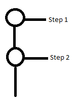
我想在CSS的右侧和底部创建一个带有线条的圆圈。类似于下图。我找到了一个水平连接圆圈的css code。我无法弄清楚如何垂直添加线条或类似于我附加的图像?
  <!DOCTYPE html>
  <html lang="en">
      <head>
          <meta charset="utf-8">
          <style>
            @import "compass/css3";

            li {
                width: 2em;
                height: 2em;
                text-align: center;
                line-height: 2em;
                border-radius: 1em;
                background: dodgerblue;
                margin: 0 1em;
                display: inline-block;
                color: white;
                position: relative;
            }

            li::before {
                content: '';
                position: absolute;
                top: .9em;
                left: -4em;
                width: 4em;
                height: .2em;
                background: dodgerblue;
                z-index: -1;
            }

            li:first-child::before {
                display: none;
            }

            .active {
                background: dodgerblue;
            }

            .active ~ li {
                background: lightblue;
            }

            .active ~ li::before {
                background: lightblue;
            }

            body {
                font-family: sans-serif;
                padding: 2em;
            }
        </style>
     </head>
     <body>
         <ul>
             <li>1</li>
             <li>2</li>
             <li>3</li>
             <li class="active">4</li>
             <li>5</li>
             <li>6</li>
             <li>7</li>
         </ul>
     </body>
 </html>
3 个答案:
答案 0 :(得分:6)
使用伪元素的组合来实现目标。
&#13;
&#13;
&#13;
&#13;
ul {
  list-style: none;
  margin: 50px;
  padding: 0;
  font: normal 16px/22px Arial;
  color: #999;
}
li {
  overflow: hidden;
  position: relative;
  padding: 0 0 10px 35px;
  }
  li::before {
    content: '';
    position: absolute;
    left: 9px;
    top: 9px;
    width: 20px;
    height: 999px;
    border: 2px solid lightblue;
    border-width: 2px 0 0 2px;
    }
    li:last-child::before {
      border-width: 2px 0 0;
      }
  li::after {
    content: '';
    position: absolute;
    left: 0;
    top: 0;
    width: 16px;
    height: 16px;
    background: #fff;
    border: 2px solid lightblue;
    border-radius: 50%;
    }
  li.current,
  li.passed {
    color: #000;
    }
    li.current::before {
      border-top-color: dodgerblue;
      }
    li.current::after {
      border-color: dodgerblue;
      background: dodgerblue;
      }
    li.passed::before,
    li.passed::after {
      border-color: dodgerblue;
      }
<ul>
<li class="passed">Step #1</li>
<li class="passed">Step #2</li>
<li class="passed">Step #3</li>
<li class="current">Step #4<br><small><i>Description of the step</i></small></li>
<li>Step #5</li>
<li>Step #6</li>
<li>Step #7</li>
</ul>
如果您愿意,请参阅jsfiddle
答案 1 :(得分:1)
查看更新的笔:
http://codepen.io/Debabrata89/pen/QNZrxE
以下是相关代码:
HTML:
<div></div><span id="step1">step1</span>
<div id="second"></div>
<div></div><span id="step2">step2</span>
<div id="last"></div>
CSS:
@import "compass/css3";

div {
  width: 2em;
  height: 2em;
  text-align: center;
  line-height: 2em;
  border-radius: 1em;
  background: dodgerblue;
  margin: 0 1em;
  color: white;
  position: relative;
 -ms-transform: rotate(-180deg);
 -webkit-transform: rotate(-180deg);
 transform: rotate(-180deg);
}

div::before{
  content: '';
  position: absolute;
  top: .9em;
  left: -4em;
  width: 4em;
  height: .2em;
  background: dodgerblue;
  z-index: -1;

}


div:first-child::after {
  display: none;
}


body {
  font-family: sans-serif;
  padding: 2em;
}
#last{
  transform: rotate(-90deg);
  width:0;
  height:0;
}
 #second{
   transform: rotate(-90deg);
   width:0;
   height:10;
   left:16px;
   top:-16px;

}
#step1{
  position:absolute;
  top:40px;
  left:150px
}
#step2{
  position:absolute;
  top:104px;
  left:150px
 }
答案 2 :(得分:1)
尝试this fiddle。
我更改了一些属性并添加了li:after。
li {
  width: 2em;
  height: 2em;
  text-align: center;
  line-height: 2em;
  border-radius: 1em;
  background: dodgerblue;
  margin: 1em 1em;
  color: white;
  position: relative;
}
li::before {
  content: '';
  position: absolute;
  top: -4.1em;
  left: 1em;
  /* width: 4em; */
  width: .2em;
  height: 2em;
  background: dodgerblue;
  z-index: -1;
}
li::after {
  content: '';
  position: absolute;
  top: 0.9em;
  left: 1em;
  width: 4em;
  height: .2em;
  background: dodgerblue;
  z-index: -1;
}
li:first-child::before {
  display: none;
}
.active {
  background: dodgerblue;
}
.active ~ li {
  background: lightblue;
}
.active ~ li::before {
  background: lightblue;
}
body {
  font-family: sans-serif;
  padding: 2em;
}
相关问题
最新问题
- 我写了这段代码,但我无法理解我的错误
- 我无法从一个代码实例的列表中删除 None 值,但我可以在另一个实例中。为什么它适用于一个细分市场而不适用于另一个细分市场?
- 是否有可能使 loadstring 不可能等于打印?卢阿
- java中的random.expovariate()
- Appscript 通过会议在 Google 日历中发送电子邮件和创建活动
- 为什么我的 Onclick 箭头功能在 React 中不起作用?
- 在此代码中是否有使用“this”的替代方法?
- 在 SQL Server 和 PostgreSQL 上查询,我如何从第一个表获得第二个表的可视化
- 每千个数字得到
- 更新了城市边界 KML 文件的来源?