тдѓСйЋтюежЮъжђЈТўјУЃїТЎ»СИітѕЏт╗║жђЈТўјТќЄТюг
ТЃ│У▒АСИђСИІ№╝џТюЅСИђСИфУЃїТЎ»тѕєжЁЇу╗ЎРђюbodyРђЮтњїСИђСИфуЎйУЅ▓уџёРђюdivРђЮ№╝їжЄїжЮбТюЅСИђСИфТќЄТюгсђѓУ┐ЎСИфТќЄТюгТў»У┐ЎТаиТѕЉС╗гтЈ»С╗ЦжђџУ┐Єт«ЃуюІтѕ░УЃїТЎ»сђѓтдѓСйЋућеCSSт«ъуј░№╝ЪтЃЈУ┐ЎТаи№╝џ
3 СИфуГћТАѕ:
уГћТАѕ 0 :(тЙЌтѕє№╝џ3)
ТѓетЈ»С╗ЦСй┐уће SVG тѕЏт╗║mask№╝їтЁХСИГrectтЁЃу┤аућеС║јуЎйУЅ▓УЃїТЎ»№╝їtextтЁЃу┤аућеС║јжђЈТўјТќЄТюгжЃетѕєсђѓ
body {
  margin: 0;
  padding: 0;
  display: flex;
  align-items: center;
  justify-content: center;
  background: url('http://blog.oxforddictionaries.com/wp-content/uploads/mountain-names.jpg');
  background-size: cover;
  height: 100vh;
  background-position: center;
  font-family: 'Open Sans', sans-serif;
}

svg {
  width: 300px;
  height: 100px;
}
svg text {
  text-anchor: middle;
}
svg #overlay {
  fill: white;
  opacity: 0.7;
}
svg #text {
  font-size: 40px;
  font-weight: bold;
}

svg #r {
  fill: white;
  mask: url(#mask);
}
<svg>
<defs>
<mask id="mask" x="0" y="0" width="100%" height="100%">
<rect id="overlay" x="0" y="0" width="100%" height="100%" />
<text id="text" x="50%" y="0" dy="65px">Some text</text>
</mask>
</defs>
<rect id="r" x="0" y="0" width="100%" height="100%" />
</svg>
ТЏ┤Тќ░№╝џУдЂСй┐ућежђЈТўјТќЄтГЌтѕЏт╗║т«їТЋ┤тЁЃу┤атцДт░ЈУдєуЏќ№╝їТѓетЈ»С╗ЦтюеуѕХтЁЃу┤аСИіСй┐ућеposition: relative№╝їтюеsvgСИіСй┐ућеposition: absoluteт╣ХУ«Йуй«maskжФўт║дтњїт«йт║дтѕ░100%сђѓУдЂСй┐textт▒ЁСИГ№╝їТѓетЈ»С╗Цdy: 50%Сй┐ућеalignment-baseline: middle;тњїtext-anchor: middle;
body {
  margin: 0;
  padding: 0;
}

.element {
  margin: 0;
  padding: 0;
  display: flex;
  align-items: center;
  justify-content: center;
  background: url('http://blog.oxforddictionaries.com/wp-content/uploads/mountain-names.jpg');
  background-size: cover;
  height: 100vh;
  background-position: center;
  font-family: 'Open Sans', sans-serif;
  position: relative;
}

section {
  height: 100vh;
  background: lightgreen;
}

svg {
  position: absolute;
  left: 0;
  right: 0;
  top: 0;
  height: 100%;
  width: 100%;
}

svg text {
  text-anchor: middle;
  alignment-baseline: middle;
  font-size: 40px;
  font-weight: bold;
}

svg #overlay {
  fill: white;
  opacity: 0.7;
}

svg #r {
  fill: white;
  mask: url(#mask);
}
<div class="element">
<svg>
<defs>
<mask id="mask" x="0" y="0" width="100%" height="100%">
<rect id="overlay" x="0" y="0" width="100%" height="100%" />
<text id="text" x="50%" y="0" dy="50%">Some text here</text>
</mask>
</defs>
<rect id="r" x="0" y="0" width="100%" height="100%" />
</svg>
</div>
<section></section>
уГћТАѕ 1 :(тЙЌтѕє№╝џ0)
Сй┐ућеСИЇжђЈТўјт║д;
HTML№╝џ
<body>
    <div class='frontimage'>

    </div>
</body>
уџёCSS№╝џ
body{
    background-image: url("yourimage.jpg");
}
.frontimage{
    background-image: url("yourotherimage.jpg");
    opacity: 0.5;
}
уГћТАѕ 2 :(тЙЌтѕє№╝џ0)
ућеcssСйатЈ»С╗ЦСй┐ућеСИЇжђЈТўјт║д№╝џ0.6; №╝ѕ0 =т«їтЁежђЈТўј - 1 =т«їтЁетЈ»УДЂ№╝Ѕсђѓ
*{font-family:Helvetica, Arial, Sans-Serif;}
.background{background:url(http://www.paisajesbonitos.org/wp-content/uploads/2015/11/paisajes-bonitos-de-oto%C3%B1o-lago.jpg);}
.text{font-size: 5em; font-weight:bold; opacity:0.6;}
<div class="background">
<span class="text">
Lorem ipsum
</span>
</div>
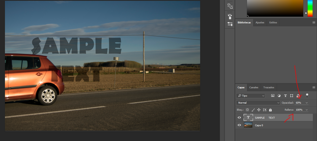
Сй┐ућеphotoshop№╝їТѓетЈ»С╗ЦтЄЈт░ЉТќЄТюгтЏЙт▒ѓуџётАФтЁЁТЮАТѕќтбътіаТГцтЏЙт▒ѓуџёжђЈТўјт║дсђѓ
- тдѓСйЋтѕЏт╗║жђЈТўјУЃїТЎ»№╝Ъ
- жђЈТўјУЃїТЎ»СИіуџёжЮъжђЈТўјУЙЊтЁЦТќЄТюг
- жђЈТўјУЃїТЎ»СИјжЮъжђЈТўјТїЅжњ«
- жђЈТўјУЃїТЎ»тЏЙтЃЈСИјУДєтЏЙСИГуџёжЮъжђЈТўјТќЄТюг
- тдѓСйЋт░єжЮъжђЈТўјтѕЄТЇбтѕ░жђЈТўјУЃїТЎ»тГљуфЌтЈБ
- тѕЏт╗║жђЈТўјУЃїТЎ»СйєС┐ЮТїЂТќЄТюгтњїтЏЙТаЄСИЇжђЈТўј
- тдѓСйЋтѕЏт╗║тЁиТюЅт«їтЁежђЈТўјТќЄТюгуџётЇіжђЈТўјУЃїТЎ»уџёТїЅжњ«№╝Ъ
- Android№╝џжђЈТўјтЏЙуЅЄ
- тюеСИЇжђЈТўјУЃїТЎ»уџёжђЈТўјТќЄТюг
- тдѓСйЋтюежЮъжђЈТўјУЃїТЎ»СИітѕЏт╗║жђЈТўјТќЄТюг
- ТѕЉтєЎС║єУ┐ЎТ«хС╗БуаЂ№╝їСйєТѕЉТЌаТ│ЋуљєУДБТѕЉуџёжћЎУ»»
- ТѕЉТЌаТ│ЋС╗јСИђСИфС╗БуаЂт«ъСЙІуџётѕЌУАеСИГтѕажЎц None тђ╝№╝їСйєТѕЉтЈ»С╗ЦтюетЈдСИђСИфт«ъСЙІСИГсђѓСИ║С╗ђС╣ѕт«ЃжђѓућеС║јСИђСИфу╗єтѕєтИѓтю║УђїСИЇжђѓућеС║јтЈдСИђСИфу╗єтѕєтИѓтю║№╝Ъ
- Тў»тљдТюЅтЈ»УЃйСй┐ loadstring СИЇтЈ»УЃйуГЅС║јТЅЊтЇ░№╝ЪтЇбжў┐
- javaСИГуџёrandom.expovariate()
- Appscript жђџУ┐ЄС╝џУ««тюе Google ТЌЦтјєСИГтЈЉжђЂућхтГљжѓ«С╗ХтњїтѕЏт╗║Т┤╗тіе
- СИ║С╗ђС╣ѕТѕЉуџё Onclick у«Гтц┤тіЪУЃйтюе React СИГСИЇУхиСйюуће№╝Ъ
- тюеТГцС╗БуаЂСИГТў»тљдТюЅСй┐ућеРђюthisРђЮуџёТЏ┐С╗БТќ╣Т│Ћ№╝Ъ
- тюе SQL Server тњї PostgreSQL СИіТЪЦУ»б№╝їТѕЉтдѓСйЋС╗југгСИђСИфУАеУјитЙЌуггС║їСИфУАеуџётЈ»УДєтїќ
- Т»ЈтЇЃСИфТЋ░тГЌтЙЌтѕ░
- ТЏ┤Тќ░С║єтЪјтИѓУЙ╣уЋї KML ТќЄС╗ХуџёТЮЦТ║љ№╝Ъ