Grid Layoutдёӯзҡ„align-itemsдёҺalign-contentжңүд»Җд№ҲеҢәеҲ«пјҹ
жҲ‘е·Ійҳ…иҜ»A complete guide to GridпјҢдҪҶд»Қ然混ж·ҶдәҶдёӨз»„е®№еҷЁеұһжҖ§д№Ӣй—ҙзҡ„е·®ејӮпјҢеҚівҖңjustify/align-contentвҖқдёҺвҖң-contentвҖқгҖӮ
жҲ‘зҡ„ж··ж·Ҷеӣҙз»•зқҖдҪңиҖ…еЈ°з§°вҖң-contentвҖқйӣҶеҗҲеӯҳеңЁпјҢеӣ дёә
В Вжңүж—¶зҪ‘ж јзҡ„жҖ»еӨ§е°ҸеҸҜиғҪе°ҸдәҺ В В е®ғзҡ„зҪ‘ж је®№еҷЁ
жҲ‘и®ӨдёәиҝҷйҖӮз”ЁдәҺдёӨиҖ…пјҢиҖҢдёҚжҳҜвҖңfibвҖқйӣҶзӢ¬жңүзҡ„гҖӮ
жңүдәәеҸҜд»Ҙеё®еҝҷи§ЈйҮҠдёҖдёӢеҗ—пјҹжңҖеҘҪдҪҝз”ЁдёҖдәӣеӣҫеҪўиҜҙжҳҺдҪңдёәдҫӢеӯҗгҖӮ
1 дёӘзӯ”жЎҲ:
зӯ”жЎҲ 0 :(еҫ—еҲҶпјҡ4)
и®©жҲ‘们д»Һжҫ„жё…жңҜиҜӯејҖе§Ӣпјҡ
зҪ‘ж је®№еҷЁ
зҪ‘ж је®№еҷЁжҳҜзҪ‘ж је’ҢзҪ‘ж јйЎ№зҡ„ж•ҙдҪ“е®№еҷЁгҖӮе®ғе»әз«ӢдәҶзҪ‘ж јж јејҸеҢ–дёҠдёӢж–ҮпјҲдёҺе…¶д»–ж јејҸеҢ–дёҠдёӢж–ҮзӣёеҜ№пјҢдҫӢеҰӮflexжҲ–blockпјүгҖӮ
зҪ‘ж ј
зҪ‘ж јжҳҜдёҖз»„зӣёдәӨзҡ„еһӮзӣҙе’Ңж°ҙе№ізәҝпјҢе°ҶзҪ‘ж је®№еҷЁзҡ„з©әй—ҙеҲ’еҲҶдёәзҪ‘ж јеҢәеҹҹпјҢиҝҷдәӣжҳҜеҢ…еҗ«зҪ‘ж јйЎ№зҡ„жЎҶгҖӮ
зҪ‘ж јйЎ№
зҪ‘ж јйЎ№жҳҜзҪ‘ж је®№еҷЁдёӯиЎЁзӨәжөҒеҶ…еҶ…е®№зҡ„жЎҶпјҲеҚіпјҢжңӘе®Ңе…Ёе®ҡдҪҚзҡ„еҶ…е®№пјүгҖӮ
д»ҘдёӢжҳҜW3Cпјҡ
зҡ„жҸ’еӣҫ 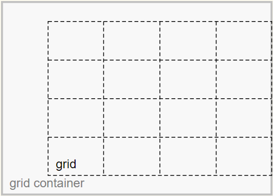
justify-contentе’Ңalign-contentеұһжҖ§еҜ№йҪҗзҪ‘ж јгҖӮ
justify-selfпјҢjustify-itemsпјҢalign-selfе’Ңalign-itemsеұһжҖ§еҜ№йҪҗзҪ‘ж јйЎ№гҖӮ
е…ідәҺдҪ й—®йўҳдёӯжҸҸиҝ°зҡ„й—®йўҳпјҡ
В ВжҲ‘зҡ„еӣ°жғ‘еӣҙз»•зқҖдҪңиҖ…еЈ°з§°пјҶпјғ34;
-contentпјҶпјғ34;и®ҫзҪ®жҳҜеӣ дёәпјҡпјҶпјғ34;жңүж—¶зҪ‘ж јзҡ„жҖ»еӨ§е°ҸеҸҜиғҪе°ҸдәҺе…¶зҪ‘ж је®№еҷЁзҡ„еӨ§е°ҸпјҶпјғ34;
е—ҜпјҢжӮЁеҸҜд»ҘеңЁжҸ’еӣҫдёӯзңӢеҲ°зҪ‘ж је°ҸдәҺзҪ‘ж је®№еҷЁгҖӮ
еӣ жӯӨпјҢеү©дҪҷз©әй—ҙпјҢе®№еҷЁиғҪеӨҹе°ҶжӯӨз©әй—ҙеҲҶеёғеҲ°еһӮзӣҙеұ…дёӯпјҲalign-content: centerпјүе’ҢеҸіеҜ№йҪҗпјҲjustify-content: endпјүзҪ‘ж јгҖӮ
йўқеӨ–зҡ„з©әй—ҙд№ҹеҸҜд»Ҙи®©зҪ‘ж јдёҺspace-aroundпјҢspace-betweenе’Ңspace-evenlyзӯүеҖјйҡ”ејҖгҖӮ
дҪҶжҳҜпјҢеҰӮжһңзҪ‘ж јеӨ§е°ҸзӯүдәҺе®№еҷЁеӨ§е°ҸпјҢеҲҷжІЎжңүеҸҜз”Ёз©әй—ҙпјҢalign-content / justify-contentе°Ҷж— ж•ҲгҖӮ
д»ҘдёӢжҳҜ规иҢғдёӯзҡ„жӣҙеӨҡеҶ…е®№пјҡ
В В10.3. Row-axis Alignment: the
В В В Вjustify-selfandjustify-itemspropertiesзҪ‘ж јйЎ№еҸҜд»ҘдҪҝз”ЁеҶ…иҒ”з»ҙеәҰеңЁеҶ…иҒ”з»ҙеәҰдёӯеҜ№йҪҗ В В зҪ‘ж јйЎ№жҲ–
В В В Вjustify-selfеұһжҖ§дёҠзҡ„justify-itemsеұһжҖ§ В В еңЁзҪ‘ж је®№еҷЁдёҠгҖӮ10.4. Column-axis Alignment: the
В В В Вalign-selfandalign-itemspropertiesзҪ‘ж јйЎ№д№ҹеҸҜд»ҘеңЁеқ—е°әеҜёдёӯеҜ№йҪҗпјҲеһӮзӣҙ В В еңЁеҶ…иҒ”з»ҙеәҰдёҠдҪҝз”Ё
В В В Вalign-selfеұһжҖ§ В В зҪ‘ж је®№еҷЁдёҠзҡ„зҪ‘ж јйЎ№жҲ–align-itemsеұһжҖ§гҖӮ10.5. Aligning the Grid: the
В В В Вjustify-contentandalign-contentpropertiesеҰӮжһңзҪ‘ж јзҡ„еӨ–иҫ№зјҳдёҺзҪ‘ж је®№еҷЁдёҚеҜ№еә” В В еҶ…е®№иҫ№пјҲдҫӢеҰӮпјҢеҰӮжһңжІЎжңүеҲ—жҳҜеј№жҖ§еӨ§е°Ҹзҡ„пјүпјҢзҪ‘ж ј В В иҪЁйҒ“ж №жҚ®еҶ…е®№жЎҶеңЁеҶ…е®№жЎҶдёӯеҜ№йҪҗ В В зҪ‘ж јдёҠзҡ„
В В В Вjustify-contentе’Ңalign-contentеұһжҖ§ В В е®№еҷЁпјҲејәи°ғиЎҘе……пјү
- жҲ‘еҶҷдәҶиҝҷж®өд»Јз ҒпјҢдҪҶжҲ‘ж— жі•зҗҶи§ЈжҲ‘зҡ„й”ҷиҜҜ
- жҲ‘ж— жі•д»ҺдёҖдёӘд»Јз Ғе®һдҫӢзҡ„еҲ—иЎЁдёӯеҲ йҷӨ None еҖјпјҢдҪҶжҲ‘еҸҜд»ҘеңЁеҸҰдёҖдёӘе®һдҫӢдёӯгҖӮдёәд»Җд№Ҳе®ғйҖӮз”ЁдәҺдёҖдёӘз»ҶеҲҶеёӮеңәиҖҢдёҚйҖӮз”ЁдәҺеҸҰдёҖдёӘз»ҶеҲҶеёӮеңәпјҹ
- жҳҜеҗҰжңүеҸҜиғҪдҪҝ loadstring дёҚеҸҜиғҪзӯүдәҺжү“еҚ°пјҹеҚўйҳҝ
- javaдёӯзҡ„random.expovariate()
- Appscript йҖҡиҝҮдјҡи®®еңЁ Google ж—ҘеҺҶдёӯеҸ‘йҖҒз”өеӯҗйӮ®д»¶е’ҢеҲӣе»әжҙ»еҠЁ
- дёәд»Җд№ҲжҲ‘зҡ„ Onclick з®ӯеӨҙеҠҹиғҪеңЁ React дёӯдёҚиө·дҪңз”Ёпјҹ
- еңЁжӯӨд»Јз ҒдёӯжҳҜеҗҰжңүдҪҝз”ЁвҖңthisвҖқзҡ„жӣҝд»Јж–№жі•пјҹ
- еңЁ SQL Server е’Ң PostgreSQL дёҠжҹҘиҜўпјҢжҲ‘еҰӮдҪ•д»Һ第дёҖдёӘиЎЁиҺ·еҫ—第дәҢдёӘиЎЁзҡ„еҸҜи§ҶеҢ–
- жҜҸеҚғдёӘж•°еӯ—еҫ—еҲ°
- жӣҙж–°дәҶеҹҺеёӮиҫ№з•Ң KML ж–Ү件зҡ„жқҘжәҗпјҹ