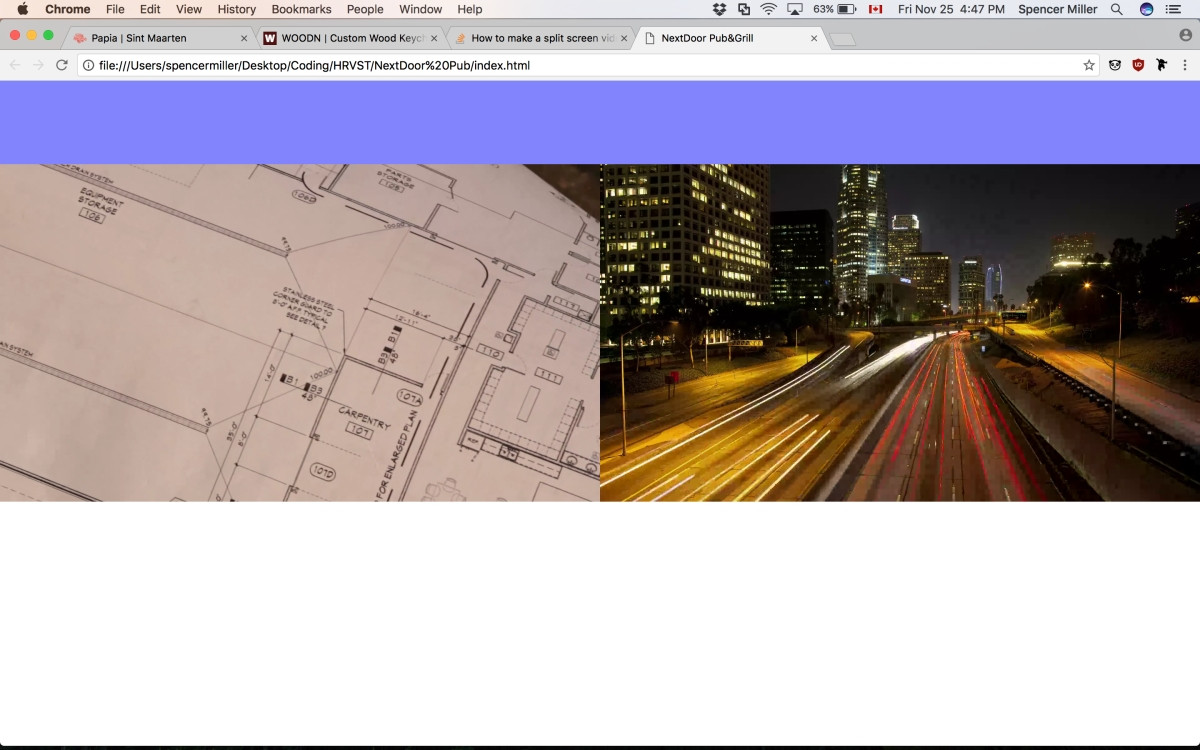
我想在我正在处理的网页上实现这种分屏视频效果。 Here is a picture of the result I have so far
HTML:
<!DOCTYPE html>
<html>
<head>
<meta charset="UTF-8">
<meta http-equiv="X-UA-Compatible" content="IE=edge,chrome=1">
<meta name="viewport" content="width=device-width, initial-scale=1">
<title>NextDoor Pub&Grill</title>
<link href="css/reset.css" rel="stylesheet" type="text/css" />
<link href="css/styles.css" rel="stylesheet" type="text/css" />
</head>
<body>
<header>
<div class="header__menu full-width">
</div>
</header>
<nav>
<div class="nav flex full-width">
<div class="nav__video flex full-width">
<div id="left">
<div class="nav__video--left" onclick="expandRight()">
<video playsinline autoplay muted loop>
<!--- Inlcude the video files with .webm file first --->
<source src="assets/videoLeft/loop.webm">
<source src="assets/videoLeft/loop.mp4">
<source src="assets/videoLeft/loop.mov">
</video>
</div>
</div>
<div id="right">
<div class="nav__video--right" onclick="expandLeft()">
<video playsinline autoplay muted loop>
<!--- Inlcude the video files with .webm file first --->
<source src="assets/videoRight/loop.webm">
<source src="assets/videoRight/loop.mp4">
<source src="assets/videoRight/loop.mov">
</video>
</div>
</div>
</div>
</div>
</nav>
<script src="js/scripts.js"></script>
</body>
</html>
CSS:
    .skin{

    }

    .full-width{
        width: 100%;
    }

    .flex{
        display: -webkit-flex;
        display: flex;
    }

    .nav{
        position: absolute;
        -webkit-flex-direction: column;
        flex-direction: column;
        height: 100%;
    }

    .header__menu{
        height: 100px;
        background-color: rgba(0,0,255,0.5);
    }

    .nav__video{
        -webkit-flex-direction: row;
        flex-direction: row;
        -webkit-align-items: center;
        align-items: center;
        -webkit-justify-content: center;
        justify-content: center;
        height: 100%;
    }

    #left{
        width: 50%;
        height: inherit;
        object-fit: cover;
    }

    #right{
        width: 50%;
        height: inherit;
        object-fit: cover;
    }

    .nav__video--left{

    }

    .nav__video--right{

    }

    video{
        height: 100%;
        width: 100%;
        object-fit: contain;
    }

}
因此,正如上面的代码所示,视频所在的div的大小可以占据顶部菜单栏下方的整个高度。但是,视频仅显示在各自div的上半部分。如何在保持相同宽高比的同时确保视频占据整个空白区域? (每个视频的一部分将被截断)
答案 0 :(得分:1)
在使用它一段时间后,this似乎是正确的CSS组合,同时考虑到横幅,同时提供封面效果和全高。
height: calc(100vh - 100px);给出全高度减去标题高度。其余的主要是在整个元素树中携带height和width,以便video具有相应尺寸的正确尺寸。
请记住,IE不支持object-size,如果没有它,这种效果只能在javascript的帮助下完成。
.full-width{
  width: 100%;
}

.flex{
  display: -webkit-flex;
  display: flex;
}

.nav{
  position: absolute;
  -webkit-flex-direction: column;
  flex-direction: column;
  height: calc(100vh - 100px);
}

.header__menu{
  height: 100px;
  background-color: rgba(0,0,255,0.5);
}

.nav__video{
  -webkit-flex-direction: row;
  flex-direction: row;
  -webkit-align-items: center;
  align-items: center;
  -webkit-justify-content: center;
  justify-content: center;
  height:100%;

}

#left, #right {
  width: 50%;
  height: 100%;
}

#left{
  background-color: green;
}

#right{
  background-color: yellow;

}

.nav__video--left, .nav__video--right{
  width: 100%;
  height: 100%;
  overflow:hidden;
}

.nav__video--left{
  background-color: blue;
}

.nav__video--right{
  background-color: red;
}

video{
  width: 100%;
  height: 100%;
  object-fit: cover;
}
答案 1 :(得分:0)
尝试
video {
  width: auto;
  min-width: 100%;
  height: auto;
  min-height: 100%;
}
或
video {
  position: absolute;
  right: 0;
  bottom: 0;
  top: 0;
  right: 0;
  width: 100%;
  height: 100vh;
}
答案 2 :(得分:0)
Here是一个工作小提琴,我希望能与你想要的东西相匹配。
.nav__video--left{
  background-color: blue;
  background-size: cover;
}

.nav__video--right{
background-color: red;
}

video{
    object-fit: cover;
    min-height: 100vh;
    min-width: 100%;
    overflow: hidden;
}
然后我设置object-fit: cover,以便视频填充整个div和overflow:hidden;以隐藏延伸到div之外的视频部分。