所有剩余空间的第二次DIV
我想创建两个div,其中一个没有JS而且支持IE8。
- 每个都有100%的宽度。
- 每个都具有嵌套布局的相对或绝对定位。
- 顶部div按内容有高度,不固定(很重要)和整个剩余空间的底部div。
在我的例子中,底部div太短,我怎么能伸展到底部?
<html>
<head>
<style type="text/css"><!--
* {
    padding: 1px;
    margin: 0px;
    border: solid 1px;
    width: 100%;
}

#super {
    position: absolute;
    height: 100%;
}

#top {
    position: relative;
}

#bottom {
    position: relative;
    top: 0px;
    bottom: 0px;
}
--></style>

</head>
<body>
<div id="super">
<div id="top">top</div>
<div id="bottom">bottom</div>
</div>
</body>
</html>
4 个答案:
答案 0 :(得分:2)
您可以使用css表属性来创建此布局。
<强> HTML:
<div id="super">
  <div id="top">
    <div class="content">
      top
    </div>
  </div>
  <div id="bottom">
    <div class="content">
      bottom
    </div>
  </div>
</div>
必要的CSS:
html,
body {
  height: 100%;
}
#super {
  height: 100%;
  width: 100%;
  display: table;
}
#super > div {
  display: table-row;
}
#top {
  background: green;
}
#bottom {
  background: blue;
}
html,
body {
  height: 100%;
  padding: 0;
  margin: 0;
}
#super {
  height: 100%;
  width: 100%;
  display: table;
}

#top {
  background: green;
  overflow: hidden;
  height: 1%;
}

.content {
  padding: 10px;
}

#bottom {
  background: blue;
}

#super > div {
  display: table-row;
}
<div id="super">
<div id="top">
<div class="content">
top
</div>
</div>
<div id="bottom">
<div class="content">
bottom</div>
</div>
</div>
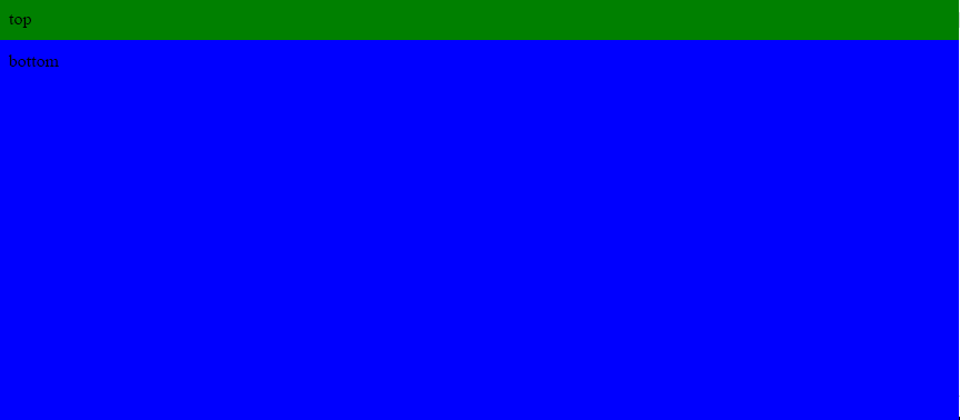
输出图片:
答案 1 :(得分:1)
您可以使用display: table包装顶部和底部div的容器和表格行:
&#13;
&#13;
&#13;
&#13;
* {
    padding: 1px;
    margin: 0px;
    border: solid 1px;
    width: 100%;
}
#super {
    display: table;
    position: absolute;
    height: 100vh;
}
#top {
    display: table-row;
    height: 1px;
    position: relative;
    background: orange;
}
#bottom {
    display: table-row;
    position: relative;
    top: 0px;
    bottom: 0px;
    background: teal;
}
<div id="super">
<div id="top">top<br>top text</div>
<div id="bottom">bottom</div>
</div>
答案 2 :(得分:1)
使用flex-box
.parent{
  display: flex;
  flex-direction: column;
  min-height: 100vh
}
.child2{
  flex: 1;
  background: blue;
}
<div class="parent">
<div class="child1"> first child</div>
<div class="child2"> second child</div>
</div>
Demo 此处
答案 3 :(得分:0)
试试这个:
#bottom {
position: relative;
top: 0px;
bottom: 0px;
HEIGHT: 800px;
}
相关问题
最新问题
- 我写了这段代码,但我无法理解我的错误
- 我无法从一个代码实例的列表中删除 None 值,但我可以在另一个实例中。为什么它适用于一个细分市场而不适用于另一个细分市场?
- 是否有可能使 loadstring 不可能等于打印?卢阿
- java中的random.expovariate()
- Appscript 通过会议在 Google 日历中发送电子邮件和创建活动
- 为什么我的 Onclick 箭头功能在 React 中不起作用?
- 在此代码中是否有使用“this”的替代方法?
- 在 SQL Server 和 PostgreSQL 上查询,我如何从第一个表获得第二个表的可视化
- 每千个数字得到
- 更新了城市边界 KML 文件的来源?