Svg填充给定路径的动画
我正在尝试从左到右设置箭头动画。我的箭头路径代码如下:


<svg id="svg_circle" width="100%" height="100%" viewBox = '0 0 450 400'>
    <g transform = "translate(0,0)">
      <path class="path" stroke="#F0F0F0" fill="#fff" stroke-width="1" opacity="1" d="m34.97813,21.70979l-33.55223,0.47088l-0.0394,-13.57138l34.2665,-0.47295l-0.0208,-7.14282l14.50618,14.42226l-14.95643,15.04345l-0.20382,-8.74944z" id="svg_1">
          <animate id="project_anim1" attributeName="fill" from="#fff" to="#4DAF4C" begin="1s" dur="1s" fill="freeze" repeatCount="1"></animate>
      </path>
    </g>
</svg>
以上是我箭头的svg路径内容。
请有人帮助我如何从左到右填充路径。等待快速回复
3 个答案:
答案 0 :(得分:10)
您只需设置<stop>中<linear gradient>的动画即可。
&#13;
&#13;
&#13;
&#13;
<svg id="svg_circle" width="100%" height="100%" viewBox = '0 0 450 400'>

  <defs>
    <linearGradient id="left-to-right">
      <stop offset="0" stop-color="#4DAF4C">
        <animate dur="2s" attributeName="offset" fill="freeze" from="0" to="1" />
      </stop>
      <stop offset="0" stop-color="#fff">
        <animate dur="2s" attributeName="offset" fill="freeze" from="0" to="1" />
      </stop>

    </linearGradient>
  </defs>

  <path class="path" stroke="#F0F0F0" fill="url(#left-to-right)" stroke-width="1" opacity="1" d="m34.97813,21.70979l-33.55223,0.47088l-0.0394,-13.57138l34.2665,-0.47295l-0.0208,-7.14282l14.50618,14.42226l-14.95643,15.04345l-0.20382,-8.74944z" id="svg_1" />
</svg>
这是如何工作的,我们有一个线性渐变表示从绿色到白色的突然变化。 <animation>元素将该突然变化的位置从箭头左侧(偏移= 0)移动到右侧(偏移=&#34; 1&#34;)。
请注意,SVG <animate>元素在IE中不起作用。如果需要支持IE,则需要使用FakeSmile库或使用其他方法(例如JS动画库)。
答案 1 :(得分:4)
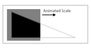
我认为使用fill属性无法做到这一点。但相反,您可以将SVG路径反转为具有像孔一样的三角形的矩形。现在你只需要在该路径后面的第二个元素,你可以在x方向上简单地设置刻度动画,从左到右填充孔。
这是显示该技术的图像:
这是一个有效的例子:
&#13;
&#13;
&#13;
&#13;
<svg width="100%" height="100%" viewBox='0 0 450 400'>
  <rect x="0" y="0" width="1" height="22" style="fill: black;" >
    <animateTransform attributeName="transform" type="scale" from="1 1" to="50 1" begin="0s" dur="2s" repeatCount="indefinite" />
  </rect>
  <path fill="#ffffff" d="M0,0v29.8h86V0H0z M6.5,25V5.5L48.8,25H6.5z"/>
</svg>
注意:答案从三角形更新为箭头,我不会更新我的答案,因为每种形状的技术都相同。
答案 2 :(得分:4)
以andreas&#39;为基础answer。您可以使用动画形状覆盖箭头以揭开它。
&#13;
&#13;
&#13;
&#13;
<svg id="svg_circle" width="450" height="400" viewBox='0 0 450 400'>
  <path class="path" stroke="#F0F0F0" fill="#fff"
    stroke-width="1" opacity="1" id="svg_1"
    d="m34.97813,21.70979l-33.55223,0.47088l-0.0394,
       -13.57138l34.2665,-0.47295l-0.0208,-7.14282
       l14.50618,14.42226l-14.95643,15.04345l-0.20382,
       -8.74944z">
   <animate id="project_anim1" attributeName="fill"
      from="#fff" to="#4DAF4C" begin="0s" dur="3s"
      fill="freeze" repeatCount="indefinite" />
  </path>
  <rect x="0" y="0" width="53" height="34" fill="#fff">
    <animate attributeType="XML" attributeName="x"
      from="0" to="53" begin="0s" dur="3s"
      repeatCount="indefinite" />
    <animate attributeType="XML" attributeName="width"
      from="53" to="0" begin="0s" dur="3s"
      repeatCount="indefinite" />
  </rect>
</svg>
相关问题
最新问题
- 我写了这段代码,但我无法理解我的错误
- 我无法从一个代码实例的列表中删除 None 值,但我可以在另一个实例中。为什么它适用于一个细分市场而不适用于另一个细分市场?
- 是否有可能使 loadstring 不可能等于打印?卢阿
- java中的random.expovariate()
- Appscript 通过会议在 Google 日历中发送电子邮件和创建活动
- 为什么我的 Onclick 箭头功能在 React 中不起作用?
- 在此代码中是否有使用“this”的替代方法?
- 在 SQL Server 和 PostgreSQL 上查询,我如何从第一个表获得第二个表的可视化
- 每千个数字得到
- 更新了城市边界 KML 文件的来源?