CSS三角形和盒子阴影
我用CSS完成了下面的图像:
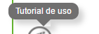
正如您所看到的,三角形有一个间隙,可以从工具提示中剪切框阴影。
代码如下:


/* Generated by less 2.5.1 */
* {
  margin: 0;
  padding: 0;
  box-sizing: border-box;
}
/* Demo of the tool-tip CSS */
.tooltip {
  text-decoration: underline;
  color: #37b9b5;
  cursor: default;
}
.tooltip-bubble {
  position: absolute;
  z-index: 1;
  padding: 5px 10px;
  color: #fff;
  width: auto;
  box-shadow: 7px 7px 11px 0px rgba(112, 111, 111, 0.3);
  background-color: transparent;
  border-radius: 10px;
}
.tooltip-bubble div {
  position: relative;
  z-index: 1;
  font-size: 12px;
}
.tooltip-bubble::before {
  position: absolute;
  content: '';
  top: 0;
  left: 0;
  width: 100%;
  height: 100%;
  background-color: #706f6f;
  border-radius: 10px;
}
.tooltip-bubble .arrow {
  content: '';
  display: block;
  position: absolute;
  top: 100%;
  left: 50%;
  width: 0px;
  height: 0px;
  border-left: 10px solid transparent;
  border-right: 10px solid transparent;
  transform: translate(-50%, 0);
  box-shadow: 7px 7px 11px 0px rgba(112, 111, 111, 0.3);
}
.tooltip-bubble .arrow.up {
  top: -10px;
  border-bottom: 10px solid #706f6f;
  border-left: 10px solid transparent;
  border-right: 10px solid transparent;
}
.tooltip-bubble .arrow.down {
  border-top: 10px solid #706f6f;
  border-left: 10px solid transparent;
  border-right: 10px solid transparent;
}
<div class="tooltip-bubble"><div>Tutorial de uso</div><div class="arrow down"></div></div>
我尝试了透明的背景颜色,但它没有用。
2 个答案:
答案 0 :(得分:5)
略有不同的做法,我只针对向下箭头做了。
我没有使用CSS创建三角形,而是创建了一个正方形并将其旋转了45度。我用这种方法可以想到的唯一缺点是工具提示气泡的高度需要等于或大于箭头宽度的一半。
您可能还想将箭头上的阴影更改为正方形的右侧,而不是右下角,以便在旋转后它可以正常工作。
&#13;
&#13;
&#13;
&#13;
* {
  margin: 0;
  padding: 0;
  box-sizing: border-box;
}
/* Demo of the tool-tip CSS */
.tooltip {
  text-decoration: underline;
  color: #37b9b5;
  cursor: default;
}
.tooltip-bubble {
  position: absolute;
  z-index: 1;
  padding: 5px 10px;
  color: #fff;
  width: auto;
  box-shadow: 7px 7px 11px 0px rgba(112, 111, 111, 0.3);
  background-color: transparent;
  border-radius: 10px;
}
.tooltip-bubble div {
  position: relative;
  z-index: 1;
  font-size: 12px;
}
.tooltip-bubble::before {
  position: absolute;
  content: '';
  top: 0;
  left: 0;
  width: 100%;
  height: 100%;
  background-color: #706f6f;
  border-radius: 10px;
}
.tooltip-bubble .arrow {
  background-color: #706f6f;
  content: '';
  display: block;
  position: absolute;
  left: 50%;
  height: 10px;
  width: 10px;
  transform: translate(-50%, 0) rotate(45deg);
  box-shadow: 7px 7px 11px 0px rgba(112, 111, 111, 0.3);
}
.tooltip-bubble .arrow.down {
  margin-top: -5px;
  top: 100%;
}
<div class="tooltip-bubble"><div>Tutorial de uso</div><div class="arrow down"></div></div>
答案 1 :(得分:1)
您可以使用转换。他们现在已经pretty well supported
了
&#13;
&#13;
&#13;
&#13;
/* Generated by less 2.5.1 */
* {
  margin: 0;
  padding: 0;
  box-sizing: border-box;
}
/* Demo of the tool-tip CSS */
.tooltip {
  text-decoration: underline;
  color: #37b9b5;
  cursor: default;
}
.tooltip-bubble {
  position: absolute;
  z-index: 1;
  padding: 5px 10px;
  color: #fff;
  width: auto;
  box-shadow: 7px 7px 11px 0px rgba(112, 111, 111, 0.3);
  background-color: transparent;
  border-radius: 10px;
}
.tooltip-bubble div {
  position: relative;
  z-index: 1;
  font-size: 12px;
}
.tooltip-bubble::before {
  position: absolute;
  content: '';
  top: 0;
  left: 0;
  width: 100%;
  height: 100%;
  background-color: #706f6f;
  border-radius: 10px;
  z-index: 1;
}
.tooltip-bubble .arrow {
  content: '';
  display: block;
  position: absolute;
  top: 100%;
  left: 50%;
  width: 0px;
  height: 0px;
  border-left: 10px solid transparent;
  border-right: 10px solid transparent;
  transform: translate(-50%, 0);
  box-shadow: 7px 7px 11px 0px rgba(112, 111, 111, 0.3);
}
.tooltip-bubble .arrow.up {
  top: -10px;
  border-bottom: 10px solid #706f6f;
  border-left: 10px solid transparent;
  border-right: 10px solid transparent;
}
.tooltip-bubble .arrow.down {
  border: 7px solid #706f6f;
  transform: rotate(45deg) translate(-50%, -50%);
  transform-origin: 0 0;
  z-index: 0;
}
<div class="tooltip-bubble"><div>Tutorial de uso</div><div class="arrow down"></div></div>
相关问题
最新问题
- 我写了这段代码,但我无法理解我的错误
- 我无法从一个代码实例的列表中删除 None 值,但我可以在另一个实例中。为什么它适用于一个细分市场而不适用于另一个细分市场?
- 是否有可能使 loadstring 不可能等于打印?卢阿
- java中的random.expovariate()
- Appscript 通过会议在 Google 日历中发送电子邮件和创建活动
- 为什么我的 Onclick 箭头功能在 React 中不起作用?
- 在此代码中是否有使用“this”的替代方法?
- 在 SQL Server 和 PostgreSQL 上查询,我如何从第一个表获得第二个表的可视化
- 每千个数字得到
- 更新了城市边界 KML 文件的来源?