如何在angular4 app中制作md-sidenav-container div的全高?
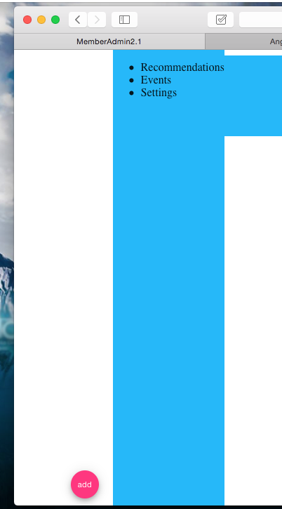
我有一个angular4应用程序,并使用角度材料框架https://material.angular.io/components/sidenav/examples。我想让md-sidenav-container拉伸整个div的高度,而不会遮住标题。我附上了全屏指令,这导致sidenav填满屏幕的整个高度,从而掩盖了标题组件。这不是我想要的。图像显示了标题上方的sidenav伸展,以及它在标题处停止但未伸展到底部的另一次尝试。我希望它一直延伸到标题,一直到屏幕的底部。我该如何做到这一点? 谢谢!
HTML
<div class="bar">
  <md-sidenav-container class="example-sidenav-fab-container">
  <md-sidenav #sidenav mode="side" opened="true" align="end">
    <!--<button md-mini-fab class="example-fab" (click)="sidenav.toggle()">-->
      <!--<md-icon>add</md-icon>-->
    <!--</button>-->
    <div class="example-scrolling-content">
      <ul>
        <li>Recommendations</li>
        <li>Events</li>
        <li>Settings</li>
      </ul>
    </div>
  </md-sidenav>
  <button md-mini-fab class="example-fab" (click)="sidenav.toggle()">
    <md-icon>add</md-icon>
  </button>
</md-sidenav-container>
</div>
的CSS
md-sidenav-container
  :background-color white
  :float right
  :width 300px
  :height 400px

md-sidenav
  :background-color $light-blue


//.example-sidenav-fab-container
//  width: 300px
//  height: 400px
  //border: 1px solid rgba(0, 0, 0, 0.5)


.example-sidenav-fab-container md-sidenav
  max-width: 300px

.example-sidenav-fab-container md-sidenav
  display: flex
  overflow: visible

.example-scrolling-content
  overflow: auto


.example-fab
  position: absolute
  right: 20px
  bottom: 10px

.bar
  :height 100%
3 个答案:
答案 0 :(得分:12)
我发现这种解决方法运行正常
HTML
<md-sidenav-container id="container" fullscreen >
CSS
#container {
 top: 64px !important;
}

@media(max-width: 599px) {
  #container {
    top: 56px !important;
  }
}
top必须与工具栏的高度相同。请记住,当宽度小于600px时,标准角度材质工具栏高度会变小。
答案 1 :(得分:8)
我在同样的问题上挣扎。将top设置为64px的解决方案对我来说不起作用。
我找到了两种不同的解决方案。
-
第一个解决方案使用flexbox。将
md-toolbar和md-sidenav-container放在包含height: 100%的div中,并将display: flex与flex-direction: column一起使用。 -
或者,此解决方案可能实际上做同样的事情,您可以将
md-toolbar和md-sidenav-container项保留在根级别,然后让md-sidenav-container拥有height: calc(100% - 64px)其中工具栏的高度为64px。
答案 2 :(得分:3)
html, body, material-app, mat-sidenav-container {
  height: 100%;
  width: 100%;
  margin: 0;
}
相关问题
最新问题
- 我写了这段代码,但我无法理解我的错误
- 我无法从一个代码实例的列表中删除 None 值,但我可以在另一个实例中。为什么它适用于一个细分市场而不适用于另一个细分市场?
- 是否有可能使 loadstring 不可能等于打印?卢阿
- java中的random.expovariate()
- Appscript 通过会议在 Google 日历中发送电子邮件和创建活动
- 为什么我的 Onclick 箭头功能在 React 中不起作用?
- 在此代码中是否有使用“this”的替代方法?
- 在 SQL Server 和 PostgreSQL 上查询,我如何从第一个表获得第二个表的可视化
- 每千个数字得到
- 更新了城市边界 KML 文件的来源?