如何仅使用Zurb Foundation flex网格仅为中小屏幕水平对齐中心
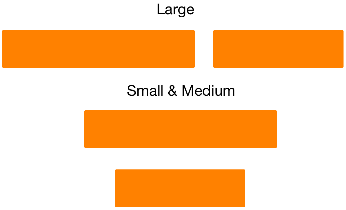
我想align-center这两列仅适用于medium down大小的屏幕,而不是大型屏幕。以前,此问题适用于small-centered和medium-centered,但不适用于 Zurb Foundation's Flex Grid 。
<div class="row">
  <div class="small-12 large-7 columns">
    <p>A: Left on large, centred otherwise</p>
  </div>
  <div class="small-12 large-5 columns>
    <p>B: Right on large, centred otherwise</p>
  </div>
</div>
我一直在寻找align-center-middle之类的东西,但似乎无法找到任何东西。我可以创建一个自定义类,但如果存在,我更喜欢使用内置选项。
1 个答案:
答案 0 :(得分:0)
如果没有人知道使用内置Zurb Foundation功能的方法,我将这些辅助类添加到我的项目中:
.align-center-small {
  @include breakpoint(small only) {
    -webkit-box-pack: center !important;
    -ms-flex-pack: center !important;
    justify-content: center !important;
  }
}

.align-center-medium {
  @include breakpoint(medium only) {
    -webkit-box-pack: center !important;
    -ms-flex-pack: center !important;
    justify-content: center !important;
  }
}

.align-center-large {
  @include breakpoint(large only) {
    -webkit-box-pack: center !important;
    -ms-flex-pack: center !important;
    justify-content: center !important;
  }
}
相关问题
最新问题
- 我写了这段代码,但我无法理解我的错误
- 我无法从一个代码实例的列表中删除 None 值,但我可以在另一个实例中。为什么它适用于一个细分市场而不适用于另一个细分市场?
- 是否有可能使 loadstring 不可能等于打印?卢阿
- java中的random.expovariate()
- Appscript 通过会议在 Google 日历中发送电子邮件和创建活动
- 为什么我的 Onclick 箭头功能在 React 中不起作用?
- 在此代码中是否有使用“this”的替代方法?
- 在 SQL Server 和 PostgreSQL 上查询,我如何从第一个表获得第二个表的可视化
- 每千个数字得到
- 更新了城市边界 KML 文件的来源?