创建备用列表元素
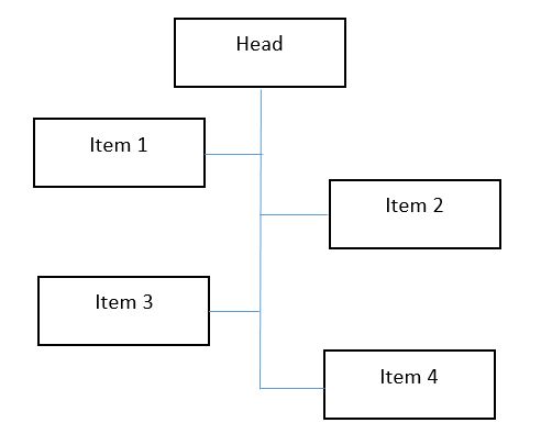
我试图创建一个列表样式,如下图所示
我试图添加边界,但它会在整个结构中出现。


.styled-list {
  list-style: none;
  max-width: 200px;
  padding: 0;
  margin: 0;
}

.styled-list li {
  position: relative;
  padding-left: 10px;
}
.styled-list li:before {
  border-radius: 100%;
  position: absolute;
  content: '';
  height: 5px;
  width: 5px;
  top: 6px;
  left: 0;
}
.styled-list li:nth-child(even) {
  padding-right: 10px;
  text-align: right;
  padding-left: 0;
}
.styled-list li:nth-child(even):before {
  left: auto;
  right: 0;
}
<ul class="styled-list">
<li>List Item 1</li>
<li>List Item 2</li>
<li>List Item 3</li>
<li>List Item 4</li>
<li>List Item 5</li>
<li>List Item 6</li>
<li>List Item 7</li>
<li>List Item 8</li>
</ul>
如何将我的列表更改为显示的图像。
2 个答案:
答案 0 :(得分:4)
使用一些:after伪类,可以完成:
请注意,它需要一些小的调整......
&#13;
&#13;
&#13;
&#13;
* { margin: 0; padding: 0; box-sizing: border-box; }
.styled-list {
font-size: 1em;
list-style: none;
width: 500px;
border: 1px solid red;
position: relative;
}
.styled-list li {
width: 40%;
min-height: 3em;
line-height: 1em;
border: 1px solid grey;
padding: 1em;
position: relative;
margin-bottom: 1em;
}
/* move the odd items(expept the first) to the right */
.styled-list li:nth-child(2n+3) {
margin-left: 60%;
}
/* move the first item (head) to the center */
.styled-list li:first-child {
margin-left: 30%;
margin-right: 30%;
}
/* create the lines to the middle */
.styled-list li:nth-child(even):after,
.styled-list li:nth-child(2n+3):before {
content: ' ';
border-top: 1px solid black;
position: absolute;
top: 50%;
}
/* line for the left items */
.styled-list li:nth-child(even):after {
left:100%;
right: -25%;
margin-right: -1px; /* compensate line width */
}
/* line for the right items */
.styled-list li:nth-child(2n+3):before {
left: -25%;
right: 100%;
margin-left: -1px; /* compensate line width */
}
/* horizontal line */
.styled-list:after {
content: ' ';
border-left: 1px solid black;
position: absolute;
top: 3em;
bottom: 2.5em;
left: 50%;
right: 0;
margin-bottom: 0; /* compensate line width */
}<ul class="styled-list">
<li>Head</li>
<li>List Item 1</li>
<li>List Item 2</li>
<li>List Item 3 with some more text inside it that can also be in three lines</li>
<li>List Item 4</li>
<li>List Item 5</li>
<li>List Item 6</li>
<li>List Item 7</li>
<li>List Item 8</li>
</ul>
答案 1 :(得分:3)
试试此代码
&#13;
&#13;
&#13;
&#13;
.styled-list {
position:relative;
list-style: none;
max-width: 200px;
padding: 0;
margin: 0 auto;
}
.styled-list:before {
position:absolute;
content:" ";
background:#000;
top:-10px;
bottom:10px;
right:50%;
width:2px;
margin-right:-1px;
}
.head {
position: relative;
padding: 5px;
border:1px solid #000;
margin:0 auto 10px;
text-align:center;
max-width:100px;
}
.styled-list li {
position: relative;
padding: 5px;
border:1px solid #000;
display:inline-block;
}
.styled-list li:nth-child(even) {
margin-top:20px;
float:right;
}
.styled-list li:nth-child(even):after {
content:" ";
position:absolute;
width:18px;
height:2px;
left:-18px;
top:50%;
background:#000;
}
.styled-list li:nth-child(odd) {
margin-bottom:20px;
}
.styled-list li:nth-child(odd):after {
content:" ";
position:absolute;
width:18px;
height:2px;
right:-18px;
top:50%;
background:#000;
}<div class="head">Header</div>
<ul class="styled-list">
  <li>List Item 1</li>
  <li>List Item 2</li>
  <li>List Item 3</li>
  <li>List Item 4</li>
  <li>List Item 5</li>
  <li>List Item 6</li>
  <li>List Item 7</li>
  <li>List Item 8</li>
</ul>
相关问题
最新问题
- 我写了这段代码,但我无法理解我的错误
- 我无法从一个代码实例的列表中删除 None 值,但我可以在另一个实例中。为什么它适用于一个细分市场而不适用于另一个细分市场?
- 是否有可能使 loadstring 不可能等于打印?卢阿
- java中的random.expovariate()
- Appscript 通过会议在 Google 日历中发送电子邮件和创建活动
- 为什么我的 Onclick 箭头功能在 React 中不起作用?
- 在此代码中是否有使用“this”的替代方法?
- 在 SQL Server 和 PostgreSQL 上查询,我如何从第一个表获得第二个表的可视化
- 每千个数字得到
- 更新了城市边界 KML 文件的来源?