当显示尺寸更改时,以不同方式对齐Flexbox
我使用Flexboxes有以下HTML / CSS代码:
*{
 font-family:Arial;
}
html,
body {
  height: 100%;
  margin: 0
}
.flexbox {
  display: flex;
  flex-direction: column;
  flex-wrap: nowrap;
  height: 100%;
  width: 100%
}
.flexbox .header{
  background: green;
  border:solid;
  font-size: 30;
  font-weight: bold;
  padding-left: 5;
}
.flexbox .main {
  flex: 1;
  background: red;
  position: relative
}

.flexbox-row {
  display: flex;
  position:absolute;
  height: 100%;
  width: 100%
}
.flexbox-row .links
{
  background: yellow;
  width:15%;
  height:100%;
}
.flexbox-row .second {
  flex: 1;
  background: blue;
  height:100%;
}


nav.sidenav {
    margin:0;
    background-color: white;
    overflow: auto;
    height:100%;
}


nav.sidenav a {
    display: block;
    color: black;
    text-decoration: none;
    padding: 8px;
    text-align: center;
}

nav.sidenav a.active {
    background-color: blue;
    color: white;
}

nav.sidenav a:hover {
    background-color: #555;
    color: white;
    text-decoration: underline;
}


@media screen and (max-width: 1000px) {
  nav.sidenav {
      width: 100%;
      height: auto;
      position: relative;
      border-top:none;
      border-bottom:solid;
      margin-top:0;
      }
      nav.sidenav a {
          float: left;
          padding: 8px;
      }
  .flexbox {
  display: flex;
  flex-direction: column;
  flex-wrap: initial;
  width: 100%
  }
  .flexbox-row .links{
  width:100%;
  }
  .flexbox-row .second {
  background: blue;
}

}
<div class="flexbox">
<div class="header">HeaderHeaderHeaderHeaderHeaderHeade</div>
<div class="main">
<div class="flexbox-row">
<div class="links">
navbar
</div>
<div class="second"> content</div>
</div>
</div>
如何在更改显示宽度时归档,Flexbox对齐如下:
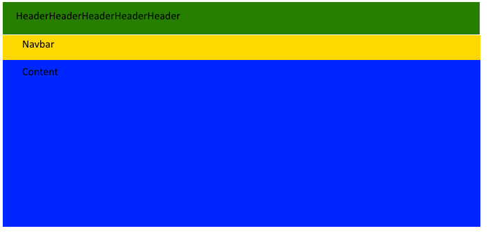
因此标题保持不变,然后是导航栏和内容。填写浏览器高度。 我刚接触css并且不太了解如何正确使用flexbox。
2 个答案:
答案 0 :(得分:1)
在媒体查询(@media screen and (max-width: 1000px) {...)中,添加
.flexbox-row {
  flex-direction: column;
}
将.flexbox-row(即.links和.second)的子元素放在彼此之下( - &gt; flex-direction: column;),这就是您在图片中所拥有的内容。以下是修改后的代码段:
*{
 font-family:Arial;
}
html,
body {
  height: 100%;
  margin: 0
}
.flexbox {
  display: flex;
  flex-direction: column;
  flex-wrap: nowrap;
  height: 100%;
  width: 100%
}
.flexbox .header{
  background: green;
  border:solid;
  font-size: 30;
  font-weight: bold;
  padding-left: 5;
}
.flexbox .main {
  flex: 1;
  background: red;
  position: relative
}

.flexbox-row {
  display: flex;
  position:absolute;
  height: 100%;
  width: 100%
}
.flexbox-row .links
{
  background: yellow;
  width:15%;
  height:100%;
}
.flexbox-row .second {
  flex: 1;
  background: blue;
  height:100%;
}


nav.sidenav {
    margin:0;
    background-color: white;
    overflow: auto;
    height:100%;
}


nav.sidenav a {
    display: block;
    color: black;
    text-decoration: none;
    padding: 8px;
    text-align: center;
}

nav.sidenav a.active {
    background-color: blue;
    color: white;
}

nav.sidenav a:hover {
    background-color: #555;
    color: white;
    text-decoration: underline;
}


@media screen and (max-width: 1000px) {
  nav.sidenav {
      width: 100%;
      height: auto;
      position: relative;
      border-top:none;
      border-bottom:solid;
      margin-top:0;
      }
      nav.sidenav a {
          float: left;
          padding: 8px;
      }
  .flexbox {
  display: flex;
  flex-direction: column;
  flex-wrap: initial;
  width: 100%
  }
  .flexbox-row .links{
  width:100%;
  }
  .flexbox-row .second {
  background: blue;
}
.flexbox-row {
  flex-direction: column;
}
}
<div class="flexbox">
<div class="header">HeaderHeaderHeaderHeaderHeaderHeade</div>
<div class="main">
<div class="flexbox-row">
<div class="links">
navbar
</div>
<div class="second"> content</div>
</div>
</div>
答案 1 :(得分:1)
两件主要的事情:
- 在较窄的屏幕上,使用媒体查询,将
content放在links下方
- 取消绝对定位并改为使用Flexbox,因此内容大小适当
我在CSS中添加了很多笔记,解释了什么以及为什么。
* {
  font-family: Arial;
}

html,body {
  height: 100%;
  margin: 0
}

.flexbox {
  display: flex;
  flex-direction: column;
  /*flex-wrap: nowrap;           not needed, default value  */
  height: 100%;
  /*width: 100%                  not needed, default behavior  */
}

.flexbox .header {
  background: green;
  border: solid;
  font-size: 30;
  font-weight: bold;
  padding-left: 5px;         /*  need unit, added "px"  */
}

.flexbox .main {
  flex: 1;
  background: red;
  /*position: relative;          not needed anymore  */
  display: flex;             /*  instead of absolute position  */
}

.flexbox-row {
  display: flex;
  /*position: absolute;          not needed anymore  */
  /*height: 100%;                not needed when parent has display: flex  */
  width: 100%;
}

.flexbox-row .links {
  background: yellow;
  width: 15%;
  /*height: 100%;                not needed when parent has display: flex  */
}

.flexbox-row .second {
  flex: 1;
  background: blue;
  /*height: 100%;                not needed when parent has display: flex  */
}


nav.sidenav {
  margin: 0;
  background-color: white;
  overflow: auto;
  height: 100%;
}

nav.sidenav a {
  display: block;
  color: black;
  text-decoration: none;
  padding: 8px;
  text-align: center;
}

nav.sidenav a.active {
  background-color: blue;
  color: white;
}

nav.sidenav a:hover {
  background-color: #555;
  color: white;
  text-decoration: underline;
}

@media screen and (max-width: 1000px) {
  nav.sidenav {
    width: 100%;
    height: auto;
    position: relative;
    border-top: none;
    border-bottom: solid;
    margin-top: 0;
  }
  nav.sidenav a {
    float: left;
    padding: 8px;
  }
  /*  not needed, already set
  .flexbox {
    display: flex;
    flex-direction: column;
    flex-wrap: initial;
    width: 100%;
  }
  */
  .flexbox-row {
    flex-direction: column;  /*  added, put content below navbar  */
  }
  .flexbox-row .links {
    width: 100%;
  }
  /*  not needed, already set
  .flexbox-row .second {
    background: blue;
  }
  */
}
<div class="flexbox">
<div class="header">HeaderHeaderHeaderHeaderHeaderHeader</div>
<div class="main">
<div class="flexbox-row">
<div class="links">
navbar
</div>
<div class="second">
content
</div>
</div>
</div>
</div>
相关问题
最新问题
- 我写了这段代码,但我无法理解我的错误
- 我无法从一个代码实例的列表中删除 None 值,但我可以在另一个实例中。为什么它适用于一个细分市场而不适用于另一个细分市场?
- 是否有可能使 loadstring 不可能等于打印?卢阿
- java中的random.expovariate()
- Appscript 通过会议在 Google 日历中发送电子邮件和创建活动
- 为什么我的 Onclick 箭头功能在 React 中不起作用?
- 在此代码中是否有使用“this”的替代方法?
- 在 SQL Server 和 PostgreSQL 上查询,我如何从第一个表获得第二个表的可视化
- 每千个数字得到
- 更新了城市边界 KML 文件的来源?