CSS背景不透明度变为灰色并仅覆盖移动设备上的图像
这是目标。屏幕截图取自Google Chrome上的桌面:

然而,这不是它在移动设备上的样子。缩小桌面上的窗口大小也会得到正确的结果,所以我猜这不是屏幕大小的问题,而是平台问题。这是在wordpress网站上,该部分的html是:
<div id="athena-page-jumbotron" class="parallax-window" data-parallax="scroll" data-image-src="<?php echo wp_get_attachment_url(get_post_thumbnail_id($post->ID)) ?>">
获得该效果的CSS是:
#athena-page-jumbotron {
 width: 100%;
 background-size: cover;
 height: 400px;
 overflow: hidden;
 background: rgba( 0,0,0,0.4 ); // this is what gives it the opacity
}
然而,在移动设备上,它看起来像这样:
您可以看到缺少暗覆盖,这使得文本难以阅读。 为了尝试解决这个问题,我添加了其他规则来强制执行叠加层的不透明度
#athena-page-jumbotron {
 background: rgba(0,0,0,0.4) !important;
}
然而,这会产生以下效果,这是不可取的:

如您所见,叠加层仍然缺失,但有一个灰色框。将CSS更改为background-color而不是background会将其还原为原始版本。将不透明度从0.4更改为1会将灰色框更改为黑色,将其更改为0会使框变为白色。同时为分辨率添加@media标记也无济于事。
非常感谢任何帮助!
1 个答案:
答案 0 :(得分:2)
您可以使用线性渐变轻松完成此操作。
&#13;
&#13;
&#13;
&#13;
.tinted-image {
font-size: 32px;
line-height:200px;
color: white;
text-align: center;
width: 300px;
height: 200px;
background:
/* top, transparent red */
linear-gradient(
rgba(0, 0, 0, 0.45),
rgba(0, 0, 0, 0.45)
),
/* bottom, image */
url(https://blogs.office.com/en-us/wp-content/uploads/sites/2/2017/06/June-updates-to-Get-and-Transform.jpg);
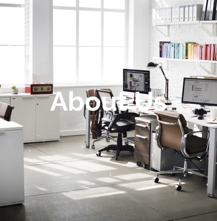
}<div class="tinted-image">
about us
</div>
相关问题
最新问题
- 我写了这段代码,但我无法理解我的错误
- 我无法从一个代码实例的列表中删除 None 值,但我可以在另一个实例中。为什么它适用于一个细分市场而不适用于另一个细分市场?
- 是否有可能使 loadstring 不可能等于打印?卢阿
- java中的random.expovariate()
- Appscript 通过会议在 Google 日历中发送电子邮件和创建活动
- 为什么我的 Onclick 箭头功能在 React 中不起作用?
- 在此代码中是否有使用“this”的替代方法?
- 在 SQL Server 和 PostgreSQL 上查询,我如何从第一个表获得第二个表的可视化
- 每千个数字得到
- 更新了城市边界 KML 文件的来源?