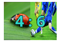
我想创建这样的内容:example。
我的代码。 HTML:
<td>
      <a href="/Topicality/Detail/1030" class="topicality-list-match-image">
           <img src="/Content/Images/test.jpg" alt="brak obrazka" class="topicality-image-match-single-image" data-detailid="1030">
           <img src="/Content/Images/blankshield.png" alt="brak obrazka" class="topicality-image-match-single-image" data-detailid="1030">
           <div class="topicality-text-on-images">
           2:5
           </div>
      </a>
</td>
CSS:
.topicality-list-match-image {
height: 80px;
max-width: 110px;
display: inline-flex;
white-space: nowrap;
filter: brightness(100%);
}

.topicality-image-match-single-image {
width: 100%;
object-fit: cover;
overflow: hidden;
}

.topicality-text-on-images {
position: absolute;
top: 50%;
left: 50%;
transform: translate(-50%, -50%);
color: #30D5C8;
font-weight: bold;
font-size: xx-large;
text-shadow: -1px 0 black, 0 1px black, 1px 0 black, 0 -1px black;
}
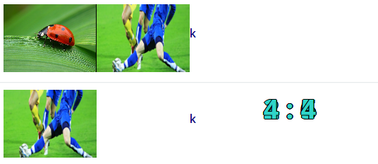
它适用于Firefox,但是当我使用不同的浏览器时,它看起来很难看。
看起来文本位于整个表格的中心,图片更宽。
答案 0 :(得分:0)
为类position: relative指定样式.topicality-list-match-image,让div相对于正确的相对位置放置。
.topicality-list-match-image {
    height: 80px;
    max-width: 110px;
    display: inline-flex;
    white-space: nowrap;
    filter: brightness(100%);
    position: relative; /*add this style*/
}
答案 1 :(得分:0)
我建议不要使用td我建议div使用display:flex
.flex-row {
  display: flex;
  flex-flow: row nowrap;
  height: 100vh;
  background: #000;
}

.flex-column {
  display: flex;
  flex-flow: column nowrap;
}

.flexitem {
  text-align: center;
  color: white;
  font: normal normal bold 2em/1 Helvetica;
  box-sizing: border-box;
  flex: 1;
}

.flexitem .flexitem {
  font-size: 1em;
}

.imageright {
  background: url(https://images.unsplash.com/photo-1463062511209-f7aa591fa72f?dpr=1&auto=format&fit=crop&w=568&h=379&q=60&cs=tinysrgb);
  background-size: cover;
  opacity: 0.8;
}

.imageleft {
  background: url(https://images.unsplash.com/photo-1451976426598-a7593bd6d0b2?dpr=1&auto=format&fit=crop&w=568&h=379&q=60&cs=tinysrgb);
  background-size: cover;
  opacity: 0.8;
}

.overlay-text {
  position: absolute;
  top: 50%;
left: 50%;
transform: translate(-50%, -50%);
color: #30D5C8;
font-weight: bold;
font-size: xx-large;
text-shadow: -1px 0 black, 0 1px black, 1px 0 black, 0 -1px black;
z-index:99;
}
<div class="flex-row">
<div class="overlay-text">2:5</div>
<div class="flex-column flexitem">
<div class="flexitem imageleft"></div>
</div>
<div class="flexitem imageright"></div>
</div>
它也会有回应。