Onclick图像显示div
我试图隐藏页面的一部分,直到点击一个按钮,最好的方法是什么?
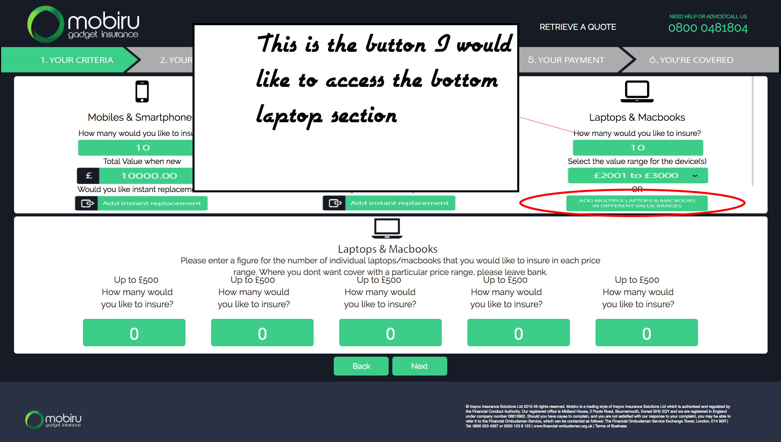
我附上了一张红色环绕的图片是我想用作切换的按钮,以显示笔记本电脑部分的内容。目前,如果您单击图像,它只会打开一个带图像的选项卡,而我希望它显示打开笔记本电脑和Mac部分。
我已将一个JS小提琴附加到我当前的代码中。
https://jsfiddle.net/2j4b4bdn/2/
<html>
<head>
<meta charset="utf-8">
<link href="https://fonts.googleapis.com/css?family=Raleway" rel="stylesheet">
<link rel="stylesheet" href="https://maxcdn.bootstrapcdn.com/bootstrap/3.3.7/css/bootstrap.min.css">
<link href="https://maxcdn.bootstrapcdn.com/font-awesome/4.7.0/css/font-awesome.min.css" rel="stylesheet" crossorigin="anonymous">
<link href="style.css" rel="stylesheet" crossorigin="anonymous">
<style>
body {
background-color: #161A25;
margin:0;
}
#logo {
position:absolute;
left:0;
top:0;
}
h9
{
color: white;
position:absolute;
right:50rem;
top:4rem;
font-size: 15px;
font-family: 'Raleway', sans-serif;
}
h10
{
color: white;
position:absolute;
right:30rem;
top:4rem;
font-size: 15px;
font-family: 'Raleway', sans-serif;
}
h6
{
color: black;
position:absolute;
font-size: 15px;
font-family: 'Raleway', sans-serif;
}
h7
{
color: #32CE87;
position:absolute;
right:6rem;
top:2.5rem;
font-size: 9px;
font-family: 'Raleway', sans-serif;
}
h8
{
color: white;
position:absolute;
right:6rem;
top:3.5rem;
font-family: 'Raleway', sans-serif;
font-size: 22px;
color: #32CE87;
}
.footer {
position: fixed;
right:0;
bottom: 0;
width: 100%;
height:110px;
background-color: #2A3046;
color: white;
}
img.logo {
height: 80px;
left:3em;
position: relative
}
img.logo1 {
height: 40px;
left:3em;
bottom:2rem;
position:absolute;
}
.my-button {
display: inline-block;
margin: 1px;
background: #32CE87;
color: white;
font-family: 'Raleway', sans-serif;
text-align: center;
border-radius: 5px;
padding: 8px 16px;
-moz-transition: all 0.2s;
-webkit-transition: all 0.2s;
transition: all 0.2s;
width: 100px;
text-decoration: none;
}
.my-button:hover {
background: #666;
color: #c1e1e0;
}
.center-bottom {
position: fixed;
bottom: 12rem;
width: 100%;
text-align: center;
}
img.arrow {
max-height: 40px;
}
.row {
background-color: white;
max-width:100%;
margin-top: 0.5rem;
margin-left: 10px;
margin-right: 10px;
border-radius: 5px;
}
.box1 {
background-color: white;
max-width:100%;
height:250px;
padding-bottom:50px;
margin-top: 0.5rem;
margin-left: 25px;
margin-right: 25px;
border-radius: 5px;
}
img {
margin-top:0.5rem;
}
div.container1 {
background-color: white;
max-width:100%;
height:250px;
padding-bottom:50px;
margin-top: 0.5rem;
margin-left: 25px;
margin-right: 25px;
border-radius: 5px;
}
div.container {
margin-top:14rem;
}
p {
font-size:7px;
width:490px;
position: absolute;
right:12em;
text-align: left;
bottom: 1.5rem;
}
img.laptop {
height: 80px;
position: absolute;
left:0px;
right: 0px;
margin-top: -0.5rem;
margin-left: auto;
margin-right: auto;
}
div.bottomtext {
position: relative;
left:0px;
right: 0px;
font-family: 'Raleway', sans-serif;
margin-left: auto;
margin-right: auto;
text-align: center;
width:800px;
top:7rem;
font-size: 1.2rem;
}
img.textimage
{
height:20px;
left:8rem;
position: absolute;
font-family: 'Raleway', sans-serif;
}
.images {
display: inline;
margin: 0px;
padding: 0px;
vertical-align:middle;
width:200px;
}
#content {
display: block;
margin: 0px;
padding: 0px;
position: relative;
top: 90px;
height: auto;
max-width: auto;
overflow-y: hidden;
overflow-x:auto;
word-wrap:normal;
white-space:nowrap;
height: 50px;
}
img.column {
height:50px;
width: 100%;
position: relative;
padding: 0px;
margin: 0px;
}
img.row
{height:60px;
}
h9:hover {
color: #32CE87;
}
h10:hover {
color: #32CE87;
}
p:hover {
color: #32CE87;
}
h7:hover {
color: white;
}
h8:hover {
color: white;
}
.pt-inner-wrap {
color: #ecf0f1;
text-align: center;
color: black;
border-right: 1px solid #d4d4d4;
bottom:-6px;
}
.pt-inner-wrap1 {
color: #ecf0f1;
height: 200px;
text-align: center;
color: black;
border-right: 1px solid #d4d4d4;
bottom:-6px;
}
img.img-responsive {
width: 230px;
height: 32px;
}
img.img-responsive1 {
width: 260px;
height: 50px;
margin-top: 12rem;
}
h4 {
font-size: 18px;
font-family: 'Raleway', sans-serif;
top: 1rem;
}
h6.pt-title {
font-size: 20px;
text-align: center;
vertical-align: middle;
position: absolute;
}
h6.pt-title1 {
margin-top:8rem;
font-size: 20px;
width: 200px;
margin-left:12rem;
position: absolute
}
figcaption {
font-family: 'Raleway', sans-serif;
}
.col-xs-2{
background: #32CE87;;
color:#FFF;
border-radius: 5px;
height: 50px;
text-align: center;
padding-top: 5px;
font-size: 3rem;
}
.col-half-offset{
margin-left:4.166666667%;
text-align: center;
vertical-align:middle;
padding-top: 5px;
}
p.text1 {
position:fixed;
bottom:23rem;
text-align:center;
width:160px;
font-size:16px;
font-family: 'Raleway', sans-serif;
right:86rem;
border-right: 1px solid;
}
p.text2 {
position:fixed;
bottom:23rem;
text-align:center;
width:160px;
font-size:16px;
font-family: 'Raleway', sans-serif;
right:63rem;
border-right: 1px solid;
}
p.text3 {
position:fixed;
bottom:23rem;
text-align:center;
width:160px;
font-size:16px;
font-family: 'Raleway', sans-serif;
right:39rem;
border-right: 1px solid;
}
p.text4 {
position:fixed;
right: 16rem;
bottom:23rem;
text-align:center;
width:160px;
font-size:16px;
font-family: 'Raleway', sans-serif;
}
p.text5 {
position:fixed;
left:17rem;
bottom:23rem;
text-align:center;
width:160px;
font-size:16px;
font-family: 'Raleway', sans-serif;
border-right: 1px solid;
}
</style>
</head>
<body>
<img src="Logo-Trans.png" class="logo" >
<div class="toptext">
<h9> GET A QUOTE</h9>
<h10> RETRIEVE A QUOTE</h10>
<h7>NEED HELP OR ADVICE?CALL US <br style> </h7>
<h8> 0800 0481804</h8>
</div>
<img src="nav.png" class="column">
<div class="container1">
<div class="row">
<div class="col-sm-4">
<div class="pt-inner-wrap">
<i class="fa fa-mobile fa-4x"></i>
<h4 class="pt-title">Mobiles & Smartphones</h4>
<figcaption>How many would you like to insure?</figcaption>
<img src="10.png" width="200px" class="img-responsive" style="margin: 0 auto;"> <figcaption>Total Value when new</figcaption>
<img src="10000.png" width="200px" class="img-responsive" style="margin: 0 auto;"> <figcaption>Would you like instant replacement?<i class="fa fa-question-circle" aria-hidden="true" style="margin-right;1rem; color:grey" ></i></figcaption>
<img src="replacement.png" width="200px" class="img-responsive" style="margin: 0 auto;">
</div>
</div>
<div class="col-sm-4">
<div class="pt-inner-wrap">
<img src="tablet.png" style="height:50px;">
<h4 class="pt-title">iPad's & Tablets</h4>
<figcaption>How many would you like to insure?</figcaption>
<img src="10.png" width="200px" class="img-responsive" style="margin: 0 auto;"> <figcaption>Total Value when new</figcaption>
<img src="10000.png" width="200px" class="img-responsive" style="margin: 0 auto;"> <figcaption>Would you like instant replacement?<i class="fa fa-question-circle" aria-hidden="true" style="right;1rem; color:grey"></i></figcaption>
<img src="replacement.png" width="200px" class="img-responsive" style="margin: 0 auto;">
</div>
</div>
<div class="col-sm-4" >
<div class="pt-inner-wrap" style="border-right: 0px ">
<i class="fa fa-laptop fa-4x"></i>
<h4 class="pt-title">Laptops & Macbooks</h4>
<figcaption>How many would you like to insure?</figcaption>
<img src="10.png" width="200px" class="img-responsive" style="margin: 0 auto;">
<figcaption>Select the value range for the device(s)</figcaption>
<img src="2000.png" width="100px" class="img-responsive" style="margin: 0 auto;"> <figcaption>OR</figcaption>
<h6 class="pt-title"></h6>
<img src="multiple.png" width="200px" class="img-responsive" style="margin: 0 auto;" onclick="window.open(this.src)">
</div>
</div>
</div>
</div>
<!-- jQuery library -->
<script src="https://ajax.googleapis.com/ajax/libs/jquery/3.2.1/jquery.min.js"></script>
<!-- Latest compiled JavaScript -->
<script src="https://maxcdn.bootstrapcdn.com/bootstrap/3.3.7/js/bootstrap.min.js"></script>
<div class="box1">
<div> <img src="laptop.png" class="laptop"> </div>
<div class="bottomtext">Please enter a figure for the number of individual laptops/macbooks that you would like to insure in each price range. Where you dont want cover with a particular price range, please leave bank.</div>
<div class="container">
<div class="row" style="">
<div class="col-xs-2" id="p1">0</div>
<p class=Text1>Up to £500 <br>How many would you like to insure?</p>
<div class="col-xs-2 col-half-offset" id="p2">0</div>
<div style="position:absolute; left:10rem;">
<p class=Text2>Up to £500 <br>How many would you like to insure?</p></div>
<div class="col-xs-2 col-half-offset" id="p3">0</div>
<div style="position:absolute; left:10rem;">
<p class=Text3>Up to £500 <br>How many would you like to insure?</p> </div>
<div class="col-xs-2 col-half-offset" id="p4">0</div>
<div style="position:absolute; left:10rem;">
<p class=Text4>Up to £500 <br>How many would you like to insure?</p></div>
<div class="col-xs-2 col-half-offset" id="p5">0</div>
<div style="position:absolute; left:10rem;">
<p class=Text5>Up to £500 <br>How many would you like to insure?</p></div>
<div></div>
</div>
</div>
</div>
<div class="footer">
<div class="center-bottom">
<a class="my-button" title="Relevant Title" href="#">BACK</a>
<a class="my-button" title="Relevant Title" href="#">NEXT</a>
</div>
<p> © Insync Insurance Solutions Ltd 2016 All rights reserved. Mobiru is a trading style of Insync Insurance Solutions Ltd which is authorised and regulated by the Financial Conduct Authority. Our registered office is Midland House, 2 Poole Road, Bournemouth, Dorset BH2 5QY and we are registered in England under company number 08810662. Should you have cause to complain, and you are not satisfied with our response to your complaint, you may be able to refer it to the Financial Ombudsman Service, which can be contacted as follows: The Financial Ombudsman Service Exchange Tower, London, E14 9SR | <br>Tel: 0800 023 4567 or 0300 123 9 123 | www.financial-ombudsman.org.uk | Terms of Business </p>
<img src="Logo-Trans.png" class="logo1">
</div>
</body>
</html>
2 个答案:
答案 0 :(得分:0)
首先,将来我建议您仅将相关代码复制到您所面临的问题中。将所有HTML,CSS和JS倾倒到一个像这样的块中,其中大部分与你试图解决的问题无关,这使得其他人难以理解。
现在,既然你已经包含了jQuery(虽然你需要将它包含在你的0.2.1标签中),你也可以使用一些CSS和它附带的<head>函数。
下面是一些显示它的动作代码,因为你的代码有点混乱,无法显示简洁的概念。当单击按钮时,您基本上需要在所需元素(laptop / mac部分)上执行.toggleClass()功能。如果您希望它看起来更流畅,您需要查看.toggleClass()和.hide()函数。可以找到文档here。
.show()$( "#toggleBtn" ).click(function() {
$( ".laptops" ).toggleClass( "show" );
});body {
padding: 10px 0px;
}
.laptops {
padding: 5px 10px;
margin-top: 10px;
background-color: #32CE87;
display: none;
}
答案 1 :(得分:0)
我不完全确定你要实现的目标,但是如果你只想在点击另一个元素时出现一个元素,你可以使用js轻松完成。我通常在css中处理visiblity,并添加一个类来使元素出现。
HTML:
<div class="toggler">
Click me
</div>
<div class="element">
Hello
</div>
CSS:
.element{
       opacity:0;
    }
.element.show{
       opacity:1;
}
JS:
var elementToClick = document.querySelector(".toggler");
var elementToShow = document.querySelector(".element");

if(elementToClick){
    elementToClick.addEventListener("click", showElement)
}

function showElement(){
    elementToShow.classList.add("show");
}
相关问题
最新问题
- 我写了这段代码,但我无法理解我的错误
- 我无法从一个代码实例的列表中删除 None 值,但我可以在另一个实例中。为什么它适用于一个细分市场而不适用于另一个细分市场?
- 是否有可能使 loadstring 不可能等于打印?卢阿
- java中的random.expovariate()
- Appscript 通过会议在 Google 日历中发送电子邮件和创建活动
- 为什么我的 Onclick 箭头功能在 React 中不起作用?
- 在此代码中是否有使用“this”的替代方法?
- 在 SQL Server 和 PostgreSQL 上查询,我如何从第一个表获得第二个表的可视化
- 每千个数字得到
- 更新了城市边界 KML 文件的来源?