DivеёҰеңҶи§’иҫ№жЎҶ
жҲ‘дёҚжҳҺзҷҪжҲ‘зҡ„divиҺ·еҫ—дёҖдёӘжӣҙеӨ§зҡ„еңҶеҪўеә•йғЁиҫ№жЎҶзҡ„е…¬ејҸпјҢеҰӮжһңжңүжӣҙз®ҖеҚ•зҡ„ж–№жі•еңЁBootstrapдёӯе®һзҺ°е®ғгҖӮ
зҺ°еңЁе°ұжҳҜиҝҷж ·пјҡ
жҲ‘жғіеҰӮдҪ•ејҖеҸ‘е®ғпјҡ

.header {
background-color: blue;
height: 40px;
width: 90px;
border-bottom-left-radius: 180px;
border-bottom-right-radius: 180px;
border-bottom: 0;
}
<div class="header">
</div>
3 дёӘзӯ”жЎҲ:
зӯ”жЎҲ 0 :(еҫ—еҲҶпјҡ2)
жӮЁеҸҜд»ҘдҪҝз”Ёborder-radiusе’ҢдёҖдәӣжәўеҮәпјҢиҝҷж ·жӮЁе°ұеҸҜд»Ҙдҫқиө–дјӘе…ғзҙ гҖӮ
пјҶпјғ13;
пјҶпјғ13;
пјҶпјғ13;
пјҶпјғ13;
.header {
  position: relative;
  height: 40px;
  width: 90px;
  overflow:hidden;
}

.header:before {
  content: "";
  position:absolute;
  top:0;
  bottom:0;
  left:-10px;
  right:-10px;
  background-color: blue;
  border-bottom-left-radius: 50%;
  border-bottom-right-radius: 50%;
  border-bottom: 0;
}
<div class="header">
</div>
жҲ–дҪҝз”Ёradial-gradientпјҡ
пјҶпјғ13;
пјҶпјғ13;
пјҶпјғ13;
пјҶпјғ13;
.header-1 {
  position: relative;
  height: 40px;
  width: 90px;
  overflow: hidden;
  background: radial-gradient(circle at top, blue 50%, transparent 51%) center/200% 250% no-repeat;
}

.header-2 {
  position: relative;
  height: 40px;
  width: 90px;
  overflow: hidden;
  background: radial-gradient(ellipse at center, blue 50%, transparent 53%) 50% 100%/170% 150% no-repeat;
}
<div class="header-1">
</div>
<div class="header-2">
</div>
жҲ–clip-pathпјҡ
пјҶпјғ13;
пјҶпјғ13;
пјҶпјғ13;
пјҶпјғ13;
.header {
  height: 20px;
  width: 90px;
  position: relative;
  background-color: blue;
}

.header:before {
  content: "";
  position: absolute;
  bottom: -15px;
  height: 30px;
  left: 0;
  right: 0;
  background-color: blue;
-webkit-clip-path: ellipse(60% 50% at 50% 50%);
clip-path: ellipse(60% 50% at 50% 50%);
}
<div class="header">
</div>
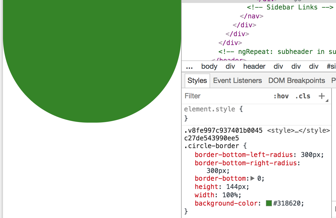
зӯ”жЎҲ 1 :(еҫ—еҲҶпјҡ1)
иҝҷжҳҜдёҖдёӘеҜ№жҲ‘жңүз”Ёзҡ„и§ЈеҶіж–№жЎҲ
.container{
  position:relative;
  width:100%;
  height:100px;
  text-align:center;
  overflow:hidden;
  z-index:2;
}
.header{
  height:60px;
  position:absolute;
  top:0;
  bottom:0;
  left:-20px;
  right:-20px;
  background-color: green;
  border-bottom-right-radius:100%;
  border-bottom-left-radius:100%;
  padding:10px;
  box-shadow: 5px 15px 10px grey;
}
<div class="container">
<div class="header">
this is the header
</div>
</div>
зӯ”жЎҲ 2 :(еҫ—еҲҶпјҡ0)
еҖҹеҠ© clip-path пјҢжҲ‘们еҸҜд»ҘиҺ·еҫ—жӯӨиҫ“еҮә
.first-div{
background:#007dbf;
height:400px;
clip-path: ellipse(70% 49% at 50% 30%);
}
<div class="first-div"></div>
зӣёе…ій—®йўҳ
- CssеёҰиҫ№жЎҶзҡ„еңҶи§’
- jQuery UIи°ғж•ҙеӨ§е°Ҹ - еёҰиҫ№жЎҶзҡ„DIVеңҶи§’
- жү©еұ•ж—¶еёҰжңүеңҶи§’е’ҢжҸ’е…Ҙиҫ№жЎҶзҡ„Div
- е°Ҷиҫ№жЎҶеә”з”ЁдәҺеёҰеңҶи§’зҡ„divпјҹ
- iOSеңҶи§’UIImageеёҰиҫ№жЎҶ
- еёҰеңҶи§’зҡ„иҫ№жЎҶеӣҫеғҸ
- еёҰеңҶи§’зҡ„UITableViewиҫ№жЎҶ
- DivеёҰеңҶи§’иҫ№жЎҶ
- еёҰеҶ…иҫ№жЎҶзҡ„еңҶи§’
- дёәеёҰжңүDIVзҡ„еңҶи§’ж·»еҠ иҫ№жЎҶ
жңҖж–°й—®йўҳ
- жҲ‘еҶҷдәҶиҝҷж®өд»Јз ҒпјҢдҪҶжҲ‘ж— жі•зҗҶи§ЈжҲ‘зҡ„й”ҷиҜҜ
- жҲ‘ж— жі•д»ҺдёҖдёӘд»Јз Ғе®һдҫӢзҡ„еҲ—иЎЁдёӯеҲ йҷӨ None еҖјпјҢдҪҶжҲ‘еҸҜд»ҘеңЁеҸҰдёҖдёӘе®һдҫӢдёӯгҖӮдёәд»Җд№Ҳе®ғйҖӮз”ЁдәҺдёҖдёӘз»ҶеҲҶеёӮеңәиҖҢдёҚйҖӮз”ЁдәҺеҸҰдёҖдёӘз»ҶеҲҶеёӮеңәпјҹ
- жҳҜеҗҰжңүеҸҜиғҪдҪҝ loadstring дёҚеҸҜиғҪзӯүдәҺжү“еҚ°пјҹеҚўйҳҝ
- javaдёӯзҡ„random.expovariate()
- Appscript йҖҡиҝҮдјҡи®®еңЁ Google ж—ҘеҺҶдёӯеҸ‘йҖҒз”өеӯҗйӮ®д»¶е’ҢеҲӣе»әжҙ»еҠЁ
- дёәд»Җд№ҲжҲ‘зҡ„ Onclick з®ӯеӨҙеҠҹиғҪеңЁ React дёӯдёҚиө·дҪңз”Ёпјҹ
- еңЁжӯӨд»Јз ҒдёӯжҳҜеҗҰжңүдҪҝз”ЁвҖңthisвҖқзҡ„жӣҝд»Јж–№жі•пјҹ
- еңЁ SQL Server е’Ң PostgreSQL дёҠжҹҘиҜўпјҢжҲ‘еҰӮдҪ•д»Һ第дёҖдёӘиЎЁиҺ·еҫ—第дәҢдёӘиЎЁзҡ„еҸҜи§ҶеҢ–
- жҜҸеҚғдёӘж•°еӯ—еҫ—еҲ°
- жӣҙж–°дәҶеҹҺеёӮиҫ№з•Ң KML ж–Ү件зҡ„жқҘжәҗпјҹ