我创建了一个自适应导航栏。我有两个问题。 1)当我缩小测试页面上的屏幕时,所有链接都不会隐藏。 2)当我将代码插入Drupal时,它会将嵌套的链接放在不同的基线上。它在测试页面上没有这样做。我无法找到一种方法来创建没有按钮的响应条...可能是因为我是初学者。
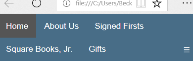
以下是enter image description here enter image description here和代码两个问题的屏幕截图。
<!DOCTYPE html>
<html>
<head>
<meta name="viewport" content="width=device-width, initial-scale=1">
<link rel="stylesheet" href="https://cdnjs.cloudflare.com/ajax/libs/font-awesome/4.7.0/css/font-awesome.min.css">
<style>
body {margin:0;font-family:Helvetica}
/* Add a background color to the top navigation */
.topnav {
overflow: hidden;
background-color: #486D87;
}
/* Style the links inside the navigation bar */
.topnav a {
float: left;
display: block;
color: white;
text-align: center;
padding: 14px 16px;
text-decoration: none;
font-size: 17px;
}
.active {
background-color: #555;
color: white;
}
/* Hide the link that should open and close the topnav on small screens */
.topnav .icon {
display: none;
}
/* Dropdown container - needed to position the dropdown content */
.dropdown {
float: left;
overflow: hidden;
}
/* Style the dropdown button to fit inside the topnav */
.dropdown .dropbtn {
font-size: 17px;
border: none;
outline: none;
color: white;
padding: 14px 16px;
background-color: inherit;
font-family: inherit;
margin: 0;
}
/* Style the dropdown content (hidden by default) */
.dropdown-content {
display: none;
position: absolute;
background-color: #f1f1f1;
min-width: 160px;
box-shadow: 0px 8px 16px 0px rgba(0,0,0,0.2);
z-index: 1;
}
/* Style the links inside the dropdown */
.dropdown-content a {
float: none;
color: black;
padding: 12px 16px;
text-decoration: none;
display: block;
text-align: left;
}
/* Add a background color on topnav links and the dropdown button on hover */
.topnav a:hover, .dropdown:hover .dropbtn {
background-color: #BE6A14;
color: white;
}
/* Add a background color to dropdown links on hover */
.dropdown-content a:hover {
background-color: #BE6A14;
color: black;
}
/* Show the dropdown menu when the user moves the mouse over the dropdown button */
.dropdown:hover .dropdown-content {
display: block;
}
/* When the screen is less than 600 pixels wide, hide all links, except for the first one ("Home"). Show the link that contains should open and close the topnav (.icon) */
@media screen and (max-width: 600px) {
.topnav a:not(:first-child), .dropdown .dropbtn {
display: none;
}
.topnav a.icon {
float: right;
display: block;
}
}
/* The "responsive" class is added to the topnav with JavaScript when the user clicks on the icon. This class makes the topnav look good on small screens (display the links vertically instead of horizontally) */
@media screen and (max-width: 600px) {
.topnav.responsive {position: relative;}
.topnav.responsive a.icon {
position: absolute;
right: 0;
top: 0;
}
.topnav.responsive a {
float: none;
display: block;
text-align: left;
}
.topnav.responsive .dropdown {float: none;}
.topnav.responsive .dropdown-content {position: relative;}
.topnav.responsive .dropdown .dropbtn {
display: block;
width: 100%;
text-align: left;
}
}
</style>
</head>
<body>
<div class="topnav" id="myTopnav">
<a href="/" class="active">Home</a>
<div class="dropdown">
<button class="dropbtn">About Us</button>
<div class="dropdown-content">
<a href="/about">Store Info</a>
<a href="/history">History</a>
<a href="/consignment">Consignment</a>
<a href="/we-buy-used-books">We Buy Used Books</a>
</div>
</div>
<a href="/event">Events</a>
<a href="/blog">Blog</a>
<div class="dropdown">
<button class="dropbtn">Signed Firsts</button>
<div class="dropdown-content">
<a href="/signedfirsts">Signed Fiction</a>
<a href="/square-non-fiction-subscription">Signed Nonfiction</a>
<a href="/signed-suspense">Signed Suspense</a>
</div>
</div>
<a href="/staff-recommendations">Staff Picks</a>
<div class="dropdown">
<button class="dropbtn">Square Books, Jr.</button>
<div class="dropdown-content">
<a href="/junior">Store Info</a>
<a href="/junior/history">History</a>
<a href="/junior/storytime">Storytime</a>
</div>
</div>
<div class="dropdown">
<button class="dropbtn">Gifts</button>
<div class="dropdown-content">
<a href="/square-books-gifts">
<a href="/gift-cards">Gift Cards</a>
</div>
</div>
<a href="/dear-reader-newsletter">Dear Reader</a>
<a href="javascript:void(0);" style="font-size:15px;" class="icon" onclick="myFunction()">☰</a>
</div>
<script>
/* Toggle between adding and removing the "responsive" class to topnav when the user clicks on the icon */
function myFunction() {
var x = document.getElementById("myTopnav");
if (x.className === "topnav") {
x.className += " responsive";
} else {
x.className = "topnav";
}
}
</script>
</body>
</html>
答案 0 :(得分:0)
也许这会解决您的使用案例:
https://jsfiddle.net/5tof6ry0/4/
css的变化:
.topnav {
  overflow: hidden;
  background-color: #486D87;
  display: flex;
  justify-content: space-between;
}
答案 1 :(得分:-1)
您的代码似乎很好,您只需要使用媒体查询隐藏按钮元素。
将此插入您的CSS。
@media screen and (max-width: 600px) {
/*Hide button elements*/
.topnav button,
.topnav a:not(:first-child)
{display: none;}