ж— жі•жӣҙж”№TextFieldиҫ№жЎҶйўңиүІ
жҲ‘жӯЈеңЁе°қиҜ•дҪҝз”ЁTextFieldжӣҙж”№BorderSideиҫ№жЎҶзҡ„йўңиүІпјҢдҪҶе®ғдёҚиө·дҪңз”ЁгҖӮ
иҝҷжҳҜжҲ‘зҡ„д»Јз ҒгҖӮ
new TextField(
        decoration: new InputDecoration(
            border: new OutlineInputBorder(
              borderSide: new BorderSide(color: Colors.teal)
            ),
            hintText: 'Tell us about yourself',
            helperText: 'Keep it short, this is just a demo.',
            labelText: 'Life story',
            prefixIcon: const Icon(Icons.person, color: Colors.green,),
            prefixText: ' ',
            suffixText: 'USD',
            suffixStyle: const TextStyle(color: Colors.green)),
       )
)
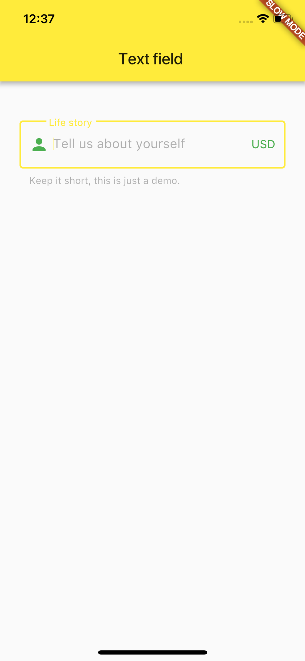
з»“жһңжҲӘеӣҫеҰӮдёӢжүҖзӨәгҖӮ
10 дёӘзӯ”жЎҲ:
зӯ”жЎҲ 0 :(еҫ—еҲҶпјҡ21)
з”ұдәҺй»ҳи®Өдё»йўҳи®ҫзҪ®еңЁеұҸ幕дёҠпјҢеӣ жӯӨжІЎжңүж”№еҸҳгҖӮ
еӣ жӯӨпјҢеҸӘйңҖдҪҝз”Ё new ThemeDataпјҲпјү
еҢ…иЈ…TextFieldпјҢеҚіеҸҜдёәжӮЁжӯЈеңЁз»ҳеҲ¶зҡ„е°ҸйғЁд»¶жӣҙж”№е®ғ们child: new Theme(
data: new ThemeData(
primaryColor: Colors.redAccent,
primaryColorDark: Colors.red,
),
child: new TextField(
decoration: new InputDecoration(
border: new OutlineInputBorder(
borderSide: new BorderSide(color: Colors.teal)),
hintText: 'Tell us about yourself',
helperText: 'Keep it short, this is just a demo.',
labelText: 'Life story',
prefixIcon: const Icon(
Icons.person,
color: Colors.green,
),
prefixText: ' ',
suffixText: 'USD',
suffixStyle: const TextStyle(color: Colors.green)),
),
));
зӯ”жЎҲ 1 :(еҫ—еҲҶпјҡ20)
жү§иЎҢжӯӨж“ҚдҪңзҡ„ж–°ж–№жі•жҳҜеғҸиҝҷж ·дҪҝз”ЁenabledBorderпјҡ
new TextField(
  decoration: new InputDecoration(
    enabledBorder: const OutlineInputBorder(
      borderSide: const BorderSide(color: Colors.grey, width: 0.0),
    ),
    focusedBorder: ...
    border: ...
  ),
)
зӯ”жЎҲ 2 :(еҫ—еҲҶпјҡ9)
жӣҙж”№primaryColorе’ҢprimaryColorDarkйўңиүІзҡ„д»Јз ҒдёҚдјҡжӣҙж”№иҫ№жЎҶзҡ„йўңиүІпјҢеҸӘжңүеңЁзӮ№жҢүйўңиүІеҗҺжүҚдјҡдҝқжҢҒй»‘иүІ
еҝ…йЎ»жӣҙж”№зҡ„еұһжҖ§дёәhintColor
BorderSideдёҚеә”иҜҘз”ЁдәҺжӯӨпјҢжӮЁйңҖиҰҒжӣҙж”№дё»йўҳгҖӮ
иҰҒдҪҝзәўиүІй»ҳи®Өе°Ҷдё»йўҳж”ҫеңЁMaterialApp(theme: ...)дёӯ并жӣҙж”№зү№е®ҡе°ҸйғЁд»¶зҡ„дё»йўҳпјҢдҫӢеҰӮе°Ҷй»ҳи®ӨзәўиүІжӣҙж”№дёәе°ҸйғЁд»¶зҡ„й»„иүІпјҢиҜ·дҪҝз”Ёд»ҘдёӢеҶ…е®№еҢ…еӣҙе°ҸйғЁд»¶пјҡ / p>
new Theme(
  data: new ThemeData(
    hintColor: Colors.yellow
  ),
  child: ...
)
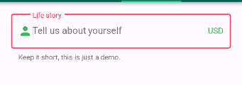
д»ҘдёӢжҳҜд»Јз Ғе’Ңgifпјҡ
иҜ·жіЁж„ҸпјҢеҰӮжһңжҲ‘们е°ҶprimaryColorйўңиүІе®ҡд№үдёәй»‘иүІпјҢеҲҷзӮ№жҢүе°ҸйғЁд»¶дјҡйҖүжӢ©й»‘иүІ
дҪҶиҰҒжӣҙж”№е°ҸйғЁд»¶еҶ…зҡ„ж Үзӯҫе’Ңж–Үеӯ—пјҢжҲ‘们йңҖиҰҒе°Ҷдё»йўҳи®ҫзҪ®дёәInputDecorationTheme
д»Ҙй»„иүІејҖеӨҙзҡ„е°ҸйғЁд»¶жңүиҮӘе·ұзҡ„дё»йўҳпјҢд»ҘзәўиүІејҖеӨҙзҡ„е°ҸйғЁд»¶е…·жңүдҪҝз”ЁеҮҪж•°buildTheme()е®ҡд№үзҡ„й»ҳи®Өдё»йўҳ
import 'package:flutter/material.dart';
void main() => runApp(new MyApp());
ThemeData buildTheme() {
final ThemeData base = ThemeData();
return base.copyWith(
hintColor: Colors.red,
primaryColor: Colors.black,
inputDecorationTheme: InputDecorationTheme(
hintStyle: TextStyle(
color: Colors.blue,
),
labelStyle: TextStyle(
color: Colors.green,
),
),
);
}
class MyApp extends StatelessWidget {
@override
Widget build(BuildContext context) {
return new MaterialApp(
theme: buildTheme(),
home: new HomePage(),
);
}
}
class HomePage extends StatefulWidget {
@override
_HomePageState createState() => new _HomePageState();
}
class _HomePageState extends State<HomePage> {
String xp = '0';
@override
Widget build(BuildContext context) {
return new Scaffold(
appBar: new AppBar(),
body: new Container(
padding: new EdgeInsets.only(top: 16.0),
child: new ListView(
children: <Widget>[
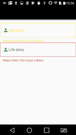
new InkWell(
onTap: () {},
child: new Theme(
data: new ThemeData(
hintColor: Colors.yellow
),
child: new TextField(
decoration: new InputDecoration(
border: new OutlineInputBorder(),
hintText: 'Tell us about yourself',
helperText: 'Keep it short, this is just a demo.',
labelText: 'Life story',
prefixIcon: const Icon(Icons.person, color: Colors.green,),
prefixText: ' ',
suffixText: 'USD',
suffixStyle: const TextStyle(color: Colors.green)),
)
)
),
new InkWell(
onTap: () {},
child: new TextField(
decoration: new InputDecoration(
border: new OutlineInputBorder(
borderSide: new BorderSide(color: Colors.teal)
),
hintText: 'Tell us about yourself',
helperText: 'Keep it short, this is just a demo.',
labelText: 'Life story',
prefixIcon: const Icon(Icons.person, color: Colors.green,),
prefixText: ' ',
suffixText: 'USD',
suffixStyle: const TextStyle(color: Colors.green)),
)
)
],
),
)
);
}
}
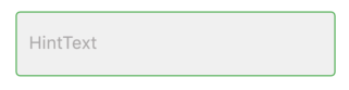
зӯ”жЎҲ 3 :(еҫ—еҲҶпјҡ4)
жңҖеҘҪпјҢжңҖжңүж•Ҳзҡ„и§ЈеҶіж–№жЎҲжҳҜеңЁдё»зұ»дёӯж·»еҠ дё»йўҳпјҢ并еғҸиҝҷж ·ж·»еҠ иҫ“е…Ҙдҝ®йҘ°гҖӮ
theme: ThemeData(
    inputDecorationTheme: InputDecorationTheme(
        border: OutlineInputBorder(
           borderSide: BorderSide(color: Colors.pink)
        )
    ),
)
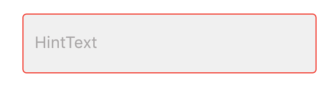
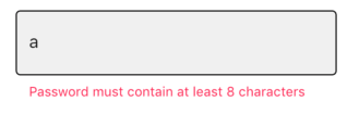
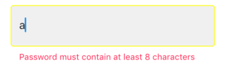
зӯ”жЎҲ 4 :(еҫ—еҲҶпјҡ1)
еҘҪеҗ§пјҢжҲ‘зңҹзҡ„дёҚзҹҘйҒ“дёәд»Җд№ҲеҲҶй…Қз»ҷиҫ№жЎҶзҡ„йўңиүІдёҚиө·дҪңз”ЁгҖӮдҪҶжҳҜжӮЁеҸҜд»ҘдҪҝз”Ёж–Үжң¬еӯ—ж®өзҡ„е…¶д»–иҫ№жЎҶеұһжҖ§жқҘжҺ§еҲ¶иҫ№жЎҶйўңиүІгҖӮе®ғ们жҳҜпјҡ
- disabledBorderпјҡеҗҜз”Ёи®ҫзҪ®дёәfalseж—¶иў«жҝҖжҙ»
- enabledBorderпјҡеҗҜз”Ёи®ҫзҪ®дёәtrueж—¶жҝҖжҙ»пјҲй»ҳи®Өжғ…еҶөдёӢпјҢTextFieldзҡ„enabledеұһжҖ§дёәtrueпјү
- errorBorderпјҡеңЁеҮәзҺ°жҹҗдәӣй”ҷиҜҜпјҲеҚійӘҢиҜҒеӨұиҙҘпјүж—¶иў«жҝҖжҙ»
- focusedBorderпјҡеҪ“жҲ‘们еҚ•еҮ»/е…іжіЁTextFieldж—¶иў«жҝҖжҙ»гҖӮ
- focusedErrorBorderпјҡеңЁеҮәзҺ°й”ҷиҜҜдё”еҪ“еүҚжҲ‘们专注дәҺиҜҘTextFieldж—¶иў«жҝҖжҙ»гҖӮ
дёӢйқўжҳҜдёҖдёӘд»Јз Ғж®өпјҡ
TextField(
 enabled: false, // to trigger disabledBorder
 decoration: InputDecoration(
   filled: true,
   fillColor: Color(0xFFF2F2F2),
   focusedBorder: OutlineInputBorder(
     borderRadius: BorderRadius.all(Radius.circular(4)),
     borderSide: BorderSide(width: 1,color: Colors.red),
   ),
   disabledBorder: OutlineInputBorder(
     borderRadius: BorderRadius.all(Radius.circular(4)),
     borderSide: BorderSide(width: 1,color: Colors.orange),
   ),
   enabledBorder: OutlineInputBorder(
     borderRadius: BorderRadius.all(Radius.circular(4)),
     borderSide: BorderSide(width: 1,color: Colors.green),
   ),
   border: OutlineInputBorder(
     borderRadius: BorderRadius.all(Radius.circular(4)),
     borderSide: BorderSide(width: 1,)
   ),
   errorBorder: OutlineInputBorder(
     borderRadius: BorderRadius.all(Radius.circular(4)),
     borderSide: BorderSide(width: 1,color: Colors.black)
   ),
   focusedErrorBorder: OutlineInputBorder(
     borderRadius: BorderRadius.all(Radius.circular(4)),
     borderSide: BorderSide(width: 1,color: Colors.yellowAccent)
   ),
   hintText: "HintText",
   hintStyle: TextStyle(fontSize: 16,color: Color(0xFFB3B1B1)),
   errorText: snapshot.error,
 ),
 controller: _passwordController,
 onChanged: _authenticationFormBloc.onPasswordChanged,
                            obscureText: false,
),
disabledBorderпјҡ
enabledBorderпјҡ
focusedBorderпјҡ
errorBorderпјҡ
errorFocusedBorderпјҡ
еёҢжңӣе®ғеҜ№жӮЁжңүеё®еҠ©гҖӮ
зӯ”жЎҲ 5 :(еҫ—еҲҶпјҡ1)
/*
 * Assuming your form contains these:
    <input name="first_name">
    <input name="last_name">
    <input name="middle_initial">
 */

$name_search = array(
    'relation' => 'AND',
);

// * okay, this still uses 3 clauses, but it always would be just 3 clauses
foreach ( array( 'first_name', 'last_name', 'middle_initial' ) as $name ) {
    if ( ! empty( $_POST[ $name ] ) ) {
        $name_search[ $name ] = array(
            'key'     => '_full_name',
            'value'   => sanitize_text_field( $_POST[ $name ] ),
            'compare' => 'LIKE',
        );
    }
}

$args['meta_query']['name_search'] = $name_search;
зӯ”жЎҲ 6 :(еҫ—еҲҶпјҡ0)
жҲ‘们е°қиҜ•дәҶеёҰжңүзІҳиҙҙд»Јз Ғж®өзҡ„иҮӘе®ҡд№үжҗңзҙўжЎҶгҖӮиҝҷж®өд»Јз ҒеҸҜз”ЁдәҺFlutterдёӯзҡ„жүҖжңүTextFiledиЈ…йҘ°гҖӮеёҢжңӣжӯӨзүҮж®өеҜ№е…¶д»–дәәжңүеё®еҠ©гҖӮ
Container(
        margin: EdgeInsets.fromLTRB(0.0, 10.0, 0.0, 10.0),
        child:  new Theme(
          data: new ThemeData(
           hintColor: Colors.white,
            primaryColor: Colors.white,
            primaryColorDark: Colors.white,
          ),
          child:Padding(
          padding: EdgeInsets.all(10.0),
          child: TextField(
            style: TextStyle(color: Colors.white),
            onChanged: (value) {
              filterSearchResults(value);
            },
            controller: editingController,
            decoration: InputDecoration(
                labelText: "Search",
                hintText: "Search",
                prefixIcon: Icon(Icons.search,color: Colors.white,),
                enabled: true,
                enabledBorder: OutlineInputBorder(
                  borderSide: BorderSide(color: Colors.white),
                    borderRadius: BorderRadius.all(Radius.circular(25.0))),
                border: OutlineInputBorder(
                    borderSide: const BorderSide(color: Colors.white, width: 0.0),
                    borderRadius: BorderRadius.all(Radius.circular(25.0)))),
          ),
        ),
        ),
      ),
зӯ”жЎҲ 7 :(еҫ—еҲҶпјҡ0)
жӮЁеҸҜд»Ҙе°ҶжӯӨд»Јз Ғз”ЁдәҺеә•йғЁе·ҘдҪңиЎЁд»ҘеҸҠжҷ®йҖҡж–Үжң¬еӯ—ж®өпјҡ
class TextFieldForDropDown extends StatelessWidget {
      final String title;
      final String hintText;
      final TextEditingController textEditingController;
      bool isPassword;
      final Function onTap;
      final bool enable;
      TextFieldForDropDown({this.title, this.hintText, this.textEditingController, this.isPassword = false, this.onTap, this.enable});
      @override
      Widget build(BuildContext context) {

        var titleTextStyle = TextStyle(
          color: Color(0xff9098C8),
          fontSize: 12,
          fontWeight: FontWeight.w400,
          fontFamily: "Muli",
        );

        var textFieldTextStyle = TextStyle(
          color: Colors.white,
          fontSize: 14,
          fontWeight: FontWeight.w400,
          fontFamily: "Muli",
        );

        var borderSides = OutlineInputBorder(borderSide: new BorderSide(color: Color(0xff38406B)));
        var borderSides1 = OutlineInputBorder(borderSide: new BorderSide(color: Color(0xffdae4ff)));

        return InkWell(
          onTap: onTap,
          child: Container(
            child: Column(
              crossAxisAlignment: CrossAxisAlignment.start,
              children: [
                Text(this.title, style: titleTextStyle),
                SizedBox(height: 8),
                TextFormField(
                  enabled: enable,
                  // onTap: onTap,
                  obscureText: isPassword,
                  style: textFieldTextStyle,
                  decoration: InputDecoration(
                    contentPadding: EdgeInsets.symmetric(horizontal: 8, vertical: 8),
                    hintText: this.hintText,
                    hintStyle: titleTextStyle,
                    border: textEditingController.text != "" ? borderSides1 :borderSides,
                    enabledBorder:  textEditingController.text != "" ? borderSides1 :borderSides,
                    disabledBorder: textEditingController.text != "" ? borderSides1 :borderSides,
                    focusedBorder: OutlineInputBorder(borderSide: new BorderSide(color: Color(0xffdae4ff))),
                  ),
                  controller: textEditingController,
                )
              ],
            ),
          ),
        );
      }
    }
并еғҸиҝҷж ·дҪҝз”Ёпјҡ
TextFieldForDropDown(
                                title: 'Phone Number*',
                                hintText: '+123-22-223-00',
                                textEditingController: viewModel.phoneController,
                              ),
зӯ”жЎҲ 8 :(еҫ—еҲҶпјҡ-1)
enabledBorder: OutlineInputBorder(
  borderRadius: BorderRadius.circular(10.0),
  borderSide: BorderSide(color: Colors.red)
),
зӯ”жЎҲ 9 :(еҫ—еҲҶпјҡ-1)
Padding(
            padding: EdgeInsets.symmetric(vertical: 10, horizontal: 40),
            child: TextField(
              cursorColor: Color.fromRGBO(25, 118, 218, 1),
              decoration: new InputDecoration(
                border: new OutlineInputBorder(
                  borderSide:
                      new BorderSide(color: Color.fromRGBO(25, 118, 218, 1)),
                ),
                focusedBorder: new OutlineInputBorder(
                  borderSide:
                      new BorderSide(color: Color.fromRGBO(25, 118, 218, 1)),
                ),
                labelText: "Edit Phone",
                labelStyle: TextStyle(
                  color: Colors.grey,
                ),
                prefixIcon: const Icon(
                  Icons.phone_outlined,
                  color: Color.fromRGBO(25, 118, 218, 1),
                ),
              ),
            ),
          ),
зЁҚеҗҺи°ўи°ўжҲ‘:)
- жӣҙж”№textFieldиҫ№жЎҶйўңиүІiOS
- еҰӮдҪ•жӣҙж”№TextFieldиҫ№жЎҶзҡ„йўңиүІпјҹ iOSзүҲ
- жҲ‘жғідҪҝз”ЁitemIdжӣҙж”№ж–Үжң¬еӯ—ж®өзҡ„иҫ№жЎҶйўңиүІ
- еҰӮдҪ•жӣҙж”№UIAlertControllerзҡ„ж–Үжң¬жЎҶиҫ№жЎҶйўңиүІ
- Bootstrap - ж–Үжң¬еӯ—ж®өзҡ„иҫ№жЎҶйўңиүІ
- ж— жі•жӣҙж”№TextFieldиҫ№жЎҶйўңиүІ
- еҰӮдҪ•жӣҙж”№Material-UI <textfield>зҡ„иҫ№жЎҶйўңиүІ
- жӣҙж”№иҪ®е»“ж–Үжң¬еӯ—ж®өзҡ„й»ҳи®Өиҫ№жЎҶйўңиүІ
- иҒҡз„Ұж—¶жӣҙж”№TextFieldзҡ„иҫ№жЎҶйўңиүІ
- Flutter-еҰӮдҪ•жӣҙж”№TextFieldиҫ№жЎҶйўңиүІпјҹ
- жҲ‘еҶҷдәҶиҝҷж®өд»Јз ҒпјҢдҪҶжҲ‘ж— жі•зҗҶи§ЈжҲ‘зҡ„й”ҷиҜҜ
- жҲ‘ж— жі•д»ҺдёҖдёӘд»Јз Ғе®һдҫӢзҡ„еҲ—иЎЁдёӯеҲ йҷӨ None еҖјпјҢдҪҶжҲ‘еҸҜд»ҘеңЁеҸҰдёҖдёӘе®һдҫӢдёӯгҖӮдёәд»Җд№Ҳе®ғйҖӮз”ЁдәҺдёҖдёӘз»ҶеҲҶеёӮеңәиҖҢдёҚйҖӮз”ЁдәҺеҸҰдёҖдёӘз»ҶеҲҶеёӮеңәпјҹ
- жҳҜеҗҰжңүеҸҜиғҪдҪҝ loadstring дёҚеҸҜиғҪзӯүдәҺжү“еҚ°пјҹеҚўйҳҝ
- javaдёӯзҡ„random.expovariate()
- Appscript йҖҡиҝҮдјҡи®®еңЁ Google ж—ҘеҺҶдёӯеҸ‘йҖҒз”өеӯҗйӮ®д»¶е’ҢеҲӣе»әжҙ»еҠЁ
- дёәд»Җд№ҲжҲ‘зҡ„ Onclick з®ӯеӨҙеҠҹиғҪеңЁ React дёӯдёҚиө·дҪңз”Ёпјҹ
- еңЁжӯӨд»Јз ҒдёӯжҳҜеҗҰжңүдҪҝз”ЁвҖңthisвҖқзҡ„жӣҝд»Јж–№жі•пјҹ
- еңЁ SQL Server е’Ң PostgreSQL дёҠжҹҘиҜўпјҢжҲ‘еҰӮдҪ•д»Һ第дёҖдёӘиЎЁиҺ·еҫ—第дәҢдёӘиЎЁзҡ„еҸҜи§ҶеҢ–
- жҜҸеҚғдёӘж•°еӯ—еҫ—еҲ°
- жӣҙж–°дәҶеҹҺеёӮиҫ№з•Ң KML ж–Ү件зҡ„жқҘжәҗпјҹ