弹性项目之间的空间
我目前正在尝试学习弹性盒子,但我的知识不足以让我知道在Google或Stack上搜索什么。
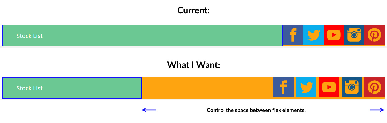
我希望第一个元素'stock'与Flex容器保持对齐, last 社交媒体图标右对齐。
我需要在股票清单和第一个社交媒体图标之间留出空间,然后在每个社交图标之间留出一点空间。
.flex-container {
 width: 100%;
 padding-left: 0;
 padding-right: 0;
 }

 #flex-items {
 display: flex;
 flex-direction: row;
 flex-wrap: nowrap;
 justify-content: flex-end;
 background-color: orange;
 }

 .stock {
 margin-right: auto;
 background-color: #6dc993;
 display: flex;
 border: 2px solid blue;
 flex-grow: 1;
 }

 .stock > p {
 margin-left: 5%;
 display: flex;
 align-self: center;
 font-size: 20px;
 color: white;
 height: 20%;
 }
<div class="flex-container">
<div id="flex-items">
<div class="stock"><p>Stock List</p></div>
<div><img title="Like us on Facebook" src="http://i.cubeupload.com/ULYeTe.jpg" alt="Like us on Facebook" width="68" height="76" /></div>
<div><img title="Like us on Facebook" src="http://i.cubeupload.com/ULYeTe.jpg" alt="Like us on Facebook" width="68" height="76" /></div>
<div><img title="Like us on Facebook" src="http://i.cubeupload.com/ULYeTe.jpg" alt="Like us on Facebook" width="68" height="76" /></div>
<div><img title="Like us on Facebook" src="http://i.cubeupload.com/ULYeTe.jpg" alt="Like us on Facebook" width="68" height="76" /></div>
<div><img title="Like us on Facebook" src="http://i.cubeupload.com/ULYeTe.jpg" alt="Like us on Facebook" width="68" height="76" /></div>
</div>
</div>
5 个答案:
答案 0 :(得分:0)
我在.stock上摆脱了flex-grow因为它让它变得适合剩下的空间,这正是你不想要的,然后瞄准社交媒体div并增加边距以扩大它们。 (或者你可以在图标周围添加另一个容器并在它们之间展开那些空间)。然后我给股票增加了一个宽度,例如40%。可以像其他人所说的那样将这个宽度作为弹性基础。
.flex-container {
  width: 100%;
  padding-left: 0;
  padding-right: 0;
}

#flex-items {
  display: flex;
  flex-direction: row;
  flex-wrap: nowrap;
  background-color: orange;
}

.stock {
  width: 40%;
  margin-right: auto;
  background-color: #6dc993;
  display: flex;
  border: 2px solid blue;
}

.stock>p {
  margin-left: 5%;
  display: flex;
  align-self: center;
  font-size: 20px;
  color: white;
  height: 20%;
}

#flex-items div:not(:first-of-type) {
  margin-left: 10px;
}
<div class="flex-container">
<div id="flex-items">
<div class="stock">
<p>Stock List</p>
</div>
<div><img title="Like us on Facebook" src="http://i.cubeupload.com/ULYeTe.jpg" alt="Like us on Facebook" width="68" height="76" /></div>
<div><img title="Like us on Facebook" src="http://i.cubeupload.com/ULYeTe.jpg" alt="Like us on Facebook" width="68" height="76" /></div>
<div><img title="Like us on Facebook" src="http://i.cubeupload.com/ULYeTe.jpg" alt="Like us on Facebook" width="68" height="76" /></div>
<div><img title="Like us on Facebook" src="http://i.cubeupload.com/ULYeTe.jpg" alt="Like us on Facebook" width="68" height="76" /></div>
<div><img title="Like us on Facebook" src="http://i.cubeupload.com/ULYeTe.jpg" alt="Like us on Facebook" width="68" height="76" /></div>
</div>
</div>
答案 1 :(得分:0)
以下是我的问题解决方案
.stock {
   margin-right: auto;
   background-color: #6dc993;
   display: flex;
   border-right: 5px solid blue;
   flex-grow: 1; //removed
   flex-basis: 30%; //added
 }
我已将flex-basis添加到静态30%并删除了动态flex-grow。由于flex-grow在您的情况下设置为1,因此.stock的宽度将相对于屏幕宽度增加。
最后为社交图标添加了间距。
#flex-items div:not(:first-of-type) {
  margin-left: 10px;
}
<强> Demo
答案 2 :(得分:0)
这样的事情:
&#13;
&#13;
&#13;
&#13;
.flex-container {
 width: 100%;
 padding-left: 0;
 padding-right: 0;
 }

 #flex-items {
 display: flex;
 flex-direction: row;
 flex-wrap: nowrap;
 justify-content: space-between;
 background-color: orange;
   height: 75px;
 }

 .stock {
 margin-right: auto;
 background-color: #6dc993;
 display: flex;
 border: 2px solid blue;
 flex-grow: 1;
 width: 33%;
 }
.links {
  width: 66%;
  display: flex;
  justify-content: flex-end;
}
.links > div > img {
  margin-left: 5px;
}


 .stock > p {
 margin-left: 5%;
 display: flex;
 align-self: center;
 font-size: 20px;
 color: white;
 height: 20%;
 }
<div class="flex-container">
<div id="flex-items">
<div class="stock"><p>Stock List</p></div>
<div class="links">
<div><img title="Like us on Facebook" src="http://i.cubeupload.com/ULYeTe.jpg" alt="Like us on Facebook" width="68" height="76" /></div>
<div><img title="Like us on Facebook" src="http://i.cubeupload.com/ULYeTe.jpg" alt="Like us on Facebook" width="68" height="76" /></div>
<div><img title="Like us on Facebook" src="http://i.cubeupload.com/ULYeTe.jpg" alt="Like us on Facebook" width="68" height="76" /></div>
<div><img title="Like us on Facebook" src="http://i.cubeupload.com/ULYeTe.jpg" alt="Like us on Facebook" width="68" height="76" /></div>
<div><img title="Like us on Facebook" src="http://i.cubeupload.com/ULYeTe.jpg" alt="Like us on Facebook" width="68" height="76" /></div>
</div>
</div>
</div>
答案 3 :(得分:0)
正如大家提到的那样,问题在于你的flex-grow,我不建议删除该属性,而是要更好地了解flexbox,请参阅此Flex-grow。添加flex增长会调整所有div项目的大小。
flex-grow属性指定弹性项目相对于其他弹性项目的增长量。
答案 4 :(得分:0)
您可以在此codepen
中找到解决方案
.flex-container {
 width: 100%;
 padding-left: 0;
 padding-right: 0;
 }

 #flex-items {
 display: flex;
 justify-content: flex-start;
 background-color: orange;
 }
.socialWrapper {
  display: flex;
}

 .stock {
 margin-right: auto;
 background-color: #6dc993;
 display: flex;
 width: 40%;
 border: 2px solid blue;
 }

 .stock > p {
 margin-left: 5%;
 display: flex;
 align-self: center;
 font-size: 20px;
 color: white;
 height: 20%;
 }

.icon-wrap {
  margin-left:5px;
}
.icon-wrap img {
  height: 100%;
}
<div class="flex-container">
<div id="flex-items">
<div class="stock"><p>Stock List</p></div>
<div class="socialWrapper">
<div class="icon-wrap"><img title="Like us on Facebook" src="http://i.cubeupload.com/ULYeTe.jpg" alt="Like us on Facebook" width="68" height="76" /></div>
<div class="icon-wrap"><img title="Like us on Facebook" src="http://i.cubeupload.com/ULYeTe.jpg" alt="Like us on Facebook" width="68" height="76" /></div>
<div class="icon-wrap"><img title="Like us on Facebook" src="http://i.cubeupload.com/ULYeTe.jpg" alt="Like us on Facebook" width="68" height="76" /></div>
<div class="icon-wrap"><img title="Like us on Facebook" src="http://i.cubeupload.com/ULYeTe.jpg" alt="Like us on Facebook" width="68" height="76" /></div>
<div class="icon-wrap"><img title="Like us on Facebook" src="http://i.cubeupload.com/ULYeTe.jpg" alt="Like us on Facebook" width="68" height="76" /></div>
</div>
</div>
</div>
相关问题
最新问题
- 我写了这段代码,但我无法理解我的错误
- 我无法从一个代码实例的列表中删除 None 值,但我可以在另一个实例中。为什么它适用于一个细分市场而不适用于另一个细分市场?
- 是否有可能使 loadstring 不可能等于打印?卢阿
- java中的random.expovariate()
- Appscript 通过会议在 Google 日历中发送电子邮件和创建活动
- 为什么我的 Onclick 箭头功能在 React 中不起作用?
- 在此代码中是否有使用“this”的替代方法?
- 在 SQL Server 和 PostgreSQL 上查询,我如何从第一个表获得第二个表的可视化
- 每千个数字得到
- 更新了城市边界 KML 文件的来源?