Bootstrap 4网格-左侧3列堆叠的列,右侧1列
我一直在尝试获取Bootstrap 4布局,如下所示:
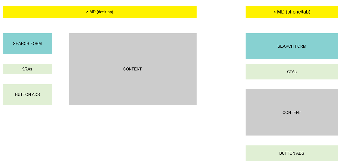
在大型设备上,我需要将“搜索表单”,“ CTA”和“按钮”广告放到垂直4列中,而“内容”将占据右侧的所有空间(内容可变且可以根据需要向下扩展)。
对于小型设备,我希望“搜索表单”,“ CTA”,“内容”和“按钮”广告按此顺序显示,占用屏幕宽度的100%。
我将使用网格排序类来更改正常流程。但就目前而言,我仍然受困,无法为大型设备提供所需的布局。我尝试过的代码如下所示,但“内容”始终位于其他项目的下方,而不是旁边。
这个question似乎解决了这个问题,但是推/拉类现在消失了吗?
我的代码(两次尝试)
<div class="row align-items-start">

  <div class="col-md-4">
    <div style="height:50px;width:100%;background-color: red;"></div>
  </div>

  <div class="w-100"></div>

  <div class="col-md-4">
    <div style="height:50px;width:100%;background-color: blue;"></div>
  </div>

  <div class="w-100"></div>

  <div class="col-md-4">
    <div style="height:50px;width:100%;background-color: green;"></div>
  </div>

  <div class="w-100"></div>

  <div  class="col-md-8 offset-md-4">
    <div style="height:50px;width:100%;background-color: yellow;"></div>
  </div>

</div>


<div class="row ">

  <div class="col-md-4">
    <div style="height:50px;width:100%;background-color: red;"></div>
  </div>

  <div class="col-md-4">
    <div style="height:50px;width:100%;background-color: blue;"></div>
  </div>

  <div class="col-md-4">
    <div style="height:50px;width:100%;background-color: green;"></div>
  </div>

  <div style='float:right;' class="col-md-8 offset-md-4">
    <div style="height:50px;width:100%;background-color: yellow;"></div>
  </div>

</div>
3 个答案:
答案 0 :(得分:3)
您需要禁用flexbox(d-md-block),并在较大屏幕宽度的列上使用浮点数。然后,将flexbox order-*用于较小/移动的屏幕宽度。
<div class="container-fluid">
    <div class="row d-md-block">
        <div class="col-md-4 float-left">
            <div style="height:50px;width:100%;background-color: red;">A</div>
        </div>
        <div class="col-md-8 float-right order-1">
            <div style="height:150px;width:100%;background-color: green;">C</div>
        </div>
        <div class="col-md-4 float-left order-0">
            <div style="height:50px;width:100%;background-color: blue;">B</div>
        </div>
        <div class="col-md-4 float-left order-last">
            <div style="height:50px;width:100%;background-color: yellow;">D</div>
        </div>
    </div>
</div>
https://www.codeply.com/go/jfARR4GYE4
相关:
Bootstrap with different order on mobile version
https://www.codeply.com/go/mKykCsBFDX
A-B-C-D A-C-B-D
答案 1 :(得分:1)
您可以这样做
.top{
    background-color: yellow;
    height: 50px;
}

.left-side{
    width: 100%;
}

.first{
    background-color: aqua;
}
.second{
    background-color: green;
}

.third{
    background-color: aquamarine;
}


.content{
    height: 300px;
    background-color: grey;
    width: 100%;

}

.show-on-small{
    display: none;
}

@media only screen and (max-width: 768px) {

     .show-on-small{
        display: block;
    }

    .hide-on-small{
        display: none;
    }
}
<!DOCTYPE html>
<html lang="en">
<head>
<meta charset="UTF-8">
<meta name="viewport" content="width=device-width, initial-scale=1.0">
<meta http-equiv="X-UA-Compatible" content="ie=edge">
<title>Document</title>
<link rel="stylesheet" href="https://stackpath.bootstrapcdn.com/bootstrap/4.1.1/css/bootstrap.min.css">
<link rel="stylesheet" href="sty.css">
</head>
<body>
<div class="container-fluid">
<div class="row">
<div class="col-12 top">
MD Desktop
</div>
</div>
<div class="row">
<div class="col-md-4">
<div class="left-side first">SEARCH FORM</div>
<div class="left-side second">CTAs</div>
<div class="left-side third hide-on-small">BUTTON ADS</div>
</div>
<div class="col-md-8">
<div class="content">CONTENT</div>
</div>
<div class="col-md-4 show-on-small">
<div class="left-side third">BUTTON ADS</div>
</div>
</div>
</div>
</body>
</html>
答案 2 :(得分:-1)
您可以使用flexbox的order属性以所需的方式进行排序。您可以使用媒体查询在不同的视口中实现不同的顺序。 有关更多详细信息,请参见https://developer.mozilla.org/en-US/docs/Web/CSS/CSS_Flexible_Box_Layout/Ordering_Flex_Items。
相关问题
最新问题
- 我写了这段代码,但我无法理解我的错误
- 我无法从一个代码实例的列表中删除 None 值,但我可以在另一个实例中。为什么它适用于一个细分市场而不适用于另一个细分市场?
- 是否有可能使 loadstring 不可能等于打印?卢阿
- java中的random.expovariate()
- Appscript 通过会议在 Google 日历中发送电子邮件和创建活动
- 为什么我的 Onclick 箭头功能在 React 中不起作用?
- 在此代码中是否有使用“this”的替代方法?
- 在 SQL Server 和 PostgreSQL 上查询,我如何从第一个表获得第二个表的可视化
- 每千个数字得到
- 更新了城市边界 KML 文件的来源?