MaterialComponents主题警报对话框按钮
最近我从支持库切换到com.google.android.material:material:1.0.0
但是现在我有一个问题,在此页面中有一个注释https://github.com/material-components/material-components-android/blob/master/docs/getting-started.md
注意:使用“材料组件”主题可以启用自定义视图充气机,该充气机将默认组件替换为其对应的“材料”。当前,这仅用MaterialButton替换Button XML组件。
还有我正在使用的主题
Theme.MaterialComponents.Light.NoActionBar
与该注释中的内容完全相同,它将AlertDialog Buttons替换为MaterialButtons,但是问题是默认情况下MaterialButtons是彩色背景,现在这些按钮看起来像这样: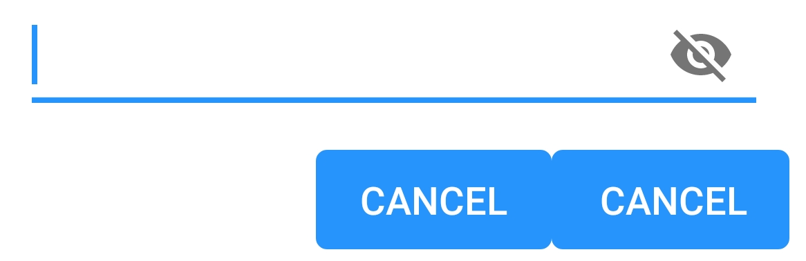
如何使它们再次变为无边界和无背景?
PS我正在使用警报生成器来创建警报对话框:
android.app.AlertDialog.Builder
8 个答案:
答案 0 :(得分:28)
我弄清楚是什么原因导致了这个问题。我需要使用其他AlertDialog类:
androidx.appcompat.app.AlertDialog
当我切换到此模式时,一切都按预期开始工作。这是我找到解决方案的地方:
https://github.com/material-components/material-components-android/issues/162
答案 1 :(得分:11)
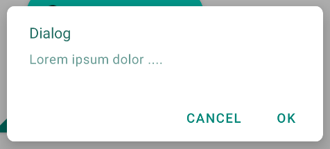
如果您正在使用Material Components库,则拥有AlertDialog的最佳方法是使用MaterialAlertDialogBuilder。
new MaterialAlertDialogBuilder(context)
            .setTitle("Dialog")
            .setMessage("Lorem ipsum dolor ....")
            .setPositiveButton("Ok", /* listener = */ null)
            .setNegativeButton("Cancel", /* listener = */ null)
            .show();
这是默认结果:
答案 2 :(得分:6)
使用com.google.android.material:material:1.0.0和androidx.appcompat.app.AlertDialog时,您可以使用buttonBar作为父项来自定义Widget.MaterialComponents.Button.TextButton中的每个按钮。
val builder: AlertDialog.Builder = AlertDialog.Builder(ContextThemeWrapper(context, R.style.AlertDialogTheme))
使用默认布局或通过builder.setView(R.layout.my_dialog)添加自定义
以您的样式:
<style name="AlertDialogTheme" parent="Theme.MaterialComponents.Light.Dialog.Alert">
    <item name="buttonBarPositiveButtonStyle">@style/Alert.Button.Positive</item>
    <item name="buttonBarNegativeButtonStyle">@style/Alert.Button.Neutral</item>
    <item name="buttonBarNeutralButtonStyle">@style/Alert.Button.Neutral</item>
</style>

<style name="Alert.Button.Positive" parent="Widget.MaterialComponents.Button.TextButton">
    <item name="backgroundTint">@color/transparent</item>
    <item name="rippleColor">@color/colorAccent</item>
    <item name="android:textColor">@color/colorPrimary</item>
    <item name="android:textSize">14sp</item>
    <item name="android:textAllCaps">false</item>
</style>

<style name="Alert.Button.Neutral" parent="Widget.MaterialComponents.Button.TextButton">
    <item name="backgroundTint">@color/transparent</item>
    <item name="rippleColor">@color/colorAccent</item>
    <item name="android:textColor">@color/gray_dark</item>
    <item name="android:textSize">14sp</item>
</style>
答案 3 :(得分:3)
首先,如果您使用的是Material Theme,最好使用MaterialAlertDialog。
MaterialAlertDialogBuilder(context)
            .setTitle(R.string.confirm)
            .setMessage(R.string.logout)
            .setPositiveButton(R.string.logout_alert_positive) { _, _ -> activity?.logout() }
            .setNegativeButton(R.string.never_mind, null)
            .show()
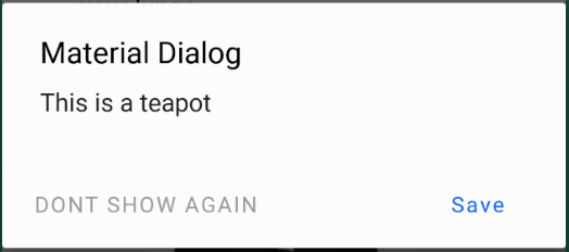
This是MaterialAlertDialog操作的layout.xml。如您所见,有3个按钮,每个按钮都有自己的样式。因此,这里是您可以更改它们的方法。
第1步::告诉Android您要更改默认的MaterialAlertDialog主题。
<style name="Base.AppTheme" parent="Theme.MaterialComponents.DayNight.NoActionBar">
    ...
    <item name="materialAlertDialogTheme">@style/AlertDialog</item>
    ...
</style>
第2步::告诉Android您要更改特定的按钮样式。 buttonBarNeutralButtonStyle,buttonBarNegativeButtonStyle或buttonBarPositiveButtonStyle
<style name="AlertDialog" parent="ThemeOverlay.MaterialComponents.MaterialAlertDialog">
    <item name="buttonBarNegativeButtonStyle">@style/NegativeButtonStyle</item>
</style>
步骤3:定义自定义样式
<style name="NegativeButtonStyle" parent="Widget.MaterialComponents.Button.TextButton">
    <item name="android:textColor">#FF0000</item>
</style>
答案 4 :(得分:0)
在此处使用MaterialComponents找到了另一种解决方案:https://issuetracker.google.com/issues/116861837#comment9
<style name="Theme.Custom.Material.Alert.Dialog.Light" parent="Theme.MaterialComponents.Light.Dialog.Alert">
    <item name="materialButtonStyle">@style/Widget.AppCompat.Button.Borderless</item>
</style>

<style name="Theme.Custom.Material.Base.Light" parent="Theme.MaterialComponents.Light.NoActionBar">
    <item name="android:dialogTheme">@style/Theme.Custom.Material.Alert.Dialog.Light</item>
    <item name="android:alertDialogTheme">@style/Theme.Custom.Material.Alert.Dialog.Light</item>
  ....
</style>
尽管这对我来说仍然不是“预期行为”。
答案 5 :(得分:0)
如果您正在使用com.android.support:design:28.0.0库,则可以按预期使用android.support.v7.app.AlertDialog。
答案 6 :(得分:0)
如果您不想使用androidx.appcompat.app.AlertDialog,则可以重新定义对话框按钮的样式:
在您的style.xml中:
<style name="AppTheme" parent="Theme.MaterialComponents.Light.NoActionBar">
   ...
   <item name="android:buttonBarButtonStyle">@style/DialogButton</item>
   ...
</style>

<style name="DialogButton" parent="Widget.MaterialComponents.Button.TextButton"/>
答案 7 :(得分:0)
我测试了以上答案。尽管我有一个好主意,但没有一个适合我的情况。所以,这就是我的答案。
-
确保清单文件中的“应用程序”或“活动”下有
android:theme="@style/AppMaterialTheme"。 -
打开Styles.xml文件,然后根据以下内容进行更改。
<style name="AppMaterialTheme" parent="Theme.MaterialComponents.DayNight.NoActionBar"> <item name="colorPrimary">@color/primaryBlue</item> <item name="colorPrimaryDark">@color/primaryBlue</item> <item name="colorAccent">@color/colorAccent</item> <item name="colorControlActivated">@color/primaryBlue</item> <item name="colorControlHighlight">@color/colorAccent_main</item> <item name="colorButtonNormal">@color/white</item> <item name="materialAlertDialogTheme">@style/AlertDialogMaterialTheme</item> </style> <style name="AlertDialogMaterialTheme" parent="ThemeOverlay.MaterialComponents.MaterialAlertDialog"> <item name="buttonBarPositiveButtonStyle">@style/Alert.Button.Positive</item> <item name="buttonBarNegativeButtonStyle">@style/Alert.Button.Negative</item> </style> <style name="Alert.Button.Positive" parent="Widget.MaterialComponents.Button.UnelevatedButton"> <item name="android:fillColor">@color/color_0054BB</item> <item name="android:textColor">@color/white</item> <item name="android:textAllCaps">false</item> <item name="android:textSize">14sp</item> <item name="rippleColor">@color/colorAccent_main</item> </style> <style name="Alert.Button.Negative" parent="Widget.MaterialComponents.Button.OutlinedButton"> <item name="strokeColor">@color/color_0054BB</item> <item name="android:textColor">@color/color_0054BB</item> <item name="android:textAllCaps">false</item> <item name="android:textSize">14sp</item> <item name="android:layout_marginEnd">8dp</item> <item name="rippleColor">@color/colorAccent_main</item> </style> -
您无需将主题应用于AlertDialog,因为您的“活动”将主题应用于主题。因此,请正常创建对话框。
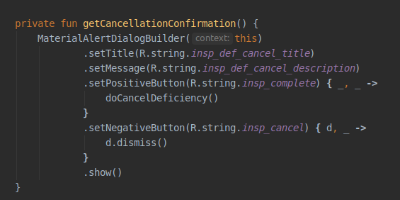
结果将是
- 我写了这段代码,但我无法理解我的错误
- 我无法从一个代码实例的列表中删除 None 值,但我可以在另一个实例中。为什么它适用于一个细分市场而不适用于另一个细分市场?
- 是否有可能使 loadstring 不可能等于打印?卢阿
- java中的random.expovariate()
- Appscript 通过会议在 Google 日历中发送电子邮件和创建活动
- 为什么我的 Onclick 箭头功能在 React 中不起作用?
- 在此代码中是否有使用“this”的替代方法?
- 在 SQL Server 和 PostgreSQL 上查询,我如何从第一个表获得第二个表的可视化
- 每千个数字得到
- 更新了城市边界 KML 文件的来源?