创建水平居中的背景图像渐变三角形
我想使用clip-path: polygon(...)创建一个指向css的三角形,并使用background-image: linear-gradient(...)在其上应用渐变。
一切正常,但是我需要此形状作为网页的背景。
它必须始终居中,并且需要剪切/剪切不适合浏览器窗口的左右边缘。三角形不应自行缩放。我想保留三角形边缘的陡度,并且三角形的高度不应更改:
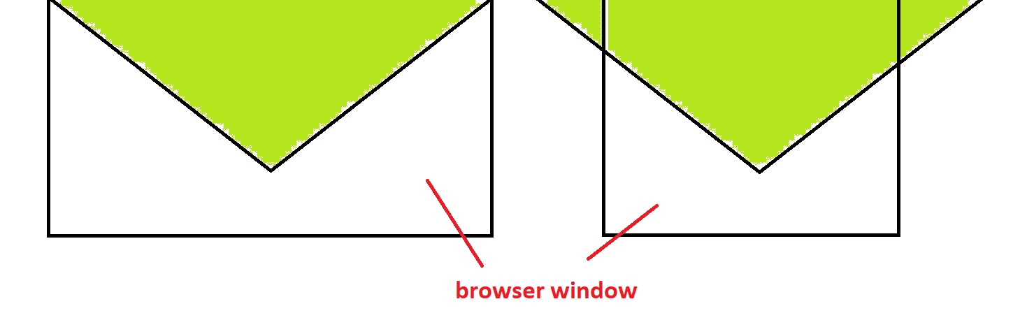
如图所示,即使浏览器窗口太小而不能容纳三角形,三角形也应保持相同的宽度和高度。
到目前为止,我有:
    div.main-background {
        position: absolute;
        z-index: -1;
        top: 0;
        height: 500px;
        width: 100%;
        background-image: linear-gradient(to bottom, #65AAB0, #AEE2B6);
        background-attachment: fixed;
        background-position-x: center;
        background-size: 1400px 500px;
        clip-path: polygon(50% 80%, 0 0, 1400px 0);
    }
<div class="main-background"></div>
但这显然是错误的。
5 个答案:
答案 0 :(得分:1)
您可以使用SVG来实现
html,
body {
  margin: 0
}

svg {
  width: 100%;
}
<svg viewBox="0 0 1920 400" height="400" preserveAspectRatio="xMidYMax slice">
<defs>
<linearGradient id="Gradient1" x1="0" x2="0" y1="0" y2="1">
<stop offset="0%" stop-color="#65AAB0"></stop>
<stop offset="100%" stop-color="#AEE2B6"></stop>
</linearGradient>
</defs>
<polygon points="0,0 960,400 1920,0" fill="url(#Gradient1)"></polygon>
</svg>
答案 1 :(得分:1)
您可以尝试以下多种背景。我使三角形的宽度为600px,高度为300px,可以轻松调整。
body {
  background:
    linear-gradient(to bottom right,transparent 49.8%,#fff 50%) calc(50% + 150px) 0 /300px 300px,
    linear-gradient(to bottom left, transparent 49.8%,#fff 50%) calc(50% - 150px) 0 /300px 300px,
    linear-gradient(to bottom, #65AAB0, #AEE2B6)top center/ 600px 300px;
  background-repeat:no-repeat;
}
使用CSS变量更容易:
body {
  --w:800px;
  --h:300px;
  background:
    linear-gradient(to bottom right,transparent 49.8%,#fff 50%) calc(50% + calc(var(--w)/4)) 0 /calc(var(--w)/2) var(--h),
    linear-gradient(to bottom left, transparent 49.8%,#fff 50%) calc(50% - calc(var(--w)/4)) 0 /calc(var(--w)/2) var(--h),
    linear-gradient(to bottom, #65AAB0, #AEE2B6)top center/ var(--w) var(--h);
  background-repeat:no-repeat;
}
答案 2 :(得分:1)
您正在以错误的方式进行操作。您的div不包含任何内容,因此仅仅是装饰性的东西。如果您希望页面背景具有某种外观,那么背景应该具有的任何外观都会进入document元素的background属性(通常为body或html)中。
摆脱无用的div.main-background毫无用处,并使用下面的背景图像(独立运行(在其自己的SVG文件中)或使用data: URI内联):
<?xml version="1.0" ?>
<svg xmlns="http://www.w3.org/2000/svg" viewBox="0 0 1 1">
    <polygon fill="lime" points="0,0 0.5,0.4 1,0" />
</svg>
以下CSS声明将使用以上内容作为背景图片,根据您的解释,背景尺寸应为确定的长度(而不是相对于视口尺寸的尺寸),我将使用40em,因为我没有从您的问题中选择任何线索:
body {
    background: url('data:image/svg+xml,<svg xmlns="http://www.w3.org/2000/svg" viewBox="0 0 1 1"><polygon fill="lime" points="0,0 0.5,0.4 1,0" /></svg>');
    background-size: 40em;
    background-repeat: no-repeat;
    background-position: top center;
}
或者,您可以使用独立的SVG文件,那么您的background规则将有所不同:
background: url(<URL-of-SVG-file>);
您可以通过编辑SVG内容轻松添加渐变,这是SVG的基本功能,此处的其他答案之一甚至演示了如何实现。
答案 3 :(得分:0)
使用视口单位,这是您想要的吗?适用于任何分辨率。
div.main-background {
       position: absolute;
       z-index: -1;
       top: 0;
       left: 0;
       right: 0;
       height: 35.71vw;
       background-image: linear-gradient(to bottom, #65AAB0, #AEE2B6);
       background-attachment: fixed;
       background-position: center;
       clip-path: polygon(50% 80%, 0 0, 100vw 0);
    }
<div class="main-background"></div>
答案 4 :(得分:0)
也许您可以仅使用CSS和after伪元素来使用这种技巧:
body {
  overflow: hidden;
}

.arrow-down {
  --w:800px;
  --h:300px;
  position: relative;
  width: var(--w);
  height: var(--h);
  margin-left: 50%;
  transform: translate(-50%, 0);
  background-image: linear-gradient(to bottom, #65AAB0, #AEE2B6);
}

.arrow-down::after{
  content: '';
  position: absolute;
  top: 0;
  bottom: 0;
  left: 0;
  right: 0;
  border: solid white;
  border-width: calc(var(--h)/2) calc(var(--w)/2);
  border-top-color: transparent;
}
<body>
<div class="arrow-down"></div>
</body>
当然,您可以调整宽度和高度以更好地满足您的需求。
- 我写了这段代码,但我无法理解我的错误
- 我无法从一个代码实例的列表中删除 None 值,但我可以在另一个实例中。为什么它适用于一个细分市场而不适用于另一个细分市场?
- 是否有可能使 loadstring 不可能等于打印?卢阿
- java中的random.expovariate()
- Appscript 通过会议在 Google 日历中发送电子邮件和创建活动
- 为什么我的 Onclick 箭头功能在 React 中不起作用?
- 在此代码中是否有使用“this”的替代方法?
- 在 SQL Server 和 PostgreSQL 上查询,我如何从第一个表获得第二个表的可视化
- 每千个数字得到
- 更新了城市边界 KML 文件的来源?