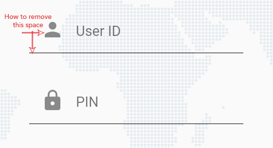
еҰӮдҪ•д»ҺTextFieldеҲ йҷӨеҶ…е®№еЎ«е……пјҹ
жҲ‘дёҚзҶҹжӮүflutterпјҢжӯЈеңЁеҲӣе»әзҷ»еҪ•иЎЁеҚ•пјҢдёәжӯӨжҲ‘дҪҝз”ЁдәҶTextField并添еҠ дәҶеүҚзјҖеӣҫж ҮпјҢдҪҶжҳҜеңЁж–Үжң¬еӯ—ж®өд№Ӣй—ҙпјҲз”ЁжҲ·IDе’ҢPinпјүд»ҘеҸҠеүҚзјҖеӣҫж Үд№ӢеүҚпјҢжҲ‘еҫ—еҲ°дәҶдёҖдәӣйўқеӨ–зҡ„з©әж јгҖӮжҲ‘д№ҹе°қиҜ•дәҶInputDecorationThemeпјҢдҪҶжҳҜжІЎжңүз”ЁгҖӮ
иҜ·и®©жҲ‘зҹҘйҒ“еҰӮдҪ•еҲ йҷӨжҲ–еҮҸе°‘з©әй—ҙгҖӮпјҹ
дёӢйқўжҳҜжҲ‘зҡ„д»Јз Ғпјҡ
TextField(
  maxLength: 8,
  keyboardType: TextInputType.number,
  decoration: InputDecoration(
    hintText: hint,
    hintStyle: TextStyle(fontSize: 12.0),
    prefixIcon: Icon(icon),
    counterText: '',
  ),
)
11 дёӘзӯ”жЎҲ:
зӯ”жЎҲ 0 :(еҫ—еҲҶпјҡ10)
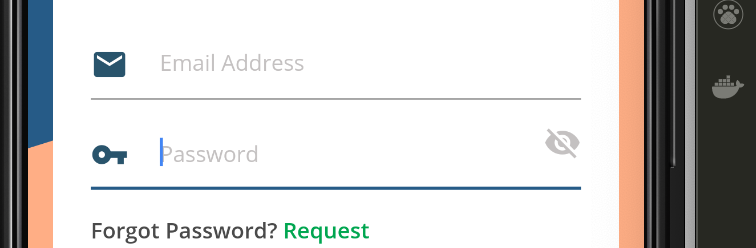
йҖҡиҝҮеҗ‘prefixIconж·»еҠ еүҚзјҖзәҰжқҹ并еғҸиҝҷж ·еЎ«е……
пјҢе°ұеҸҜд»ҘиҪ»жқҫе®һзҺ°иҝҷдёҖзӣ®ж Ү TextFormField(
enabled: true,
decoration: InputDecoration(
prefixIconConstraints:BoxConstraints(minWidth: 23, maxHeight: 20),
prefixIcon: Padding(
padding: const EdgeInsets.only(right: 20),
child: Icon(
Icons.email,
color: clockColor,
),
),
hintText:"Email Address"
hintStyle:TextStyle(color: hintColor, fontSize: 14),
),
),
иҝҷйҮҢжҳҜиҫ“еҮәпјҢеёҢжңӣеҜ№жӮЁжңүеё®еҠ©
зӯ”жЎҲ 1 :(еҫ—еҲҶпјҡ9)
д»Һflutter 1.17.5пјҲдёҺ1.2XзӣёеҗҢпјүејҖе§ӢпјҢд»Ҙе®Ңе…Ёе®Ңе…ЁеҲ йҷӨжҲ–жүӢеҠЁж“ҚдҪңеЎ«е……пјҢйҰ–е…Ҳеҝ…йЎ»и®ҫзҪ®isDense: trueпјҢ然еҗҺеҸҜд»Ҙж №жҚ®йңҖиҰҒи°ғж•ҙcontentPaddingжҲ–еңЁзҲ¶е°ҸйғЁд»¶дёҠеә”з”ЁеЎ«е……гҖӮ
TextField(
  inputDecorationTheme: InputDecorationTheme(
     isDense: true,
     contentPadding: EdgeInsets.symmetric(horizontal: 0, vertical: 0),
     ...
  ),
)
зӯ”жЎҲ 2 :(еҫ—еҲҶпјҡ3)
жӮЁеҸҜд»ҘдҪҝз”ЁInputDecorationзҡ„contentPaddingгҖӮ
иҝҷжҳҜзӨәдҫӢд»Јз Ғ
TextField(
   maxLines: 8,
   decoration: InputDecoration(
      contentPadding: EdgeInsets.symmetric(vertical: 5),
      labelText: 'Description',
      labelStyle: txtHintStyle,
   )
 )
зӯ”жЎҲ 3 :(еҫ—еҲҶпјҡ3)
жӮЁеҸҜд»ҘйҖҡиҝҮйҷҚдҪҺTextFieldзҡ„й«ҳеәҰжқҘе°қиҜ•жӯӨжҠҖе·§
SizedBox(
  height: 44, // set this
  child: TextField(),
)
зӯ”жЎҲ 4 :(еҫ—еҲҶпјҡ2)
жӮЁеҸҜд»ҘдҪҝз”Ёпјҡ
TextField(
   maxLines: 1,
   decoration: InputDecoration(contentPadding: EdgeInsets.only(bottom: -10.0))
 )
зӯ”жЎҲ 5 :(еҫ—еҲҶпјҡ0)
ж №жҚ®ж–ҮжЎЈпјҢиҜҘprefixIconе·ІеҢ…еҗ«12.0зҡ„еЎ«е……гҖӮ еӣ жӯӨпјҢжӮЁж— йңҖжҸҗдҫӣйўқеӨ–зҡ„еЎ«е……гҖӮ
иҜ·еҸӮи§ҒдёӢйқўзҡ„иҜҙжҳҺе’Ңд»Јз ҒпјҢжӮЁеҸҜд»ҘеңЁinput_decorator.dartдёӯжүҫеҲ°гҖӮ
В ВеүҚзјҖеӣҫж Үзҡ„жңҖе°Ҹе°әеҜёдёә48px x 48pxпјҢ В В дҪҶеҸҜд»Ҙжү©еұ•еҲ°жӣҙеӨҡгҖӮд»»дҪ•еӨ§дәҺ24еғҸзҙ зҡ„еғҸзҙ В В йңҖиҰҒйўқеӨ–зҡ„еЎ«е……д»ҘзЎ®дҝқе…¶з¬ҰеҗҲжқҗж–ҷи§„ж ј В В иҫ“е…Ҙзҡ„е·Ұиҫ№зјҳе’Ңиҫ“е…Ҙзҡ„еүҚжІҝд№Ӣй—ҙзҡ„12pxеЎ«е…… В В еүҚзјҖеӣҫж ҮгҖӮеЎ«е……еүҚзјҖеӣҫж Үзҡ„еүҚжІҝпјҡ
prefixIcon: Padding(
     padding: const EdgeInsetsDirectional.only(start: 12.0),
     child: myIcon, // icon is 48px widget.
)
жҲ‘еёҢжңӣе®ғдјҡжңүжүҖеё®еҠ©гҖӮ
зӯ”жЎҲ 6 :(еҫ—еҲҶпјҡ0)
жҲ‘жқҘжҷҡдәҶдёҖзӮ№пјҢдҪҶжҳҜжӮЁе”ҜдёҖиҰҒеҒҡзҡ„е°ұжҳҜдҪҝз”ЁиҙҹеЎ«е……пјҡ
TextField(
   decoration: InputDecoration(
      contentPadding: EdgeInsets.symmetric(vertical: -5),
      labelText: 'Description',
   )
 )
зӯ”жЎҲ 7 :(еҫ—еҲҶпјҡ0)
йҖҡиҝҮдҪҝз”Ё
еә”з”ЁеҮҸеҸ·еЎ«е……transform: Matrix4.translationValues(-10.0, 0.0, 0.0),
еӣҫж Үе®№еҷЁеҶ…зҡ„иЎҢдёҠж–№
TextFormField(
          keyboardType: TextInputType.number,
          style: new TextStyle(color: Colors.white, fontSize: 17),
          decoration: new InputDecoration(
              prefixIcon: Container(
                transform: Matrix4.translationValues(-10.0, 0.0, 0.0),
                child: Icon(
                  Icons.vpn_key,
                  color: Colors.white,
                ),
              ),
              labelText: "Enter Password",
              labelStyle: new TextStyle(color: Colors.white)),
        ),
зӯ”жЎҲ 8 :(еҫ—еҲҶпјҡ0)
жҲ‘еҝ…йЎ»е®һзҺ°зұ»дјјзҡ„зӣ®ж ҮпјҢдҪҶжҳҜжүҫдёҚеҲ°е®ҢзҫҺзҡ„и§ЈеҶіж–№жЎҲгҖӮжҸҗеҮә并解еҶідҪҝз”ЁStackе°ҸйғЁд»¶зҡ„й—®йўҳгҖӮ
Widget _username(context){
  return SizedBox(
    height: 35,
    child: Stack(
      children: <Widget>[
        Align(
          alignment: Alignment.centerLeft,
          child: Icon(
            Icons.mail,
            size: 20,
            color: Theme.of(context).accentColor,
          ),
        ),
        TextField(
          style: TextStyle(
              color: Colors.white
          ),
          decoration: InputDecoration(
            contentPadding: const EdgeInsets.symmetric(vertical: 11.0, horizontal: 33.0),
            hasFloatingPlaceholder: false,
            labelText: 'Username',
            labelStyle: TextStyle(
                color: Colors.white
            ),
            enabledBorder: UnderlineInputBorder(
                borderSide: BorderSide(
                  color: Theme.of(context).accentColor,
                )
            ),
            focusedBorder: UnderlineInputBorder(
              borderSide: BorderSide(
                color: Theme.of(context).accentColor,
              ),
            ),
          ),
        ),
      ]
    ),
  );
}
SizedBoxз”ЁдәҺжҺ§еҲ¶еһӮзӣҙеЎ«е……гҖӮеҜ№дәҺж°ҙе№іеЎ«е……пјҢе°ҶIconе’ҢTextFieldе ҶеҸ еңЁдёҖиө·гҖӮз»“жһңжҳҜеңЁIconдёҠж–№йҮҚеҸ дәҶTextFieldзҡ„ж ҮзӯҫпјҢеӣ жӯӨcontentPaddingеұһжҖ§з”ЁдәҺе°Ҷж Үзӯҫеҗ‘еҸіз§»еҠЁгҖӮжңүдәҶиҝҷдёӘпјҢжҲ‘е®һзҺ°дәҶд»ҘдёӢеӨ–и§ӮгҖӮ

зӯ”жЎҲ 9 :(еҫ—еҲҶпјҡ0)
еҜ№дәҺйӮЈдәӣеңЁ TextFormField дёӯжҢЈжүҺзҡ„дәәжқҘиҜҙпјҢsuffixIcon жҲ– prefixIcon з”ұдәҺ 48x еЎ«е……иҖҢдёҚе…Ғи®ёеҸҳе°ҸпјҢжӮЁеҸҜд»ҘйҖҡиҝҮз”Ё { еҢ…иЈ№е®ғжқҘе®һзҺ°иҝҷдёҖзӮ№{1}} е°ҶејәеҲ¶еӯҗйЎ№пјҲеңЁжң¬дҫӢдёӯдёә IntrinsicHeightпјүзј©е°ҸеҲ°жӣҙеҗҲзҗҶзҡ„еӨ§е°ҸпјҢдё»иҰҒжҳҜе°Ҷе…¶еӨ§е°Ҹи°ғж•ҙдёәиҫ“е…Ҙеӯ—дҪ“еӨ§е°Ҹ + д»»дҪ•иЈ…йҘ°еЎ«е……гҖӮ
дҪҶжҳҜпјҢиҜ·и®°дҪҸпјҢиҝҷеә”иҜҘеҸӘжҳҜдёҖз§Қи§ЈеҶіж–№жі•пјҢ并且еә”иҜҘжңүдёҖдёӘйҖүйЎ№еҸҜд»ҘжүӢеҠЁи®ҫзҪ®еӣҫж ҮеЎ«е……гҖӮдҪҝз”ЁжӯӨи§ЈеҶіж–№жЎҲпјҢеҰӮжһңжӮЁзҡ„еӣҫж ҮеӨ§дәҺ TextFormField иҫ“е…Ҙж–Үжң¬пјҢе®ғдёҚдјҡеңЁж„ҸпјҢеӣҫж ҮдјҡжәўеҮәжЎҶгҖӮ
зӯ”жЎҲ 10 :(еҫ—еҲҶпјҡ0)
жҲ‘е°қиҜ•дәҶеҫҲеӨҡж–№жі•пјҢдҪҶеҸӘеҜ№жҲ‘жңүз”ЁгҖӮ
еҰӮжһңиҰҒеҲ йҷӨ Prefix еӣҫж Үзҡ„е·ҰеЎ«е……пјҢиҜ·е°Ҷ prefixIconConstraints:BoxConstraints(maxHeight: 20) иөӢдәҲ InpuDecorationгҖӮ
TextField(
      autocorrect: false,
      textAlignVertical: TextAlignVertical.bottom,
      onSubmitted: (value) {
        getXHelper.textFieldSubmit(value, type);
      },
      decoration: InputDecoration(
        isDense: true,
        prefixIconConstraints:BoxConstraints(maxHeight: 20) ,
        hintText: placeHolder,
        prefixIcon: Padding(
          padding: const EdgeInsets.only(top: 0, right: 5, bottom: 0),
          child: Icon(
            icon,
            size: 20,
          ),
        ),
        suffixIcon: type == TextFieldType.password ? passShowButton : null,
      ),
      controller: controller,
      cursorColor: Colors.black,
      style:
          TextStyle(color: Colors.black, fontFamily: AppFontFamily.fontFamily),
    );
- жҲ‘еҶҷдәҶиҝҷж®өд»Јз ҒпјҢдҪҶжҲ‘ж— жі•зҗҶи§ЈжҲ‘зҡ„й”ҷиҜҜ
- жҲ‘ж— жі•д»ҺдёҖдёӘд»Јз Ғе®һдҫӢзҡ„еҲ—иЎЁдёӯеҲ йҷӨ None еҖјпјҢдҪҶжҲ‘еҸҜд»ҘеңЁеҸҰдёҖдёӘе®һдҫӢдёӯгҖӮдёәд»Җд№Ҳе®ғйҖӮз”ЁдәҺдёҖдёӘз»ҶеҲҶеёӮеңәиҖҢдёҚйҖӮз”ЁдәҺеҸҰдёҖдёӘз»ҶеҲҶеёӮеңәпјҹ
- жҳҜеҗҰжңүеҸҜиғҪдҪҝ loadstring дёҚеҸҜиғҪзӯүдәҺжү“еҚ°пјҹеҚўйҳҝ
- javaдёӯзҡ„random.expovariate()
- Appscript йҖҡиҝҮдјҡи®®еңЁ Google ж—ҘеҺҶдёӯеҸ‘йҖҒз”өеӯҗйӮ®д»¶е’ҢеҲӣе»әжҙ»еҠЁ
- дёәд»Җд№ҲжҲ‘зҡ„ Onclick з®ӯеӨҙеҠҹиғҪеңЁ React дёӯдёҚиө·дҪңз”Ёпјҹ
- еңЁжӯӨд»Јз ҒдёӯжҳҜеҗҰжңүдҪҝз”ЁвҖңthisвҖқзҡ„жӣҝд»Јж–№жі•пјҹ
- еңЁ SQL Server е’Ң PostgreSQL дёҠжҹҘиҜўпјҢжҲ‘еҰӮдҪ•д»Һ第дёҖдёӘиЎЁиҺ·еҫ—第дәҢдёӘиЎЁзҡ„еҸҜи§ҶеҢ–
- жҜҸеҚғдёӘж•°еӯ—еҫ—еҲ°
- жӣҙж–°дәҶеҹҺеёӮиҫ№з•Ң KML ж–Ү件зҡ„жқҘжәҗпјҹ